Change the color of a data series in 3D Maps
You can change the color of a data series so that it stands out more. You do this in the Layer Pane.
-
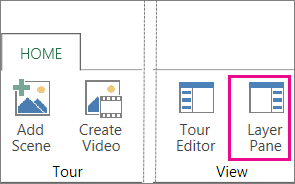
Click Home > Layer Pane.

-
Pick the layer containing the data series you want to change.
-
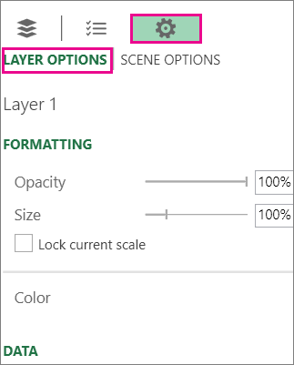
Click Settings, and click Layer Options.

-
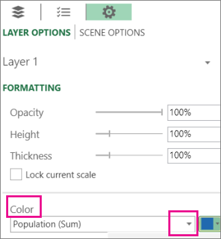
Under Color, click the down arrow in the first box and pick the data series you want to change.

-
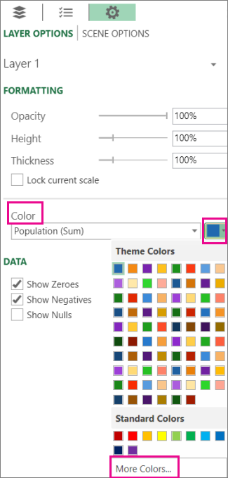
Click the down arrow in the color box and pick a different color.

Tip: To create your own color, click More Colors and then mix your color in the Color box.
No comments:
Post a Comment