Chart types
Some of the content in this topic may not be applicable to some languages.
Which Office program are you using?
Word
The charting feature in Office makes it easy to create an attractive chart in Excel and then add it to your document.
Many chart types are available to help you display data in ways that are meaningful to your audience. Here are some examples of the most common chart types and how they can be used.
Column chart
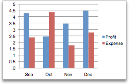
Data that is arranged in columns or rows on an Excel sheet can be plotted in a column chart. In column charts, categories are typically organized along the horizontal axis and values along the vertical axis.
Column charts are useful to show how data changes over time or to show comparisons among items.
Column charts have the following chart subtypes:
-
Clustered column chart Compares values across categories. A clustered column chart displays values in 2-D vertical rectangles. A clustered column in a 3-D chart displays the data by using a 3-D perspective.
-
Stacked column chart Shows the relationship of individual items to the whole, comparing the contribution of each value to a total across categories. A stacked column chart displays values in 2-D vertical stacked rectangles. A 3-D stacked column chart displays the data by using a 3-D perspective. A 3-D perspective is not a true 3-D chart because a third value axis (depth axis) is not used.
-
100% stacked column chart Compares the percentage that each value contributes to a total across categories. A 100% stacked column chart displays values in 2-D vertical 100% stacked rectangles. A 3-D 100% stacked column chart displays the data by using a 3-D perspective. A 3-D perspective is not a true 3-D chart because a third value axis (depth axis) is not used.
-
3-D column chart Uses three axes that you can change (a horizontal axis, a vertical axis, and a depth axis). They compare data points along the horizontal and the depth axes.
-
Cylinder, cone, and pyramid chart Available in the same clustered, stacked, 100% stacked, and 3-D chart types that are provided for rectangular column charts. They show and compare data in the same manner. The only difference is that these chart types display cylinder, cone, and pyramid shapes instead of rectangles.
Line chart
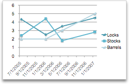
Data that is arranged in columns or rows on an Excel sheet can be plotted in a line chart. Line charts can display continuous data over time, set against a common scale, and are therefore ideal to show trends in data at equal intervals. In a line chart, category data is distributed evenly along the horizontal axis, and all value data is distributed evenly along the vertical axis.
Line charts work well if your category labels are text, and represent evenly spaced values such as months, quarters, or fiscal years.
Line charts have the following chart subtypes:
-
Line chart with or without markers Shows trends over time or ordered categories, especially when there are many data points and the order in which they are presented is important. If there are many categories or the values are approximate, use a line chart without markers.
-
Stacked line chart with or without markers Shows the trend of the contribution of each value over time or ordered categories. If there are many categories or the values are approximate, use a stacked line chart without markers.
-
100% stacked line chart displayed with or without markers Shows the trend of the percentage each value contributes over time or ordered categories. If there are many categories or the values are approximate, use a 100% stacked line chart without markers.
-
3-D line chart Shows each row or column of data as a 3-D ribbon. A 3-D line chart has horizontal, vertical, and depth axes that you can change.
Pie chart
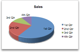
Data that is arranged in one column or row only on an Excel sheet can be plotted in a pie chart. Pie charts show the size of items in one data series, proportional to the sum of the items. The data points in a pie chart are displayed as a percentage of the whole pie.
Consider using a pie chart when you have only one data series that you want to plot, none of the values that you want to plot are negative, almost none of the values that you want to plot are zero values, you don't have more than seven categories, and the categories represent parts of the whole pie.
Pie charts have the following chart subtypes:
-
Pie chart Displays the contribution of each value to a total in a 2-D or 3-D format. You can pull out slices of a pie chart manually to emphasize the slices.
-
Pie of pie or bar of pie chart Displays pie charts with user-defined values that are extracted from the main pie chart and combined into a secondary pie chart or into a stacked bar chart. These chart types are useful when you want to make small slices in the main pie chart easier to distinguish.
-
Exploded pie chart Displays the contribution of each value to a total while emphasizing individual values. Exploded pie charts can be displayed in 3-D format. You can change the pie explosion setting for all slices and individual slices. However, you cannot move the slices of an exploded pie manually.
Bar chart
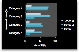
Data that is arranged in columns or rows on an Excel sheet can be plotted in a bar chart.
Use bar charts to show comparisons among individual items.
Bar charts have the following chart subtypes:
-
Clustered bar chart Compares values across categories. In a clustered bar chart, the categories are typically organized along the vertical axis, and the values along the horizontal axis. A clustered bar in 3-D chart displays the horizontal rectangles in 3-D format. It does not display the data on three axes.
-
Stacked bar chart Shows the relationship of individual items to the whole. A stacked bar in 3-D chart displays the horizontal rectangles in 3-D format. It does not display the data on three axes.
-
100% stacked bar chart and 100% stacked bar chart in 3-D Compares the percentage that each value contributes to a total across categories. A 100% stacked bar in 3-D chart displays the horizontal rectangles in 3-D format. It does not display the data on three axes.
-
Horizontal cylinder, cone, and pyramid chart Available in the same clustered, stacked, and 100% stacked chart types that are provided for rectangular bar charts. They show and compare data the same manner. The only difference is that these chart types display cylinder, cone, and pyramid shapes instead of horizontal rectangles.
Area chart
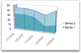
Data that is arranged in columns or rows on an Excel sheet can be plotted in an area chart. By displaying the sum of the plotted values, an area chart also shows the relationship of parts to a whole.
Area charts emphasize the magnitude of change over time, and can be used to draw attention to the total value across a trend. For example, data that represents profit over time can be plotted in an area chart to emphasize the total profit.
Area charts have the following chart subtypes:
-
Area chart Displays the trend of values over time or other category data. 3-D area charts use three axes (horizontal, vertical, and depth) that you can change. Generally, consider using a line chart instead of a nonstacked area chart because data from one series can be obscured by data from another series.
-
Stacked area chart Displays the trend of the contribution of each value over time or other category data. A stacked area chart in 3-D is displayed in the same manner but uses a 3-D perspective. A 3-D perspective is not a true 3-D chart because a third value axis (depth axis) is not used.
-
100% stacked area chart Displays the trend of the percentage that each value contributes over time or other category data. A 100% stacked area chart in 3-D is displayed in the same manner but uses a 3-D perspective. A 3-D perspective is not a true 3-D chart because a third value axis (depth axis) is not used.
XY (scatter) chart
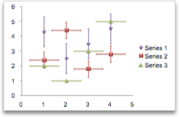
Data that is arranged in columns and rows on an Excel sheet can be plotted in an xy (scatter) chart. A scatter chart has two value axes. It shows one set of numeric data along the horizontal axis (x-axis) and another along the vertical axis (y-axis). It combines these values into single data points and displays them in irregular intervals, or clusters.
Scatter charts show the relationships among the numeric values in several data series, or plot two groups of numbers as one series of xy coordinates. Scatter charts are typically used for displaying and comparing numeric values, such as scientific, statistical, and engineering data.
Scatter charts have the following chart subtypes:
-
Scatter chart with markers only Compares pairs of values. Use a scatter chart with data markers but without lines if you have many data points and connecting lines would make the data more difficult to read. You can also use this chart type when you do not have to show connectivity of the data points.
-
Scatter chart with smooth lines and scatter chart with smooth lines and markers Displays a smooth curve that connects the data points. Smooth lines can be displayed with or without markers. Use a smooth line without markers if there are many data points.
-
Scatter chart with straight lines and scatter chart with straight lines and markers Displays straight connecting lines between data points. Straight lines can be displayed with or without markers.
Bubble chart
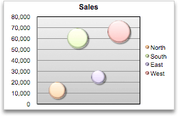
A bubble chart is a kind of xy (scatter) chart, where the size of the bubble represents the value of a third variable.
Bubble charts have the following chart subtypes:
-
Bubble chart or bubble chart with 3-D effect Compares sets of three values instead of two. The third value determines the size of the bubble marker. You can choose to display bubbles in 2-D format or with a 3-D effect.
Stock chart
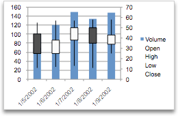
Data that is arranged in columns or rows in a specific order on an Excel sheet can be plotted in a stock chart.
As its name implies, a stock chart is most frequently used to show the fluctuation of stock prices. However, this chart may also be used for scientific data. For example, you could use a stock chart to indicate the fluctuation of daily or annual temperatures.
Stock charts have the following chart sub-types:
-
High-low-close stock chart Illustrates stock prices. It requires three series of values in the correct order: high, low, and then close.
-
Open-high-low-close stock chart Requires four series of values in the correct order: open, high, low, and then close.
-
Volume-high-low-close stock chart Requires four series of values in the correct order: volume, high, low, and then close. It measures volume by using two value axes: one for the columns that measure volume, and the other for the stock prices.
-
Volume-open-high-low-close stock chart Requires five series of values in the correct order: volume, open, high, low, and then close.
Surface chart
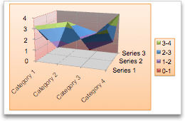
Data that is arranged in columns or rows on an Excel sheet can be plotted in a surface chart. As in a topographic map, colors and patterns indicate areas that are in the same range of values.
A surface chart is useful when you want to find optimal combinations between two sets of data.
Surface charts have the following chart subtypes:
-
3-D surface chart Shows trends in values across two dimensions in a continuous curve. Color bands in a surface chart do not represent the data series. They represent the difference between the values. This chart shows a 3-D view of the data, which can be imagined as a rubber sheet stretched over a 3-D column chart. It is typically used to show relationships between large amounts of data that may otherwise be difficult to see.
-
Wireframe 3-D surface chart Shows only the lines. A wireframe 3-D surface chart is not easy to read, but this chart type is useful for faster plotting of large data sets.
-
Contour chart Surface charts viewed from above, similar to 2-D topographic maps. In a contour chart, color bands represent specific ranges of values. The lines in a contour chart connect interpolated points of equal value.
-
Wireframe contour chart Surface charts viewed from above. Without color bands on the surface, a wireframe chart shows only the lines. Wireframe contour charts are not easy to read. You may want to use a 3-D surface chart instead.
Doughnut chart
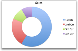
Like a pie chart, a doughnut chart shows the relationship of parts to a whole. However, it can contain more than one data series. Each ring of the doughnut chart represents a data series.
Doughnut charts have the following chart subtypes:
-
Doughnut chart Displays data in rings, where each ring represents a data series. If percentages are displayed in data labels, each ring will total 100%.
-
Exploded doughnut chart Displays the contribution of each value to a total while emphasizing individual values. However, they can contain more than one data series.
Radar chart
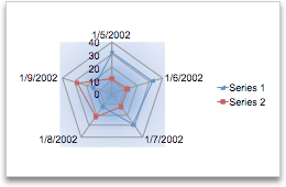
In a radar chart, each category has its own value axis radiating from the center point. Lines connect all the values in the same series.
Use radar charts to compare the aggregate values of several data series.
Radar charts have the following chart subtypes:
-
Radar chart Displays changes in values in relation to a center point.
-
Filled radar chart Displays changes in values in relation to a center point, and fills the area covered by a data series with color.
See also
PowerPoint
The charting feature in Office makes it easy to create an attractive chart in Excel and then add it to your presentation.
Many chart types are available to help you display data in ways that are meaningful to your audience. Here are some examples of the most common chart types and how they can be used.
Column chart

Data that is arranged in columns or rows on an Excel sheet can be plotted in a column chart. In column charts, categories are typically organized along the horizontal axis and values along the vertical axis.
Column charts are useful to show how data changes over time or to show comparisons among items.
Column charts have the following chart subtypes:
-
Clustered column chart Compares values across categories. A clustered column chart displays values in 2-D vertical rectangles. A clustered column in a 3-D chart displays the data by using a 3-D perspective.
-
Stacked column chart Shows the relationship of individual items to the whole, comparing the contribution of each value to a total across categories. A stacked column chart displays values in 2-D vertical stacked rectangles. A 3-D stacked column chart displays the data by using a 3-D perspective. A 3-D perspective is not a true 3-D chart because a third value axis (depth axis) is not used.
-
100% stacked column chart Compares the percentage that each value contributes to a total across categories. A 100% stacked column chart displays values in 2-D vertical 100% stacked rectangles. A 3-D 100% stacked column chart displays the data by using a 3-D perspective. A 3-D perspective is not a true 3-D chart because a third value axis (depth axis) is not used.
-
3-D column chart Uses three axes that you can change (a horizontal axis, a vertical axis, and a depth axis). They compare data points along the horizontal and the depth axes.
-
Cylinder, cone, and pyramid chart Available in the same clustered, stacked, 100% stacked, and 3-D chart types that are provided for rectangular column charts. They show and compare data in the same manner. The only difference is that these chart types display cylinder, cone, and pyramid shapes instead of rectangles.
Line chart

Data that is arranged in columns or rows on an Excel sheet can be plotted in a line chart. Line charts can display continuous data over time, set against a common scale, and are therefore ideal to show trends in data at equal intervals. In a line chart, category data is distributed evenly along the horizontal axis, and all value data is distributed evenly along the vertical axis.
Line charts work well if your category labels are text, and represent evenly spaced values such as months, quarters, or fiscal years.
Line charts have the following chart subtypes:
-
Line chart with or without markers Shows trends over time or ordered categories, especially when there are many data points and the order in which they are presented is important. If there are many categories or the values are approximate, use a line chart without markers.
-
Stacked line chart with or without markers Shows the trend of the contribution of each value over time or ordered categories. If there are many categories or the values are approximate, use a stacked line chart without markers.
-
100% stacked line chart displayed with or without markers Shows the trend of the percentage each value contributes over time or ordered categories. If there are many categories or the values are approximate, use a 100% stacked line chart without markers.
-
3-D line chart Shows each row or column of data as a 3-D ribbon. A 3-D line chart has horizontal, vertical, and depth axes that you can change.
Pie chart

Data that is arranged in one column or row only on an Excel sheet can be plotted in a pie chart. Pie charts show the size of items in one data series, proportional to the sum of the items. The data points in a pie chart are displayed as a percentage of the whole pie.
Consider using a pie chart when you have only one data series that you want to plot, none of the values that you want to plot are negative, almost none of the values that you want to plot are zero values, you don't have more than seven categories, and the categories represent parts of the whole pie.
Pie charts have the following chart subtypes:
-
Pie chart Displays the contribution of each value to a total in a 2-D or 3-D format. You can pull out slices of a pie chart manually to emphasize the slices.
-
Pie of pie or bar of pie chart Displays pie charts with user-defined values that are extracted from the main pie chart and combined into a secondary pie chart or into a stacked bar chart. These chart types are useful when you want to make small slices in the main pie chart easier to distinguish.
-
Exploded pie chart Displays the contribution of each value to a total while emphasizing individual values. Exploded pie charts can be displayed in 3-D format. You can change the pie explosion setting for all slices and individual slices. However, you cannot move the slices of an exploded pie manually.
Bar chart

Data that is arranged in columns or rows on an Excel sheet can be plotted in a bar chart.
Use bar charts to show comparisons among individual items.
Bar charts have the following chart subtypes:
-
Clustered bar chart Compares values across categories. In a clustered bar chart, the categories are typically organized along the vertical axis, and the values along the horizontal axis. A clustered bar in 3-D chart displays the horizontal rectangles in 3-D format. It does not display the data on three axes.
-
Stacked bar chart Shows the relationship of individual items to the whole. A stacked bar in 3-D chart displays the horizontal rectangles in 3-D format. It does not display the data on three axes.
-
100% stacked bar chart and 100% stacked bar chart in 3-D Compares the percentage that each value contributes to a total across categories. A 100% stacked bar in 3-D chart displays the horizontal rectangles in 3-D format. It does not display the data on three axes.
-
Horizontal cylinder, cone, and pyramid chart Available in the same clustered, stacked, and 100% stacked chart types that are provided for rectangular bar charts. They show and compare data the same manner. The only difference is that these chart types display cylinder, cone, and pyramid shapes instead of horizontal rectangles.
Area chart

Data that is arranged in columns or rows on an Excel sheet can be plotted in an area chart. By displaying the sum of the plotted values, an area chart also shows the relationship of parts to a whole.
Area charts emphasize the magnitude of change over time, and can be used to draw attention to the total value across a trend. For example, data that represents profit over time can be plotted in an area chart to emphasize the total profit.
Area charts have the following chart subtypes:
-
Area chart Displays the trend of values over time or other category data. 3-D area charts use three axes (horizontal, vertical, and depth) that you can change. Generally, consider using a line chart instead of a nonstacked area chart because data from one series can be obscured by data from another series.
-
Stacked area chart Displays the trend of the contribution of each value over time or other category data. A stacked area chart in 3-D is displayed in the same manner but uses a 3-D perspective. A 3-D perspective is not a true 3-D chart because a third value axis (depth axis) is not used.
-
100% stacked area chart Displays the trend of the percentage that each value contributes over time or other category data. A 100% stacked area chart in 3-D is displayed in the same manner but uses a 3-D perspective. A 3-D perspective is not a true 3-D chart because a third value axis (depth axis) is not used.
XY (scatter) chart

Data that is arranged in columns and rows on an Excel sheet can be plotted in an xy (scatter) chart. A scatter chart has two value axes. It shows one set of numeric data along the horizontal axis (x-axis) and another along the vertical axis (y-axis). It combines these values into single data points and displays them in irregular intervals, or clusters.
Scatter charts show the relationships among the numeric values in several data series, or plot two groups of numbers as one series of xy coordinates. Scatter charts are typically used for displaying and comparing numeric values, such as scientific, statistical, and engineering data.
Scatter charts have the following chart subtypes:
-
Scatter chart with markers only Compares pairs of values. Use a scatter chart with data markers but without lines if you have many data points and connecting lines would make the data more difficult to read. You can also use this chart type when you do not have to show connectivity of the data points.
-
Scatter chart with smooth lines and scatter chart with smooth lines and markers Displays a smooth curve that connects the data points. Smooth lines can be displayed with or without markers. Use a smooth line without markers if there are many data points.
-
Scatter chart with straight lines and scatter chart with straight lines and markers Displays straight connecting lines between data points. Straight lines can be displayed with or without markers.
Bubble chart

A bubble chart is a kind of xy (scatter) chart, where the size of the bubble represents the value of a third variable.
Bubble charts have the following chart subtypes:
-
Bubble chart or bubble chart with 3-D effect Compares sets of three values instead of two. The third value determines the size of the bubble marker. You can choose to display bubbles in 2-D format or with a 3-D effect.
Stock chart

Data that is arranged in columns or rows in a specific order on an Excel sheet can be plotted in a stock chart.
As its name implies, a stock chart is most frequently used to show the fluctuation of stock prices. However, this chart may also be used for scientific data. For example, you could use a stock chart to indicate the fluctuation of daily or annual temperatures.
Stock charts have the following chart sub-types:
-
High-low-close stock chart Illustrates stock prices. It requires three series of values in the correct order: high, low, and then close.
-
Open-high-low-close stock chart Requires four series of values in the correct order: open, high, low, and then close.
-
Volume-high-low-close stock chart Requires four series of values in the correct order: volume, high, low, and then close. It measures volume by using two value axes: one for the columns that measure volume, and the other for the stock prices.
-
Volume-open-high-low-close stock chart Requires five series of values in the correct order: volume, open, high, low, and then close.
Surface chart

Data that is arranged in columns or rows on an Excel sheet can be plotted in a surface chart. As in a topographic map, colors and patterns indicate areas that are in the same range of values.
A surface chart is useful when you want to find optimal combinations between two sets of data.
Surface charts have the following chart subtypes:
-
3-D surface chart Shows trends in values across two dimensions in a continuous curve. Color bands in a surface chart do not represent the data series. They represent the difference between the values. This chart shows a 3-D view of the data, which can be imagined as a rubber sheet stretched over a 3-D column chart. It is typically used to show relationships between large amounts of data that may otherwise be difficult to see.
-
Wireframe 3-D surface chart Shows only the lines. A wireframe 3-D surface chart is not easy to read, but this chart type is useful for faster plotting of large data sets.
-
Contour chart Surface charts viewed from above, similar to 2-D topographic maps. In a contour chart, color bands represent specific ranges of values. The lines in a contour chart connect interpolated points of equal value.
-
Wireframe contour chart Surface charts viewed from above. Without color bands on the surface, a wireframe chart shows only the lines. Wireframe contour charts are not easy to read. You may want to use a 3-D surface chart instead.
Doughnut chart

Like a pie chart, a doughnut chart shows the relationship of parts to a whole. However, it can contain more than one data series. Each ring of the doughnut chart represents a data series.
Doughnut charts have the following chart subtypes:
-
Doughnut chart Displays data in rings, where each ring represents a data series. If percentages are displayed in data labels, each ring will total 100%.
-
Exploded doughnut chart Displays the contribution of each value to a total while emphasizing individual values. However, they can contain more than one data series.
Radar chart

In a radar chart, each category has its own value axis radiating from the center point. Lines connect all the values in the same series.
Use radar charts to compare the aggregate values of several data series.
Radar charts have the following chart subtypes:
-
Radar chart Displays changes in values in relation to a center point.
-
Filled radar chart Displays changes in values in relation to a center point, and fills the area covered by a data series with color.
See also
Excel
Many chart types are available to help you display data in ways that are meaningful to your audience. Here are some examples of the most common chart types and how they can be used.
Column chart

Data that is arranged in columns or rows on an Excel sheet can be plotted in a column chart. In column charts, categories are typically organized along the horizontal axis and values along the vertical axis.
Column charts are useful to show how data changes over time or to show comparisons among items.
Column charts have the following chart subtypes:
-
Clustered column chart Compares values across categories. A clustered column chart displays values in 2-D vertical rectangles. A clustered column in a 3-D chart displays the data by using a 3-D perspective.
-
Stacked column chart Shows the relationship of individual items to the whole, comparing the contribution of each value to a total across categories. A stacked column chart displays values in 2-D vertical stacked rectangles. A 3-D stacked column chart displays the data by using a 3-D perspective. A 3-D perspective is not a true 3-D chart because a third value axis (depth axis) is not used.
-
100% stacked column chart Compares the percentage that each value contributes to a total across categories. A 100% stacked column chart displays values in 2-D vertical 100% stacked rectangles. A 3-D 100% stacked column chart displays the data by using a 3-D perspective. A 3-D perspective is not a true 3-D chart because a third value axis (depth axis) is not used.
-
3-D column chart Uses three axes that you can change (a horizontal axis, a vertical axis, and a depth axis). They compare data points along the horizontal and the depth axes.
-
Cylinder, cone, and pyramid chart Available in the same clustered, stacked, 100% stacked, and 3-D chart types that are provided for rectangular column charts. They show and compare data in the same manner. The only difference is that these chart types display cylinder, cone, and pyramid shapes instead of rectangles.
Line chart

Data that is arranged in columns or rows on an Excel sheet can be plotted in a line chart. Line charts can display continuous data over time, set against a common scale, and are therefore ideal to show trends in data at equal intervals. In a line chart, category data is distributed evenly along the horizontal axis, and all value data is distributed evenly along the vertical axis.
Line charts work well if your category labels are text, and represent evenly spaced values such as months, quarters, or fiscal years.
Line charts have the following chart subtypes:
-
Line chart with or without markers Shows trends over time or ordered categories, especially when there are many data points and the order in which they are presented is important. If there are many categories or the values are approximate, use a line chart without markers.
-
Stacked line chart with or without markers Shows the trend of the contribution of each value over time or ordered categories. If there are many categories or the values are approximate, use a stacked line chart without markers.
-
100% stacked line chart displayed with or without markers Shows the trend of the percentage each value contributes over time or ordered categories. If there are many categories or the values are approximate, use a 100% stacked line chart without markers.
-
3-D line chart Shows each row or column of data as a 3-D ribbon. A 3-D line chart has horizontal, vertical, and depth axes that you can change.
Pie chart

Data that is arranged in one column or row only on an Excel sheet can be plotted in a pie chart. Pie charts show the size of items in one data series, proportional to the sum of the items. The data points in a pie chart are displayed as a percentage of the whole pie.
Consider using a pie chart when you have only one data series that you want to plot, none of the values that you want to plot are negative, almost none of the values that you want to plot are zero values, you don't have more than seven categories, and the categories represent parts of the whole pie.
Pie charts have the following chart subtypes:
-
Pie chart Displays the contribution of each value to a total in a 2-D or 3-D format. You can pull out slices of a pie chart manually to emphasize the slices.
-
Pie of pie or bar of pie chart Displays pie charts with user-defined values that are extracted from the main pie chart and combined into a secondary pie chart or into a stacked bar chart. These chart types are useful when you want to make small slices in the main pie chart easier to distinguish.
-
Exploded pie chart Displays the contribution of each value to a total while emphasizing individual values. Exploded pie charts can be displayed in 3-D format. You can change the pie explosion setting for all slices and individual slices. However, you cannot move the slices of an exploded pie manually.
Bar chart

Data that is arranged in columns or rows on an Excel sheet can be plotted in a bar chart.
Use bar charts to show comparisons among individual items.
Bar charts have the following chart subtypes:
-
Clustered bar chart Compares values across categories. In a clustered bar chart, the categories are typically organized along the vertical axis, and the values along the horizontal axis. A clustered bar in 3-D chart displays the horizontal rectangles in 3-D format. It does not display the data on three axes.
-
Stacked bar chart Shows the relationship of individual items to the whole. A stacked bar in 3-D chart displays the horizontal rectangles in 3-D format. It does not display the data on three axes.
-
100% stacked bar chart and 100% stacked bar chart in 3-D Compares the percentage that each value contributes to a total across categories. A 100% stacked bar in 3-D chart displays the horizontal rectangles in 3-D format. It does not display the data on three axes.
-
Horizontal cylinder, cone, and pyramid chart Available in the same clustered, stacked, and 100% stacked chart types that are provided for rectangular bar charts. They show and compare data the same manner. The only difference is that these chart types display cylinder, cone, and pyramid shapes instead of horizontal rectangles.
Area chart

Data that is arranged in columns or rows on an Excel sheet can be plotted in an area chart. By displaying the sum of the plotted values, an area chart also shows the relationship of parts to a whole.
Area charts emphasize the magnitude of change over time, and can be used to draw attention to the total value across a trend. For example, data that represents profit over time can be plotted in an area chart to emphasize the total profit.
Area charts have the following chart subtypes:
-
Area chart Displays the trend of values over time or other category data. 3-D area charts use three axes (horizontal, vertical, and depth) that you can change. Generally, consider using a line chart instead of a nonstacked area chart because data from one series can be obscured by data from another series.
-
Stacked area chart Displays the trend of the contribution of each value over time or other category data. A stacked area chart in 3-D is displayed in the same manner but uses a 3-D perspective. A 3-D perspective is not a true 3-D chart because a third value axis (depth axis) is not used.
-
100% stacked area chart Displays the trend of the percentage that each value contributes over time or other category data. A 100% stacked area chart in 3-D is displayed in the same manner but uses a 3-D perspective. A 3-D perspective is not a true 3-D chart because a third value axis (depth axis) is not used.
XY (scatter) chart

Data that is arranged in columns and rows on an Excel sheet can be plotted in an xy (scatter) chart. A scatter chart has two value axes. It shows one set of numeric data along the horizontal axis (x-axis) and another along the vertical axis (y-axis). It combines these values into single data points and displays them in irregular intervals, or clusters.
Scatter charts show the relationships among the numeric values in several data series, or plot two groups of numbers as one series of xy coordinates. Scatter charts are typically used for displaying and comparing numeric values, such as scientific, statistical, and engineering data.
Scatter charts have the following chart subtypes:
-
Scatter chart with markers only Compares pairs of values. Use a scatter chart with data markers but without lines if you have many data points and connecting lines would make the data more difficult to read. You can also use this chart type when you do not have to show connectivity of the data points.
-
Scatter chart with smooth lines and scatter chart with smooth lines and markers Displays a smooth curve that connects the data points. Smooth lines can be displayed with or without markers. Use a smooth line without markers if there are many data points.
-
Scatter chart with straight lines and scatter chart with straight lines and markers Displays straight connecting lines between data points. Straight lines can be displayed with or without markers.
Bubble chart

A bubble chart is a kind of xy (scatter) chart, where the size of the bubble represents the value of a third variable.
Bubble charts have the following chart subtypes:
-
Bubble chart or bubble chart with 3-D effect Compares sets of three values instead of two. The third value determines the size of the bubble marker. You can choose to display bubbles in 2-D format or with a 3-D effect.
Stock chart

Data that is arranged in columns or rows in a specific order on an Excel sheet can be plotted in a stock chart.
As its name implies, a stock chart is most frequently used to show the fluctuation of stock prices. However, this chart may also be used for scientific data. For example, you could use a stock chart to indicate the fluctuation of daily or annual temperatures.
Stock charts have the following chart sub-types:
-
High-low-close stock chart Illustrates stock prices. It requires three series of values in the correct order: high, low, and then close.
-
Open-high-low-close stock chart Requires four series of values in the correct order: open, high, low, and then close.
-
Volume-high-low-close stock chart Requires four series of values in the correct order: volume, high, low, and then close. It measures volume by using two value axes: one for the columns that measure volume, and the other for the stock prices.
-
Volume-open-high-low-close stock chart Requires five series of values in the correct order: volume, open, high, low, and then close.
Surface chart

Data that is arranged in columns or rows on an Excel sheet can be plotted in a surface chart. As in a topographic map, colors and patterns indicate areas that are in the same range of values.
A surface chart is useful when you want to find optimal combinations between two sets of data.
Surface charts have the following chart subtypes:
-
3-D surface chart Shows trends in values across two dimensions in a continuous curve. Color bands in a surface chart do not represent the data series. They represent the difference between the values. This chart shows a 3-D view of the data, which can be imagined as a rubber sheet stretched over a 3-D column chart. It is typically used to show relationships between large amounts of data that may otherwise be difficult to see.
-
Wireframe 3-D surface chart Shows only the lines. A wireframe 3-D surface chart is not easy to read, but this chart type is useful for faster plotting of large data sets.
-
Contour chart Surface charts viewed from above, similar to 2-D topographic maps. In a contour chart, color bands represent specific ranges of values. The lines in a contour chart connect interpolated points of equal value.
-
Wireframe contour chart Surface charts viewed from above. Without color bands on the surface, a wireframe chart shows only the lines. Wireframe contour charts are not easy to read. You may want to use a 3-D surface chart instead.
Doughnut chart

Like a pie chart, a doughnut chart shows the relationship of parts to a whole. However, it can contain more than one data series. Each ring of the doughnut chart represents a data series.
Doughnut charts have the following chart subtypes:
-
Doughnut chart Displays data in rings, where each ring represents a data series. If percentages are displayed in data labels, each ring will total 100%.
-
Exploded doughnut chart Displays the contribution of each value to a total while emphasizing individual values. However, they can contain more than one data series.
Radar chart

In a radar chart, each category has its own value axis radiating from the center point. Lines connect all the values in the same series.
Use radar charts to compare the aggregate values of several data series.
Radar charts have the following chart subtypes:
-
Radar chart Displays changes in values in relation to a center point.
-
Filled radar chart Displays changes in values in relation to a center point, and fills the area covered by a data series with color.
Download the Microsoft 98-365 Q&A PDF file easily to prepare Windows Server Administration Fundamentals exam. It is particularly designed for Microsoft 98-365 exam and our Microsoft specialists have created this 98-365 Question Dumps observing the original 98-365 exam.
ReplyDelete