Create a treemap chart in Office
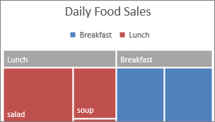
A treemap chart provides a hierarchical view of your data and makes it easy to spot patterns, such as which items are a store's best sellers. The tree branches are represented by rectangles and each sub-branch is shown as a smaller rectangle. The treemap chart displays categories by color and proximity and can easily show lots of data which would be difficult with other chart types.
Treemap charts are good for comparing proportions within the hierarchy, however, treemap charts aren't great at showing hierarchical levels between the largest categories and each data point. A sunburst chart is a much better visual chart for showing that.

Create a treemap chart
-
Select your data.
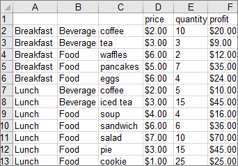 Data used to create the example chart above
 -
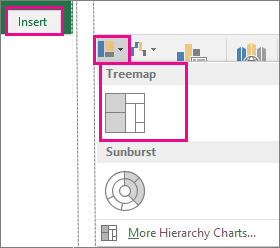
Click Insert > Insert Hierarchy Chart > Treemap.
You can also use Recommended Charts to create a treemap chart, although the treemap chart will only be recommended when empty (blank) cells exist within the hierarchal structure (click Insert > Recommended Charts > All Charts tab).
Tip: Use the Design and Format tabs to customize the look of your chart. If you don't see these tabs, click anywhere in the treemap chart to add the Chart Tools to the ribbon.

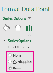
Change label display
Excel automatically uses a different color for each of the top level or parent categories. However, you can also use the layout of the data labels to distinguish between the categories.
-
Right-click one of the rectangles on the chart > Format Data Series.
-
Under Series Options > Label Options, pick the display option you want.
Notes:
-
This feature is only available if you have an Office 365 subscription, and Mac version 16 or later. Find your Office version.
-

Create a treemap chart
-
Select your data.
Data used to create the example chart above -
On the ribbon, click the Insert tab, then click
 (Hierarchy icon), and then select Treemap.
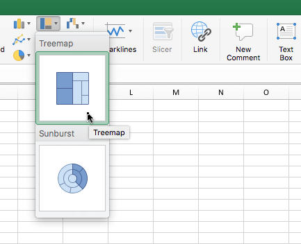
Note: Use the Chart Design and Format tabs to customize the look of your chart. If you don't see these tabs, click anywhere in the Treemap chart to display them on the ribbon.
Tip: To read more about the treemap chart and how it helps you visualize hierarchical data, see this blog post on the treemap and sunburst chart by the Excel team. You may also be interested learning more about the other new chart types described in this blog post.
No comments:
Post a Comment