Maybe you've created a chart and think "this needs a little something else" to make it more impactful. Here's where Chart Styles  is useful. Click the chart, click
  , located next to the chart in the upper right corner, and pick an option in the Style or Color galleries.
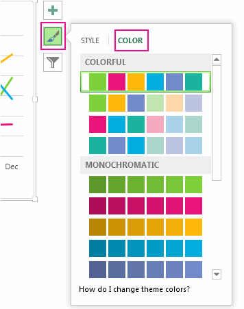
Change the color of a chart
-
Click the chart you want to change.
-
In the upper right corner, next to the chart, click Chart Styles
 .
. -
Click Color and pick the color scheme you want.

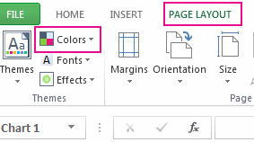
Tip: Chart styles (combinations of formatting options and chart layouts) use the theme colors. To change color schemes, switch to a different theme. In Excel, click Page Layout, click the Colors button, and then pick the color scheme you want or create your own theme colors.

Change the chart style
-
Click the chart you want to change.
-
In the upper right corner next to the chart, click Chart Styles
 .
. -
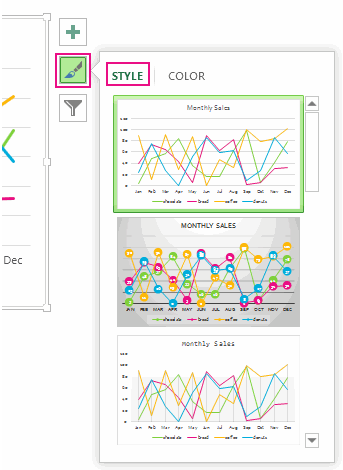
Click Style and pick the option you want.

As you scroll down the gallery, Live Preview shows you how your chart data will look with the currently selected style.
No comments:
Post a Comment