Thursday, November 1, 2018

Run a macro

Run a macro

To run a macro in PowerPoint, the Developer tab must be visible on the ribbon. See Show the Developer tab.

With the Developer tab visible:

  1. On the Developer tab, in the Code group, click Macros.

  2. In the Macro dialog box, under Macro name, select the macro that you want, and then click Run.

For information about the security risks of macros and enabling or disabling macros in presentations in the Trust Center, see Enable or disable macros in Office documents.

If you want to create or edit a macro, you must use Visual Basic for Applications (VBA).

Introduction to laying out a form template

Introduction to laying out a form template

When you design a Microsoft Office InfoPath form template, you must consider how to lay out, or arrange, the elements on the form template.

Generally, you should organize the different parts of your form template so that people who fill it out can move through the form in a logical manner. In addition, it is a good idea to align text boxes, check boxes, and other elements along the horizontal and vertical lines of an imaginary grid. You can use layout tables to define the boundaries of your grid and help line up elements on the form template.

In this article

Layout tables and the Layout task pane

Layout-related controls

Layout tips

Layout tables and the Layout task pane

Ideally, you should design a form template that is visually appealing and easy for others to use. Layout tables can help you achieve both of these goals.

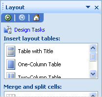
The Layout task pane offers a collection of predesigned layout tables that you can use in your form template to give it a visual structure.

Layout task pane

A layout table is like any other table, except that it is used only for layout purposes and not for data presentation. In addition, unlike other tables, layout tables do not have visible borders by default. When you design your form template in design mode, the layout table's borders are represented by dashed lines, so that you know you are working within the table. However, when users fill out a form that is based on your form template, those borders don't appear.

Among other things, you can use layout tables to organize controls, to separate one section from another, to create header and footer sections, and to hold logos and other graphics.

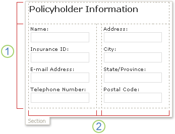
In the following example, a layout table is used to organize text boxes inside a section on a form template.

Layout table inside a section on a form template

1. This layout table has two rows.

2. There are three columns in the second row. The center column is used only for spacing purposes.

If you want to add or remove rows and columns from a layout table, click any of the options in the Merge and split cells list in the task pane. If the layout tables in the Layout task pane don't meet your needs, you can insert a custom layout table with the exact number of rows and columns that you want.

You can also use the Layout task pane to quickly insert scrolling regions and horizontal regions in your form template, which are described in detail in the following section.

Top of Page

Layout-related controls

In addition to layout tables, you can use layout-related controls, such as sections or repeating sections, to help you design your form template. When you insert a layout-related control onto your form template, you are essentially inserting an empty container for storing other controls.

The following table provides brief descriptions of the controls that are most commonly used for layout purposes.

Control

Description

Section

A control that contains other controls. For example, in an insurance claim form template, you might use a section to group a set of text boxes that are used to collect contact information from policyholders.

Optional section

A control that contains other controls but does not appear on the form unless the user chooses to add it. For example, although all employees in a company might use a goal-setting section in their performance review forms, only managers might choose to add an optional section about leadership goals.

Repeating control

A control, such as a repeating section or repeating table, that lets users expand the contents of a form when it is filled out and display only the necessary number of entries in a series. For example, you can use a repeating table to collect itemized expenses in an expense report form template.

Scrolling region

A control that contains other controls, retains a fixed size, and includes scroll bars so that users can scroll to see information that is out of view. Scrolling regions can be useful when a section of a form template contains a lot of data, and users do not need to see all of the data at one time. For example, if you use a repeating table to display numerous records from a database, you can insert the repeating table inside a scrolling region to display just a few of the records at a time. Because scrolling regions are used exclusively for layout purposes, they are not bound to fields or groups in the data source. Scrolling regions are not supported in browser-compatible form templates.

Horizontal region

A control that contains other controls and can be placed in a horizontal formation on a form template. For example, when several horizontal regions are placed side-by-side, the regions will wrap, or flow, to the next line as the size of the screen changes. Because horizontal regions are used exclusively for layout purposes, they are not bound to fields or groups in the data source. Horizontal region controls are not supported in browser-compatible form templates.

Choice group

A control that presents a set of mutually exclusive choices to users. A choice group contains choice sections, one of which appears as the default choice in a form. Those choice sections contain other controls. For example, address information in an employee information form template can be formatted as a choice group that contains choice sections. Each choice section contains controls with the correct address syntax for a specific country or region. When employees fill out a form that is based on the form template, they can replace the default address section with one that applies to their country or region.

Top of Page

Layout tips

Use the following tips to help you refine the appearance, size, and other aspects of layout tables and layout-related controls.

  • If you are designing a new, blank form template, it is helpful to first determine how you want the form template to be laid out before you begin designing it. If you are having trouble envisioning a layout, first try sketching your ideas on paper. You can also use a program such as Microsoft Office Visio to refine your ideas and create mock-ups of the form template's user interface. After you have a plan in mind, you can insert a predesigned table from the Layout task pane and customize it as necessary.

  • In design mode, the borders of layout tables are represented by dashed lines so that you can see individual rows and columns. When users fill out a form that is based on your form template, these gridlines are hidden. This results in a cleaner, less cluttered design. If you prefer to hide the gridlines in design mode, you can turn them off by clicking Hide Gridlines on the Table menu.

  • By default, InfoPath inserts layout tables and layout-related controls, such as sections and scrolling regions, at a width that matches that of the printed page. To change this default setting, on the View menu, click View Properties. On the General tab, under Layout settings, select the Use a custom layout width for this form template check box, and then type a different number in the Custom layout width box.

  • If you specify a custom layout width for layout tables and layout controls, make sure that it isn't wider than the printable area for your form template. To quickly see how wide your printed page is — and whether the content on the form template will fit on the page — click Page Width Guide on the View menu. When you click this command, a dashed vertical guide appears on the right side of the screen. This guide indicates the right margin of the printed page, based on the default printer for your computer.

  • To change the border or color of layout controls or layout tables, select the controls or tables that you want to change. On the Format menu, click Borders and Shading, and then make the necessary adjustments.

  • By default, a layout table is aligned to the left side of the form template. To center or right-align the entire table, select the table. On the Table menu, click Table Properties, and then click Center or Right on the Table tab.

  • Cell padding is the amount of space that surrounds the contents of a cell. You can think of it as buffer space between the cell and the text inside the cell. Adjusting the padding generally offers you more control over spacing than does pressing ENTER to add additional space. To adjust the cell padding in a cell, select the options on the Cell tab in the Table Properties dialog box.

Top of Page

Send an IM from Lync Web App

Send an IM from Lync Web App

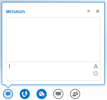
During a Lync Meeting, click the IM icon to type an instant message (IM). Type in the bottom part of the message input area and press Enter to send the message. Your message will go to all the meeting participants. From Lync Web App, you cannot send an IM to a specific meeting participant, or to anyone who is not a meeting participant. Also, you cannot send images (except emoticons) or files as IMs.

screen shot of the IM window that displays when hovering on the IM button

Both outgoing and incoming messages appear in the message history pane at the top of the IM window with the sign-in name of the sender, and a time stamp for when the message was sent.

Related tasks

Dock the IM window

By default, the IM window in Lync Web App is not displayed. If you don't see it, point your mouse to the IM icon to see a preview of the IM window, or click the icon to open the IM window. If you opened the preview, it will stay open until you click elsewhere on the screen. You can click the arrow icon on the top right of the preview to pin the IM window to the left side of the meeting room.

Format a message

The formatting of the messages you send is determined by the format of the last character you type in the message. This means that if all the text you type is in one font but only the last character is in a different font, the message is sent using the different font. Your font choice affects only the messages you send, not those of the person who receives and responds to them.

To select formatting options, click the Change text color, font and other formatting icon in the message input area to choose the color, font, size, and font style for all the text you type. You can change your choices for each message. However, your choices will remain in place for the current meeting only, and only on the device you used to set it. If the font of an incoming message is different from what it was sent with, it might be because your browser doesn't support the font.

In Lync Web App, you can format a paragraph of text but not individual letters, words, or phrases. You can't copy text from the message history pane to reuse it, or save a copy of all the instant messages exchanged during a meeting.

Add emoticons to a message

Click the Select an emoticon icon in the message input area, and click the emoticon you want. The typographical equivalent of the emoticon, for example :) for the smiley, appears in your message. When you press Enter and send the message, the emoticon will appear in the message history pane.

Tip:  If you know the typographical equivalent of the emoticon you want to add, you can type it directly into your message.

Your browser does not support video. Install Microsoft Silverlight, Adobe Flash Player, or Internet Explorer 9.

We have added our data to the line chart. Now, let's customize the chart, so it has the details and style we want.

Change the color of a chart

When you insert a chart, small buttons appear next to its upper-right corner. Use the Chart Styles button to quickly change the color or style of the chart.

  1. Click the chart you want to change.

  2. In the upper-right corner, next to the chart, click Chart Styles.

  3. Click Color and pick the color scheme you want, or click Style and pick the option you want.

Want more?

Change the format of data labels in a chart

Copy an Excel chart to another Office program

We have added our data to the chart. Now, let's customize the chart, so it has the details and style we want.

To start, I'll Zoom In a little bit.

Then, I'll click the Chart Title, select the text, and type a new title "Average Precipitation".

Next, I'd like to change the formatting of the data values, so that they include decimal places.

So, I'll click to select the chart and look for these icons.

Then I'll click the top one, Chart Elements, and I'll point to Axes, click the arrow that appears, and click More Options.

The Format Axis pane opens and the horizontal axis is selected in the chart.

I want to change the vertical axis. So, in the chart, I'll point to one of the data values and click to select the vertical axis.

In the pane, I'll scroll to NUMBER and click to expand its options.

Under Category, I'll click the arrow and change the General formatting to Number.

The default value for Decimal places is 2, and the values in the chart now show two decimal places.

I'll click X to close the pane.

Let's add a label for the data values.

We click CHART ELEMENTS, point to Axis Titles, click the arrow next to it, and check Primary Vertical.

A text box appears for the vertical axis. It is selected, so I can type my label, and I'll type "Inches".

Now, the chart shows incremental values for inches of precipitation.

But I'd like to show the exact amounts at the markers.

So, I'll click CHART ELEMENTS and point to Data Labels.

Exact amounts appear above the markers, showing our data for Average Precipitation.

I'll check the Data Labels box to display these.

Let's do a bit more with the data and check Trendline. We are prompted to choose one of the series, New York or Seattle.

I'll leave New York selected and click OK.

A trendline appears for the New York data and shows as a blue dotted line.

Now, let's add a trendline for Seattle.

I have already checked Trendline, so I'll point to it, click its arrow, and then click More Options.

This time, I'll choose Seattle and click OK.

An orange trendline now runs through the Seattle data, and the Format Trendline pane opens.

I'll leave the trendline set to Linear.

Note that the current trendline is selected in the chart — the selection handles appear at either end — and, in the pane, I can click Fill & Line or Effects to choose more formatting options for the line.

But for now, let's click X to close this pane, and instead click Chart Styles to see the available styles for the chart.

That's a quick way to get chart formatting.

I'll point to a style to see a preview on the chart.

I like this one, Style 11, because it emphasizes the trendlines and moves the legend to the top.

I'll click to apply it.

Now, let's add a chart border. To do that, select the chart, and double-click the selection border.

In the Format Chart Area pane, click BORDER and Solid line, and in the Color box, click to choose a color.

How about dark gray?. Now, close the pane.

Let's click Slide Show and look at the finished chart. It has all the elements and the look that I want.

Up next: Insert a linked Excel line chart.