After plotting your geography data in 3D Maps, you can use the Layer Pane to change the look and feel of your data on the map. By default, 3D Maps shows a column chart, but you can show a bubble chart, region chart, or heat map instead.

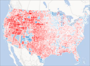
Here's an example of a region chart that shows voting preferences by county for the major political parties in the United States. The deeper the red or the blue color, the higher the percentage by which a particular party leads in an election.
Here's how to change the way your data is visualized:
-
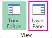
If you don't see the Layer Pane, click Home > Layer Pane.
-
For the layer where you want to show additional data, in the Add Field drop-down list under Location, click the type of data that you want to show.
(You can add more than one type of data.)
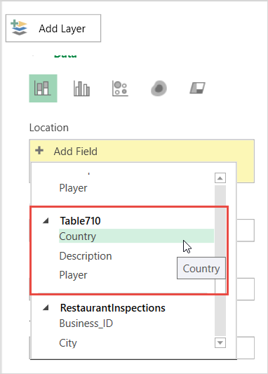
Tip: The fields that appear in this list will vary depending on the data that is available.
-
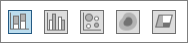
To change the type of chart that is displayed, click any of the available types: Stacked Column, Clustered Column, Bubble, Heat Map, or Region.
Notes:
-
When you apply a heat map, the Height or Size box changes to a Value box. You can change the way value fields are aggregated, by clicking the arrow in the Value box and picking the function that you want. Typically, Sum is applied by default, but you can pick Average, Count, Max, Min, or None. You can also remove a value field from the Value box.
-
If you drag a field to the Category box and leave the Height box blank, 3D Maps automatically adds that field to the Height box and draws a visual that represents the count of each category.
-
Instead of dragging fields into the Height and Category boxes, you can just check the field boxes. 3D Maps puts those fields in the appropriate box.
No comments:
Post a Comment