Changing the look and feel makes your site much more attractive and more likely to be used. Besides, it's fun and safe to try out different color schemes, fonts, and looks, and easy to get it just right.
Note: You need to be a member of the Designers group or have contributor permission to modify a team site. A safe way to practice changing a team site is to create and use a subsite under the team site. For more information, see Create a subsite under the existing site.
Change the look and feel
-
Sign in to Office 365 with your work or school account, and then navigate to your team site (In the app launcher
 , click Sites, and then locate your team site).
Can't find the app you're looking for? From the app launcher, select All apps to see an alphabetical list of the Office 365 apps available to you. From there, you can search for a specific app.
-
Click Settings
 > Change the look.
 -
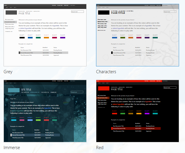
Choose a look from the gallery. You can instantly see what changes look like in the preview area.

-
To change the color scheme, click the arrow next to Colors and select another color scheme.

-
To change the layout, click the arrow next to Site layout and select another layout. The layout controls the position of the navigation links, search box, and so on.

-
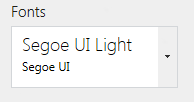
To change the fonts, click the arrow next to Fonts and select another font.

-
If you want to revert back to what you had in the beginning, at the top of the page, click Start over.
-
When you're ready to see a full-sized preview of how your changes will look when applied to your site content, at the top of the page, click Try it out.
-
If you like what you see in the full-sized preview, click Yes keep it; if not, click No, not quite there.

Explore a new look (Extra credit!)
-
Change the look and feel of your team site to: Sea Monster look, White with gray - 80% and dark blue color, Oslo site layout, and Century Gothic font.
-
Show it in full-sized preview.
-
Back out the changes and return to the previous team site look and feel.
Want more?
The basics of the team site are in place. Now, let's work on the look and feel.
First, I click the Settings icon. Then Change the look.
There are many styles to choose from the gallery. I'll pick this one.
I can adjust the color scheme to fit with our logo.
I'll click the arrow next to Colors and select this one.
I'll keep the standard site layout, called Seattle.
There are a number of font styles to choose. This one looks good.
Notice that the preview pane instantly shows you the results of your changes.
If I didn't like the results, I could just click Start over.
But I'm ready to see a full-sized preview applied to the site, so I click Try it out.
If I need to make some changes, I could click No, not quite there.
But I like what I see, so I'll click Yes, keep it.
And here are the changes on my team site.
No comments:
Post a Comment