Font - Advanced settings
Settings on the Advanced tab are for fine-tuning font formatting. Watch the Preview pane at the bottom of the dialog box to see the effect of the settings you pick.
Change character spacing
Sometimes making subtle adjustments to the scale and spacing between characters makes a big impact.
-
Scale is another way of increasing or decreasing the size of a font. You can resize the font based on a percentage of the original font size.
-
Spacing can be increased or decreased in whole and fractional point increments.
-
Normal -- uses the standard or default spacing.
-
Expanded -- adds proportional spacing evenly between the selected text.
-
Condensed -- decreases the spacing, proportionally, between the letters in the selected text.
-
-
Position can be increased or decreased in whole and fractional point increments.
-
Normal -- positions the bottom of the selected text at the baseline.
-
Raised -- positions the bottom of the selected text above the baseline by the point size you specify.
-
Lowered -- positions the bottom of the selected text below the baseline by the point size you specify.
-
-
Kerning for fonts x points and above automatically adjusts the amount of space between certain combinations of characters so that an entire word looks more evenly spaced. Select the Kerning for fonts checkbox, then enter the smallest font size to apply kerning to. Your app will automatically kern all fonts that are that size or bigger. You can't apply kerning to text smaller than 8 points.
OpenType Options
OpenType refers to the scalable fonts that Microsoft and Adobe cooperatively created based on TrueType fonts.
-
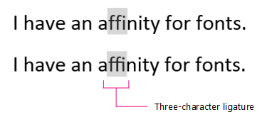
Ligature describes when two or more characters are combined. For the most part, these are used to make otherwise awkward letter pairs more visually please and easier to read. Here's an example:

-
None -- no letters are combined; each stands alone.
-
Standard Only -- certain letter pairs are always combined for better legibility.
-
Standard and Contextual -- letter pairs that are combined for better legibility--based on the letters before and after the ligature. Standard ligatures include fi and fl.
-
Historical and Discretionary -- these are generally more decorative and fancy. Common discretionary ligature pairs are ck, sp, st, and rt.
-
All -- uses all of the criteria above.
-
-
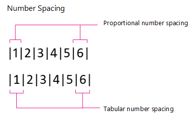
Number Spacing defines whether numbers will align vertically.

-
Default -- font number spacing as-is, without changes.
-
Proportional -- narrow numbers like "1" and wide numbers like "5" are each surrounded by the same amount of white space, resulting in varying widths.
-
Tabular -- each number and its surrounding white space is the same width. This option is perfect for accounting entries or accounting documents like an annual report.
Note: Notice that the number "1" in the illustration above is the same font and size for both proportional and tabular formats, but tabular format uses an alternate number shape to prevent misinterpreting it as a "7."
-
-
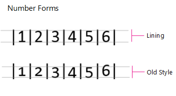
Number forms enable you to get a little creative with number size and alignment.

-
Default -- number size and alignment is the same as it is for the standard font.
-
Lining -- all of the numbers have exactly the same height. This is a great option for tables and forms.
-
Old Style -- numbers may go above the cap line or below the baseline, depending on the font.
-
-
Stylistic sets describe when an OpenType font has many alternate characters. These alternate characters are organized into a set with similar variations grouped together for convenience. Although there are up to 20 to choose from in the drop-down, it's rare to find and OpenType font with more than six stylistic sets.
-
Use Contextual Alternates automatically uses alternate characters only in special situations, to improve spacing or connections. This is especially useful for script fonts and for non-Latin fonts, like Arabic.
If you're curious to learn more about OpenType fonts, take a look at the Adobe OpenType page.
No comments:
Post a Comment