Create a PivotChart
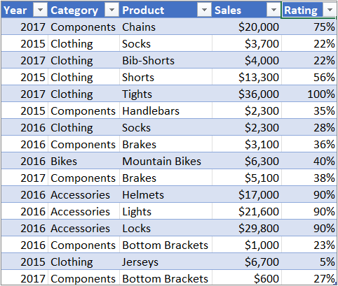
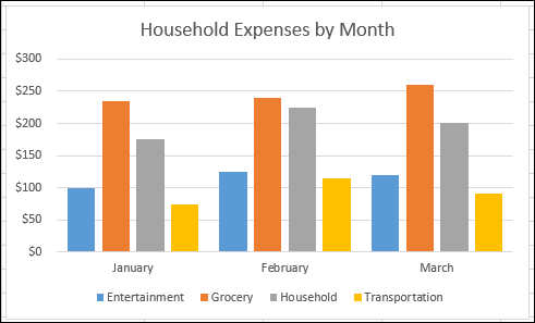
Sometimes it can be hard to see the big picture when you have raw data that hasn't been summarized, like the example below. Many times, your first step will be to create a PivotTable to summarize and analyze your data in a structured format, which is well and good, but not everyone can look at numbers and quickly see what's going on. PivotCharts are a great way to add data visualizations to your data.
| Household expense data | Corresponding PivotChart |
| | |

Create a PivotChart
-
Select a cell in your table.
-
Select Insert > PivotChart
 .
. -
Select OK.
Create a chart from a PivotTable
-
Select a cell in your table.
-
Select PivotTable Tools > Analyze > PivotChart
 .
. -
Select a chart.
-
Select OK.
To create a PivotChart on the Mac, you need to create a PivotTable first, and then insert a chart. Once that is done, the chart will behave like a PivotChart if you change the fields in the PivotTable Fields list.
-
Create a PivotTable if you don't have one already.
-
Select any cell within the PivotTable.
-
On the Insert tab, click a button to insert either a column, line, pie, or radar chart. Please note that other types of charts do not work with PivotTables at this time. For example, treemap charts, statistical charts, and combo charts do not work with PivotTables yet.
-
After you insert a column, line, pie, or radar chart, you can pivot it by changing or moving fields using the PivotTable Fields list.
-
You can also filter data in a PivotTable, and use slicers. When you do that, the chart will also be filtered.
Need more help?
You can always ask an expert in the Excel Tech Community, get support in the Answers community, or suggest a new feature or improvement on Excel User Voice.


No comments:
Post a Comment