Bubble and scatter charts in Power View
Scatter and bubble charts are a great way to display a lot of related data in one chart. In scatter charts, the x-axis displays one numeric field and the y-axis displays another, making it easy to see the relationship between the two values for all the items in the chart.
In a bubble chart, a third numeric field controls the size of the data points.

Create a bubble chart
-
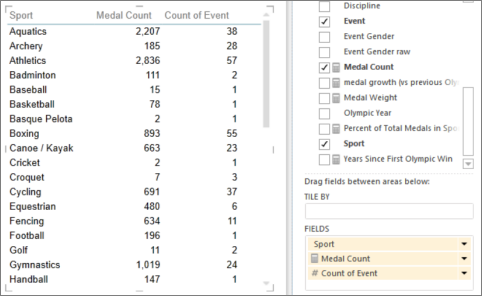
Create a table with one category value.
 In this table, the category is Sport.
Tip: Pick a category that doesn't have too many values. If the category has more than 2,000 values, you see a note that the chart is "showing representative sample" rather than all the categories. Really, it's hard to see individual bubbles if you have a lot of them.
-
Add two or three numeric values to the table.
-
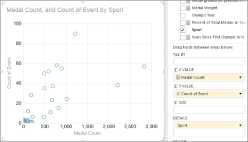
With two values, you get a scatter chart of little circles, all the same size.
-
With three values, you get bubble chart. Each bubble is a different color and the size of the bubble illustrates the third value.
-
-
To convert the table to a chart, on the Design tab:
-
In Power View in Excel, click the arrow under Other Chart and click Scatter.
-
In Power View in SharePoint, click Scatter.
Power View automatically puts the category in the Details box, and the two numeric values in the X Value and Y Value boxes.
 Sport is now in the Details box.
 -
Follow data over time
To view changes in data over time, you can add a time dimension to scatter and bubble charts, with a 'play' axis.
-
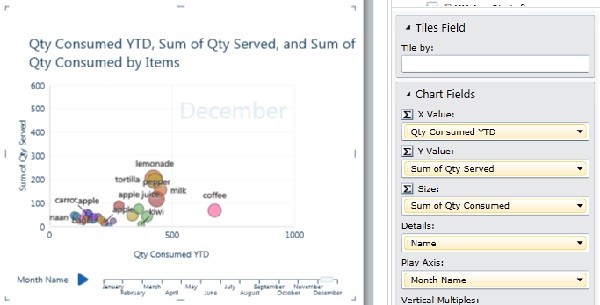
Select the bubble or scatter chart and drag a field with time values to the Play Axis box.
This adds a 'play' button and time line to the bottom of the chart.
When you click the play button, the bubbles travel, grow, and shrink to show how the values change based on the play axis. You can pause at any point to study the data in more detail. When you can click a bubble on the chart, you can see its history in the trail the bubble has followed over time.

Color-based categories for scatter and bubble charts
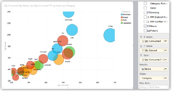
You can add a field to the Color box for a scatter or bubble chart, and it colors the bubbles or scatter points differently, according to the different values in that field, overriding the bubble colors. For example, adding the Category field to a bubble chart of foods assigns different colors to the bubbles depending on if they are fruits, vegetables, breads, or beverages.

The field can't be a calculated field, and can have no more than twenty instances.
Note: You can click a color in the legend to highlight all the bubbles for that color, but that doesn't show traces for all the bubbles in that color. You have to click each bubble individually to show its trace. You can select more than one bubble at a time by pressing Ctrl + Click.
Notes: Video copyrights:
-
Olympics Dataset © Guardian News & Media Ltd.
-
Flag images courtesy of CIA Factbook (cia.gov)
-
Population data courtesy of UNData (data.un.org ) on Microsoft Azure Marketplace.
-
Olympic Sport Pictograms by Thadius856 and Parutakupiu, distributed according to the license on Wikimedia Commons (creativecommons.org/licenses/by-sa/3.0/)
See Also
Charts and other visualizations in Power View
Power View: Explore, visualize, and present your data
Power View and Power Pivot videos
Tutorial: PivotTable data analysis using a Data Model in Excel 2013
No comments:
Post a Comment