Construct your own data graphic
A data graphic is a set of enhancements that you can apply to shapes to show data that the shapes contain. A data graphic presents your data as a combination of textual and visual elements, such as flags and progress bars.
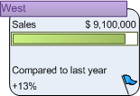
Let's say, for example, that you have a shape that contains information about sales, and you want to display that information as follows:
-
Region as text showing only the value (West) instead of the label (Sales Region)
-
Sales as text showing both the label and the value
-
Sales again, but this time as a progress bar relating current sales with projected sales for the year
-
Comparison to last year showing both the label and the value
-
Comparison to last year again, but this time as an icon showing a flag to indicate the status
The following data graphic clearly conveys this information.

After you create a data graphic
Once you've created a data graphic, you can:
-
Apply it to other shapes with the same data.
-
Edit the data graphic to automatically change all of the shapes that the data graphic is applied to.
After you apply a data graphic to multiple shapes, if you change the data graphic, those changes are applied to all of the shapes to which you applied that data graphic.
You can create as many data graphics as you need for your shapes. For example, you can create one to show employee data and apply it to all of your employee shapes. You can create a second data graphic to show equipment data and apply it to all of your equipment shapes.
Construct your own data graphic
-
Click Data, and then click Display Data on Shapes.
-
In the Data Graphics task pane, under Create a new data graphic, click New Data Graphic.
-
To customize the data graphic, select options in the New Data Graphic and the New callout type dialog boxes.
No comments:
Post a Comment