In a Microsoft InfoPath 2010 form template, you can add several different types of choice controls (check and list boxes) to enable users to select from pre-defined or custom options, depending on how you want to present and collect the information. The following sections detail each of the choice controls that are available.
In this article
About check and list boxes
Drop-down list box

Drop-down list boxes are used to present an expandable list of choices to a user. When a user first opens the form, the default value, if specified, is the choice that appears in the control. To select another option, the user clicks the arrow on the side of the control and clicks the option that they want.
By default, Select appears as the first entry in a drop-down list box. This lets users know that they can make a selection. After inserting a drop-down list box, you must specify the choices that appear in the control, either manually or by retrieving them from a data connection.
Use a drop-down list box when you want to:
-
Enable users to make a single choice from a set of predefined options.
Multiple-selection list box
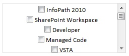
With multiple-selection list boxes, users make choices by selecting or clearing check boxes that appear in a group control on the form. If the number of options exceeds the height of the control, a scroll bar appears so that users can scroll to see the additional choices.
Users can select as many check boxes as necessary from the list, and you can allow new entries to be entered. In this case, a check box with a text box appears as the last item in the list. To enter a custom value, a user selects the check box next to the text box, and then types the entry.
Use a multiple-selection list box when you want to:
-
Enable users to make multiple choices from a set of predefined options.
-
Enable users to make multiple choices and specify their own custom values.
List box

List boxes are used to present a scrollable list of choices to a user. To select something from a list box, a user clicks the item that they want, which highlights their choice. Multiple choices in a list box are displayed immediately and, if the number of choices in the list exceeds the height of the box that contains them, a scroll bar appears. If users are using the keyboard to fill out the form, they can press the up and down arrow keys to move through the items in the list box.
Use a list box when you want to:
-
Enable users to make multiple choices from a set of predefined options.
Combo box

Combo boxes are a combination of a drop-down list box and a text box. They function and appear similar to drop-down list boxes — the options are hidden until the user clicks the arrow to view the options. If the user does not want to select one of the predefined options, then they can click in the combo box and enter a custom value, enabling the user to use a combo box similar to a text box. This is indicated to the user, when the values in a combo box have been manually populated, by the following text that appears in a combo box: Select or type.
Note: If the list items in the combo box are not manually entered and are retrieved from an external source of data, such as SharePoint or a database, then the Select or type text is omitted.
Use a combo box when you want to:
-
Enable users to either select a value from a list of predefined options or type a custom value.
Check box

Check boxes are controls that can be toggled to indicate whether it's checked or unchecked. That is, they can be used to represent true/false or yes/no choices.
Use a check box when you want to:
-
Enable users to make a true/false or yes/no choice.
-
Enable users to activate whether or not to display additional information in a form. For example, you can add a section after a check box and hide the section if the check box is not selected.
-
Display true/false or yes/no information from a database, Web service, or other data source.
Option button

Option buttons are inserted as a group of mutually-exclusive selectable controls that are all visible to the user at a time. For example, if you have five options that a user can select from, and all choices should be shown to the user without them having to scroll through a list, then use option buttons. The user can then quickly scan through the choices available to them and select only one choice from the options.
Use option buttons when you want to:
-
Enable users to choose a single selection.
-
Display all of the available options simultaneously and allow the user select the corresponding option.
Insert a choice control
The procedure for inserting a choice control differs slightly, depending on whether you are designing a new, blank form template or basing the design of your form template on a database or other external data source.
Insert choice control in a new, blank form template
-
On the form template, place the cursor where you want to insert the control.
-
On the Home tab, in the Controls group, click a control.
Note: If you are inserting a group of Option Buttons, indicate how many option buttons you want to insert, and then click OK.
-
To add a label to the control, type text above or to the left of the control. Or, for best practices, if you are using a layout table to organize the controls and labels, type the label of the control in the adjacent cell. For example, if the list or choice control allows the user to select a state, you can type State.
Insert choice control on a form template that is based on an existing data source
If you base the design of your form template on an external data source, the fields and groups in the Fields task pane are used for that existing data source. In this scenario, you can insert a choice control by dragging a field from the Fields task pane onto the form or by inserting the control as described in the following procedure:
-
In the form template, place the cursor where you want to insert the control.
-
In the Fields task pane, right-click a field from the external data source.
-
Select the type of control you want to insert.
Note: If you are inserting a group of Option Buttons, indicate how many option buttons you want to insert, and then click OK.
-
The name of the field or group is automatically inserted as the control label by default. If necessary, change the label text.
Tip: You can also drag the field from the Fields task pane to the form. If you do this, the most appropriate control is used based on the field type. If the desired type is not selected by default, use the previous method to select the correct type, or right-click the control, click Change Control, and then click the desired control type.
Assign values to a drop-down list, multiple-selection list box, combo box, or list box
After adding a list box, drop-down list box, combo box, or multiple selection list box, you need to set the options that are available to choose. Complete the appropriate steps, below, to assign these options.
Manually enter the values
Manually entering values is useful when there is a small, limited set of predetermined values that aren't expected to change in the future. When manually setting values are used, if the values change, then you must update the form and re-publish it.
-
Select a control.
-
Under Control Tools, from the Properties tab, click Control Properties.
-
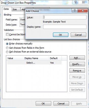
From the Data tab, click Add.
-
In the Value box, type the text that you want to save if a user selects this entry.
-
In the Display name box, type the text that you want to appear for this entry.
-
Click OK.
-
To add additional values, repeat steps 3 through 6.
Use values from another part of the form
Getting choices from other fields in the form enables you to populate the list with values that originate from values that are entered by the user. For example, doing this allows you to use values that a user might have entered into a repeating table where they entered product categories, and use them to populate a drop-down list to assign individual products to the product categories that they just defined.
-
Select the control that to add options to.
-
Under Control Tools, from the Properties tab, click Control Properties.
-
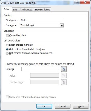
On the Data tab, select Get choices from fields in this form.
-
Next to the Entries box, click Select XPath
 .
.
-
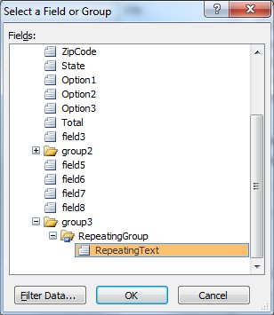
Select the desired repeating field.
-
Click OK.
Note: To prevent multiple values with the same name from appearing, select the Show only entries with unique display names check box.
Use values from an external source of data
Using an external source of data ensures that your form is always current with the latest changes to the external data, assuming that the user is able to access the external resource.
Note: While it is possible to set up the initial receive data connection during this process, it is easier if a connection has already been configured.
-
Select a control.
-
Under Control Tools, from the Properties tab, click Control Properties.
-
On the Data tab, in the List box choices section, click Get choices from an external data source.
-
Select the desired data source from the Data source list or click Add.
-
Next to the Entries box, click Select XPath
 .
. -
Select the local repeating field that will save the data.
-
Click OK.
Note: If you are adding a Multiple-Selection List Box and you want users to be able to type a custom value at the bottom, select the Allow users to enter custom values check box.
-
To prevent multiple values with the same name from appearing, select the Show only entries with unique display names check box.
Assign value types to a check box
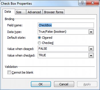
By default, check boxes are set to a Boolean (true/false) data type and the default state is clear (false). You can, however, set them to return a different value, based on their state, when a user fills out the form. For example, if you are preparing the form to send to a group of users to ask about food allergies, a check box can be associated with the question, Allergic to shellfish? Instead of receiving a true/false response, when you get the form back, you can set the data type to Text, and the clear value to Not allergic to shellfish, while the selected value is Allergic to shellfish.
-
Select a check box.
-
Under Control Tools, from the Properties tab, click Control Properties.
-
Select the data type, default state, value when cleared, and value when checked that you want.
Assign values to an option button in a group of option buttons
-
Select an option button.
-
Under Control Tools, on the Properties tab, click Control Properties.
-
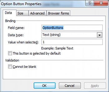
Indicate the desired value that should be returned when the option button is selected.
-
Click OK.
-
For each subsequent option button, repeat steps 1 through 4.
Layout tips
Use the following tips to help you refine the appearance, size, and other aspects of a choice control:
-
To add a ScreenTip to a control, click the control, and then under Control Tools, on the Properties tab, in the Properties group, click Control Properties. On the Advanced tab, in the ScreenTip box, enter the ScreenTip.
-
To customize the font that appears in a list box, drop-down list box, or next to the check boxes in a multiple-selection list box, use the Font and Font Size boxes on the Formatting toolbar. To change the font and font size for all similar controls, select the list boxes, drop-down list boxes, or multiple-selection list boxes that contain the formatting that you want, and then, on the Format menu, click Apply Font to All List Box Controls.
-
To change the width of several controls simultaneously, select the controls, and then under Control Tools, on the Properties tab, in the Control Size group, in the Width box, enter a width and press ENTER on the keyboard.
-
You can adjust the space between a specified control and other controls near it on a form template by adjusting the margins. To do this, click the control, and then under Control Tools, on the Properties tab, in the Control Size group, click Margins. Next, on the Size tab, adjust the margins.
-
To add a border around a control, click the control, and then under Control Tools, on the Properties tab, in the Color group, click Borders. On the Borders tab, make the desired selections, and then click OK.
-
Tab order refers to the order in which the focus of the cursor is moved when the user presses the TAB key. In the case of option buttons, when users press the TAB key, the focus moves to the first option button in the group, if none of the option buttons are selected, or to the most recently selected option button. A subsequent press of the TAB key skips the remaining option buttons and moves to the next control in the tab order. Although users can use the arrow keys to navigate through the buttons, you might occasionally want the TAB key to move the focus instead. In this case, you can manually adjust the tab order by changing tab index. To do this, click the control, and then under Control Tools, on the Properties tab, in the Properties group, click Control Properties. On the Advanced tab, and then make the desired change to the Tab index box.
-
When adding items to a list, consider making the control a little wider than the items in the list so that items in the list are not truncated, particularly if there is a scroll bar.
A few months ago, I felt so depressed, I got frustrated with bad credits, but then I contacted HACK VANISH by phone: +1 (747) 293-8514 and email: HACK VANISH (@) GMAIL. COM. I found out about hack vanish services through positive reviews read on some credit blogs, in a blink of an eye this great hacker restored my credit score from 509 to 784 in all 3 major credit bureaus, they got removed evictions and foreclosures, my LexisNexis and Chex system was repaired respectively, a few days later I received an email confirming the approval of my mortgage loan, it was quite surprising because I never thought it was possible. Today, I can confidently say that 2021 was a banner year for my husband and I as we now own a new house and a new SUV courtesy of HACK VANISH, I would definitely recommend him to anyone in need of a genuine Hacker.
ReplyDelete