By default, Microsoft Office Excel determines the minimum and maximum scale values of the vertical (value) axis, also known as the y axis, when you create a chart. However, you can customize the scale to better meet your needs. When the values that are plotted in the chart cover a very large range, you can also change the value axis to a logarithmic scale, also known as log scale.
To change the scale of other axes in a chart, see Change the scale of the horizontal (category) axis in a chart or Change the scale of the depth (series) axis in a chart.
- Which Office version are you using?
- Office 2013 - Office 2016
- Office 2007 - Office 2010
-
In a chart, click the value axis that you want to change, or do the following to select the axis from a list of chart elements:
-
Click anywhere in the chart.
This displays the Chart Tools, adding the Design and Format tabs.
-
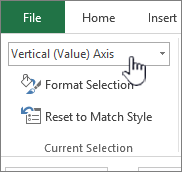
On the Format tab, in the Current Selection group, click the arrow next to the Chart Elements box, and then click Vertical (Value) Axis.
-
-
On the Format tab, in the Current Selection group, click Format Selection.
-
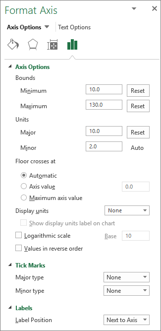
In the Format Axis dialog box, click Axis Options, and then do one or more of the following:
Important The following scaling options are available only when a value axis is selected.
-
To change the number at which the vertical (value) axis starts or ends, for the Minimum or Maximum option, type a different number in the Minimum box or the Maximum box. You can click Reset to bring it back to its original value if needed.
-
To change the interval of tick marks and chart gridlines, for the Major unit or Minor unit option, type a different number in the Major unit box or Minor unit box. You can click Reset to bring it back to its original value if needed.
-
To reverse the order of the values, select the Values in reverse order check box.
Note When you change the order of the values on the vertical (value) axis from bottom to top, the category labels on the horizontal (category) axis flip from the bottom to the top of the chart. Likewise, when you change the order of the categories from left to right, the value labels flip from the left side to the right side of the chart.
-
To change the value axis to logarithmic, select the Logarithmic scale check box.
Note A logarithmic scale cannot be used for negative values or zero.
-
To change the display units on the value axis, in the Display units list, select the units you want.
To show a label that describes the units, select the Show display units label on chart check box.
Tip Changing the display unit is useful when the chart values are large numbers that you want to appear shorter and more readable on the axis. For example, you can display chart values that range from 1,000,000 to 50,000,000 as 1 to 50 on the axis and show a label that indicates the units are expressed in millions.
-
To change the placement of the axis tick marks and labels, under Tick Marks, select any of the options in the Major type or Minor type boxes.
-
Click the drop down box under Labels and choose a label position.
-
To change the point where you want the horizontal (category) axis to cross the vertical (value) axis, under Floor crosses at, click Axis value, and then type the number you want in the text box. Or, click Maximum axis value to specify that the horizontal (category) axis crosses the vertical (value) axis at the highest value on the axis.
Note When you click Maximum axis value, the category labels are moved to the opposite side of the chart.
-
-
In a chart, click the value axis that you want to change, or do the following to select the axis from a list of chart elements:
-
Click anywhere in the chart.
This displays the Chart Tools, adding the Design, Layout, and Format tabs.
-
On the Format tab, in the Current Selection group, click the arrow next to the Chart Elements box, and then click Vertical (Value) Axis.
-
-
On the Format tab, in the Current Selection group, click Format Selection.
-
In the Format Axis dialog box, click Axis Options, and then do one or more of the following:
Important The following scaling options are available only when a value axis is selected.
-
To change the number at which the vertical (value) axis starts or ends, for the Minimum or Maximum option, click Fixed, and then type a different number in the Minimum box or the Maximum box.
-
To change the interval of tick marks and chart gridlines, for the Major unit or Minor unit option, click Fixed, and then type a different number in the Major unit box or Minor unit box.
-
To reverse the order of the values, select the Values in reverse order check box.
Note When you change the order of the values on the vertical (value) axis from bottom to top, the category labels on the horizontal (category) axis flip from the bottom to the top of the chart. Likewise, when you change the order of the categories from left to right, the value labels flip from the left side to the right side of the chart.
-
To change the value axis to logarithmic, select the Logarithmic scale check box.
Note A logarithmic scale cannot be used for negative values or zero.
-
To change the display units on the value axis, in the Display units list, select the units you want.
To show a label that describes the units, select the Show display units label on chart check box.
Tip Changing the display unit is useful when the chart values are large numbers that you want to appear shorter and more readable on the axis. For example, you can display chart values that range from 1,000,000 to 50,000,000 as 1 to 50 on the axis and show a label that indicates the units are expressed in millions.
-
To change the placement of the axis tick marks and labels, select any of the options in the Major tick mark type, Minor tick mark type, and Axis labels boxes.
-
To change the point where you want the horizontal (category) axis to cross the vertical (value) axis, under Horizontal axis crosses, click Axis value, and then type the number you want in the text box. Or, click Maximum axis value to specify that the horizontal (category) axis crosses the vertical (value) axis at the highest value on the axis.
Note When you click Maximum axis value, the category labels are moved to the opposite side of the chart.
-
- Which Office version are you using?
- Office 2016 for Mac
- Office for MacOS 2011
Note: The screen shots in this article were taken in Excel 2016. If you have a different version your view might be slightly different, but unless otherwise noted, the functionality is the same.
-
This step applies to Word 2016 for Mac only: On the View menu, click Print Layout.
-
Click the chart.
-
On the Format tab, click Vertical (Value) Axis in the dropdown list and then click Format Pane.
-
In the Format Axis dialog box, click Axis Options, and then do one or more of the following:
Important The following scaling options are available only when a value axis is selected.
-
To change the number at which the vertical (value) axis starts or ends, for the Minimum or Maximum option, type a different number in the Minimum box or the Maximum box. You can click the Reset arrow to bring it back to its original value if needed.
-
To change the interval of tick marks and chart gridlines, for the Major unit or Minor unit option, type a different number in the Major unit box or Minor unit box. You can click the Reset arrow to bring it back to its original value if needed.
-
To reverse the order of the values, select the Values in reverse order check box.
Note When you change the order of the values on the vertical (value) axis from bottom to top, the category labels on the horizontal (category) axis flip from the bottom to the top of the chart. Likewise, when you change the order of the categories from left to right, the value labels flip from the left side to the right side of the chart.
-
To change the value axis to logarithmic, select the Logarithmic scale check box.
Note A logarithmic scale cannot be used for negative values or zero.
-
To change the display units on the value axis, in the Display units list, select the units you want.
To show a label that describes the units, select the Show display units label on chart check box.
Tip Changing the display unit is useful when the chart values are large numbers that you want to appear shorter and more readable on the axis. For example, you can display chart values that range from 1,000,000 to 50,000,000 as 1 to 50 on the axis and show a label that indicates the units are expressed in millions.
-
To change the placement of the axis tick marks and labels, under Tick Marks, select any of the options in the Major type or Minor type boxes.
-
Click the drop down box under Labels and choose a label position.
-
To change the point where you want the horizontal (category) axis to cross the vertical (value) axis, under Floor crosses at, click Axis value, and then type the number you want in the text box. Or, click Maximum axis value to specify that the horizontal (category) axis crosses the vertical (value) axis at the highest value on the axis.
Note When you click Maximum axis value, the category labels are moved to the opposite side of the chart.
-
-
This step applies to Word for Mac 2011 only: On the View menu, click Print Layout.
-
Click the chart, and then click the Chart Layout tab.
-
Under Axes, click Axes > Vertical Axis > Axis Options.
Note: Depending on the chart type, some options may not be available.
-
In the Format Axis dialog box, click Scale, and under Value axis scale, modify any of the following options:
-
To change the number at which the vertical (value) axis starts or ends, for the Minimum or Maximum option, type a different number in the Minimum box or the Maximum box.
-
To change the interval of tick marks and chart gridlines, for the Major unit or Minor unit option, type a different number in the Major unit box or Minor unit box.
-
-
Click OK.
Add or change the position of vertical axis label
For a vertical axis, you can add and position the axis on the top or the bottom of the plot area.
Note: The options may be reversed for bar compared column charts.
-
This step applies to Word for Mac 2011 only: On the View menu, click Print Layout.
-
Click the chart, and then click the Chart Layout tab.
-
Under Axes, click Axes > Vertical Axis, and then click the kind of axis label that you want.
Note: Depending on the chart type, some options may not be available.
Tips
-
When a chart displays a secondary vertical (value) axis, you can also change the scale of that axis. For more information about displaying a secondary vertical axis, see Add or remove a secondary axis in a chart.
-
XY (scatter) charts and bubble charts show values on both the horizontal (category) axis and vertical (value) axis, while line charts show values on only the vertical (value) axis. This difference is important in determining which chart type to use. Because the scale of the line chart's horizontal (category) axis cannot be changed as much as the scale of the vertical (value) axis that is used in the xy (scatter) chart, consider using an xy (scatter) chart instead of a line chart if you have to change the scaling of that axis, or display it as a logarithmic scale.
-
After changing the scale of the axis, you might also want to change how the axis is formatted. For more information, see Change the display of chart axes.
No comments:
Post a Comment