Power View Multiples Visualizations
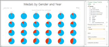
Have you ever wanted to create a series of identical charts in Excel – same X and Y axes, but different values? Multiples are the perfect way to accomplish this. They are small repeating charts that make it easier to compare many different values at the same time.

You add the repeating value to the vertical or horizontal multiples box, and Power View creates a container with one chart for each value. For example, if you have a line chart with sales by month, you could add a country/region field to the multiples field and have one line chart for each country or region.
Vertical multiples expand across the available page width and then wrap down the page into the space available. If all multiples do not fit in the available space, you get a vertical scroll bar.
Horizontal multiples expand across the page. If all multiples do not fit on the page width, you get a horizontal scroll bar.
Multiples: A set of charts with the same axes
Create multiples
With a chart selected, drag a field to the Vertical Multiples or Horizontal Multiples box.
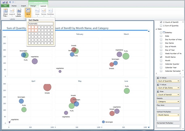
To set the number of multiples to display across and down, on the Layout tab:
In Power View in Excel, click Grid Height and Grid Width.
In Power View in SharePoint, click Grid.
If you click the pop-out button on a set of multiples, you don't see more multiples. Each multiple gets larger.


Synchronized axes in multiples
In multiples Power View automatically synchronizes the horizontal and vertical axes and the bubble size in bubble charts. All multiples have the same axis values. This makes it easier to compare the values in one multiple to another. However, if values in one multiple are much greater than in another, it can be harder to read the multiple with the smaller values.
See Also
Power View and Power Pivot videos
Power View: Explore, visualize, and present your data
Tutorial: PivotTable data analysis using a Data Model in Excel 2013
No comments:
Post a Comment