Use charts and graphs in your presentation
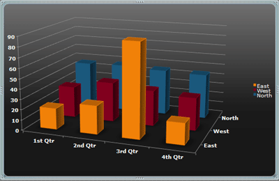
You can make a chart in PowerPoint or Excel. If you have lots of data to chart, create your chart in Excel, and then copy it into your presentation. This is also the best way if your data changes regularly and you want your chart to always reflect the latest numbers. In that case, when you copy and paste the chart, keep it linked to the original Excel file.
To create a simple chart from scratch in PowerPoint, click Insert > Chart and pick the chart you want.
-
Click Insert > Chart.

-
Click the chart type and then double-click the chart you want.
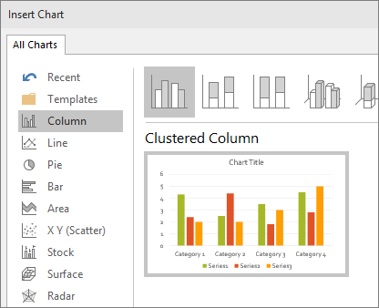
Tip: For help deciding which chart is best for your data, see Available chart types.
-
In the worksheet that appears, replace the placeholder data with your own information.

-
When you've finished, close the worksheet.
Tip: When you insert a chart, small buttons appear next to its upper-right corner. Use the Chart Elements  button to show, hide, or format things like axis titles or data labels. Or use the Chart Styles
  button to quickly change the color or style of the chart. The Chart Filters
  button is a more advanced option that shows or hides data in your chart.
To create a simple chart from scratch in PowerPoint, click Insert > Chart and pick the chart you want.
-
On the Insert tab, in the Illustrations group, click Chart.

-
In the Insert Chart dialog box, click the arrows to scroll through the chart types.
Select the type of chart that you want and then click OK.
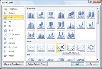
Tip: When you rest the mouse pointer over any chart type, a ScreenTip displays its name.
-
Edit the data in Excel 2010.
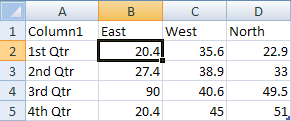
When you are finished editing your data, you can close Excel.
-
Click the File tab and then click Close. The chart in PowerPoint is automatically updated with the new data.
You can modify the chart in PowerPoint, including changes to appearance, size or position. Click the chart, then on the green Chart Tools tab, use the Design, Layout or Format tab to make changes. To add animation effects to the chart, use tools on the Animations tab.
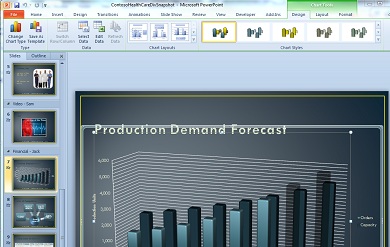
Note: If you don't see the Chart Tools, make sure that you click anywhere inside the chart to activate it.
You can change chart data in PowerPoint. Click the chart, then on the green Chart Tools tab, select the Design tab, and then click Edit Data. For more details, see Change the data in an existing chart.
Tips
-
To get a good idea of what you can add to or change in your chart, under Chart Tools, click the Design, Layout, and Format tabs, and then explore the groups and options that are provided on each tab.

-
You can also access design, layout, and formatting features that are available for specific chart elements (such as chart axes or the legend) by right-clicking those chart elements.
-
Some types of charts, such as organization charts, flow charts, hierarchical diagrams, or showing repetitive information, might be more easily and effectively created using SmartArt. If you are not sure which would be the best tool, see When should I use a SmartArt graphic and when should I use a chart?
More information
-
For more information about how to insert a linked Excel chart, see Insert a linked Excel chart in PowerPoint 2010.
-
For more information about how to edit data in a chart, see Edit data in a chart.
Insert a chart or graph in your presentation
To create a simple chart from scratch in PowerPoint, click Insert > Chart and pick the chart you want.
-
In PowerPoint 2007, click the placeholder that you want to contain the chart.
-
On the Insert tab, in the Illustrations group, click Chart.
-
In the Insert Chart dialog box, click a chart, and then click OK.
Office Excel 2007 opens in a split window and displays sample data on a worksheet.
 Sample data on an Excel worksheet
 -
In Excel, to replace the sample data, click a cell on the worksheet, and then type the data that you want.
You can also replace the sample axis labels in Column A and the legend entry name in Row 1.
Note: After you update the worksheet, the chart in PowerPoint 2007 updates automatically with the new data.
-
When you are finished inputting the data in Excel, on the File menu, click Close.
Note: To change the data in a chart you've inserted, use the Edit Data command. To learn more about the Edit Data command, see Change the data in an existing chart.
Paste an Excel chart or graph into your presentation and link to data in Excel
You create and copy the chart or graph in Office Excel 2007 and then paste it into your PowerPoint 2007 presentation. When you update the data in the linked Office Excel 2007 file, you can update the chart in PowerPoint by using the Refresh Data command.
To learn more about copying and pasting Excel charts and graphs into your PowerPoint presentation, see the article Copy an Excel chart to another Office program.
Note: If you want to be able to automatically update or refresh the data in your chart or graph, you must save the Excel file before inserting the chart or graph.
-
In Excel, select the chart by clicking its border, and then on the Home tab, in the Clipboard group, click Cut.
-
In PowerPoint 2007, click the placeholder on the slide or notes page that you want to insert the chart on.
-
On the Home tab, in the Clipboard group, click the arrow under Paste, and then click Paste.
Create an organization chart, a timeline, or add a chart from Excel
-
To create an organization chart, see the article Create an organization chart.
-
To create a timeline using a SmartArt graphic, see the article Create a SmartArt graphic.
-
To learn about the different types of Excel charts that you can add to your PowerPoint slides, see the article Available chart types.
Tip: If you don't know whether you need a data chart or some other type of graphic, see the article When should I use a SmartArt graphic and when should I use a chart?
Overview of data charting and graphing
You can add a data chart or graph to your presentation in one of two ways:
-
You can create a chart or graph in your presentation. When you create a new chart in PowerPoint 2007, you edit the data for that chart in Office Excel 2007, but the data is saved with the PowerPoint file.
-
You can paste an Excel chart or graph into your presentation and link to the data in an Office Excel 2007 file. When you copy a chart from a saved Office Excel 2007 file and paste it into your presentation, the data in the chart is linked to that Excel file. If you want to change the data in the chart, you must make your changes to the linked worksheet in Office Excel 2007 and then refresh the data in your PowerPoint presentation. The Excel worksheet is a separate file and is not saved with the PowerPoint file.
Note: If you open a presentation that was created in an earlier version of PowerPoint and the presentation contains a graph or chart that was created by using Microsoft Graph, PowerPoint 2007 maintains the look and feel of the graph or chart and lets you continue to update your graph or chart.
Microsoft Office Tutorials: Use Charts And Graphs In Your Presentation >>>>> Download Now
ReplyDelete>>>>> Download Full
Microsoft Office Tutorials: Use Charts And Graphs In Your Presentation >>>>> Download LINK
>>>>> Download Now
Microsoft Office Tutorials: Use Charts And Graphs In Your Presentation >>>>> Download Full
>>>>> Download LINK Fp