This topic gives you step-by-step instructions and best practices on how to make your email messages accessible to people with disabilities. When your emails are accessible, you unlock your content to everyone and people with differing abilities can read and work with your messages. You learn, for example, how to add alt texts to images so that people using screen readers are able to listen to what the image is all about. You'll also learn how to use fonts, colors, and styles to maximize the inclusiveness of your email messages before sending them.

People who are blind or have low vision can understand your emails more easily if you create them with accessibility in mind.
Windows: Best practices for making Outlook email accessible
The following table includes key best practices for creating Outlook email that is accessible to people with disabilities.
| What to fix | Why fix it | How to fix it |
|---|---|---|
| Include alternative text with all visuals. Visual content includes pictures, SmartArt graphics, shapes, groups, charts, embedded objects, ink, and videos. | Alt text helps people who can't see the screen to understand what's important in images and other visuals. To find missing alternative text, use the Accessibility Checker. Avoid using text in images as the sole method of conveying important information. If you must use an image with text in it, repeat that text in the document. In alt text, briefly describe the image and mention the existence of the text and its intent. | Add alt text to visuals in Microsoft 365 |
| Add meaningful hyperlink text and ScreenTips. | People who use screen readers sometimes scan a list of links. Links should convey clear and accurate information about the destination. For example, instead of linking to the text Click here, include the full title of the destination page. Tip: You can also add ScreenTips that appear when your cursor hovers over text or images that include a hyperlink. | |
| Ensure that color is not the only means of conveying information. | People who are blind, have low vision, or are colorblind might miss out on the meaning conveyed by particular colors. For example, add an underline to color-coded hyperlink text so that people who are colorblind know that the text is linked even if they can't see the color. For headings, consider adding bold or using a larger font. | |
| Use sufficient contrast for text and background colors. | The text in your email should be readable in High Contrast mode so that everyone, including people with visual disabilities, can see it well. For example, use bright colors or high-contrast color schemes on opposite ends of the color spectrum. White and black schemes make it easier for people who are colorblind to distinguish text and shapes. To find insufficient color contrast, use the Accessibility Checker. | |
| Use a larger font size (11pt or larger), sans serif fonts, and sufficient white space. | People who have dyslexia describe seeing text "swim together" on a page (the compressing of one line of text into the line below). They often see text merge or distort. For people who have dyslexia or have low vision, reduce the reading load. For example, they may benefit from familiar sans serif fonts such as Arial or Calibri. Avoid using all capital letters and excessive italics or underlines. Include ample white space between sentences and paragraphs. | |
| Use built-in headings and styles. | To preserve tab order and to make it easier for screen readers to read your email, use a logical heading order and the built-in formatting tools in Outlook. For example, organize headings in the prescribed logical order. Use Heading 1, Heading 2, and then Heading 3, rather than Heading 3, Heading 1, and then Heading 2. And, organize the information in your email into small chunks. Ideally, each heading would include only a few paragraphs. | |
| Use a simple table structure, and specify column header information. | Screen readers keep track of their location in a table by counting table cells. If a table is nested within another table or if a cell is merged or split, the screen reader loses count and can't provide helpful information about the table after that point. Blank cells in a table could also mislead someone using a screen reader into thinking that there is nothing more in the table. To ensure that tables don't contain split cells, merged cells, or nested tables, use the Accessibility Checker. Screen readers also use header information to identify rows and columns. |
Add alt text to visuals in Microsoft 365
The following procedures describe how to add alt text to visuals in your Outlook email in Microsoft 365:
Note: For audio and video content, in addition to alt text, include closed captioning for people who are deaf or have limited hearing.
Add alt text to images
Add alt text to images, such as pictures, screenshots, icons, videos, and 3D models, so that screen readers can read the text to describe the image to users who can't see the image.
-
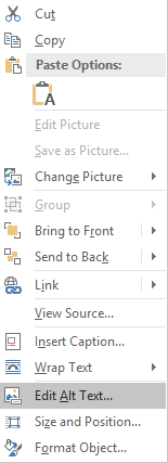
Right-click an image.
-
Select Edit Alt Text. The Alt Text pane opens on the right side of the document body.
-
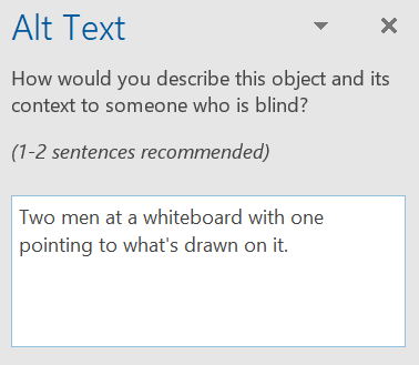
Type 1-2 sentences to describe the image and its context to someone who cannot see it.
Add alt text to shapes or SmartArt graphics
-
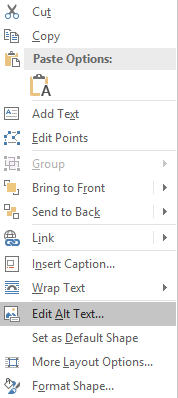
Right-click a shape or SmartArt graphic.
Tip: You have to right-click somewhere inside the frame that surrounds the entire shape or SmartArt graphic, not inside one of its parts.
-
Select Edit Alt Text. The Alt Text pane opens on the right side of the document body.
-
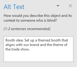
Type 1-2 sentences to describe the shape or SmartArt graphic and its context to someone who cannot see it.
Add alt text to charts
-
Right-click a chart.
Tip: You have to right-click somewhere inside the frame that surrounds the entire chart, not inside one of its parts.
-
Select Edit Alt Text. The Alt Text pane opens on the right side of the document body.

-
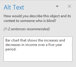
Type 1-2 sentences to describe the chart and its context to someone who cannot see it.
Add alt text to visuals in Office 2019
The following procedures describe how to add alt text to visuals in your Outlook email in Office 2019:
Note: For audio and video content, in addition to alt text, include closed captioning for people who are deaf or have limited hearing.
Add alt text to images
Add alt text to images, such as pictures, screenshots, icons, videos, and 3D models, so that screen readers can read the text to describe the image to users who can't see the image.
-
Right-click an image.
-
Select Edit Alt Text. The Alt Text pane opens on the right side of the document body.

-
Type 1-2 sentences to describe the image and its context to someone who cannot see it.

Add alt text to shapes or SmartArt graphics
-
Right-click a shape or SmartArt graphic.
Tip: You have to right-click somewhere inside the frame that surrounds the entire shape or SmartArt graphic, not inside one of its parts.
-
Select Edit Alt Text. The Alt Text pane opens on the right side of the document body.

-
Type 1-2 sentences to describe the shape or SmartArt graphic and its context to someone who cannot see it.

Add alt text to charts
-
Right-click a chart.
Tip: You have to right-click somewhere inside the frame that surrounds the entire chart, not inside one of its parts.
-
Select Edit Alt Text. The Alt Text pane opens on the right side of the document body.

-
Type 1-2 sentences to describe the chart and its context to someone who cannot see it.

Add alt text to visuals in Office 2016
The following procedures describe how to add alt text to visuals in your Outlook email:
Note: We recommend only putting text in the description field and leaving the title blank. This will provide the best experience with most major screen readers including Narrator. For audio and video content, in addition to alt text, include closed captioning for people who are deaf or have limited hearing.
Add alt text to images
Add alt text to images, such as pictures and screenshots, so that screen readers can read the text to describe the image to users who can't see the image.
-
Right-click an image.
-
Select Format Picture > Layout & Properties.
-
Select Alt Text.
-
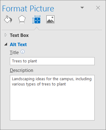
Type a description and a title.
Tip: Include the most important information in the first line, and be as concise as possible.
Add alt text to SmartArt graphics
-
Right-click a SmartArt graphic.
-
Select Format Object > Shape Options > Layout & Properties.
-
Select Alt Text.
-
Type a description and a title.
Tip: Include the most important information in the first line, and be as concise as possible.
Add alt text to shapes
Add alt text to shapes, including shapes within a SmartArt graphic.
-
Right-click a shape.
-
Select Format Shape > Layout & Properties.
-
Select Alt Text.
-
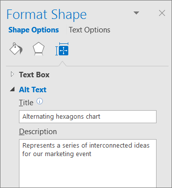
Type a description and a title.
Tip: Include the most important information in the first line, and be as concise as possible.
Add alt text to charts
-
Right-click a chart.
-
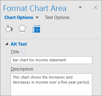
Select Format Chart Area > Chart Options > Layout & Properties.
-
Select Alt Text.
-
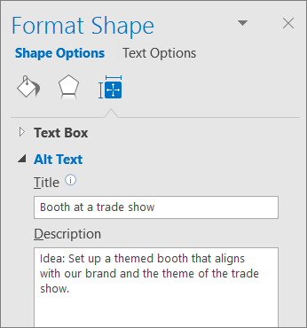
Type a description and a title.
Tip: Include the most important information in the first line, and be as concise as possible.
Make hyperlinks, text, and tables accessible
The following procedures describe how to make the hyperlinks, text, and tables in your Outlook email accessible.
Add hyperlink text and ScreenTips
-
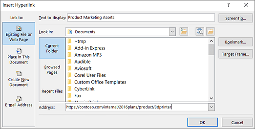
Select the text to which you want to add the hyperlink, and then right-click it.
-
Select Link. The text you selected is shown in the Text to display box. This is the hyperlink text.
-
If necessary, change the hyperlink text. In the Address box, type the destination URL.
-
Select the ScreenTip button and, in the ScreenTip text box, type a ScreenTip.
Tip: If the title on the hyperlink's destination page gives an accurate summary of what's on the page, use it for the hyperlink text. For example, this hyperlink text matches the title on the destination page: Templates and Themes for Office Online.
Use accessible font format
-
Select your text.
-
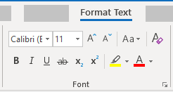
Select the Format Text tab.
-
In the Font group, which provides options for font type, size, style, and color, select your formatting choices.
Use accessible font color
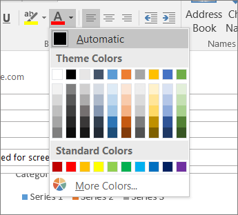
To ensure that text displays well in High Contrast mode, use the Automatic setting for font colors.
-
Select your text.
-
Select Message > Font Color.
-
Select Automatic.
Use bulleted list styles
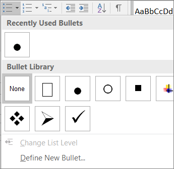
Create bulleted lists by using the Bullets button.
-
Position the cursor anywhere in your email.
-
Select the Format Text tab.
-
In the Paragraph group, select the Bullets button.
-
Type each bullet item in the bulleted list.
Use ordered lists
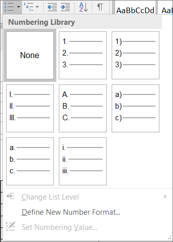
Create sequential steps by using the Numbering button.
-
Position the cursor anywhere in your email.
-
Select the Format Text tab.
-
In the Paragraph group, select the Numbering button.
-
Type the sequential steps.
Adjust space between sentences and paragraphs
Increase or decrease white space between sentences and paragraphs.
-
Select your text.
-
Select the Format Text tab.
-
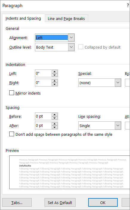
In the Paragraph group, in the lower-right corner of the group, select the Dialog box launcher button. The Paragraph dialog box opens, showing the Indents and Spacing tab.

-
Under Spacing, select the spacing options you want.
Use table headers
Specify a header row in a table.
-
Position the cursor anywhere in a table.
-
On the Table Design tab, in the Table Styles group, select the Header Row check box.
-
Type your column headings.

Request an accessible email
Let a sender know that you prefer to receive accessible content.
-
To go to your account on the web, in Outlook, select File > Info, and then in Account Settings, click the link under Access this account on the web.
-
In Outlook on the web, to go to Accessibility Settings, select
 > View all Outlook settings > General > Accessibility.
 -
To request accessible content, select the Ask senders to send content that's accessible checkbox.
See also
Improve accessibility with the Accessibility Checker
Rules for the Accessibility Checker
Make your Word documents accessible to people with disabilities
Make your Excel documents accessible to people with disabilities
Make your PowerPoint presentations accessible to people with disabilities
Mac: Best practices for making Outlook email accessible
The following table includes key best practices for creating Outlook email that is accessible to people with disabilities.
| What to fix | Why fix it | How to fix it |
|---|---|---|
| Include alternative text with all visuals. Visual content includes pictures, SmartArt graphics, shapes, groups, charts, embedded objects, ink, and videos. | Alt text helps people who can't see the screen to understand what's important in images and other visuals. To find missing alternative text, use the Accessibility Checker. Avoid using text in images as the sole method of conveying important information. If you must use an image with text in it, repeat that text in the document. In the alt text, briefly describe the image and mention the existence of the text and its intent. | |
| Add meaningful hyperlink text and ScreenTips. | People who use screen readers sometimes scan a list of links. Links should convey clear and accurate information about the destination. For example, instead of linking to the text Click here, include the full title of the destination page. Tip: You can also add ScreenTips that appear when your cursor hovers over text or images that include a hyperlink. | |
| Ensure that color is not the only means of conveying information. | People who are blind, have low vision, or are colorblind might miss out on the meaning conveyed by particular colors. For example, add an underline to color-coded hyperlink text so that people who are colorblind know that the text is linked even if they can't see the color. For headings, consider adding bold or using a larger font. | |
| Use sufficient contrast for text and background colors. | The text in your email should be readable in High Contrast mode so that everyone, including people with visual disabilities, can see it well. For example, use bright colors or high-contrast color schemes on opposite ends of the color spectrum. White and black schemes can help people who are colorblind distinguish between colors. To find insufficient color contrast, use the Accessibility Checker. | |
| Use a larger font size (11pt or larger), sans serif fonts, and sufficient white space. | People who have dyslexia describe seeing text "swim together" on a page (the compressing of one line of text into the line below). They often see text merge or distort. For people who have dyslexia or have low vision, reduce the reading load. For example, they may benefit from familiar sans serif fonts, such as Arial or Calibri. Avoid using all capital letters and excessive italics or underlines. Include ample white space between sentences and paragraphs. | |
| Use headings and built-in styles. | To preserve tab order and to make it easier for screen readers to read your email, use a logical heading order and the built-in formatting tools in Outlook. For example, organize the information in your email into small chunks and add headings above them. Ideally, each section would include only a few paragraphs. | |
| Use a simple table structure, and specify column header information. | Screen readers keep track of their location in a table by counting table cells. If a table is nested within another table or if a cell is merged or split, the screen reader loses count and can't provide helpful information about the table after that point. Blank cells in a table could also mislead someone using a screen reader into thinking that there is nothing more in the table. To ensure that tables don't contain split cells, merged cells, or nested tables, use the Accessibility Checker. Screen readers also use header information to identify rows and columns. |
Add alt text to visuals in Microsoft 365 for Mac
The following procedure describes how to add alt text to visuals in your Outlook email in Microsoft 365 for Mac.
Notes:
-
For audio and video content, in addition to alt text, include closed captioning for people who are deaf or have limited hearing.
-
To enable right-click on your Mac, make sure that the Secondary click option is selected in System Preferences.
Tip: To write a good alt text, make sure to convey the content and the purpose of the image in a concise and unambiguous manner. The alt text shouldn't be longer than a short sentence or two—most of the time a few thoughtfully selected words will do. Do not repeat the surrounding textual content as alt text or use phrases referring to images, such as, "a graphic of" or "an image of."
Add alt text to images
-
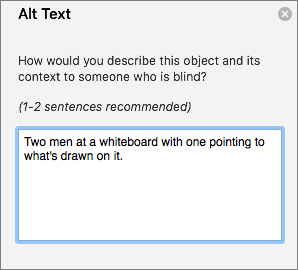
Right-click the image in your email.
-
Select Edit Alt Text....
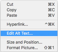
The Alt Text pane opens on the right side of the document body.
-
Type 1-2 sentences to describe the image and its context.
Tip: To spell check and correct a word you typed, just right-click the word and select from the suggested alternatives.
Add alt text to visuals in Office 2016 for Mac
Add alt text to images, such as pictures and screenshots, so that screen readers can read the text to describe the image to users who can't see it.
Tip: To write a good alt text, make sure to convey the content and the purpose of the image in a concise and unambiguous manner. The alt text shouldn't be longer than a short sentence or two—most of the time a few thoughtfully selected words will do. Do not repeat the surrounding textual content as alt text or use phrases referring to images, such as, "a graphic of" or "an image of."
Note: For audio and video content, in addition to alt text, include closed captioning for people who are deaf or have limited hearing.
-
Right-click an image.
-
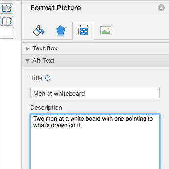
Select Format Picture > Layout & Properties.
-
Select Alt Text.
-
Type a description and a title.
Tip: Include the most important information in the first line, and be as concise as possible.
Make hyperlinks, text, and tables accessible
The following procedures describe how to make the hyperlinks, text, and tables in your Outlook email accessible.
Add hyperlink text and ScreenTips
-
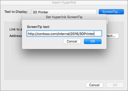
Select the text to which you want to add the hyperlink, right-click the text, and then select Hyperlink. The text you selected displays in the Text to Display box. This is the hyperlink text.
-
If necessary, change the hyperlink text.
-
In the Address box, type the destination URL.
-
Select the ScreenTip button and, in the ScreenTip text box, type a ScreenTip.
Tip: If the title on the hyperlink's destination page gives an accurate summary of what's on the page, use it for the hyperlink text. For example, this hyperlink text matches the title on the destination page: Templates and Themes for Office Online.
Use accessible font format
-
Select your text.
-
Select the Message tab.
-
In the Font group, which provides options for font type, size, style, and color, select your formatting choices.

Use accessible font color
To ensure that text displays well in High Contrast mode, use the Automatic setting for font colors.
-
Select your text.
-
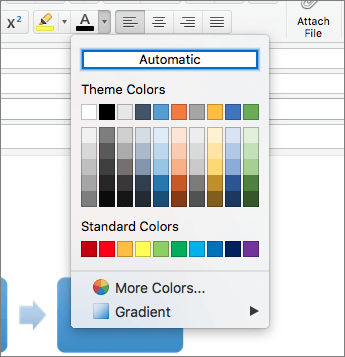
Select Message > Font Color.
-
Select Automatic.
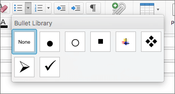
Use bulleted lists styles
Create bulleted lists by using the Bullets button.
-
Position the cursor anywhere in your email.
-
Select the Message tab.
-
In the Paragraph group, select the Bullets button.
-
Type each bullet item in the bulleted list.
Use ordered lists
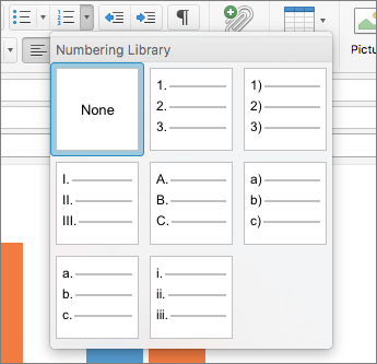
Create sequential steps by using the Numbering button.
-
Position the cursor anywhere in your email.
-
Select the Message tab.
-
In the Paragraph group, select the Numbering button.
-
Type each sequential step in the ordered list.
Adjust space between sentences and paragraphs
Increase or decrease white space between sentences and paragraphs.
-
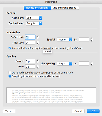
Select your text, right-click it, and then select Paragraph.
The Paragraph dialog box opens, showing the Indents and Spacing tab.
-
Under Spacing, select the spacing options you want.
Use table headers
Specify a header row in a table.
-
Position the cursor anywhere in a table.
-
On the Table Design tab, select the Header Row check box.
-
Type column headings.

See also
Improve accessibility with the Accessibility Checker
Rules for the Accessibility Checker
Make your Word documents accessible to people with disabilities
Make your Excel documents accessible to people with disabilities
Make your PowerPoint presentations accessible to people with disabilities
iOS app: Best practices for making Outlook email accessible
The following table includes key best practices for creating an Outlook for iOS email that is accessible to people with disabilities.
| What to fix | Why fix it | How to fix it |
|---|---|---|
| Include alternative text with pictures. | Alternative text helps people who can't see the screen to understand what's important in images and other visuals. Avoid using text in images as the sole method of conveying important information. If you must use an image with text in it, repeat that text in the document. In alternative text, briefly describe the image and mention the existence of the text and its intent. | |
| Add meaningful hyperlink text. | People who use screen readers sometimes scan a list of links. Links should convey clear and accurate information about the destination. For example, instead of linking to the text Click here, include the full title of the destination page. |
Add alternative text to images
Add alternative text to images, such as pictures and screenshots, so that screen readers can read the text to describe the image to readers who can't see the image.
-
In the email you are composing, double-tap an image to open the context menu.
-
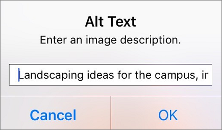
In the context menu, tap the Alt Text button.
-
Type a description.
Tip: Include the most important information in the first line, and be as concise as possible.
-
To add the text and exit the dialog box, tap OK.
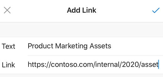
Add hyperlink text
Add a meaningful hyperlink text to help screen reader users easily scan your email for links.
-
In the email you are composing, select the text to which you want to add the hyperlink.
-
To open the context menu, tap the selected text.
-
If necessary, at the end of the menu, tap
 until the Add Link button is displayed. Tap the Add Link button.
 -
If necessary, change the hyperlink text in the Text field.
-
In the Link field, type the destination URL.
-
To insert the hyperlink, tap
 .
.
Tip: If the title on the hyperlink's destination page gives an accurate summary of what's on the page, use it for the hyperlink text. For example, this hyperlink text matches the title on the destination page: Templates and Themes for Office Online.
See also
Rules for the Accessibility Checker
Make your Word documents accessible to people with disabilities
Make your Excel documents accessible to people with disabilities
Make your PowerPoint presentations accessible to people with disabilities
Android app: Best practices for making Outlook email accessible
The following table includes the key best practice for creating an Outlook for Android email that is accessible to people with disabilities.
| What to fix | Why fix it | How to fix it |
|---|---|---|
| Include alternative text with pictures. | Alternative text helps people who can't see the screen to understand what's important in images and other visuals. Avoid using text in images as the sole method of conveying important information. If you must use an image with text in it, repeat that text in the document. In alternative text, briefly describe the image and mention the existence of the text and its intent. | |
| Add meaningful hyperlink text. | People who use screen readers sometimes scan a list of links. Links should convey clear and accurate information about the destination. For example, instead of linking to the text Click here, include the full title of the destination page. |
Add alternative text to images
Add alternative text to images, such as pictures and screenshots, so that screen readers can read the text to describe the image to readers who can't see the image.
-
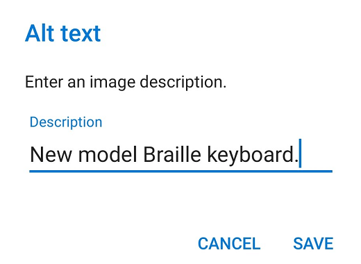
In the email you are composing, tap and hold an image to open the context menu.
-
In the context menu, tap the Alt text button.
-
Type a description.
Tip: Include the most important information in the first line, and be as concise as possible.
-
To add the text and exit the dialog box, tap SAVE.
Add hyperlink text
Add a meaningful hyperlink text to help screen reader users easily scan your email for links.
-
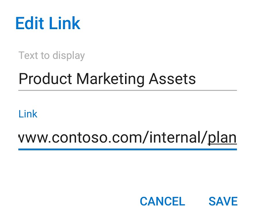
In the email you are composing, select the text to which you want to add the hyperlink. The context menu opens.
-
Tap the Add Link button.
-
If necessary, change the hyperlink text in the Text to display field.
-
In the Link field, type the destination URL.
-
To insert the hyperlink, tap the SAVE button.
Tip: If the title on the hyperlink's destination page gives an accurate summary of what's on the page, use it for the hyperlink text. For example, this hyperlink text matches the title on the destination page: Templates and Themes for Office Online.
See also
Rules for the Accessibility Checker
Make your Word documents accessible to people with disabilities
Make your Excel documents accessible to people with disabilities
Make your PowerPoint presentations accessible to people with disabilities
Web: Best practices for making Outlook email accessible
The following table includes key best practices for creating Outlook email that is accessible to people with disabilities.
Note: We're currently updating Outlook.office.com (Outlook on the Web). Some people are already using the new Outlook, and for others the classic version will be the default experience until we complete the update. For more information, go to Get help with the new Outlook on the web. Since the instructions in this topic apply to the new experience, we recommend that you switch from the classic experience to the new Outlook. To switch to the new Outlook, toggle the switch in the top right corner to Try the new Outlook.
| What to fix | Why fix it | How to fix it |
|---|---|---|
| Include alternative text with all visuals. | Alt text helps people who can't see the screen to understand what's important in images and other visuals. To find missing alternative text, use the Accessibility Checker. Avoid using text in images as the sole method of conveying important information. If you must use an image with text in it, repeat that text in the document. In alt text, briefly describe the image and mention the existence of the text and its intent. | |
| Add meaningful hyperlink text. | People who use screen readers sometimes scan a list of links. Links should convey clear and accurate information about the destination. For example, instead of linking to the text Click here, include the full title of the destination page. | |
| Ensure that color is not the only means of conveying information. | People who are blind, have low vision, or are colorblind might miss out on the meaning conveyed by particular colors. For example, add an underline to color-coded hyperlink text so that people who are colorblind know that the text is linked even if they can't see the color. For headings, consider adding bold or using a larger font. | |
| Use sufficient contrast for text and background colors. | The text in your email should be readable in High Contrast mode so that everyone, including people with visual disabilities, can see it well. To find insufficient color contrast, use the Accessibility Checker. For example, use bright colors or high-contrast color schemes on opposite ends of the color spectrum. White and black schemes make it easier for people who are colorblind to distinguish text and shapes. | |
| Use a larger font size (11pt or larger), sans serif fonts, and sufficient white space. | People who have dyslexia describe seeing text "swim together" on a page (the compressing of one line of text into the line below). They often see text merge or distort. For people who have dyslexia or have low vision, reduce the reading load. For example, they may benefit from familiar sans serif fonts such as Arial or Calibri. Avoid using all capital letters and excessive italics or underlines. Include ample white space between sentences and paragraphs. | |
| Use built-in headings and styles. | To preserve tab order and to make it easier for screen readers to read your email, use a logical heading order and the built-in formatting tools in Outlook. For example, organize headings in the prescribed logical order. Use Heading 1, Heading 2, and then Heading 3, rather than Heading 3, Heading 1, and then Heading 2. And, organize the information in your email into small chunks. Ideally, each heading would include only a few paragraphs. | |
| Use a simple table structure. | Screen readers keep track of their location in a table by counting table cells. If a table is nested within another table or if a cell is merged or split, the screen reader loses count and can't provide helpful information about the table after that point. Blank cells in a table could also mislead someone using a screen reader into thinking that there is nothing more in the table. To ensure that tables don't contain split cells, merged cells, or nested tables, use the Accessibility Checker. |
Add alt text to images
Add alt text to images, such as pictures and screenshots, so that screen readers can read the text to describe the image to users who can't see the image.
-
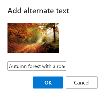
When you're composing an email, select an image in the message body.
-
To display the formatting toolbar, select
 (Show formatting options), if necessary.
 -
In the toolbar, select
 (Add alternate text to image).
 -
Type a description for the image and click OK.
Make hyperlinks and text accessible
The following procedures describe how to make the hyperlinks, text, and tables in your Outlook email accessible.
Add a meaningful hyperlink text
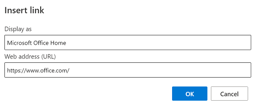
Instead of displaying the URL as the link text, type a meaningful hyperlink text.
-
When you're composing an email, type a meaningful link text in the message body.
-
Select the link text, and then press Ctrl+K. The Insert link dialog box opens.
-
In the Web address (URL) text field, type the destination URL and select OK.
Use link preview
When you add a URL to an email in Outlook.com or Outlook on the web, or when you receive an email with a URL in the body, you'll see a rich preview that includes a link title, thumbnail image, and description of the link. This is called a link preview and it is turned on by default.
To turn link preview off:
-
At the top of the page, select Settings
 > View all Outlook settings.
 -
In the Settings pane, select Mail > Compose and reply.
-
Under Link preview, clear the Preview links in email check box to turn off link preview.
Use accessible font format
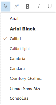
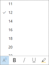
Use a familiar font type and large enough font size to help people who have dyslexia or have low vision read your email more easily.
-
Select your text.
-
To display the formatting toolbar, select
 (Show formatting options), if necessary.
 -
To change the font type, select
 (Font).
 -
In the Font menu, select the font type you want.
-
To change the font size, select
 (Font size).
 -
In the Font size menu, select the size you want.
Use accessible font color
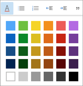
To ensure that text displays well in High Contrast mode, use black for the font color.
-
Select your text.
-
To display the formatting toolbar, select
 (Show formatting options), if necessary.
 -
In the toolbar, select
 (Font color).
 -
In the Font color menu, select the color you want.
Use bulleted lists
Create bulleted lists to add structure to your text.
-
Place the cursor anywhere in your email.
-
To display the formatting toolbar, select
 (Show formatting options), if necessary.
 -
In the toolbar, select
 (Bullets).
 -
Type each bullet item in the bulleted list.
Use ordered lists
Create ordered lists to organize your text into sequential steps.
-
Place the cursor anywhere in your email.
-
To display the formatting toolbar, select
 (Show formatting options), if necessary.
 -
In the toolbar, select
 (Numbering).
 -
Type each numbered item in the list.
Insert a simple table
Adding tables inside tables or leaving cells empty may make your emails difficult to read with a screen reader. Consider using simple tables that make it easier for the screen readers to identify the table, rows, and columns.
-
Place the cursor anywhere in your email.
-
To display the formatting toolbar, select
 (Show formatting options), if necessary.
 -
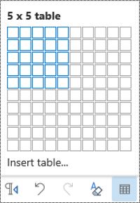
In the toolbar, select
 (Insert table). This option may only become visible after you select
  (More formatting options).
 -
In the Insert table grid, select the area of rows and columns to be added.
See also
Improve accessibility with the Accessibility Checker
Rules for the Accessibility Checker
Make your Word documents accessible to people with disabilities
Make your Excel documents accessible to people with disabilities
Make your PowerPoint presentations accessible to people with disabilities
Technical support for customers with disabilities
Microsoft wants to provide the best possible experience for all our customers. If you have a disability or questions related to accessibility, please contact the Microsoft Disability Answer Desk for technical assistance. The Disability Answer Desk support team is trained in using many popular assistive technologies and can offer assistance in English, Spanish, French, and American Sign Language. Please go to the Microsoft Disability Answer Desk site to find out the contact details for your region.
If you are a government, commercial, or enterprise user, please contact the enterprise Disability Answer Desk.
No comments:
Post a Comment