Enhance your data with data graphics
You can convey information powerfully and succinctly by adding data graphics to your diagrams. Microsoft Office Visio Professional 2007 includes a set of data graphics that you can choose from or change. You can also construct your own.
In this article
What is a data graphic?
A data graphic is a set of enhancements that you can apply to shapes to show data that the shapes contain. A data graphic presents your data as a combination of textual and visual elements, such as flags and progress bars.
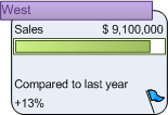
Let's say, for example, that you have a shape that contains information about sales, and you want to display that information as follows:
-
Region as text showing only the value (West) instead of the label (Sales Region)
-
Sales as text showing both the label and the value
-
Sales again, but this time as a progress bar relating current sales with projected sales for the year
-
Comparison to last year showing both the label and the value
-
Comparison to last year again, but this time as an icon showing a flag to indicate the status
The following data graphic clearly conveys this information.

After you create a data graphic, you can:
-
Apply it to other shapes with the same data.
-
Edit the data graphic to automatically change all of the shapes that the data graphic is applied to.
After you apply a data graphic to multiple shapes, if you change the data graphic, those changes are applied to all of the shapes to which you applied that data graphic.
You can create as many data graphics as you need for your shapes. For example, you can create one to show employee data and apply it to all of your employee shapes. You can create a second data graphic to show equipment data and apply it to all of your equipment shapes.
Where does the data come from?
The data that you can show by using data graphics is listed in each shape's Shape Data dialog box. (In earlier versions of Microsoft Office Visio, this data appeared in the list of custom properties for each shape.) Either you can type data into the Shape Data dialog box for each shape individually, or you can use the Link Data to Shapes Wizard. If you import your data by using the Link Data to Shapes Wizard, you can choose how you want Visio to show the data for you. For more information about the wizard, see Import data from Excel, SQL Server, SharePoint sites, and other external sources.
Display data in your shapes
-
Right-click your shape, point to Data, and then click Edit Data Graphic.
-
In the Edit Data Graphic dialog box, select the elements that you want to apply in the data graphic. See Enhance a data graphic for information about the different enhancements that you can choose from, including text, data bars, icons, and color-coding.
Change a data graphic
If the existing data graphics don't provide what you need, you can customize them instead of creating new ones. The changes are applied to any shapes to which that data graphic is applied.
-
Right-click a shape with the data graphic that you want to change, point to Data, and then click Edit Data Graphic.
-
Use the Edit Data Graphic and the Editcallout type dialog boxes to customize the data graphic. See Enhance a data graphic for information about the enhancements that you can choose from.
After you click OK in the Edit Data Graphic dialog box, the changes are applied to all of the shapes to which the data graphic is applied, as well as to the data graphic itself.
Construct a new data graphic
-
Click Data, and then click Display Data on Shapes.
-
In the Data Graphics task pane, under Create a new data graphic, click New Data Graphic.
-
Use the New Data Graphic and the Newcallout type dialog boxes to customize the data graphic. See Enhance a data graphic for information about the different enhancements that you can choose from.
Enhance a data graphic
You can add four types of elements to enhance your data graphic: text, data bars, icons, and color-coding. The following sections describe how to add each type of element.
Add text to a data graphic
There are a number of styles of text fields to choose from. Some styles are text callouts that contain both the name of the column and its value. The other styles are headings, which show only the data value.
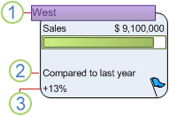
The following figure illustrates headings, text callouts, and values.

1. Headings show only values.
2. Compared to last year is the label for the callout.
3. +13% is the value for this callout.
-
On the Data menu, click Display Data on Shapes.
-
In the Data Graphics task pane, right-click the data graphic that you want to add text to, and then click Edit.
-
In the Edit Data Graphic dialog box, click New Item and then click Text.
-
In the New Text dialog box, click Data Field and select an item from the list.
-
Click Callout and select a style of icon set from the list.
-
Select the callout position in one of the following ways:
-
Under Callout position, select the Use default position check box.
-
Clear the Use default position check box, and then click the Horizontal and Vertical text boxes and select positions from the lists.
-
-
Under Details, select the options to choose how you want the callout or heading to look.
Add a data bar to a data graphic
Data bars show your data dynamically in miniature charts and graphs, such as progress bars, star ratings, thermometers, and speedometers.
-
On the Data menu, click Display Data on Shapes.
-
In the Data Graphics task pane, right-click the data graphic that you want to add a data bar to, and then click Edit.
-
In the Edit Data Graphic dialog box, click New Item and then click Data Bar.
-
In the New Data Bar dialog box, click Data Field and select an item from the list.
-
Click Callout and select a style of icon set from the list.
-
To select the callout position, do one of the following:
-
Under Callout position, select the Use default position check box.
-
Clear the Use default position check box, and then click the Horizontal and Vertical text boxes and select positions from the lists.
-
-
Under Details, select the options to choose how you want the data bar to look.
Add an icon set to a data graphic
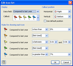
You can show your data by using sets of icons such as flags, traffic signals, and trend arrows. For example, you can use flags to indicate how current sales compare to those of the previous year. As shown in the following example, you can set the flag values so that a blue flag means sales were up significantly, a yellow flag means that sales were up moderately, and a red flag means that sales were down for the year.

-
On the Data menu, click Display Data on Shapes.
-
Right-click the data graphic that you want to add an icon to, and then click Edit.
-
In the Edit Data Graphic dialog box, click New Item and then click Icon Set.
-
In the New Icon Set dialog box, click Data Field and select an item from the list.
-
Click Callout and select a style of icon set from the list.
-
To select the callout position, do one of the following:
-
Under Callout position, select the Use default position check box.
-
Clear the Use default position check box, and then click the Horizontal and Vertical text boxes and select positions from the lists.
-
-
Under Rules for showing each icon, select the values that each icon is to represent. Using the previous example, the Edit Icon Set dialog box would look like the following figure.

Add color by value
Using the Color by Value option, you can apply color to indicate unique values or ranges of values.
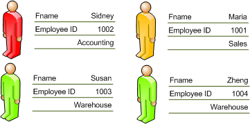
Each color represents a unique value You can apply the same color to all of the shapes that have the same value. For example, you can color all the shapes for employees in the sales department yellow and all the shapes for employees in the accounting department red.

Each color represents a range of values You can use a range of colors, from bright to muted, to indicate a range of values. For example, you can use a range of colors that pale from red to pink to correspond to regions with high, medium, and low increases in sales.

-
On the Data menu, click Display Data on Shapes.
-
In the Data Graphics task pane, right-click the data graphic that you want to color code, and then click Edit.
-
In the Edit Data Graphic dialog box, click New Item, and then click Color by Value.
-
In the New Color by Value dialog box, under Display, select an item from the Data field list.
-
Under Coloring method, do one of the following:
-
Select Each color represents a unique value to apply the same color to all shapes that have the same value.
The Color assignments list shows all the available values and assigns a fill color and text color to each value. To select a different fill or text color, click the Fill Color or Text Color arrow.
-
Select Each color represents a range of values to use a range of colors, from bright to muted, to indicate a range of values.
The Color assignments list shows a list of possible value ranges and assigns a fill color and text color to each range. Type different values into the Value 1 and Value 2 boxes to create custom ranges. To select different fill and text colors for each value, you can click the Fill Color or Text Color arrow. However, to preserve the bright-to-muted effect of the color sets, we recommend that you choose a different color for only the first item in the Color assignments list.
-
-
Click OK first in the New Color by Value dialog box and then in the Edit Data Graphic dialog box to apply the settings to shapes in your drawing.
No comments:
Post a Comment