This topic gives you step-by-step instructions and best practices on how to make your Word documents accessible and unlock your content to everyone, including people with disabilities.
Word has many features built-in that help people with different abilities to read and author documents. In this topic, you learn, for example, how to work with the Accessibility Checker to tackle accessibility issues while you're writing your document. You'll also learn how to add alt texts to images so that people using screen readers are able to listen to what the image is all about. You can also learn about how to use fonts, colors, and styles to maximize the inclusiveness of your Word documents before sharing them with others.
In this topic
Best practices for making Word documents accessible
The following table includes key best practices for creating Word documents that are accessible to people with disabilities.
| What to fix | How to find it | Why fix it | How to fix it |
|---|---|---|---|
| Avoid common accessibility issues such as missing alternative text (alt text) and low contrast colors. | Use the Accessibility Checker. | Make it easy for everyone read your documents. | |
| In general, avoid tables if possible and present the data another way. If you have to use tables, use a simple table structure for data only, and specify column header information. | To ensure that tables don't contain split cells, merged cells, or nested tables, use the Accessibility Checker. Visually scan your tables to check that they don't have any completely blank rows or columns. | Screen readers keep track of their location in a table by counting table cells. If a table is nested within another table or if a cell is merged or split, the screen reader loses count and can't provide helpful information about the table after that point. Blank cells in a table could also mislead someone using a screen reader into thinking that there is nothing more in the table. | |
| Use built-in headings and styles. | To check that the order of headings is logical, visually scan your document's table of contents. | To preserve tab order and to make it easier for screen readers to read your documents, use a logical heading order and the built-in formatting tools in Word. You can also use paragraph banners to organize your content. | Use built-in headings and styles |
| Include alt text with all visuals. | To find missing alt text, use the Accessibility Checker. | Alt text helps people who can't see the screen to understand what's important in images and other visuals. | |
| Add meaningful hyperlink text and ScreenTips. | To determine whether hyperlink text makes sense as standalone information and whether it gives readers accurate information about the destination target, visually scan your document. | People who use screen readers sometimes scan a list of links. | |
| Ensure that color is not the only means of conveying information. | To find instances of color-coding, visually scan your document. | People who are blind, have low vision, or are colorblind might miss out on the meaning conveyed by particular colors. | |
| Use sufficient contrast for text and background colors. | To find insufficient color contrast, use the Accessibility Checker. You can also look for text in your document that's hard to read or to distinguish from the background. | If your document has a high level of contrast between text and background, more people can see and use the content. |
Check accessibility while you work in Word
The Accessibility Checker is a tool that reviews your content and flags accessibility issues it comes across. It explains why each issue might be a potential problem for someone with a disability. The Accessibility Checker also suggests how you can resolve the issues that appear.
In Word, the Accessibility Checker runs automatically in the background when you're creating a document. If the Accessibility Checker detects accessibility issues, you will get a reminder in the status bar.
To manually launch the Accessibility Checker, select Review > Check Accessibility. The Accessibility pane opens, and you can now review and fix accessibility issues. For more info, go to Improve accessibility with the Accessibility Checker and Video: Check the accessibility of your document.
Tip: Use the Accessibility Reminder add-in for Office to notify authors and contributors of accessibility issues in their documents. With the add-in, you can quickly add reminder comments that spread awareness of accessibility issues and encourage the use of the Accessibility Checker. For more info, go to Use the Accessibility Reminder to notify authors of accessibility issues.
Avoid using tables
In general, avoid tables if possible and present the data another way, like paragraphs with headings and banners. Tables with fixed width might prove difficult to read for people who use Magnifier, because such tables force the content to a specific size. This makes the font very small, which forces Magnifier users to scroll horizontally, especially on mobile devices.
If you have to use tables, use the following guidelines to make sure your table is as accessible as possible:
-
Avoid fixed width tables.
-
Make sure the tables render properly on all devices, including phones and tablets.
-
If you have hyperlinks in your table, edit the link texts, so they make sense and don't break mid-sentence.
-
Make sure the document is easily read with Magnifier. Send the document draft to yourself and view it on a mobile device to make sure people won't need to horizontally scroll the document on a phone, for example.
Use table headers
Screen readers keep track of their location in a table by counting table cells. If a table is nested within another table or if a cell is merged or split, the screen reader loses count and can't provide helpful information about the table after that point. Blank cells in a table could also mislead someone using a screen reader into thinking that there is nothing more in the table. Use a simple table structure for data only and specify column header information. Screen readers also use header information to identify rows and columns.
For step-by-step instructions on how to add a header row to a table, go to Create accessible tables in Word.
To ensure that tables don't contain split cells, merged cells, or nested tables, use the Accessibility Checker.
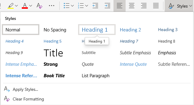
Use built-in headings and styles
Headings are meant to be scanned, both visually and with assistive technology. Ideally, headings explain what a document section is about. Use the built-in heading styles and create descriptive heading texts to make it easier for screen reader users to determine the structure of the document and navigate the headings.
Organize headings in the prescribed logical order and do not skip heading levels. For example, use Heading 1, Heading 2, and then Heading 3, rather than Heading 3, Heading 1, and then Heading 2. Organize the information in your document into small chunks. Ideally, each heading would include only a few paragraphs.
For the step-by-step instructions on how to use the headings and styles, go to Improve accessibility with heading styles.
Create paragraph banners
In addition to using headings to organize the content in your document, you can also create paragraph banners. In a paragraph banner, the background color block extends across the width of the document and highlights the text within the banner. This is a great alternative to tables to organize and separate content.
For instructions on how to create paragraph banners, go to Apply shading to words or paragraphs.
Add alt text to visuals
Alt text helps people who can't see the screen to understand what's important in visual content. Visual content includes pictures, SmartArt graphics, shapes, groups, charts, embedded objects, ink, and videos. In alt text, briefly describe the image and mention its intent. Screen readers read the text to describe the image to users who can't see the image.
Avoid using text in images as the sole method of conveying important information. If you must use an image with text in it, repeat that text in the document. In alt text, briefly describe the image and mention the existence of the text and its intent.
Tip: To write a good alt text, make sure to convey the content and the purpose of the image in a concise and unambiguous manner. The alt text shouldn't be longer than a short sentence or two—most of the time a few thoughtfully selected words will do. Do not repeat the surrounding textual content as alt text or use phrases referring to images, such as, "a graphic of" or "an image of." For more info on how to write alt text, go to Everything you need to know to write effective alt text.
For the step-by-step instructions on how to add alt text, go to Add alternative text to a shape, picture, chart, SmartArt graphic, or other object.
To find missing alt text, use the Accessibility Checker.
Notes:
-
For audio and video content, in addition to alt text, include closed captioning for people who are deaf or hard of hearing.
-
Instead of grouping objects in a diagram, flatten the diagram into a picture and add alt text to the picture. If you group the objects, the child objects are still in the tab order with groups.
Add accessible hyperlink text and ScreenTips
People who use screen readers sometimes scan a list of links. Links should convey clear and accurate information about the destination. For example, avoid using link texts such as "Click here," "See this page," Go here," or "Learn more." Instead include the full title of the destination page. You can also add ScreenTips that appear when your cursor hovers over text or images that include a hyperlink.
Tip: If the title on the hyperlink's destination page gives an accurate summary of what's on the page, use it for the hyperlink text. For example, this hyperlink text matches the title on the destination page: Create more with Microsoft templates.
For the step-by-step instructions on how to create accessible hyperlinks and ScreenTips, go to Create accessible links in Word and Create or edit a hyperlink.
Use accessible font format and color
An accessible font doesn't exclude or slow down the reading speed of anyone reading a document, including people with low vision or reading disability or people who are blind. The right font improves the legibility and readability of the document.
For instructions on how to change the default font, go to Change the default font in Word.
Use accessible font format
Here are some ideas to consider:
-
To reduce the reading load, select familiar sans serif fonts such as Arial or Calibri. Avoid using all capital letters and excessive italics or underlines.
-
A person with a vision disability might miss out on the meaning conveyed by particular colors. For example, add an underline to color-coded hyperlink text so that people who are colorblind know that the text is linked even if they can't see the color.
-
For headings, consider adding bold or using a larger font.
-
Add shapes if color is used to indicate status. For example, add a checkmark symbol
 if green is used to indicate "pass" and an uppercase X
  if red indicates "fail."
Note: These resources provide other suggestions: usability.gov and Web Accessibility for Users with Color Blindness.
Use accessible font color
The text in your document should be readable in a high contrast mode. For example, use bright colors or high-contrast color schemes on opposite ends of the color spectrum. White and black schemes make it easier for people who are colorblind to distinguish text and shapes.
Here are some ideas to consider:
-
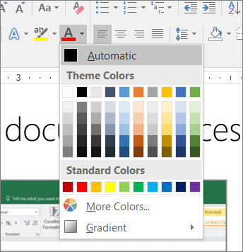
To ensure that text displays well in a high contrast mode, use the Automatic setting for font colors. For instructions on how to change the font color in Word, go to Change the font color.
-
Use the Accessibility Checker to analyze the document and find insufficient color contrast. The tool now checks the documents for text color against page color, table cell backgrounds, highlight, textbox fill color, paragraph shading, shape and SmartArt fills, headers and footers, and links.
-
Use the Colour Contrast Analyser, a free app that analyzes colors and contrast, and displays results almost immediately.
Create accessible lists
To make it easier for screen readers to read your document, organize the information in your document into small chunks such as bulleted or numbered lists.
Design lists so that you do not need to add a plain paragraph without a bullet or number to the middle of a list. If your list is broken up by a plain paragraph, some screen readers might announce the number of list items wrong. Also, the user might hear in the middle of the list that they are leaving the list.
For the step-by-step instructions on how to create lists, go to Create a bulleted or numbered list.
Adjust space between sentences and paragraphs
People who have dyslexia describe seeing text "swim together" on a page (the compressing of one line of text into the line below). They often see text merge or distort. To reduce the reading load, you can increase white space between sentences and paragraphs.
For the step-by-step instructions on adjust the spacing, go to Adjust indents and spacing in Word.
Test accessibility with Immersive Reader
Try reading the document with Immersive Reader to check how it sounds like.
-
In your document, select View > Immersive Reader.
-
On the Immersive Reader tab, select Read Aloud.
-
To exit Immersive Reader, select Close Immersive Reader.
See also
Mac: Best practices for making Word documents accessible
The following table includes key best practices for creating Word documents that are accessible to people with disabilities.
| What to fix | How to find it | Why fix it | How to fix it |
|---|---|---|---|
| Include alternative text with all visuals. Visual content includes pictures, SmartArt graphics, shapes, groups, charts, embedded objects, ink, and videos. | To find missing alternative text, use the Accessibility Checker. | Alt text helps people who can't see the screen to understand what's important in images and other visuals. Avoid using text in images as the sole method of conveying important information. If you must use an image with text in it, repeat that text in the document. In alt text, briefly describe the image and mention the existence of the text and its intent. | |
| Add meaningful hyperlink text and ScreenTips. | To determine whether hyperlink text makes sense as standalone information and whether it gives readers accurate information about the destination target, visually scan your document. | People who use screen readers sometimes scan a list of links. Links should convey clear and accurate information about the destination. For example, instead of linking to the text Click here, include the full title of the destination page. Tip: You can also add ScreenTips that appear when your cursor hovers over text or images that include a hyperlink. | |
| Ensure that color is not the only means of conveying information. | To find instances of color-coding, visually scan your document. | People who are blind, have low vision, or are colorblind might miss out on the meaning conveyed by particular colors. | |
| Use sufficient contrast for text and background colors. | To find insufficient color contrast, use the Accessibility Checker. You can also look for text in your document that's hard to read or to distinguish from the background. | If your document has a high level of contrast between text and background, more people can see and use the content. | |
| Use built-in headings and styles. | To check that the order of headings is logical, visually scan your document's table of contents. You can also click on each heading and apply a built-in heading style to it. | To preserve tab order and to make it easier for screen readers to read your documents, use a logical heading order and the built-in formatting tools in Word. For example, organize headings in the prescribed logical order. Use Heading 1, Heading 2, and then Heading 3, rather than Heading 3, Heading 1, and then Heading 2. And organize the information in your documents into small chunks. Ideally, each heading is followed by only a few paragraphs. | |
| Use a simple table structure for data only, and specify column header information. | To ensure that tables don't contain split cells, merged cells, or nested tables. You can also visually scan your tables to check that they don't have any completely blank rows or columns. | Screen readers keep track of their location in a table by counting table cells. If a table is nested within another table or if a cell is merged or split, the screen reader loses count and can't provide helpful information about the table after that point. Blank cells in a table could also mislead someone using a screen reader into thinking that there is nothing more in the table. Screen readers also use header information to identify rows and columns. |
Add alt text to visuals in Microsoft 365
The following procedures describe how to add alt text to visuals in your Word documents in Microsoft 365:
Notes:
-
For audio and video content, in addition to alt text, include closed captioning for people who are deaf or have limited hearing.
-
To enable right-click on your Mac, make sure that the Secondary click option is selected in System Preferences.
Tip: To write a good alt text, make sure to convey the content and the purpose of the image in a concise and unambiguous manner. The alt text shouldn't be longer than a short sentence or two—most of the time a few thoughtfully selected words will do. Do not repeat the surrounding textual content as alt text or use phrases referring to images, such as, "a graphic of" or "an image of."
Add alt text to images
Add alt text to images, such as pictures, screenshots, icons, videos, and 3D models, so that screen readers can read the description to users who can't see the image.
-
Do one of the following:
-
Select an image and press the Alt Text button in the Picture Format ribbon tab.
-
Right-click an image and select Edit Alt Text.

The Alt Text pane opens on the right side of the document body.
-
-
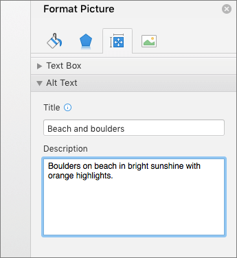
Type 1 - 2 sentences to describe the image content and context.
Tip: To spell check and correct a word you typed, just right-click the word and select from the suggested alternatives.
Add alt text to shapes or SmartArt graphics
-
Do one of the following:
-
Select a shape or SmartArt graphic and press the Alt Text button in the Shape Format ribbon tab.
-
Right-click a shape or SmartArt graphic and select Edit Alt Text.
The Alt Text pane opens on the right side of the document body.
-
-
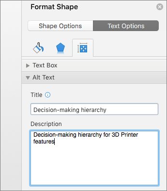
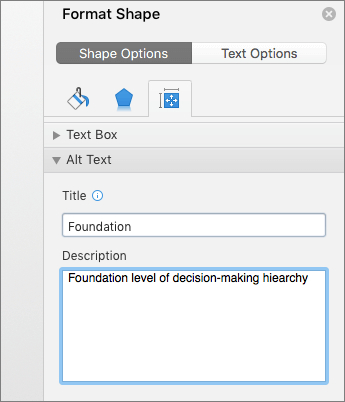
Type 1-2 sentences to describe the contents and the context of the shape or SmartArt graphic.

Tip: To spell check and correct a word you typed, just right-click the word and select from the suggested alternatives.
Add alt text to charts
-
Do one of the following:
-
Select a chart and press the Alt Text button in the Format ribbon tab.
-
Right-click a chart and select Edit Alt Text.
Tip: To open the correct menu, right-click in Chart Area, that is, somewhere inside the frame that surrounds the entire chart, not inside one of its parts.
-
-
Type 1-2 sentences to describe the contents and the context of the chart.
Tip: To spell check and correct a word you typed, just right-click the word and select from the suggested alternatives.
Make visuals decorative
Decorative objects add visual interest but aren't informative (for example, stylistic borders). People using screen readers will hear these are decorative so they know they aren't missing any important information.
-
Right-click a visual.
-
Select Edit Alt Text. The Alt Text pane opens on the right side of the document body.
-
Select the Mark as decorative check box. The text entry field is grayed out.
Tip: If you export your document as a PDF, any visuals you have marked as decorative are preserved by tagging them as artifacts.
Add alt text to visuals in Office 2016
The following procedures describe how to add alt text to visuals in your Word documents.
Note: For audio and video content, in addition to alt text, include closed captioning for people who are deaf or have limited hearing.
Add alt text to images
Add alt text to images, such as pictures and screenshots, so that screen readers can read the text to describe the image to users who can't see the image.
-
Right-click an image.
-
Select Format Picture > Layout & Properties.
-
Select Alt Text.
-
Type a description and a title.
Tip: Include the most important information in the first line, and be as concise as possible.
Add alt text to SmartArt graphics
-
Right-click a SmartArt graphic.
-
Select Format SmartArt > Shape Options > Layout & Properties.
-
Select Alt Text.
-
Type a description and a title.
Tip: Include the most important information in the first line, and be as concise as possible.
Add alt text to shapes
Add alt text to shapes, including shapes within a SmartArt graphic.
-
Right-click a shape.
-
Select Format Shape > Shape Options > Layout & Properties.
-
Select Alt Text.
-
Type a description and a title.
Tip: Include the most important information in the first line, and be as concise as possible.
Add alt text to charts
-
Right-click a chart.
-
Select Format Chart Area > Chart Options > Layout & Properties.
-
Select Alt Text.
-
Type a description and a title.
Tip: Include the most important information in the first line, and be as concise as possible.

Make hyperlinks, text, and tables accessible
The following procedures describe how to make the hyperlinks, text, and tables in your Word documents accessible.
Add hyperlink text and ScreenTips
-
Select the text to which you want to add the hyperlink, and then right-click.
-
Select Hyperlink.
The text you selected displays in the Text to Display box. This is the hyperlink text.
-
If necessary, change the hyperlink text.
-
In the Address box, type the destination URL.
-
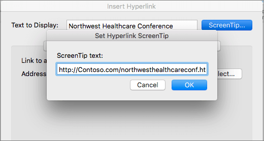
Select the ScreenTip button and, in the ScreenTip text box, type a ScreenTip.
Tip: If the title on the hyperlink's destination page gives an accurate summary of what's on the page, use it for the hyperlink text. For example, this hyperlink text matches the title on the destination page: Templates and Themes for Office Online.
Apply built-in heading styles
-
Select the heading text.
-
On the Home tab, select a heading style, for example, Heading 1 or Heading 2.

Use bulleted lists
-
Position the cursor anywhere in your document.
-
Select the Home tab.
-
In the Paragraph group, select the Bullets button.
-
Type each bullet item in the bulleted list.

Use ordered lists
-
Position the cursor anywhere in your document.
-
Select the Home tab.
-
Select the Numbering button.
-
Type the sequential steps.

Use accessible text color
Here are some ideas to consider:
-
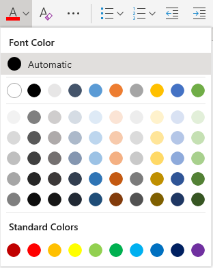
Ensure that text displays well by using the Automatic setting for font colors. Select your text, and then select Home > Font Color > Automatic.
-
Use the Accessibility Checker, to analyze the document and find insufficient color contrast. The tool now checks the documents for text color against page color, table cell backgrounds, highlight, textbox fill color, paragraph shading, shape and SmartArt fills, headers and footers, and links.
-
Use the Colour Contrast Analyzer, a free app that analyzes colors and contrast, and displays results almost immediately.
Use accessible text format
Here are some ideas to consider:
-
Add an underline to color-coded hyperlink text. That can help colorblind people know the text is linked even if they can't see the color.
-
Add shapes if color is used to indicate status. For example, add a checkmark symbol
if green is used to indicate "pass" and an uppercase X if red indicates "fail".
Note: These resources provide other suggestions: usability.gov and Web Accessibility for Users with Color Blindness.
Use text spacing
Increase or decrease white space between sentences and paragraphs.
-
Select your text.
-
Select the Home tab.
-
Select Line and Paragraph Spacing > Line Spacing Options.
The Paragraph dialog opens, showing the Indents and Spacing tab.
-
Under Spacing, select the spacing options you want.

Use table headers
-
Position the cursor anywhere in a table.
-
On the Table Design tab, select the Header Row check box.
-
Type the column headings.

See also
iOS: Best practices for making Word documents accessible
The following table includes key best practices for creating Word documents that are accessible to people with disabilities.
| What to fix | Why fix it | How to fix it |
| Add meaningful hyperlink text. | People who use screen readers sometimes scan a list of links. Links should convey clear and accurate information about the destination. For example, instead of linking to the text Click here, include the full title of the destination page. | |
| Ensure that color is not the only means of conveying information. | People who are blind, have low vision, or are colorblind might miss out on the meaning conveyed by particular colors. | |
| Use sufficient contrast for text and background colors. | If your document has a high level of contrast between text and background, more people can see and use the content. | |
| Use a larger font size (11pt or larger), sans serif fonts, and sufficient white space. | People who have dyslexia describe seeing text "swim together" on a page (the compressing of one line of text into the line below). They often see text merge or distort. For people who have dyslexia or have low vision, reduce the reading load. For example, they may benefit from familiar sans serif fonts, such as Arial or Calibri. Avoid using all capital letters, and excessive italics or underlines. Include ample white space between sentences and paragraphs. | |
| Use built-in headings and styles. | To preserve tab order and to make it easier for screen readers to read your documents, use a logical heading order and the built-in formatting tools in Word. For example, organize headings in the prescribed logical order. Use Heading 1, Heading 2, and then Heading 3, rather than Heading 3, Heading 1, and then Heading 2. And, organize the information in your documents into small chunks. Ideally, each heading would include only a few paragraphs. | |
| Use a simple table structure for data only, and specify column header information. | Screen readers keep track of their location in a table by counting table cells. If a table is nested within another table or if a cell is merged or split, the screen reader loses count and can't provide helpful information about the table after that point. Blank cells in a table could also mislead someone using a screen reader into thinking that there is nothing more in the table. Screen readers also use header information to identify rows and columns. |
Make hyperlinks, text, and tables accessible
The following procedures describe how to make the hyperlinks, text, and tables in your Word documents accessible.
Add hyperlink text
-
Select the text to which you want to add the hyperlink.
-
To open the Home tab, at the bottom of the screen, at the end of the toolbar, tap the More button.
-
Tap Home > Insert.
-
Tap the Link command.
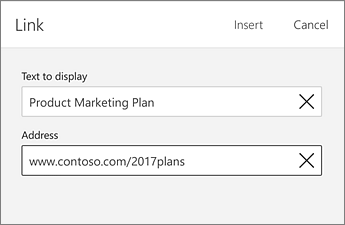
-
The text you selected is shown in the DISPLAY box. This is the hyperlink text. If necessary, change it.
-
To add a hyperlink, in the ADDRESS box, type the URL.
-
At the top of the screen, tap Done.
Tip: If the title on the hyperlink's destination page gives an accurate summary of what's on the page, use it for the hyperlink text. For example, this hyperlink text matches the title on the destination page: Templates and Themes for Office Online.

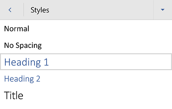
Apply built-in heading styles
-
Select the text.
-
To open the Home tab, at the bottom of the screen, at the end of the toolbar, tap the More button.
-
Tap the Styles command.
-
Tap a heading style, such as Heading 1.
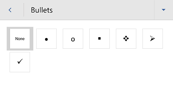
Use bulleted lists
-
Position the cursor anywhere in your document.
-
To open the Home tab, at the bottom of the screen, at the end of the toolbar, tap the More button.
-
Tap the Bullets command.
-
Tap the bullet option you want.
-
Type each bullet item in the bulleted list.
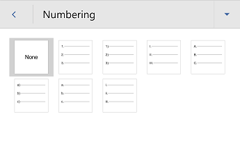
Use ordered lists
-
Position the cursor anywhere in your document.
-
To open the Home tab, at the bottom of the screen, at the end of the toolbar, tap the More button.
-
Tap the Numbering command.
-
Tap the numbering option you want.
-
Type the sequential steps.
Use accessible text color
Here are some ideas to consider:
-
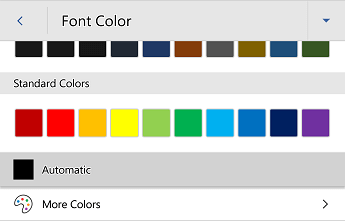
Ensure that text displays well by using the Automatic setting for font colors. Select your text, and then select Home > Font Color > Automatic.
-
Use the Colour Contrast Analyzer, a free app that analyzes colors and contrast, and displays results almost immediately.
Use accessible text format
Here are some ideas to consider:
-
Add an underline to color-coded hyperlink text. That can help colorblind people know the text is linked even if they can't see the color.
-
Add shapes if color is used to indicate status. For example, add a checkmark symbol
if green is used to indicate "pass" and an uppercase X if red indicates "fail".
Note: These resources provide other suggestions: usability.gov and Web Accessibility for Users with Color Blindness.
Use text spacing
Increase or decrease white space between sentences and paragraphs:
-
Select your text.
-
To open the Home tab, at the bottom of the screen, at the end of the toolbar, tap the More button.
-
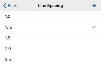
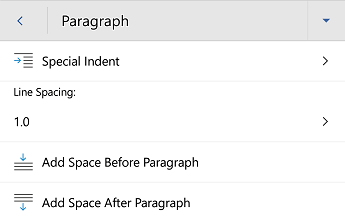
Tap Paragraph Formatting > Line spacing.
-
Tap the spacing option you want.
Use table headers
-
Position the cursor anywhere in a table.
-
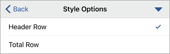
Tap Home > Insert > Table.
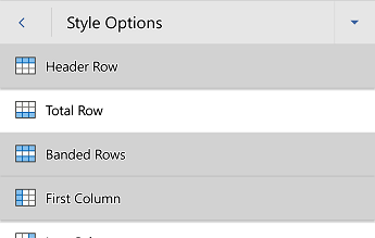
-
Tap the Style Options command.
-
To select the Header Row option, tap it.
-
In your table, type the column headings.
See also
Android: Best practices for making Word documents accessible
The following table includes key best practices for creating Word documents that are accessible to people with disabilities.
| What to fix | Why fix it | How to fix it |
| Include alternative text with all visuals and tables. Visual content includes pictures, SmartArt graphics, shapes, groups, charts, embedded objects, ink, and videos. | Alt text helps people who can't see the screen to understand what's important in images and other visuals. Avoid using text in images as the sole method of conveying important information. If you must use an image with text in it, repeat that text in the document. In alt text, briefly describe the image and mention the existence of the text and its intent. | |
| Add meaningful hyperlink text. | People who use screen readers sometimes scan a list of links. Links should convey clear and accurate information about the destination. For example, instead of linking to the text Click here, include the full title of the destination page. | |
| Ensure that color is not the only means of conveying information. | People who are blind, have low vision, or are colorblind might miss out on the meaning conveyed by particular colors. | |
| Use sufficient contrast for text and background colors. | If your document has a high level of contrast between text and background, more people can see and use the content. | |
| Use a larger font size (18pt or larger), sans serif fonts, and sufficient white space. | People who have dyslexia describe seeing text "swim together" on a page (the compressing of one line of text into the line below). They often see text merge or distort. For people who have dyslexia or have low vision, reduce the reading load. For example, they may benefit from familiar sans serif fonts, such as Arial or Calibri. Avoid using all capital letters, and excessive italics or underlines. Include ample white space between sentences and paragraphs. | |
| Use built-in headings and styles. | To preserve tab order and to make it easier for screen readers to read your documents, use a logical heading order and the built-in formatting tools in Word. For example, organize headings in the prescribed logical order. Use Heading 1, Heading 2, and then Heading 3, rather than Heading 3, Heading 1, and then Heading 2. And, organize the information in your documents into small chunks. Ideally, each heading would include only a few paragraphs. | |
| Use a simple table structure for data only, and specify column header information. | Screen readers keep track of their location in a table by counting table cells. If a table is nested within another table or if a cell is merged or split, the screen reader loses count and can't provide helpful information about the table after that point. Blank cells in a table could also mislead someone using a screen reader into thinking that there is nothing more in the table. Screen readers also use header information to identify rows and columns. |
Add alt text to visuals and tables
The following procedures describe how to add alt text to visuals and tables in your Word documents.
Note: For audio and video content, in addition to alt text, include closed captioning for people who are deaf or have limited hearing.
Add alt text to images
Add alt text to images such as pictures and screenshots so that screen readers can read the text to describe the image to users who can't see the image.
-
Select an image.
-
To open the Picture tab, at the bottom of the screen, at the right end of the toolbar, tap the More
 button.
 -
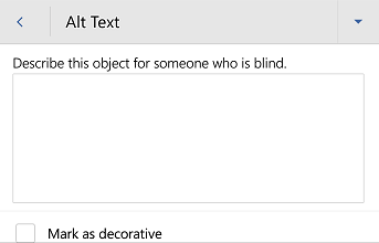
Scroll down to the Alt Text option, and then tap it.
-
Type a description. Your changes are automatically saved.
Tip: Include the most important information in the first line, and be as concise as possible.
Add alt text to shapes
Add alt text to shapes including shapes within a SmartArt graphic.
-
Select a shape.
-
To open the Shape tab, at the bottom of the screen, at the right end of the toolbar, tap the More
button. -
Scroll down to the Alt Text option, and then tap it.
-
Type a description. Your changes are automatically saved.
Tip: Include the most important information in the first line, and be as concise as possible.
Add alt text to tables
-
Tap anywhere within a table.
-
To open the Table tab, at the bottom of the screen, at the right end of the toolbar, tap the More
button. -
Scroll down to the Alt Text option, and then tap it.
-
Type a description. Your changes are automatically saved.
Tip: Include the most important information in the first line, and be as concise as possible.
Make hyperlinks, text, and tables accessible
The following procedures describe how to make the hyperlinks, text, and tables in your Word documents accessible.
Add hyperlink text
-
Select the text to which you want to add the hyperlink.
-
To open the Home tab, at the bottom of the screen, at the right end of the toolbar, tap the More
button. -
Tap Home > Insert.
-
Scroll down to the Link option, tap it, and tap Insert Link.
-
The text you selected displays in the Text to display box. This is the hyperlink text. If necessary, change it.
-
To add a hyperlink, in the Address box, type the URL.
-
At the top of the screen, tap Apply.
Tip: If the title on the hyperlink's destination page gives an accurate summary of what's on the page, use it for the hyperlink text. For example, this hyperlink text matches the title on the destination page: Templates and Themes for Office Online.
Apply built-in heading styles
-
Select the text.
-
To open the Home tab, at the bottom of the screen, at the right end of the toolbar, tap the More
button. -
Scroll down to the Styles option, and then tap it.
-
Tap a heading style, such as Heading 1.
Use bulleted lists
-
Position the cursor anywhere in your document.
-
To open the Home tab, at the bottom of the screen, at the right end of the toolbar, tap the More
button. -
Scroll down to the Bullets option, and then tap it.
-
Tap the bullet option you want.
-
Type each bullet item in the bulleted list.
Use ordered lists
-
Position the cursor anywhere in your document.
-
To open the Home tab, at the bottom of the screen, at the right end of the toolbar, tap the More
button. -
Scroll down to the Numbering option, and then tap it.
-
Tap the numbering option you want.
-
Type each item in the numbered list.
Use accessible text color
Here are some ideas to consider:
-
Ensure that text displays well by using the Automatic setting for font colors. Select your text, and then select Home > Font Color > Automatic.
-
Use the Colour Contrast Analyzer, a free app that analyzes colors and contrast, and displays results almost immediately.
Use accessible text format
Here are some ideas to consider:
-
Add an underline to color-coded hyperlink text. That can help colorblind people know the text is linked even if they can't see the color.
-
Add shapes if color is used to indicate status. For example, add a checkmark symbol
if green is used to indicate "pass" and an uppercase X if red indicates "fail".
Note: These resources provide other suggestions: usability.gov and Web Accessibility for Users with Color Blindness.
Use text spacing
Increase or decrease white space between sentences and paragraphs.
-
Select your text.
-
To open the Home tab, at the bottom of the screen, at the right end of the toolbar, tap the More
button. -
Scroll down to the Paragraph Formatting option, and then tap it.
-
Tap the spacing option you want.
Use table headers
-
Position the cursor anywhere in a table.
-
To open the Table tab, at the bottom of the screen, at the right end of the toolbar, tap the More
button. -
Scroll down to the Style Options option, and then tap it.
-
To select the Header Row option, tap it.
Tip: When an option is selected, it's grayed.
-
In your table, type each column heading.
See also
Office Online: Best practices for making Word for the web documents accessible
The following table includes key best practices for creating Word for the web documents that are accessible to people with disabilities.
| What to fix | How to find it | Why fix it | How to fix it |
|---|---|---|---|
| Include alternative text with images and tables. | Use the Accessibility Checker to find missing alternative text. | Alt text helps people who can't see the screen to understand what's important in images and other visuals. Avoid using text in images as the sole method of conveying important information. If you must use an image with text in it, repeat that text in the document. In alt text, briefly describe the image and mention the existence of the text and its intent. | |
| Add meaningful hyperlink text. | To determine whether hyperlink text makes sense as standalone information and whether it gives readers accurate information about the destination target, visually scan your document. | People who use screen readers sometimes scan a list of links. Links should convey clear and accurate information about the destination. For example, instead of linking to the text Click here, include the full title of the destination page. | |
| Ensure that color is not the only means of conveying information. | To find instances of color-coding, visually scan your document. | People who are blind, have low vision, or are colorblind might miss out on the meaning conveyed by particular colors. | |
| Use sufficient contrast for text and background colors. | To find insufficient color contrast, look for text in your document that's hard to read or to distinguish from the background. | If your document has a high level of contrast between text and background, more people can see and use the content. | |
| Use built-in headings and styles. | To find headings not using built-in styles, visually scan your document for text formatted to look like a heading. Select this text, and then look in the Home tab of the ribbon to check if a heading style has been used. | To preserve tab order and to make it easier for screen readers to read your documents, use a logical heading order and the built-in formatting tools in Word for the web. For example, organize headings in the prescribed logical order. Use Heading 1, Heading 2, and then Heading 3, rather than Heading 3, Heading 1, and then Heading 2. And, organize the information in your documents into small chunks. Ideally, each heading would include only a few paragraphs. | |
| Use a simple table structure for data only, and specify column header information. | Use the Accessibility Checker to ensure that tables don't contain split cells, merged cells, or nested tables. You can also visually scan your tables to check that they don't have any completely blank rows or columns. | Screen readers keep track of their location in a table by counting table cells. If a table is nested within another table or if a cell is merged or split, the screen reader loses count and can't provide helpful information about the table after that point. Blank rows and columns in a table could also mislead someone using a screen reader into thinking that there is nothing more in the table. Screen readers also use header information to identify rows and columns. |
Add alt text to images and tables
The following procedures describe how to add alt text to images and tables in your Word for the web documents.
Note: We recommend only putting text in the Description field and leaving the Title blank. This will provide the best experience with most major screen readers including Narrator. For audio and video content, in addition to alt text, include closed captioning for people who are deaf or have limited hearing.
Add alt text to images
Add alt text to images, such as pictures and screenshots, so that screen readers can read the text to describe the image to users who can't see the image.
-
Select an image.
-
Select Picture > Alt Text. The Format Picture pane opens to the right of the screen.
-
Type your alt text in the Description box.
Tip: Include the most important information in the first line, and be as concise as possible.

Add alt text to tables
-
Position the cursor anywhere in a table.
-
Select Table > Alt Text. The Alternative Text dialog box opens. You may need to select the ... button to see the Alt Text option.
-
Type your alt text in the Description box, and select OK.
Tip: Include the most important information in the first line, and be as concise as possible.

Make hyperlinks, text, and tables accessible
The following procedures describe how to make the hyperlinks, text, and tables in your Word for the web documents accessible.
Add hyperlink text
-
Select the text to which you want to add the hyperlink, and then right-click.
-
Select Link. The text you selected displays in the Display text box. This is the hyperlink text.
-
If necessary, change the hyperlink text.
-
In the Address box, enter the destination address for the hyperlink, and select Insert.
Tip: If the title on the hyperlink's destination page gives an accurate summary of what's on the page, use it for the hyperlink text. For example, this hyperlink text matches the title on the destination page: Templates and Themes for Office Online.

Use accessible text color
Here are some ideas to consider:
-
Ensure that text displays well by using the Automatic setting for font colors. Select your text, and then select Home >
(Font Color) > Automatic.
-
Use the Colour Contrast Analyzer, a free app that analyzes colors and contrast, and displays results almost immediately.
Use accessible text format
Here are some ideas to consider:
-
Add an underline to color-coded hyperlink text. That can help colorblind people know the text is linked even if they can't see the color.
-
Add shapes if color is used to indicate status. For example, add a checkmark symbol
if green is used to indicate "pass" and an uppercase X if red indicates "fail".
Note: These resources provide other suggestions: usability.gov and Web Accessibility for Users with Color Blindness.
Apply built-in heading styles
-
Select the heading text and then select the Home tab.
-
Select the Styles button and then select a heading style, for example, Heading 1 or Heading 2.
Use bulleted lists
-
Position the cursor anywhere in your document.
-
Select the Home tab.
-
Select the
(Bullets) button and then select the style of bullet you want to use.
-
Type each bullet item in the bulleted list.
Use ordered lists
-
Position the cursor anywhere in your document.
-
Select the Home tab.
-
Select the
(Numbering) button and then select the style of list you want to use.
-
Type the sequential steps.
Use text spacing
Increase or decrease white space between sentences and paragraphs.
-
Select your text.
-
Select the Home tab.
-
In the Paragraph group, in the lower-right corner of the group, select the Dialog box launcher button.
The Paragraph dialog box opens, showing the General, Indentation and Spacing options.
-
Under Spacing, select the spacing options you want, and select OK.


Use table headers
-
Position the cursor anywhere in a table.
-
Select Table Design > Header Row.
-
Type your column headings.

See also
Technical support for customers with disabilities
Microsoft wants to provide the best possible experience for all our customers. If you have a disability or questions related to accessibility, please contact the Microsoft Disability Answer Desk for technical assistance. The Disability Answer Desk support team is trained in using many popular assistive technologies and can offer assistance in English, Spanish, French, and American Sign Language. Please go to the Microsoft Disability Answer Desk site to find out the contact details for your region.
If you are a government, commercial, or enterprise user, please contact the enterprise Disability Answer Desk.
No comments:
Post a Comment