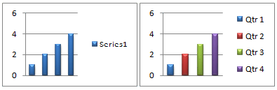
When you create a single-series chart, all data markers that represent the data points in that data series are displayed in the same color. To use different colors for each data marker, you can vary the colors automatically by using the Vary colors by point or Vary colors by slice option.
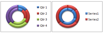
By default, the colors of slices in pie charts and doughnut charts are varied, but you can turn this option off as needed. For example, you may want to display each ring in a doughnut chart in a single color instead of varied colors.
You can also vary colors by changing the color of each data marker manually.
Important: To successfully complete these procedures, you must have an existing chart. For more information about choosing and adding charts, see Available chart types in Office.
Automatically vary all data marker colors by point or by slice
-
In a chart, click to select the data series for which you want to change the colors.
-
On the Format tab, in the Current Selection group, click Format Selection.
-
In the Format Data Series pane, click the Fill & Line
 tab, expand Fill, and then do one of the following:
-
To vary the colors of data markers in a single-series chart, select the Vary colors by point check box.
-
To display all data points of a data series in the same color on a pie chart or donut chart, clear the Vary colors by slice check box.
-
Vary individual data marker colors manually
-
On a chart, select the individual data marker that you want to change.
-
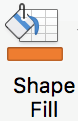
On the Format tab, in the Shape Styles group, click Shape Fill.

-
Do one of the following:
-
To use a different fill color, under Theme Colors or Standard Colors, click the color that you want to use.
Tip: Before you apply a different color, you can quickly preview how that color affects the chart. When you point to colors that you may want to use, the selected chart element will be displayed in that color on the chart.
-
To remove the color from the selected chart element, click No Fill.
-
To use a fill color that is not available under Theme Colors or Standard Colors, click More Fill Colors. In the Colors dialog box, select the color that you want to use on the Standard or Custom tab, and then click OK.
Custom fill colors that you create are added under Recent Colors so that you can use them again.
-
To fill the shape with a picture, click Picture. In the Insert Picture dialog box, browse for and select the picture that you want to use, and then click Insert.
-
To use a gradient effect for the selected fill color, point to Gradient, and then click the gradient style that you want to use.
-
To use a texture fill, point to Texture, and then click the texture that you want to use.
-
-
Repeat these steps for every data marker that you want to change.
Tip: For more information about how to change the look of chart elements, see Change the color or style of a chart in Office.
Important: To successfully complete these procedures, you must have an existing chart. For more information about choosing and adding charts, see Available chart types in Office.
Automatically vary all data marker colors by point or by slice
-
In a chart, click to select the data series for which you want to change the colors.
-
Click the Format tab and click the series from the Chart elements dropdown list, and then click Format Pane on the ribbon .
-
In the Format Data Series pane, click the Fill & Line
tab, expand Fill, and then do one of the following depending on your chart type:-
To vary the colors of data markers in a single-series chart, select the Vary colors by point check box.
-
To display all data points of a data series in the same color on a pie chart or donut chart, clear the Vary colors by slice check box.
-
Vary individual data marker colors manually
-
On the chart, select the individual data marker that you want to change.
-
On the Format tab, click Shape Fill.
-
Do one of the following:
-
To use a different fill color, under Theme Colors or Standard Colors, click the color that you want to use.
Tip: Before you apply a different color, you can quickly preview how that color affects the chart. When you point to colors that you may want to use, the selected chart element will be displayed in that color on the chart.
-
To remove the color from the selected chart element, click No Fill.
-
To use a fill color that is not available under Theme Colors or Standard Colors, click More Fill Colors. In the Colors dialog box, use the available options to create a custom fill color, and then click OK.
Custom fill colors that you create are added under Recent Colors so that you can use them again.
-
To fill the shape with a picture, click Picture. In the Insert Picture dialog box, click the picture that you want to use, and then click Insert.
-
To use a gradient effect for the selected fill color, point to Gradient, and then click the gradient style that you want to use.
-
To use a texture fill, point to Texture, and then click the texture that you want to use.
-
-
Repeat these steps for every data marker that you want to change.
Tip: For more information about how to change the look of chart elements, see Change the format of chart elements.
No comments:
Post a Comment