Guidelines and examples for sorting and filtering data by color
Sorting and filtering data by color is a great way to make data analysis easier and help the users of your worksheet see the highlights and data trends at a quick glance.

In this article
Overview of sorting and filtering data by color and icon set
Sorting and filtering data, along with conditionally formatting data, are integral parts of data analysis and can help you answer questions such as the following:
-
Who has sold more than $50,000 worth of services this month?
-
Which products have greater than 10% revenue increases from year to year?
-
Who are the highest performing and lowest performing students in the freshman class?
-
Where are the exceptions in a summary of profits over the past five years?
-
What is the overall age distribution of employees?
You sort data to quickly organize your data and to find the data that you want. You filter data to display only the rows that meet criteria that you specify and hide rows that you do not want displayed, for one or more columns of data. You conditionally format data to help you visually explore and analyze data, detect critical issues, and identify patterns and trends. Together, sorting, filtering, and conditionally formatting data can help you and other people who use your spreadsheet make more effective decisions based on your data.
You can sort and filter by format, including cell color and font color, whether you have manually or conditionally formatted the cells.
This picture shows filtering and sorting based on color or icon on the Category, M/M Δ%, and Markup columns.

You can also sort and filter by using an icon set that you created through a conditional format. Use an icon set to annotate and classify data into three to five categories that are separated by a threshold value. Each icon represents a range of values. For example in the following table of icon sets, 3 Arrows icon set, the green arrow that points upward represents higher values, the yellow sideways arrow represents middle values, and the red arrow that points downward represents lower values.
Table of icon sets
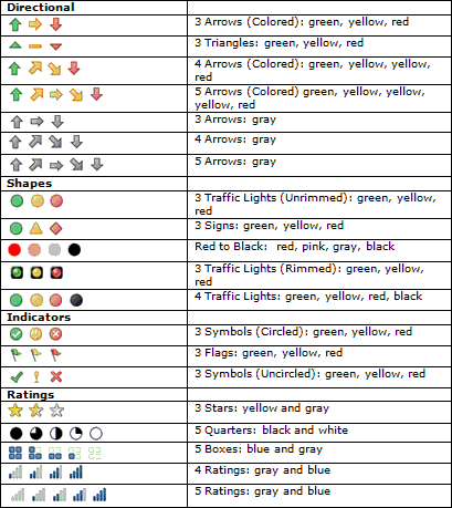
You can format cells by using a two-color scale, three-color scale, data bars, and icon sets; format cells that contain specific text, number, date or time values, top or bottom ranked values, above or below average, unique, or duplicate values; and create many rules and manage rules more easily.
Using color effectively when analyzing data
Almost everyone likes colors. The effective use of color in any document can dramatically improve the document's attractiveness and readability. Good use of color and icons in your Excel reports improves decision making by helping to focus users' attention on critical information and by helping users visually understand results. Good use of colors can provide a positive emotional feeling right from the start. On the other hand, bad use of color can distract users, and even cause fatigue if over-used. The following sections provide guidelines to help you make good use of colors, and to avoid bad use of colors.
More about document themes With Excel, it is easy to create consistent themes, and add custom styles and effects. Much of the thought that is required to combine colors effectively has already been done for you by the use of predefined document themes that use attractive color schemes. You can quickly and easily format an entire document to give it a professional and modern look by applying a document theme. A document theme is a set of formatting choices that includes a set of theme colors, a set of theme fonts (including heading and body text fonts), and a set of theme effects (including lines and fill effects).
Use standard colors and limit the number of colors
When you sort and filter by color, you might choose colors that you prefer, and the results may look good to you. But, a critical question that needs to be asked is, "Do your users prefer and see the same colors?" Your computer is capable of displaying 16,777,216 colors in 24-bit color mode. However, most users can distinguish only a tiny fraction of these colors. Furthermore, color quality can vary on computers. Room lighting, paper quality, screen and printer resolution, and browser settings can all be different. Up to 10% of the population has some difficulty distinguishing and seeing some colors. These are important variables that you probably don't have control over.
But you do have control over such variables as color choice, the number of colors, and the worksheet or cell background. By making good choices based on fundamental research, you can help make your colors communicate the correct message and interpretation of your data. You can also supplement colors with icons and legends to help ensure that users understand your intended meaning.
Consider color contrast and background
In general, use colors with a high color saturation, such as bright yellow, medium green, or dark red. Make sure that the contrast is high between the background and the foreground. For example, use a white or gray worksheet background with cell colors, or a white or gray cell color with a font color. If you must use a background color or picture, make the color or picture as light as possible so that the cell or font color is not washed out. If you are relying just on font color, consider increasing the size of the font or setting the font in bold. The larger the font, the easier it is for a user to see or distinguish the color. If necessary, adjust or remove the banding on rows or columns because the banding color might interfere with the cell or font color. All of these considerations go a long way toward helping all users correctly understand and interpret color.
Avoid using color combinations that might decrease the color visibility or confuse the viewer. You don't want to inadvertently create eye-popping art or an optical illusion. Consider using a cell border to distinguish problematic colors, such as red or green, if it is unavoidable to prevent the colors from being next to each other. Use complementary and contrasting colors to enhance contrast, and avoid using similar colors. It pays to know the basic color wheel and how to determine similar, contrasting, and complementary colors.
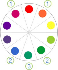
1. A similar color is one next to another color on the color wheel (for example, violet and orange are similar colors to red).
2. A contrasting color is three colors away from a color (for example, blue and green are contrasting colors to red).
3. Complementary colors are opposite each other on the color wheel (for example, blue-green is the complementary color of red).
If you have time, test out your colors, run them by a few colleagues, try them out in different lighting conditions, and experiment with different computer screen and printer settings.
Tip: If you print the document in color, double-check the cell color and cell font for readability. If the cell color is too dark, consider using a white font to improve readability.
Choosing the best colors for your needs
Need a quick summary? Use red, yellow, green, or blue, with a white or gray background.
Assign meaning to the colors that you choose based on your audience and intended purpose. If necessary, provide a legend to specifically clarify the meaning of each color. Most people can easily distinguish seven to ten colors in the same worksheet. Up to 50 colors are possible to distinguish, but would require specialized training, and is beyond the scope of this article.
The Top 10 colors
When you sort and filter data by color, use the following table to help you decide which colors to choose. These colors provide the most dramatic contrast, and, in general, are the easiest for most people to distinguish.

You can easily apply these colors to cells and fonts by using the Fill Color or Font Color buttons in the Font group on the Home tab.

Using colors that naturally convey meaning
When reading financial data, numbers are either in the red (negative) or in the black (positive). A red color conveys meaning because it is an accepted convention. If you want to highlight negative numbers, red is a top color choice. Depending on what type of data that you have, you may be able to use specific colors because they convey meaning to your audience, or perhaps there is an accepted standard for their meaning. For example:
-
If our data is about temperature readings, we can use the warm colors (red, yellow, and orange) to indicate a hotter temperature, and the cool colors (green, blue, and violet) to indicate colder temperatures.
-
If our data is about topographical data, we can use blue for water, green for vegetation, brown for desert and mountains, and white for ice and snow.
-
If our data is about traffic and safety, we can use red for stopped or halted conditions, orange for equipment danger, yellow for caution, green for safety, and blue for general information.
-
If your data is about electrical resistors, you can use the standard color code of black, brown, red, orange, yellow, green, blue, violet, gray, and white.
Walking through some examples
Suppose you are preparing a set of reports on product descriptions, pricing, and inventory levels. The following sections illustrate questions that you typically ask about this data, and how you can answer each question by using color and icon sets.
Sample Data
The following sample data is used in the examples.
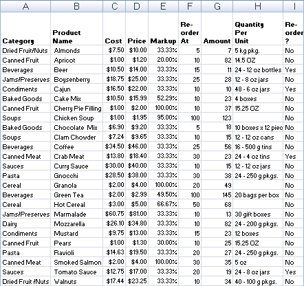
To copy the data to a blank workbook, do the following:
How to save the sample data as an .xlsx file
-
Start Microsoft Notepad.
-
Select the sample text, and then copy and paste the sample text to Notepad.
-
Save the file with a file name and extension such as Products.csv.
-
Exit Notepad.
-
Start Excel.
-
Open the file you saved from Notepad.
-
Save the file as an .xlsx file.
Sample data
Category,Product Name,Cost,Price,Markup,Reorder At,Amount,Quantity Per Unit,Reorder? Dried Fruit/Nuts,Almonds,$7.50,$10.00,"=(D2-C2)/C2",5,7,5 kg pkg.,"=IF(G2<=F2,""Yes"",""No"")" Canned Fruit,Apricot,$1.00,$1.20,"=(D3-C3)/C3",10,82,14.5 OZ,"=IF(G3<=F3,""Yes"",""No"")" Beverages,Beer,$10.50,$14.00,"=(D4-C4)/C4",15,11,24 - 12 oz bottles,"=IF(G4<=F4,""Yes"",""No"")" Jams/Preserves,Boysenberry,$18.75,$25.00,"=(D5-C5)/C5",25,28,12 - 8 oz jars,"=IF(G5<=F5,""Yes"",""No"")" Condiments,Cajun,$16.50,$22.00,"=(D6-C6)/C6",10,10,48 - 6 oz jars,"=IF(G6<=F6,""Yes"",""No"")" Baked Goods,Cake Mix,$10.50,$15.99,"=(D7-C7)/C7",10,23,4 boxes,"=IF(G7<=F7,""Yes"",""No"")" Canned Fruit,Cherry Pie Filling,$1.00,$2.00,"=(D8-C8)/C8",10,37,15.25 OZ,"=IF(G8<=F8,""Yes"",""No"")" Soups,Chicken Soup,$1.00,$1.95,"=(D9-C9)/C9",100,123,,"=IF(G9<=F9,""Yes"",""No"")" Baked Goods,Chocolate Mix,$6.90,$9.20,"=(D10-C10)/C10",5,18,10 boxes x 12 pieces,"=IF(G10<=F10,""Yes"",""No"")" Soups,Clam Chowder,$7.24,$9.65,"=(D11-C11)/C11",10,15,12 - 12 oz cans,"=IF(G11<=F11,""Yes"",""No"")" Beverages,Coffee,$34.50,$46.00,"=(D12-C12)/C12",25,56,16 - 500 g tins,"=IF(G12<=F12,""Yes"",""No"")" Canned Meat,Crab Meat,$13.80,$18.40,"=(D13-C13)/C13",30,23,24 - 4 oz tins,"=IF(G13<=F13,""Yes"",""No"")" Sauces,Curry Sauce,$30.00,$40.00,"=(D14-C14)/C14",10,15,12 - 12 oz jars,"=IF(G14<=F14,""Yes"",""No"")" Pasta,Gnocchi,$28.50,$38.00,"=(D15-C15)/C15",30,38,24 - 250 g pkgs.,"=IF(G15<=F15,""Yes"",""No"")" Cereal,Granola,$2.00,$4.00,"=(D16-C16)/C16",20,49,,"=IF(G16<=F16,""Yes"",""No"")" Beverages,Green Tea,$2.00,$2.99,"=(D17-C17)/C17",100,145,20 bags per box,"=IF(G17<=F17,""Yes"",""No"")" Cereal,Hot Cereal,$3.00,$5.00,"=(D18-C18)/C18",50,68,,"=IF(G18<=F18,""Yes"",""No"")" Jams/Preserves,Marmalade,$60.75,$81.00,"=(D19-C19)/C19",10,13,30 gift boxes,"=IF(G19<=F19,""Yes"",""No"")" Dairy,Mozzarella,$26.10,$34.80,"=(D20-C20)/C20",10,82,24 - 200 g pkgs.,"=IF(G20<=F20,""Yes"",""No"")" Condiments,Mustard,$9.75,$13.00,"=(D21-C21)/C21",15,23,12 boxes,"=IF(G21<=F21,""Yes"",""No"")" Canned Fruit,Pears,$1.00,$1.30,"=(D22-C22)/C22",10,25,15.25 OZ,"=IF(G22<=F22,""Yes"",""No"")" Pasta, Ravioli,$14.63,$19.50,"=(D23-C23)/C23",20,27,24 - 250 g pkgs.,"=IF(G23<=F23,""Yes"",""No"")" Canned Meat,Smoked Salmon,$2.00,$4.00,"=(D24-C24)/C24",30,35,5 oz,"=IF(G24<=F24,""Yes"",""No"")" Sauces,Tomato Sauce,$12.75,$17.00,"=(D25-C25)/C25",20,19,24 - 8 oz jars,"=IF(G25<=F25,""Yes"",""No"")" Dried Fruit/Nuts,Walnuts,$17.44,$23.25,"=(D26-C26)/C26",10,34,40 - 100 g pkgs.,"=IF(G26<=F26,""Yes"",""No"")"
What are the different types of product packaging?
Problem
You want to find out the different types of containers for your products, but there is no Container column. You can use the Quantity Per Unit column to manually color each cell, and then sort by color. You can also add a legend to clarify to the user what each color means.
Results
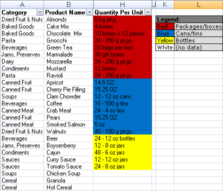
Solution
-
To manually color each cell according to the color scheme in the preceding table, click each cell, and then apply each color by using the Fill Color button in the Font group on the Home tab.
Tip: Use the Format Painter button in the Clipboard group on the Home tab to quickly apply a selected color to another cell.
-
Click a cell in the Quantity Per Unit column, and on the Home tab in the Editing group, click Sort & Filter, and then click Custom Sort.
-
In the Sort dialog box, select Quantity Per Unit under Column, select Cell Color under Sort On, and then click Copy Level twice.
-
Under Order, in the first row, select the red color, in the second row, select the blue color, and in the third row, select the yellow color.
If a cell does not contain any of the colors, such as the cells colored white, those rows remain in place.
Note: The colors that are listed are the available colors in the column. There is no default color sort order, and you cannot create a custom sort order by using a custom list.
-
Add a legend using cells on the side of the report by using the following table as a guide.
| Legend: | |
| Red | Packages and boxes |
| Blue | Cans and Tins |
| Green | Jars and Bottles |
| White | (Not sure) |
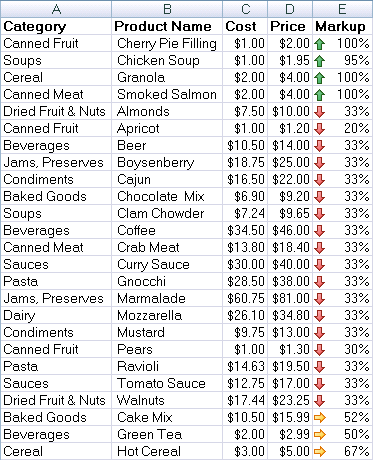
Which products have a markup above 67% or below 34%?
Problem
You want to quickly see the highest and lowest markup values at the top of the report.
Results
Solution
-
Select cells E2:E26, and on the Home tab, in the Style group, click the arrow next to Conditional Formatting, click Icon Set, and then select the Three Arrows (Colored) icon set.
-
Right-click a cell in the Markup column, point to Sort, and then click Custom Sort.
-
In the Sort dialog box, select Markup under Column, select Cell Icon under Sort On, and then click Copy Level.
-
Under Order, in the first row, select the green arrow that points upward, and in the second row, select the red arrow that points upward.
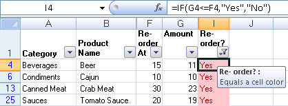
Which products need to be reordered right away?
Problem
You want to quickly generate a report of products that must be reordered right away, and then mail the report to your staff.
Results
Solution
-
Select cells I2:I26, and on the Home tab, in the Style group, click the arrow next to Conditional Formatting, point to Highlight Cells Rules , and then click Equal To.
-
Enter Yes in the first box, and then select Light Red Fill with Dark Red Text from the second box.
-
Right-click any formatted cell in the column, point to Filter, and then select Filter By Selected Cell's Color.
Tip: Hover over the Filter button in the column header to see how the column is filtered.
Which products have the highest and lowest prices and costs?
Problem
You want to see the highest and lowest prices and costs grouped together at the top of the report.
Results

Solution
-
For cells C2:C26 and D2:D26, do the following:
-
On the Home tab, in the Style group, click the arrow next to Conditional Formatting, point to Top/Bottom Rules, and then click Top 10 Items.
-
Enter 1 in the first box, and then select Yellow Fill with Dark Yellow Text from the second box.
-
On the Home tab, in the Style group, click the arrow next to Conditional Formatting, point to Top/Bottom Rules, and then click Bottom 10 Items.
-
Enter 1 in the first box, and then select Green Fill with Dark Green Text from the second box.
-
-
For the Cost and Price columns, do the following:
-
Right-click the lowest value , point to Sort, and then select Sort By Selected Cell's Color.
-
Right-click the highest value, point to Sort, and then select Sort By Selected Cell's Color.
-
No comments:
Post a Comment