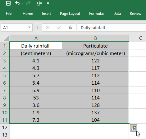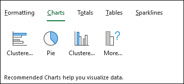
Excel's Quick Analysis button lets you instantly create different types of charts, like clustered, stacked, and scattered charts.
-
Select a range of cells.
-
Select Quick Analysis, a button that appears at the bottom right corner of the selected range.
Or, press Ctrl + Q.

-
Select Charts.

-
Hover over the chart types to get a preview, and then select the chart you want.
Want more?
A relatively new way to create a chart and pretty fast, although not quite as fast, introduced in Excel 2013 is what we call, as I highlight the data here, the Quick Analysis button.
You'll see this just beyond the lower right hand corner any time you highlight cells.
Right here, click this button.
You could press Ctrl + Q as well, and then we see charts right here, and here we get the chance to select a different chart type.
Maybe we'll choose stacked column here.
So not quite as fast as the keystroke shortcuts, but nevertheless a quick way to create a chart.
Learning doesn't stop here. Discover more expert led tutorials at LinkedIn Learning. Start your free trial today, at linkedin.com/learning.
Enjoy one month of free access to LinkedIn Learning
Learn from recognized industry experts, and get the business, tech, and creative skills that are most in demand.
Benefits-
Get unlimited access to over 4,000 video courses.
-
Receive personal recommendations based on your LinkedIn profile.
-
Stream courses from your computer or mobile device.
-
Take courses for every level – beginner to advanced.
-
Practice while you learn with quizzes, exercise files, and coding windows.
-
Choose a plan for yourself or your entire team.
No comments:
Post a Comment