Present your data in a stock chart
As its name implies, a stock chart is most often used to illustrate the fluctuation of stock prices. However, this chart may also be used for scientific data. For example, you can use a stock chart to indicate the fluctuation of daily or annual average temperatures.
If you use a stock chart to display the fluctuation of stock prices, you can also incorporate the trading volume.
In this article
Learn more about plotting data in a stock chart
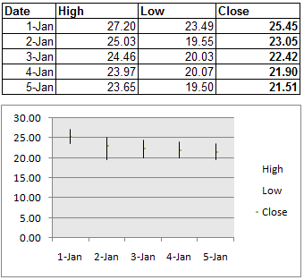
The way stock chart data is organized on your worksheet is very important. For example, to create a simple high-low-close stock chart, you should arrange your data with High, Low, and Close entered as column headings, in that order.
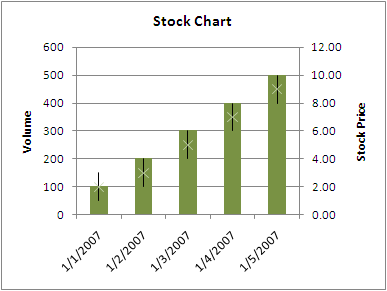
A stock chart that also measures volume displays two vertical (value) axes. The vertical axis on the left shows the volume of stocks traded, and the vertical axis on the right shows the stock prices.
When you create a stock chart, you can choose one of the following stock chart subtypes:
-
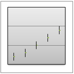
High-low-close The high-low-close stock chart is often used to illustrate stock prices. It requires three series of values in the following order: high, low, and then close.
-
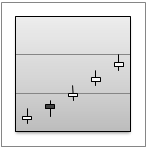
Open-high-low-close This type of stock chart requires four series of values in the correct order (open, high, low, and then close).
-
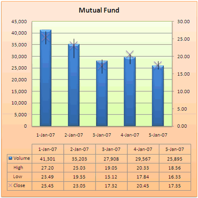
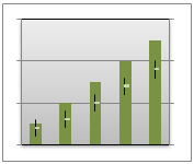
Volume-high-low-close This type of stock chart requires four series of values in the correct order (volume, high, low, and then close). It measures volume by using two value axes: one for the columns that measure volume, and the other for the stock prices.
-
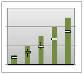
Volume-open-high-low-close This type of stock chart requires five series of values in the correct order (volume, open, high, low, and then close).
Create a stock chart

So, how did we create this stock chart? The following procedure will help you create a stock chart with similar results. For this chart, we used the example worksheet data. You can copy this data to your worksheet, or you can use your own data.
-
Copy the example worksheet data into a blank worksheet, or open the worksheet that contains the data that you want to plot in a stock chart.
How to copy the example worksheet data
-
Create a blank workbook or worksheet.
-
Select the example in the Help topic.
Note: Do not select the row or column headers.

Selecting an example from Help
-
Press CTRL+C.
-
In the worksheet, select cell A1, and press CTRL+V.
1
2
3
4
5
6
A
B
C
D
E
Dat e
Volum e
Hig h
Lo w
Clos e
1-Jan-07
41,301
27.20
23.49
25.45
2-Jan-07
35,203
25.03
19.55
23.05
3-Jan-07
27,908
19.05
15.12
17.32
4-Jan-07
29,567
20.33
17.84
20.45
5-Jan-07
25,895
18.56
16.33
17.35
-
-
Select the data that you want to plot in the stock chart.
-
On the Insert tab, in the Charts group, click Other Charts.

-
Under Stock, click Volume-High-Low-Close.
-
Click the chart area of the chart.
This displays the Chart Tools, adding the Design, Layout, and Format tabs.
-
On the Design tab, in the Chart Styles group, click the chart style that you want to use.

For our stock chart, we used Style 26.
-
On the Design tab, in the Chart Layouts group, click the chart layout that you want to use.

For our stock chart, we used Layout 4.
-
To change the size of the chart, on the Format tab, in the Size group, select the shape size that you want in the Shape Height and Shape Width boxes, and then press ENTER.
For our stock chart, we used 5" for both shape height and shape width.

-
In the chart, click the chart title, and then type the text that you want.
For our stock chart, we typed Mutual Fund.
-
To reduce the size of the chart title, right-click the title, and then enter the size that you want in the Size box on the shortcut menu.
For our stock chart, we used 14.
-
To apply a special formatting effect to the plot area and chart area, click that chart element, or select it from a list of chart elements (Layout tab, Current Selection group, Chart Elements box), and then do the following:
-
On the Format tab, in the Shape Styles group, click the More button
 , and then click the effect that you want to use.
For our stock chart, we used the Subtle Effect - Accent 3 for the plot area, and Subtle Effect - Accent 6 for the chart area.
-
-
If you want to use theme colors that are different from the default theme that is applied to your workbook, do the following:
-
On the Page Layout tab, in the Themes group, click Themes.

-
Under Built-in, click the theme that you want to use.
For our stock chart, we used the Office theme.
-
Save a chart as a template
If you want to create another chart like the one that you just created, you can save the chart as a template that you can use as the basis for other similar charts.
-
Click the chart that you want to save as a template.
-
On the Design tab, in the Type group, click Save as Template.

-
In the File name box, type a name for the template.
Tip: Unless you specify a different folder, the template file (.crtx) will be saved in the Charts folder, and the template becomes available under Templates in both the Insert Chart dialog box (Insert tab, Charts group, Dialog Box Launcher
 ) and the Change Chart Type dialog box (Design tab, Type group, Change Chart Type).
For more information about how to apply a chart template, see Reuse a favorite chart by using a chart template.
Note: A chart template contains chart formatting and stores the colors that are in use when you save the chart as a template. When you use a chart template to create a chart in another workbook, the new chart uses the colors of the chart template — not the colors of the document theme that is currently applied to the workbook. To use the document theme colors instead of the chart template colors, right-click the chart area, and then click Reset to Match Style on the shortcut menu.
No comments:
Post a Comment