Create a PivotDiagram
In this article
About PivotDiagrams and data sources
A PivotDiagram is a collection of shapes arranged in a tree structure that helps you to analyze and summarize data in a visual, easy-to-understand format. It starts out as a single shape, called a top node, that contains information imported from a worksheet, table, view, or cube. You can break the top node into a level of subnodes to view your data in various ways.
Note: If you want a visual representation of each row in a worksheet, table, or view but you don't need to analyze or summarize the data, use the Link Data to Shapes feature on the Data tab. For more information, see Enhance your data with data graphics.
Categories, levels, and nodes
To understand categories, levels, and nodes, think of each element in the context of your data source:
-
Each column of your data source is either nonnumeric or numeric.
-
Think of the nonnumeric columns as categories — like Quarter, Salesperson, or Phone Number. Any of these can become a level under the top node. Note that the values under a column like Phone Number might be numbers, but they are not numbers that can be totaled or otherwise summarized.
-
Think of the numeric columns as data such as numbers or currency that can be summed or averaged, or that have minimum or maximum values.
-
Think of each node as a group of rows from your data source that have a common value in a specified column. For example, for the category "Quarter," all the rows with QTR4 would be grouped into a single node.
Data sources
You can use the following data sources to create a PivotDiagram:
-
Microsoft Office Excel workbook
-
Microsoft Office Access database
-
Microsoft SharePoint list
-
Microsoft SQL Server database
-
Microsoft SQL Server Analysis Services
-
Other OLE DB or ODBC data sources
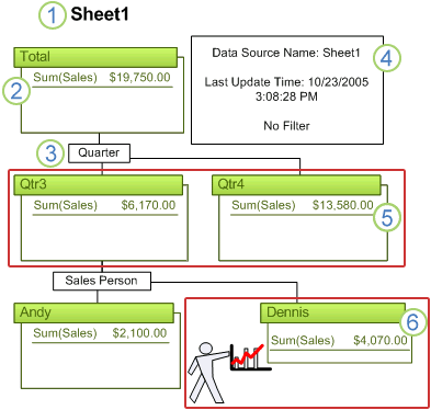
Parts of a PivotDiagram

1. Name of the PivotDiagram
2. Top node of the PivotDiagram
3. Breakdown shape
4. Data legend
5. The Qtr3 and Qtr4 shapes together are a level
6. Node with a shape applied to add impact
Sample scenario
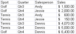
Let's say you have an Excel worksheet with information about sporting goods sales for the last two quarters like the one shown below.

What you need to know is:
-
How much did each sports department make?
-
How much was earned in each quarter?
-
How much profit did each salesperson make?
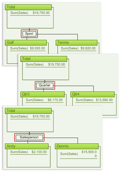
A PivotDiagram can show your data arranged in three different tree views to answer those three questions.
The following figure shows three ways to view your source data to answer your specific questions.

Create a PivotDiagram
To create a PivotDiagram, you can use the PivotDiagram template, or you can insert a Pivot Node shape into any diagram. This topic describes using the PivotDiagram template to create a single PivotDiagram. For information about inserting Pivot Node shapes into other Visio diagrams, see Insert a PivotDiagram into any drawing. For more information about creating a drawing with multiple PivotDiagrams, see Add multiple PivotDiagrams to a drawing.
When you create a PivotDiagram, the Data Selector Wizard guides you to select a data source. The data is then imported into a top PivotDiagram node, which is displayed in your drawing. You then expand the top node to show the data that you want to analyze.
Note: It is a good idea to make sure that the top cell in each column in your Excel worksheet is a column heading rather than a row of data. Headings aren't required, but they make the completed PivotDiagram much easier to understand.
-
Click the File tab.
-
Click New, click Business, and then double-click PivotDiagram.
-
Follow the steps in the Data Selector Wizard.
After you click Finish, the following three shapes appear on the drawing page:
-
A data legend containing information about the data source
-
A text box for the name of the PivotDiagram
-
The top node, which contains the imported data set
-
-
Click the top node on the drawing page, and in the PivotDiagram window, under Add Category, click the category (usually a column in your data source) by which you want to group your data.
Note: You may need to maximize the PivotDiagram window to see all of the features.
To further expand the new subnodes to expose other levels, click the node that you want to expand and repeat step 4.
Refresh the data in a PivotDiagram
You can refresh the data in an existing PivotDiagram. If your drawing contains more than one PivotDiagram, you can refresh one or all of them.
-
To refresh a PivotDiagram, select it in the drawing. On the PivotDiagram tab, in the Data group, click Refresh.
-
To refresh all of the PivotDiagrams in a drawing, click the arrow under Refresh and then click Refresh All.
Filter the data in a PivotDiagram
Each node in a level of a PivotDiagram represents a group of rows in your data source that share a common value. For example, a node for the fourth quarter (Qtr4) would contain all of the numeric data for the rows that have Qtr4 in the Quarter column.
You can use filters to choose which nodes appear in a given level. For example, if the data for the first quarter is no longer of interest, you can conceal the Qtr1 node:
-
In the PivotDiagram window, under Add Category, right-click the data (category name) that you want to filter, and then click Configure Column.
-
In the Configure Column dialog box, under Filter, under Show data where: category name, select the operations in the leftmost column, and type the values into the rightmost column to specify the data that you want to work with.
Only the nodes with information that meets the criteria that you selected appear in the drawing.
To remove the filter, reset the operations in the leftmost column of the Show data where list to (Select Operation).
Note: If your data source is a SQL Server Analysis Services cube, right-click the item that you want to filter, click Configure Dimension, and in the Configure Dimension dialog box, click Configure Level. In the Configure Level dialog box, under Filter, under Show data where category name, select the operations in the leftmost column, and type the values into the rightmost column to specify the data that you want to work with.
Customize the data in PivotDiagram nodes
When you expand a PivotDiagram node, a default set of data is displayed in each node. You can change which numeric data is displayed, the name of that data, and how numeric data is summarized.
Show or hide specific data
When you show or hide the numeric data (usually a column in your data source), the change is applied to all of the nodes in the selected PivotDiagram.
-
Select any node of the PivotDiagram.
-
In the PivotDiagram window, under Add Total, select or clear the check boxes for the data that you want to show or hide.
Change how numeric data is summarized
The default data shown in a PivotDiagram node is the sum of the first column from your data source. You can change the summary function from Sum to Average, Min, Max, or Count.
Note: This does not apply to SQL Server Analysis Services.
-
In the PivotDiagram window, under Add Total, right-click the item that you want to change, and choose the summary function that you want to apply.
Change the names of items in the Add Category and Add Totals lists
-
In the PivotDiagram window, under Add Category or Add Total, right-click the item that you want to change, and then click Configure Column.
-
In the Name box of the Configure Column dialog box, type a new name.
To revert to the original name, click Use Source Name.
Limit the number of nodes in levels
You can choose how many nodes to display in a single level or in all levels of your PivotDiagram. This is helpful if you are working with large worksheets, tables, or views and you don't need to see all of the data broken into separate nodes.
For example, you may want to show only the first 5 nodes in a level of salespeople or the first 20 nodes in a level of orders.
Limit the number of nodes displayed in all levels
-
Click the top node of the PivotDiagram that you want to change.
-
On the PivotDiagram tab, in the Data group, click the Data Options Dialog Box Launcher.
-
In the PivotDiagram Options dialog box, under Data options, select the Limit items in each breakdown check box.
-
In the Maximum number of items box, type the maximum number of nodes that you want to show.
For each level, a new node with an ellipsis (...) in its title bar appears in your PivotDiagram. These shapes contain the hidden nodes for each level.
Limit the number of nodes displayed in a single level
-
In your diagram, select the Breakdown shape of the level that you want to limit.
-
On the PivotDiagram tab, in the Sort & Filter group, click Sort & Filter.
-
In the Breakdown Options dialog box, under Show, select the Limit items in this breakdown check box.
-
In the Maximum number of items box, type the maximum number of nodes that you want to show.
A new node with an ellipsis (...) in its title bar appears in your PivotDiagram. This shape contains the hidden data for that level.
No comments:
Post a Comment