Add a secondary axis to a chart
Which Office program are you using?
Word
When the values in a chart vary widely from data series to data series, you can plot one or more data series on a secondary axis. A secondary axis can also be used as part of a combination chart when you have mixed types of data (for example, price and volume) in the same chart.
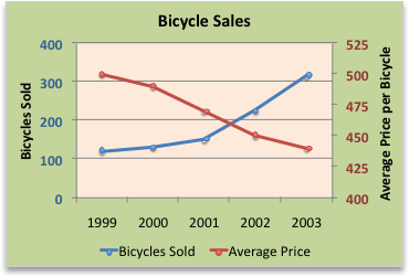
In this chart, the primary vertical axis on the left is used for sales volumes, whereas the secondary vertical axis on the right side is for price figures.

Do any of the following:
Add a secondary axis
-
On the View menu, click Print Layout.
-
In the chart, select the data series that you want to plot on a secondary axis, and then click the Chart Layout tab.
For example, in a line chart, click one of the lines in the chart, and all the data marker of that data series become selected.
-
Under Current Selection, click Format Selection.

-
In the navigation pane, click Axis.
-
Click Secondary axis, and then click OK.
To add more data series to the secondary axis, repeat this procedure.
Add an axis title for a secondary axis
-
On the View menu, click Print Layout.
-
Click the chart, and then click the Chart Layout tab.
-
Under Labels, click Axis Titles, point to Secondary Horizontal Axis Title or Secondary Vertical Axis Title, and then click the option that you want.

-
Select the text in the Axis Title box, and then type an axis title.
Add an axis label for a secondary axis
-
On the View menu, click Print Layout.
-
Click the chart, and then click the Chart Layout tab.
-
Under Axes, click Axes, point to Secondary Horizontal Axis or Secondary Vertical Axis, and then click the option that you want.

See also
PowerPoint
When the values in a chart vary widely from data series to data series, you can plot one or more data series on a secondary axis. A secondary axis can also be used as part of a combination chart when you have mixed types of data (for example, price and volume) in the same chart.
In this chart, the primary vertical axis on the left is used for sales volumes, whereas the secondary vertical axis on the right side is for price figures.

Do any of the following:
Add a secondary axis
-
In the chart, select the data series that you want to plot on a secondary axis, and then click the Chart Layout tab.
For example, in a line chart, click one of the lines in the chart, and all the data marker of that data series become selected.
-
Under Current Selection, click Format Selection.

-
In the navigation pane, click Axis.
-
Click Secondary axis, and then click OK.
To add more data series to the secondary axis, repeat this procedure.
Add an axis title for a secondary axis
-
Click the chart, and then click the Chart Layout tab.
-
Under Labels, click Axis Titles, point to Secondary Horizontal Axis Title or Secondary Vertical Axis Title, and then click the option that you want.

-
Select the text in the Axis Title box, and then type an axis title.
Add an axis label for a secondary axis
-
Click the chart, and then click the Chart Layout tab.
-
Under Axes, click Axes, point to Secondary Horizontal Axis or Secondary Vertical Axis, and then click the option that you want.

See also
Excel
When the values in a chart vary widely from data series to data series, you can plot one or more data series on a secondary axis. A secondary axis can also be used as part of a combination chart when you have mixed types of data (for example, price and volume) in the same chart.
In this chart, the primary vertical axis on the left is used for sales volumes, whereas the secondary vertical axis on the right side is for price figures.

Do any of the following:
Add a secondary axis
-
In the chart, select the data series that you want to plot on a secondary axis, and then click the Chart Layout tab.
For example, in a line chart, click one of the lines in the chart, and all the data marker of that data series become selected.
-
Under Current Selection, click Format Selection.

-
In the navigation pane, click Axis.
-
Click Secondary axis, and then click OK.
To add more data series to the secondary axis, repeat this procedure.
Add an axis title for a secondary axis
-
Click the chart, and then click the Chart Layout tab.
-
Under Labels, click Axis Titles, point to Secondary Horizontal Axis Title or Secondary Vertical Axis Title, and then click the option that you want.

-
Select the text in the Axis Title box, and then type an axis title.
Add an axis label for a secondary axis
-
Click the chart, and then click the Chart Layout tab.
-
Under Axes, click Axes, point to Secondary Horizontal Axis or Secondary Vertical Axis, and then click the option that you want.

No comments:
Post a Comment