Data graphics, an overview
Visio Professional lets you import data into shapes. After you import and link data, Visio applies data graphics to the shapes. Data graphics visualize the data for the shape.
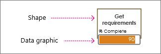
Note: Before you proceed with this article, make sure you understand the basic concepts behind importing data, and that you've already imported data into shapes.
Data graphic basics
Often when you import, Visio detects the type of data that is linked to the shape, and then applies the appropriate data graphic. In the below example, Visio detected that the % Complete field contained percentages, so it applied a data bar graphic to the shape signifying progress.
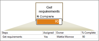
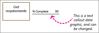
But you may want to change the graphic. For example, you might want the data bar to show a meter instead. Or, in the following example, you can see that Visio applied a text callout data graphic. You can change this to be a data bar, an icon, or you can even color the shape according to a certain value.
Which kind of data graphic do you want to use?
Data bars

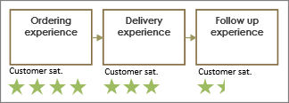

A data bar is good for showing percentages, ratings, progresses, scores, and amounts. When assigned to many shapes, you can compare the symbols and identify which shapes are performing and which ones are not. For more information, see How to use data bars.
Icon sets


Icon sets are good at showing percentages and progresses as well. However, these data graphics are more compact and often smaller in size. Some icon sets are good at showing symbols for certain states. For example, a green icon represents a shape that is in a good state, a yellow icon represents a partially good state, and a red light represents a concern. Icon sets are also good for showing Yes/No values as well. See How to use icon sets.
Text callouts
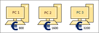
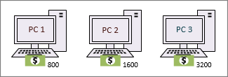
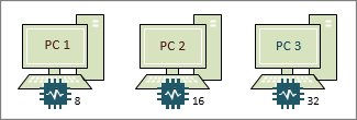
Text callout data graphics (not to be confused with callout shapes) are like text labels. They can be used to simply show data in the form of text. Or, you can have them show text, plus other symbols related to the data like currency symbols. See How to use text callouts (data graphics).
Color by value
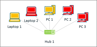
Although Visio refers to "Color by value" as a data graphic, this option doesn't show additional "graphics" or symbols next to the shapes. Instead, this feature fills the shape with a color according to its data. For example, in the above illustration, all of the computer shapes that have the value "Off" are colored red. The computers that are "On" have the color of green. See How to use color by value.
No comments:
Post a Comment