Make your Word documents accessible
Office Accessibility Center > Accessibility support for Word
This topic gives you step-by-step instructions to make your Word documents accessible to people with disabilities.

Word has many features built-in that help people with different abilities to read and author documents. Word also offers the Accessibility Checker that locates elements that might cause problems for people with disabilities.
To learn more about how the Accessibility Checker works, see Use Accessibility Checker rules to help ensure your Office documents, spreadsheets, and presentations are accessible.
Windows: Best practices for making Word documents accessible
The following table includes key best practices for creating Word documents that are accessible to people with disabilities.
| What to fix | How to find it | Why fix it | How to fix it |
| Include alternative text with all visuals and tables. Visual content includes pictures, clip art, SmartArt graphics, shapes, groups, charts, embedded objects, ink, and videos. | To find missing alternative text, use the Accessibility Checker. | Alt text helps people who can't see the screen to understand what's important in images and other visuals. Avoid using text in images as the sole method of conveying important information. If you must use an image with text in it, repeat that text in the document. In alt text, briefly describe the image and mention the existence of the text and its intent. | |
| Add meaningful hyperlink text and ScreenTips. | To determine whether hyperlink text makes sense as standalone information and whether it gives readers accurate information about the destination target, visually scan your document. | People who use screen readers sometimes scan a list of links. Links should convey clear and accurate information about the destination. For example, instead of linking to the text Click here, include the full title of the destination page. Tip: You can also add ScreenTips that appear when your cursor hovers over text or images that include a hyperlink. | |
| Ensure that color is not the only means of conveying information. | To find instances of color-coding, visually scan your document. | People who are blind, have low vision, or are colorblind might miss out on the meaning conveyed by particular colors. | |
| Use sufficient contrast for text and background colors. | To find insufficient color contrast, look for text in your document that's hard to read or to distinguish from the background. | If your document has a high level of contrast between text and background, more people can see and use the content. | |
| Use built-in headings and styles. | To find headings that are not in a logical order, use the Accessibility Checker. | To preserve tab order and to make it easier for screen readers to read your documents, use a logical heading order and the built-in formatting tools in Word. For example, organize headings in the prescribed logical order. Use Heading 1, Heading 2, and then Heading 3, rather than Heading 3, Heading 1, and then Heading 2. And, organize the information in your documents into small chunks. Ideally, each heading would include only a few paragraphs. | |
| Use a simple table structure, and specify column header information. | To ensure that tables don't contain split cells, merged cells, nested tables, or completely blank rows or columns, use the Accessibility Checker. | Screen readers keep track of their location in a table by counting table cells. If a table is nested within another table or if a cell is merged or split, the screen reader loses count and can't provide helpful information about the table after that point. Blank cells in a table could also mislead someone using a screen reader into thinking that there is nothing more in the table. Screen readers also use header information to identify rows and columns. |
Add alt text to visuals and tables
The following procedures describe how to add alt text to visuals and tables in your Word documents.
Note: We recommend only putting text in the description field and leaving the title blank. This will provide the best experience with most major screen readers including Narrator. For audio and video content, in addition to alt text, include closed captioning for people who are deaf or have limited hearing.
Add alt text to images
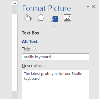
Add alt text to images, such as pictures, clip art, and screenshots, so that screen readers can read the text to describe the image to users who can't see the image.
-
Right-click an image.
-
Select Format Picture > Layout & Properties.
-
Select Alt Text.
-
Type a description and a title.
Tip: Include the most important information in the first line, and be as concise as possible.
Add alt text to SmartArt graphics
-
Right-click a SmartArt graphic.
-
Select Format Object > Shape Options > Layout & Properties.
-
Select Alt Text.
-
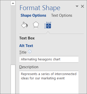
Type a description and a title.
Tip: Include the most important information in the first line, and be as concise as possible.
Add alt text to shapes
Add alt text to shapes, including shapes within a SmartArt graphic.
-
Right-click a shape, and then select Format Shape.
-
In the right pane, select Layout & Properties, and then select Alt Text.
-
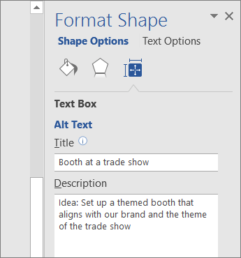
Type a description and a title.
Tip: Include the most important information in the first line, and be as concise as possible.
Add alt text to charts
-
Right-click a chart.
-
Select Format Chart Area > Chart Options > Layout & Properties.
-
Select Alt Text.
-
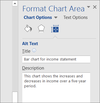
Type a description and a title.
Tip: Include the most important information in the first line, and be as concise as possible.
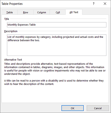
Add alt text to tables
-
Right-click a table.
-
Select Table Properties.
-
Select the Alt Text tab.
-
Type a description and a title.
Tip: Include the most important information in the first line, and be as concise as possible.
Make hyperlinks, text, and tables accessible
The following procedures describe how to make the hyperlinks, text, and tables in your Word documents accessible.
Add hyperlink text and ScreenTips
-
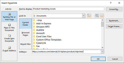
Select the text to which you want to add the hyperlink, and then right-click.
-
Select Hyperlink.
The text you selected displays in the Text to display box. This is the hyperlink text. -
If necessary, change the hyperlink text.
-
In the Address box, enter the destination address for the hyperlink.
-
Select the ScreenTip button and, in the ScreenTip text box, type a ScreenTip.
Tip: If the title on the hyperlink's destination page gives an accurate summary of what's on the page, use it for the hyperlink text. For example, this hyperlink text matches the title on the destination page: Templates and Themes for Office Online.
Apply built-in heading styles
-
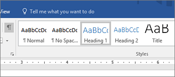
Select the heading text.
-
On the Home tab, in the Styles group, select a heading style, for example, Heading 1 or Heading 2.
Use bulleted lists
-
Position the cursor anywhere in your document.
-
Select the Home tab.
-
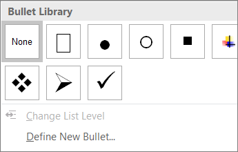
In the Paragraph group, select the Bullets button.
-
Type each bullet item in the bulleted list.
Use ordered lists
-
Position the cursor anywhere in your document.
-
Select the Home tab.
-
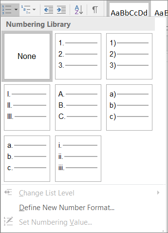
In the Paragraph group, select the Numbering button.
-
Type the sequential steps.
Use accessible text color
Here are some ideas to consider:
-
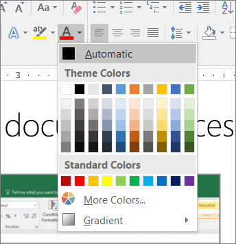
Ensure that text displays well by using the Automatic setting for font colors. Select your text, and then select Home > Font Color > Automatic.
-
Use the Colour Contrast Analyzer, a free app that analyzes colors and contrast, and displays results almost immediately.
Use accessible text format
Here are some ideas to consider:
-
Add an underline to color-coded hyperlink text. That can help colorblind people know the text is linked even if they can't see the color.
-
Add shapes if color is used to indicate status. For example, add a checkmark symbol
 if green is used to indicate "pass" and an uppercase X
  if red indicates "fail".
Note: These resources provide other suggestions: usability.gov and Web Accessibility for Users with Color Blindness.
Use text spacing
Increase or decrease white space between sentences and paragraphs.
-
Select your text.
-
Select the Home tab.
-
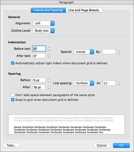
In the Paragraph group, in the lower-right corner of the group, select the More button.
The Paragraph dialog box opens, showing the Indents and Spacing tab. -
Under Spacing, select the spacing options you want.
Use table headers
-
Position the cursor anywhere in a table.
-
On the Table Tools Design tab, in the Table Style Options group, select the Header Row check box.
-
Type column headings.

Learn more
Mac: Best practices for making Word documents accessible
The following table includes key best practices for creating Word documents that are accessible to people with disabilities.
| What to fix | How to find it | Why fix it | How to fix it |
| Include alternative text with all visuals and tables. Visual content includes pictures, clip art, SmartArt graphics, shapes, groups, charts, embedded objects, ink, and videos. | To find missing alternative text, use the Accessibility Checker. | Alt text helps people who can't see the screen to understand what's important in images and other visuals. Avoid using text in images as the sole method of conveying important information. If you must use an image with text in it, repeat that text in the document. In alt text, briefly describe the image and mention the existence of the text and its intent. | |
| Add meaningful hyperlink text and ScreenTips. | To determine whether hyperlink text makes sense as standalone information and whether it gives readers accurate information about the destination target, visually scan your document. | People who use screen readers sometimes scan a list of links. Links should convey clear and accurate information about the destination. For example, instead of linking to the text Click here, include the full title of the destination page. Tip: You can also add ScreenTips that appear when your cursor hovers over text or images that include a hyperlink. | |
| Ensure that color is not the only means of conveying information. | To find instances of color-coding, visually scan your document. | People who are blind, have low vision, or are colorblind might miss out on the meaning conveyed by particular colors. | |
| Use sufficient contrast for text and background colors. | To find insufficient color contrast, look for text in your document that's hard to read or to distinguish from the background. | If your document has a high level of contrast between text and background, more people can see and use the content. | |
| Use built-in headings and styles. | To find headings that are not in a logical order, use the Accessibility Checker. | To preserve tab order and to make it easier for screen readers to read your documents, use a logical heading order and the built-in formatting tools in Word. For example, organize headings in the prescribed logical order. Use Heading 1, Heading 2, and then Heading 3, rather than Heading 3, Heading 1, and then Heading 2. And organize the information in your documents into small chunks. Ideally, each heading is followed by only a few paragraphs. | |
| Use a simple table structure, and specify column header information. | To ensure that tables don't contain split cells, merged cells, nested tables, or completely blank rows or columns, use the Accessibility Checker. | Screen readers keep track of their location in a table by counting table cells. If a table is nested within another table or if a cell is merged or split, the screen reader loses count and can't provide helpful information about the table after that point. Blank cells in a table could also mislead someone using a screen reader into thinking that there is nothing more in the table. Screen readers also use header information to identify rows and columns. |
Add alt text to visuals and tables
The following procedures describe how to add alt text to visuals and tables in your Word documents.
Note: For audio and video content, in addition to alt text, include closed captioning for people who are deaf or have limited hearing.
Add alt text to images
Add alt text to images, such as pictures, clip art, and screenshots, so that screen readers can read the text to describe the image to users who can't see the image.
-
Right-click an image.
-
Select Format Picture > Layout & Properties.
-
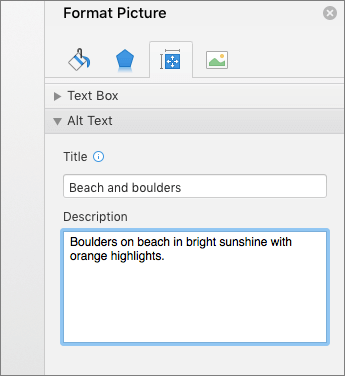
Select Alt Text.
-
Type a description and a title.
Tip: Include the most important information in the first line, and be as concise as possible.
Add alt text to SmartArt graphics
-
Right-click a SmartArt graphic.
-
Select Format SmartArt > Shape Options > Layout & Properties.
-
Select Alt Text.
-
Type a description and a title.
Tip: Include the most important information in the first line, and be as concise as possible.
Add alt text to shapes
Add alt text to shapes, including shapes within a SmartArt graphic.
-
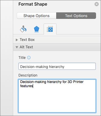
Right-click a shape.
-
Select Format Shape > Shape Options > Layout & Properties.
-
Select Alt Text.
-
Type a description and a title.
Tip: Include the most important information in the first line, and be as concise as possible.
Add alt text to charts
-
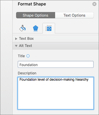
Right-click a chart.
-
Select Format Chart Area > Chart Options > Layout & Properties.
-
Select Alt Text.
-
Type a description and a title.
Tip: Include the most important information in the first line, and be as concise as possible.

Add alt text to tables
-
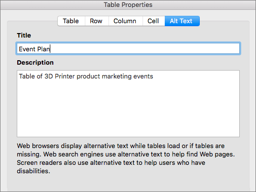
Right-click a table.
-
Select Table Properties.
-
Select the Alt Text tab.
-
Type a description and a title.
Tip: Include the most important information in the first line, and be as concise as possible.
Make hyperlinks, text, and tables accessible
The following procedures describe how to make the hyperlinks, text, and tables in your Word documents accessible.
Add hyperlink text and ScreenTips
-
Select the text to which you want to add the hyperlink, and then right-click.
-
Select Hyperlink.
The text you selected displays in the Text to Display box. This is the hyperlink text. -
If necessary, change the hyperlink text.
-
In the Address box, type the destination URL.
-
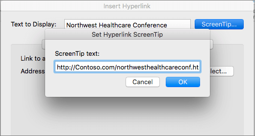
Select the ScreenTip button and, in the ScreenTip text box, type a ScreenTip.
Tip: If the title on the hyperlink's destination page gives an accurate summary of what's on the page, use it for the hyperlink text. For example, this hyperlink text matches the title on the destination page: Templates and Themes for Office Online.
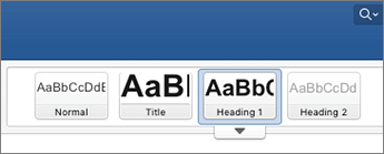
Apply built-in heading styles
-
Select the heading text.
-
On the Home tab, select a heading style, for example, Heading 1 or Heading 2.
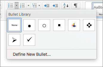
Use bulleted lists
-
Position the cursor anywhere in your document.
-
Select the Home tab.
-
In the Paragraph group, select the Bullets button.
-
Type each bullet item in the bulleted list.
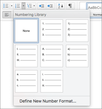
Use ordered lists
-
Position the cursor anywhere in your document.
-
Select the Home tab.
-
Select the Numbering button.
-
Type the sequential steps.
Use accessible text color
Here are some ideas to consider:
-
Ensure that text displays well by using the Automatic setting for font colors. Select your text, and then select Home > Font Color > Automatic.

-
Use the Colour Contrast Analyzer, a free app that analyzes colors and contrast, and displays results almost immediately.
Use accessible text format
Here are some ideas to consider:
-
Add an underline to color-coded hyperlink text. That can help colorblind people know the text is linked even if they can't see the color.
-
Add shapes if color is used to indicate status. For example, add a checkmark symbol
 if green is used to indicate "pass" and an uppercase X
  if red indicates "fail".
Note: These resources provide other suggestions: usability.gov and Web Accessibility for Users with Color Blindness.
Use text spacing
Increase or decrease white space between sentences and paragraphs.
-
Select your text.
-
Select the Home tab.
-
Select Line and Paragraph Spacing > Line Spacing Options.
The Paragraph dialog opens, showing the Indents and Spacing tab. -
Under Spacing, select the spacing options you want.

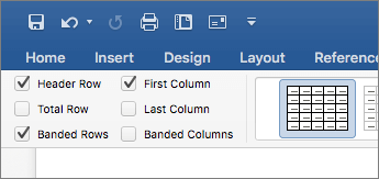
Use table headers
-
Position the cursor anywhere in a table.
-
On the Table Design tab, select the Header Row check box.
-
Type column headings.
Learn more
iOS: Best practices for making Word documents accessible
The following table includes key best practices for creating Word documents that are accessible to people with disabilities.
| What to fix | Why fix it | How to fix it |
|---|---|---|
| Add meaningful hyperlink text. | People who use screen readers sometimes scan a list of links. Links should convey clear and accurate information about the destination. For example, instead of linking to the text Click here, include the full title of the destination page. | |
| Ensure that color is not the only means of conveying information. | People who are blind, have low vision, or are colorblind might miss out on the meaning conveyed by particular colors. | |
| Use sufficient contrast for text and background colors. | If your document has a high level of contrast between text and background, more people can see and use the content. | |
| Use a larger font size (11pt or larger), sans serif fonts, and sufficient white space. | People who have dyslexia describe seeing text "swim together" on a page (the compressing of one line of text into the line below). They often see text merge or distort. For people who have dyslexia or have low vision, reduce the reading load. For example, they may benefit from familiar sans serif fonts, such as Arial or Calibri. Avoid using all capital letters, and excessive italics or underlines. Include ample white space between sentences and paragraphs. | |
| Use built-in headings and styles. | To preserve tab order and to make it easier for screen readers to read your documents, use a logical heading order and the built-in formatting tools in Word. For example, organize headings in the prescribed logical order. Use Heading 1, Heading 2, and then Heading 3, rather than Heading 3, Heading 1, and then Heading 2. And, organize the information in your documents into small chunks. Ideally, each heading would include only a few paragraphs. | |
| Use a simple table structure, and specify column header information. | Screen readers keep track of their location in a table by counting table cells. If a table is nested within another table or if a cell is merged or split, the screen reader loses count and can't provide helpful information about the table after that point. Blank cells in a table could also mislead someone using a screen reader into thinking that there is nothing more in the table. Screen readers also use header information to identify rows and columns. |
Make hyperlinks, text, and tables accessible
The following procedures describe how to make the hyperlinks, text, and tables in your Word documents accessible.
Add hyperlink text
-
Select the text to which you want to add the hyperlink.
-
To open the Home tab, at the bottom of the screen, at the end of the toolbar, tap the More icon.
-
Tap Home > Insert.
-
Scroll down to the Link command, and then tap it.
-
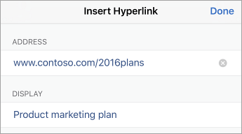
The text you selected displays in the Display box. This is the hyperlink text. If necessary, change it.
-
To add a hyperlink, in the Address box, type the URL.
-
At the top of the screen, tap Done.
Tip: If the title on the hyperlink's destination page gives an accurate summary of what's on the page, use it for the hyperlink text. For example, this hyperlink text matches the title on the destination page: Templates and Themes for Office Online.
Apply built-in heading styles
-
Select the text.
-
To open the Home tab, at the bottom of the screen, at the end of the toolbar, tap the More icon.
-
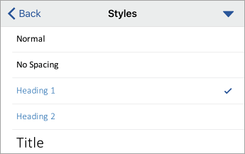
On the Styles command, tap the right arrow.
-
Tap a heading style, such as Heading 1.
Use bulleted lists
-
Position the cursor anywhere in your document.
-
To open the Home tab, at the bottom of the screen, at the end of the toolbar, tap the More icon.
-
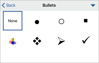
On the Bullets command, tap the right arrow.
-
Tap the bullet option you want.
-
Type each bullet item in the bulleted list.
Use ordered lists
-
Position the cursor anywhere in your document.
-
To open the Home tab, at the bottom of the screen, at the end of the toolbar, tap the More icon.
-
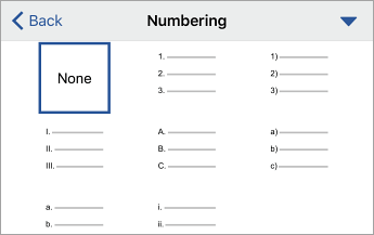
On the Numbering command, tap the right arrow.
-
Tap the numbering option you want..
-
Type the sequential steps.
Use accessible text color
Here are some ideas to consider:
-
Ensure that text displays well by using the Automatic setting for font colors. Select your text, and then select Home > Font Color > Automatic.

-
Use the Colour Contrast Analyzer, a free app that analyzes colors and contrast, and displays results almost immediately.
Use accessible text format
Here are some ideas to consider:
-
Add an underline to color-coded hyperlink text. That can help colorblind people know the text is linked even if they can't see the color.
-
Add shapes if color is used to indicate status. For example, add a checkmark symbol
 if green is used to indicate "pass" and an uppercase X
  if red indicates "fail".
Note: These resources provide other suggestions: usability.gov and Web Accessibility for Users with Color Blindness.
Use text spacing
Increase or decrease white space between sentences and paragraphs:
-
Select your text.
-
To open the Home tab, at the bottom of the screen, at the end of the toolbar, tap the More icon.
-
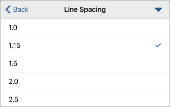
On the Line Spacing command, tap the right arrow.
-
Tap the spacing option you want.
Use table headers
-
Position the cursor anywhere in a table.
-
Tap Home > Insert > Table.
-
On the Style Options command, tap the right arrow.
-
To select the Header Row option, tap it.
-
In your table, type column headings.

Learn more
Android: Best practices for making Word documents accessible
The following table includes key best practices for creating Word documents that are accessible to people with disabilities.
| What to fix | Why fix it | How to fix it |
|---|---|---|
| Include alternative text with all visuals and tables. Visual content includes pictures, clip art, SmartArt graphics, shapes, groups, charts, embedded objects, ink, and videos. | Alt text helps people who can't see the screen to understand what's important in images and other visuals. Avoid using text in images as the sole method of conveying important information. If you must use an image with text in it, repeat that text in the document. In alt text, briefly describe the image and mention the existence of the text and its intent. | |
| Add meaningful hyperlink text. | People who use screen readers sometimes scan a list of links. Links should convey clear and accurate information about the destination. For example, instead of linking to the text Click here, include the full title of the destination page. | |
| Ensure that color is not the only means of conveying information. | People who are blind, have low vision, or are colorblind might miss out on the meaning conveyed by particular colors. | |
| Use sufficient contrast for text and background colors. | If your document has a high level of contrast between text and background, more people can see and use the content. | |
| Use a larger font size (18pt or larger), sans serif fonts, and sufficient white space. | People who have dyslexia describe seeing text "swim together" on a page (the compressing of one line of text into the line below). They often see text merge or distort. For people who have dyslexia or have low vision, reduce the reading load. For example, they may benefit from familiar sans serif fonts, such as Arial or Calibri. Avoid using all capital letters, and excessive italics or underlines. Include ample white space between sentences and paragraphs. | |
| Use built-in headings and styles. | To preserve tab order and to make it easier for screen readers to read your documents, use a logical heading order and the built-in formatting tools in Word. For example, organize headings in the prescribed logical order. Use Heading 1, Heading 2, and then Heading 3, rather than Heading 3, Heading 1, and then Heading 2. And, organize the information in your documents into small chunks. Ideally, each heading would include only a few paragraphs. | |
| Use a simple table structure, and specify column header information. | Screen readers keep track of their location in a table by counting table cells. If a table is nested within another table or if a cell is merged or split, the screen reader loses count and can't provide helpful information about the table after that point. Blank cells in a table could also mislead someone using a screen reader into thinking that there is nothing more in the table. Screen readers also use header information to identify rows and columns. |
Add alt text to visuals and tables
The following procedures describe how to add alt text to visuals and tables in your Word documents.
Note: For audio and video content, in addition to alt text, include closed captioning for people who are deaf or have limited hearing.
Add alt text to images
Add alt text to images such as pictures, clip art, and screenshots so that screen readers can read the text to describe the image to users who can't see the image
-
Select an image.
-
To open the Picture tab, at the bottom of the screen, at the end of the toolbar, tap the up arrow.
-
Scroll down to the Alt Text command, and then tap it.
-
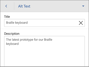
Type a description and a title. Your changes are automatically saved.
Tip: Include the most important information in the first line, and be as concise as possible.
Add alt text to shapes
Add alt text to shapes including shapes within a SmartArt graphic.
-
Select a shape.
-
To open the Shape tab, at the bottom of the screen, at the end of the toolbar, tap the up arrow.
-
Scroll down to the Alt Text command, and then tap it.
-
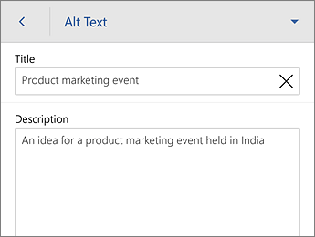
Type a description and a title. Your changes are automatically saved.
Tip: Include the most important information in the first line, and be as concise as possible.
Add alt text to tables
-
Tap anywhere within a table.
-
To open the Table tab, at the bottom of the screen, at the end of the toolbar, tap the up arrow.
-
Scroll down to the Alt Text command, and then tap it.
-
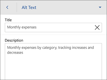
Type a description and a title. Your changes are automatically saved.
Tip: Include the most important information in the first line, and be as concise as possible.
Make hyperlinks, text, and tables accessible
The following procedures describe how to make the hyperlinks, text, and tables in your Word documents accessible.
Add hyperlink text
-
Select the text to which you want to add the hyperlink.
-
To open the Home tab, at the bottom of the screen, at the end of the toolbar, tap the up arrow.
-
Tap Home > Insert.
-
Scroll down to the Link command, and then tap it.
-
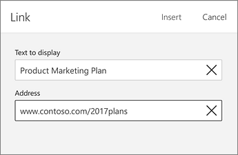
The text you selected displays in the Text to display box. This is the hyperlink text. If necessary, change it.
-
To add a hyperlink, in the Address box, type the URL.
-
At the top of the screen, tap Insert.
Tip: If the title on the hyperlink's destination page gives an accurate summary of what's on the page, use it for the hyperlink text. For example, this hyperlink text matches the title on the destination page: Templates and Themes for Office Online.
Apply built-in heading styles
-
Select the text.
-
To open the Home tab, at the bottom of the screen, at the end of the toolbar, tap the up arrow.
-
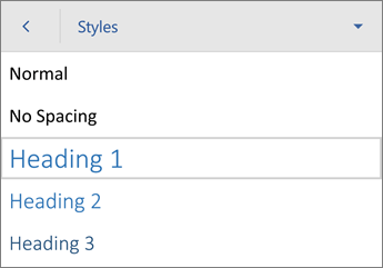
On the Styles command, tap the right arrow.
-
Tap a heading style, such as Heading 1.
Use bulleted lists
-
Position the cursor anywhere in your document.
-
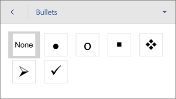
To open the Home tab, at the bottom of the screen, at the end of the toolbar, tap the up arrow. On the Bullets command, tap the right arrow.
-
Tap the bullet option you want.
-
Type each bullet item in the bulleted list.
Use ordered lists
-
Position the cursor anywhere in your document.
-
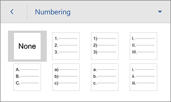
To open the Home tab, at the bottom of the screen, at the end of the toolbar, tap the up arrow. On the Numbering command, tap the right arrow.
-
Tap the numbering option you want.
-
Type the sequential steps..
Use accessible text color
Here are some ideas to consider:
-
Ensure that text displays well by using the Automatic setting for font colors. Select your text, and then select Home > Font Color > Automatic.

-
Use the Colour Contrast Analyzer, a free app that analyzes colors and contrast, and displays results almost immediately.
Use accessible text format
Here are some ideas to consider:
-
Add an underline to color-coded hyperlink text. That can help colorblind people know the text is linked even if they can't see the color.
-
Add shapes if color is used to indicate status. For example, add a checkmark symbol
 if green is used to indicate "pass" and an uppercase X
  if red indicates "fail".
Note: These resources provide other suggestions: usability.gov and Web Accessibility for Users with Color Blindness.
Use text spacing
Increase or decrease white space between sentences and paragraphs.
-
Select your text.
-
To open the Home tab, at the bottom of the screen, at the end of the toolbar, tap the up arrow.
-
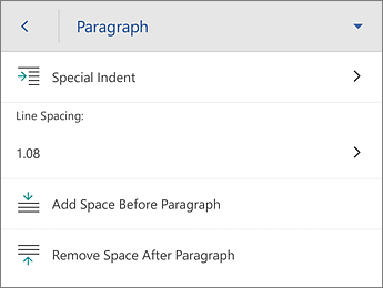
On the Paragraph Formatting command, tap the right arrow.
-
Tap the spacing option you want.
Use table headers
-
Position the cursor anywhere in a table.
-
To open the Table tab, at the bottom of the screen, at the end of the toolbar, tap the down arrow.
-
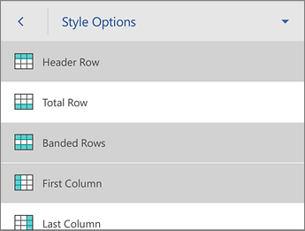
On the Style Options command, tap the right arrow.
-
To select the Header Row option, tap it.
Tip: When the option is selected, it's gray.
-
In your table, type column headings.
Learn more
Office Online: Best practices for making Word Online documents accessible
The following table includes key best practices for creating Word Online documents that are accessible to people with disabilities.
| What to fix | How to find it | Why fix it | How to fix it |
| Include alternative text with images and tables. | Use the Accessibility Checker in Word Online to find missing alternative text. | Alt text helps people who can't see the screen to understand what's important in images and other visuals. Avoid using text in images as the sole method of conveying important information. If you must use an image with text in it, repeat that text in the document. In alt text, briefly describe the image and mention the existence of the text and its intent. | |
| Add meaningful hyperlink text. | To determine whether hyperlink text makes sense as standalone information and whether it gives readers accurate information about the destination target, visually scan your document. | People who use screen readers sometimes scan a list of links. Links should convey clear and accurate information about the destination. For example, instead of linking to the text Click here, include the full title of the destination page. | |
| Ensure that color is not the only means of conveying information. | To find instances of color-coding, visually scan your document. | People who are blind, have low vision, or are colorblind might miss out on the meaning conveyed by particular colors. | |
| Use sufficient contrast for text and background colors. | To find insufficient color contrast, look for text in your document that's hard to read or to distinguish from the background. | If your document has a high level of contrast between text and background, more people can see and use the content. | |
| Use built-in headings and styles. | To find headings not using built-in styles, visually scan your document for text formatted to look like a heading. Select this text, and then look in the Home tab of the ribbon to check if a heading style has been used. | To preserve tab order and to make it easier for screen readers to read your documents, use a logical heading order and the built-in formatting tools in Word Online. For example, organize headings in the prescribed logical order. Use Heading 1, Heading 2, and then Heading 3, rather than Heading 3, Heading 1, and then Heading 2. And, organize the information in your documents into small chunks. Ideally, each heading would include only a few paragraphs. | |
| Use a simple table structure, and specify column header information. | Use the Accessibility Checker in Word Online to ensure that tables don't contain split cells, merged cells, nested tables, or completely blank rows or columns. | Screen readers keep track of their location in a table by counting table cells. If a table is nested within another table or if a cell is merged or split, the screen reader loses count and can't provide helpful information about the table after that point. Blank rows and columns in a table could also mislead someone using a screen reader into thinking that there is nothing more in the table. Screen readers also use header information to identify rows and columns. |
Add alt text to images and tables
The following procedures describe how to add alt text to images and tables in your Word Online documents.
Note: We recommend only putting text in the description field and leaving the title blank. This will provide the best experience with most major screen readers including Narrator. For audio and video content, in addition to alt text, include closed captioning for people who are deaf or have limited hearing.
Add alt text to images
Add alt text to images, such as pictures, clip art, and screenshots, so that screen readers can read the text to describe the image to users who can't see the image.
-
Select an image.
-
Select Picture Tools > Format.
-
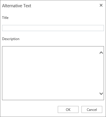
Select Alt-Text.
-
Type a description in the Alternative Text dialog box.
Tip: Include the most important information in the first line, and be as concise as possible.
Add alt text to tables
-
Position the cursor anywhere in a table.
-
Select Table Tools > Layout.
-
Select the Alt-Text tab.
-
Type a description in the Alternative Text dialog box.
Tip: Include the most important information in the first line, and be as concise as possible.
Make hyperlinks, text, and tables accessible
The following procedures describe how to make the hyperlinks, text, and tables in your Word Online documents accessible.
Add hyperlink text
-
Select the text to which you want to add the hyperlink, and then right-click.
-
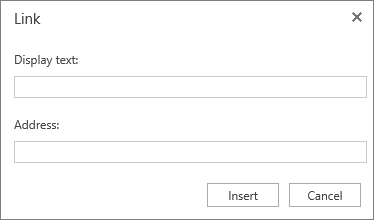
Select Link.
The text you selected displays in the Display text box. This is the hyperlink text. -
If necessary, change the hyperlink text.
-
In the Address box, enter the destination address for the hyperlink.
Tip: If the title on the hyperlink's destination page gives an accurate summary of what's on the page, use it for the hyperlink text. For example, this hyperlink text matches the title on the destination page: Templates and Themes for Office Online.
Use accessible text color
Here are some ideas to consider:
-
Ensure that text displays well by using the Automatic setting for font colors. Select your text, and then select Home > Font Color > Automatic.

-
Use the Colour Contrast Analyzer, a free app that analyzes colors and contrast, and displays results almost immediately.
Use accessible text format
Here are some ideas to consider:
-
Add an underline to color-coded hyperlink text. That can help colorblind people know the text is linked even if they can't see the color.
-
Add shapes if color is used to indicate status. For example, add a checkmark symbol
 if green is used to indicate "pass" and an uppercase X
  if red indicates "fail".
Note: These resources provide other suggestions: usability.gov and Web Accessibility for Users with Color Blindness.
Apply built-in heading styles
-
Select the heading text.
-
On the Home tab, in the Styles group, select a heading style, for example, Heading 1 or Heading 2.

Use bulleted lists
-
Position the cursor anywhere in your document.
-
Select the Home tab.
-
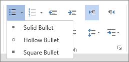
In the Paragraph group, select the Bullets button and then select the style of bullet you want to use.
-
Type each bullet item in the bulleted list.
Use ordered lists
-
Position the cursor anywhere in your document.
-
Select the Home tab.
-
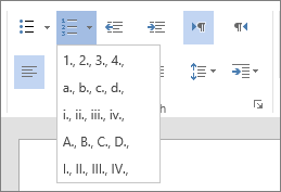
In the Paragraph group, select the Numbering button and then select the style of list you want to use.
-
Type the sequential steps.
Use text spacing
Increase or decrease white space between sentences and paragraphs.
-
Select your text.
-
Select the Home tab.
-
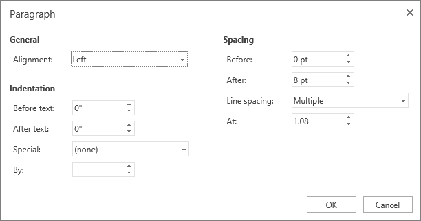
In the Paragraph group, in the lower-right corner of the group, select the More button.
The Paragraph dialog box opens, showing the Indentation and Spacing options. -
Under Spacing, select the spacing options you want.
Use table headers
-
Position the cursor anywhere in a table.
-
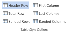
On the Table Tools Design tab, in the Table Style Options group, select Header Row.
-
Type column headings.
Use the Accessibility Checker in Word Online
-
Select the Review tab.
-
Select Check Accessibility.
-
Review the results in the Accessibility Checker. Results are categorized based on the severity of the issue found, as follows:
-
Errors. Includes content that is very difficult or impossible for people with disabilities to understand.
-
Warnings. The content is challenging for people with disabilities to understand.
-
Tips. Tips let you know that, even though people with disabilities can understand the content, it could be better organized or presented to improve their experience.
-
-
Fix the issues.
Learn more
Windows for mobile devices: Best practices for making Word documents accessible
The following table includes key best practices for creating Word documents that are accessible to people with disabilities.
| What to fix | Why fix it | How to fix it |
|---|---|---|
| Add meaningful hyperlink text. | People who use screen readers sometimes scan for a list of links. Links should convey clear and accurate information about the destination. For example, instead of using the text "click here", the link should include the full title of the destination page. | |
| Add alternative texts to graphics, tables, shapes, and other visuals. | Alt text helps people who can't see the screen understand what's important in images and other visuals, such as clip art, SmartArt graphics, shapes, groups, charts, embedded objects, linked images, ink drawings, and videos. Avoid using text in images as the sole method of conveying important information. If you need to use an image with text in it, repeat that text in the document. In alt text, briefly describe the image and mention the existence of the text and its intent. | |
| Ensure that color is not the only means of conveying information. | People with impaired vision, no vision, or colorblindness might miss out on the meaning conveyed by particular colors. Make sure you don't use color alone to convey meaning. Create text that duplicates the meaning of the color or other sensory characteristics. | |
| Use sufficient contrast for text and background colors. | The text in your documents should be readable in the high contrast mode so that everyone, including people with visual disabilities, can see it well. See page 16 of the Section 508 Basic Authoring and Testing Guide for detailed standards and advanced tools to check contrast. | |
| Use a larger font size (18pt or larger), sans-serif fonts, and sufficient white space. | People with dyslexia can perceive to experience movement of the words on a page, or text running together (a line of text compressing into the line below). The text can also merge or distort otherwise. To reduce the reading load, you can, for example:
| |
| Use built-in headings and styles. | To preserve tab order and to make it easier for screen readers to read your documents, use a logical heading order and the built-in formatting tools in Word. For example, organize headings in the prescribed logical order. Use Heading 1, Heading 2, and then Heading 3, rather than Heading 3, Heading 1, and then Heading 2. And, organize the information in your documents into small chunks. Ideally, each heading would include only a few paragraphs. | |
| Use a simple table structure, and specify column header. | Screen readers keep track of their location in a table by counting table cells. If a table is nested within another table or if a cell is merged or split, the screen reader loses count and can't provide helpful information about the table after that point. Blank cells in a table could also mislead someone using a screen reader into thinking that there is nothing more in the table. Screen readers also use header information to identify rows and columns. |
Add alt text to visuals and tables
The following procedures describe how to add alt text to visuals and tables in your Word documents.
Note: For audio and video content, in addition to alt text, you should include closed captioning for people who are deaf or have limited hearing.
Add alt text to images
Add alt text to images, such as photos, graphics, clip art, and screenshots so that screen readers can read the description of the image.
-
Select the image in your document.
-
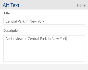
In the Picture menu, scroll down to Alt Text and tap it.
-
Type a title and a description in the fields. Keep it short, start with the most important information, and aim to convey the content and functionality of the image. When ready, tap Done.
Tip: Fill in both the Title and Description fields, as it can vary how this information is read by different screen readers.
Add alt text to shapes
Inline shapes, shapes within SmartArt, and other shapes can be used to convey visual information that cannot be read by screen readers unless you add an alt text.
-
Select the shape in your document.
-
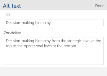
In the Shape menu, scroll down to Alt Text and tap it.
-
Type a title and a description in the fields. Keep it short, start with the most important information, and aim to convey the content and functionality of the shape. When ready, tap Done.
Tip: Fill in both the Title and Description fields, as it can vary how this information is read by different screen readers.
Add alt text to tables
Add alt text to tables to provide a short summary of the table contents for users with screen readers.
-
Tap anywhere within the table.
-
In the Table menu, scroll down to Alt Text and tap it.
-
Type a title and a description in the fields. Keep it short, start with the most important information, and aim to convey a brief summary of the table contents. When ready, tap Done.
Tip: Fill in both the Title and Description fields, as it can vary how this information is read by different screen readers.
Make hyperlinks, text, and tables accessible
The following procedures describe how to make the hyperlinks, text, and tables in your Word documents more accessible.
Add hyperlink text
Add a descriptive hyperlink to your text to let the user know what's behind the link.
-
Select the piece of text to add the hyperlink to.
-
To open the Home menu, tap the More (…) icon.
-
Tap Home > Insert.
-
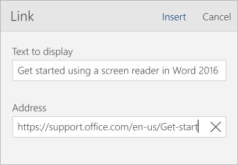
Scroll down to Link and tap it.
-
The text you selected is shown in the Text to display field. This is the hyperlink text. You can change it, if necessary.
Tip: Avoid using "click here" or similar non-descriptive expressions. If the title on the hyperlink's destination page gives an accurate summary of what's on the page, you can use it for the hyperlink text. For example, this hyperlink text matches the title on the destination page: Templates and Themes for Office Online.
-
To add a hyperlink, in the Address box, type the URL.
-
At the top of the screen, tap Insert.
Use accessible text format
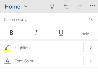
To improve your text formatting, select a plain sans-serif font, use a larger font size, align your text to the left, and avoid excessive use of block capitals and italics.
-
Select the piece of text you want to format.
-
To open the Home menu, tap the More (…) icon.
-
In the Home menu you can select, for example, a larger font size and a sans-serif type of font. You can also use other formatting options, such as bold font for emphasis.
Use accessible text color
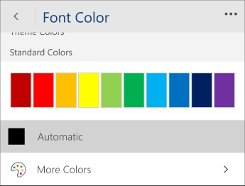
To ensure that text displays well in the high contrast mode, use the Automatic setting for font colors.
-
Select your text.
-
To open the Home menu, tap the More (…) icon.
-
On the Font Color option, tap the right arrow.
-
Tap Automatic.
Apply built-in heading styles
Use the built-in heading styles to form an outline of the document for the screen readers. The screen readers don't interpret a piece of text with large and bold font to be a heading unless the built-in styles are applied.
-
Select the text for the heading.
-
To open the Home menu, tap the More (…) icon.
-
Scroll down to Styles and tap it.
-
Tap a heading style, such as Heading 1.

Use bulleted lists
When feasible, break the text into bullet points to improve readability and accessibility.
-
Place the cursor where you want to add the list in your document, or select the piece of text to be included in the list.
-
To open the Home menu, tap the More (…) icon.
-
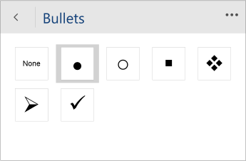
Scroll down to Bullets and tap it.
-
Tap the bullet style you want to use.
-
If needed, type the list items.
Tip: Use a full stop or a comma at the end of each list item to make screen readers pause.
Use ordered lists
When feasible, use numbered lists as they are easier to follow than a continuous block of text.
-
Place the cursor where you want to add the list in your document, or select the piece of text to be included in the list.
-
To open the Home menu, tap the More (…) icon.
-
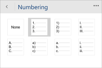
Scroll down to Numbering and tap it.
-
Tap the numbering style you want to use.
-
If needed, type the list items.
Tip: Use a full stop or a comma at the end of each list item to make screen readers pause.
Use appropriate text spacing
Increase or decrease the white space between sentences and paragraphs to improve readability.
-
Select the piece of text.
-
To open the Home menu, tap the More (…) icon.
-
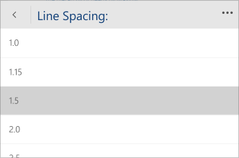
Scroll down to Paragraph Formatting and tap it.
-
Tap Line Spacing, and select the spacing option you want to use.
Use table headers
Add headers to your table to help screen readers keep track of the columns and rows.
-
In your table, place the cursor somewhere on the first row.
-
In the Table menu below, tap Insert.
-
Tap Insert Above.
-
To go back to the previous menu, tap the left arrow in the Insert menu header.
-
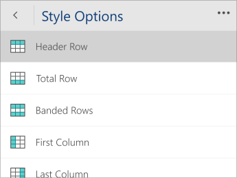
In the Table menu, scroll down to Style Options, and tap it.
-
Select Header Row.
-
Go back to your table and type the column headings.
Learn more
Technical support for customers with disabilities
Microsoft wants to provide the best possible experience for all our customers. If you have a disability or questions related to accessibility, please contact the Microsoft Disability Answer Desk for technical assistance. The Disability Answer Desk support team is trained in using many popular assistive technologies and can offer assistance in English, Spanish, French, and American Sign Language. Please go to the Microsoft Disability Answer Desk site to find out the contact details for your region.
If you are a government, commercial, or enterprise user, please contact the enterprise Disability Answer Desk.
No comments:
Post a Comment