Create a histogram in Excel 2016 for Mac
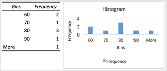
A histogram or Pareto (sorted histogram) is a column chart that shows frequency data. Here's a typical example:

To create a histogram in Excel, you use the Histogram tool of the Analysis ToolPak. It uses two columns of data to create a histogram -- one for data you want to analyze and one for bin numbers that represent the intervals by which you want to measure the frequency.
Make sure you load the Analysis ToolPak to add the Data Analysis command to the Data tab. Then you'll be ready to create a histogram. Here's how:
-
On a worksheet, type the input data in one column, adding a label in the first cell if you want. Be sure to use quantitative numeric data, like item amounts or test scores. The Histogram tool won't work with qualitative numeric data, like identification numbers entered as text.
-
In the next column, type the bin numbers in ascending order, adding a label in the first cell if you want. If you don't know what to type for your bin numbers, look at your data and see if you can recognize natural intervals. These intervals are also known as bins, and the Histogram tool will plot your data across these bins.
It's a good idea to use your own bin numbers because they may be more useful for your analysis. If you don't enter any bin numbers, the Histogram tool will create evenly distributed bin intervals by using the minimum and maximum values in the input range as start and end points.
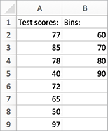
Here's an example of two columns you could use for a histogram:

-
On the Data tab, click Data Analysis.

-
Click Histogram > OK.
-
Under Input, do the following:
-
Click inside the Input Range box, and then select the cells in the first column of data.
-
Click inside the Bin Range box, and then select the cells in the second column of data.
If you used column labels on the worksheet, you can include them in the cell references.
Tip: You can also click
 to temporarily collapse the dialog box to select the ranges on the worksheet. Clicking the button again expands the dialog box.
-
-
If you included column labels in the cell references, check the Labels box.
-
Under Output options, you specify the location of the histogram:
-
To put the histogram on the same sheet, click Output Range, and then click inside the Output Range box. Click in the sheet where you want your histogram to be placed.
-
To put the histogram in a new sheet, click New Worksheet Ply.
-
To put the histogram in a new workbook, click New Workbook.
-
-
Check one or more of the following boxes:
-
Pareto (sorted histogram) This shows the data in descending order of frequency.
-
Cumulative Percentage This shows cumulative percentages and adds a cumulative percentage line to the histogram chart.
-
Chart Output This shows an embedded histogram chart.
-
-
Click OK.
No comments:
Post a Comment