In a chart you create in Excel for the web, axis labels are shown below the horizontal axis and next to the vertical axis. Your chart uses text in the source data for these axis labels.

To change the text of the category labels on the horizontal axis:
-
Click the cell that has the label text you want to change.
-
Type the text you want and press Enter.
The axis labels in the chart are automatically updated with the new text.
Tip: Axis labels are different from axis titles you can add to describe what is shown on the axes. Axis titles aren't automatically shown in a chart. To add them, see Add axis titles to a chart.
Remove axis labels from the horizontal axis
-
Click anywhere in the chart to show the Chart Tools on the ribbon.
-
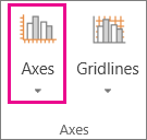
Click Chart > Axes.
-
Click Primary Horizontal Axis, and pick Show Axis without labeling.
To show the labels again, pick Show Left to Right Axis or Show Right to Left Axis.
No comments:
Post a Comment