Present your data in a column chart
Column charts are useful for showing data changes over a period of time or for illustrating comparisons among items. In column charts, categories are typically organized along the horizontal axis and values along the vertical axis.

For information on column charts, and when they should be used, see Available chart types in Office.
To create a column chart, follow these steps:
-
Enter data in a spreadsheet.
-
Select the data.
-
Depending on the Excel version you're using, select one of the following options:
-
Excel 2016: Click Insert > Insert Column or Bar Chart icon, and select a column chart option of your choice.
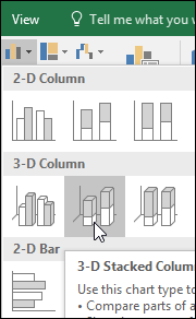
-
Excel 2013: Click Insert > Insert Column Chart icon, and select a column chart option of your choice.
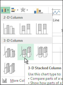
-
Excel 2010 and Excel 2007: Click Insert > Column, and select a column chart option of your choice.
You can optionally format the chart a little further. See the list below for a few options:
Note: Make sure you click on the chart first before applying a formatting option.
-
To apply a different chart layout, click Design > Charts Layout, and select a layout.
-
To apply a different chart style, click Design > Chart Styles, and pick a style.
-
To apply a different shape style, click Format > Shape Styles, and pick a style.
Note: A chart style is different from a shape style. A shape style is a formatting option that applies to the chart's border only, whereas the chart style is a formatting option that applies to the entire chart.
-
To apply different shape effects, click Format > Shape Effects, and pick an option such as Bevel or Glow, and then a sub option.
-
To apply a theme, click Page Layout > Themes, and select a theme.
-
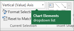
To apply a formatting option to a specific component of a chart (such as Vertical (Value) Axis, Horizontal (Category) Axis, Chart Area, to name a few), click Format > pick a component in the Chart Elements dropdown box, click Format Selection, and make any necessary changes. Repeat the step for each component you want to modify.
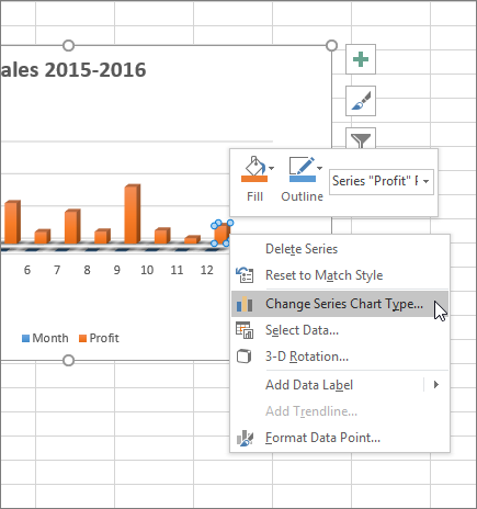
Note: If you are comfortable working in charts, you can also select and right-click on a specific area on the chart and select a formatting option.
-
To create a column chart, follow these steps:
-
In your email message, click Insert > Chart.
-
In the Insert Chart dialog box, click Column, and pick a column chart option of your choice, and click OK.
Excel opens in a split window and displays sample data on a worksheet.
-
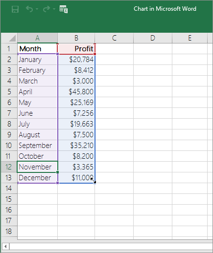
Replace the sample data with your own data.
Note: If your chart is not reflecting data from the worksheet, make sure to drag the vertical lines all the way down to the last row in the table.
-
Optionally, save the worksheet by following these steps:
-
Click the Edit Data in Microsoft Excel icon on the Quick Access Toolbar.
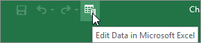
The worksheet opens in Excel.
-
Save the worksheet.
Tip: To reopen the worksheet, click Design > Edit Data, and select an option.
You can optionally format the chart a little further. See the list below for a few options:
Note: Make sure you click on the chart first before applying a formatting option.
-
To apply a different chart layout, click Design > Charts Layout, and select a layout.
-
To apply a different chart style, click Design > Chart Styles, and pick a style.
-
To apply a different shape style, click Format > Shape Styles, and pick a style.
Note: A chart style is different from a shape style. A shape style is a formatting option that applies to the chart's border only, whereas the chart style is a formatting option that applies to the entire chart.
-
To apply different shape effects, click Format > Shape Effects, and pick an option such as Bevel or Glow, and then a sub option.
-
To apply a formatting option to a specific component of a chart (such as Vertical (Value) Axis, Horizontal (Category) Axis, Chart Area, to name a few), click Format > pick a component in the Chart Elements dropdown box, click Format Selection, and make any necessary changes. Repeat the step for each component you want to modify.
Note: If you are comfortable working in charts, you can also select and right-click on a specific area on the chart and select a formatting option.
-
Did you know?
If you don't have an Office 365 subscription or the latest Office version, you can try it now:
No comments:
Post a Comment