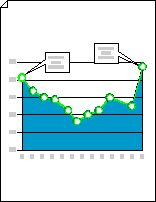
Create a line graph in Visio
A line graph shows how two pieces of information vary in relation to each other. For example, a line graph can show how the cost of shipping changed over a five year period, or how a population of insects grew or shrank as temperature changed.

-
Start Visio.
-
In Visio 2013 and newer versions: Under the search button, click Business > Charts and Graphs > Create.
In Visio 2010: Under Template Categories, click Business > Charts and Graphs > Create.
In Visio 2007: On the File menu, point to New, point to Business, and then click Charts and Graphs or Marketing Charts and Diagrams.
-
From Charting Shapes, drag the Line graph shape onto the drawing page, and then select the number of data points you want.
Tip: To change the number of data points later, right-click the line graph, click Set Number of Data Points, and then select a number.
-
Set the length of the x-axis and y-axis, and then add value and name labels to points along each axis:
-
Pause the pointer over the control handle
 at the end of the x-axis, and then drag the handle to the length you want.
 -
Repeat step 1 for the y-axis.
-
To zoom in, hold down CTRL+SHIFT and click the graph.
-
From Charting Shapes, drag the Y-axis label shape onto the drawing page. Line it up at the x- and y-axis origin, so that its horizontal line is flush with the x-axis.
-
With the Y-axis label shape selected, press CTRL+D to create a copy. Position the second label toward the top of the y-axis, so that its horizontal line is flush with the highest value.
Tip: To nudge a shape into position, select the shape and then press the arrow key that represents the direction you want.
-
Repeat to create labels for additional values along the y-axis.
-
Select each label shape, and then type the value or name that corresponds to the shape's position on the axis.
-
Repeat steps 4 through 7 using X-axis label shapes, and positioning them along the x-axis.
Tip: To space the value labels evenly, select all the labels along an axis. On the Shape menu, click Distribute Shapes, and then click the first option under Left/Right or Up/Down.
-
-
Drag the control handle associated with each data point to the appropriate value on the y-axis.
-
Add annotations to explain values or changes in values.
-
From Charting Shapes, drag a 1-D or 2-D word balloon, horizontal callout, or annotation shape onto the drawing page.
-
With the shape selected, type the text you want.
-
Drag the control handle or endpoint at the end of the pointer to change the pointer's length or direction.
-
-
To add a title to the graph, from Charting Shapes, drag a Text block shape onto the drawing page. With the text block selected, type a title.
Tip: If you want to highlight the data points on your line graph, use the Graph Line and Data Point shapes on Charting Shapes.
No comments:
Post a Comment