Add drill-down to a Power View chart or matrix
Add drill up/drill down to a chart or matrix in Power View so it shows just one level at a time. Report readers drill down to see details or drill up for summary data. To add drill up/drill down to a matrix or chart, it needs a hierarchy—either a hierarchy in the Data Model or a hierarchy you create in Power View.
Videos about drill-down

This video shows using a hierarchy that is in the data model already.

This video shows creating a hierarchy in Power View to use for drill up/drill down.
Add drill up/drill down using an existing hierarchy
This example explains adding drill up/drill down to a matrix. Drill up/drill down can also be added to bar, column, and pie charts.
The nice thing about having a hierarchy that already exists in the data model is that you can use it over and over in lots of Power View sheets and reports.
-
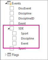
Create a visualization using an existing hierarchy. Hierarchies in the field list have an arrow for expanding and collapsing the hierarchy components. Clicking the hierarchy adds all of the component fields to the visualization as a table.
-
Convert the table to a matrix or chart. From the Design tab > Switch Visualization > Matrix.
-
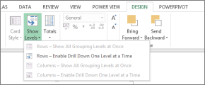
To enable drill-down, collapse the matrix. From the Design tab > Show Levels > Enable Drill Down One Level at a Time.
-
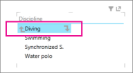
Double click a top-level hierarchy field. For example, in a Sports-Disciplines-Events hierarchy, click the sport of Aquatics. This drills down to the next level in my hierarchy and displays the four events that make up the sport of Aquatics: Diving, Swimming, Synchronized S., and Water polo.
-
Drill down further by clicking one of the fields. Clicking Synchronized S. drills down to the Events level in my hierarchy and displays duet, solo, and team.
-
Drill up by clicking the up arrow.
Create a hierarchy in Power View and use it to drill up/drill down
This example explains adding drill up/drill down to a bar chart. Drill up/drill down can also be added to matrices, column charts, and pie charts.
In order to drill down/drill up you need a hierarchy. In the previous example you used an existing hierarchy. In this example, you'll create an ad-hoc hierarchy in Power View. The hierarchy need not be "logical"; it can be any fields that you want to drill down to.
Create a table using fields that you want to be able to collapse and drill down/drill up. For help creating a table, see Tables in Power View.
You can manually create the same hierarchy you used in the previous example.
From the Events table, select Sport.
Note: The Sport field appears twice in the Events table – once on its own and again as part of the SDE hierarchy. To add Sport to the table, you can select either checkbox.
From the Disciplines table, select Discipline.
From the Events table, select Event.
Add a value field to your table. For example, Count of Medal.
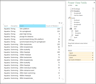
Convert the table into a chart or matrix. From the Design tab > Switch Visualization > Bar Chart > Stacked Bar.
In the Power View Fields layout area, ensure that the Axis fields are in the order you desire. In this case, Sport-Discipline-Event.
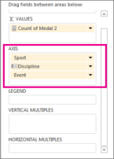
Double click a bar. For example, clicking the Aquatics bar drills down to the next level in my hierarchy and displays the four events that make up the sport of Aquatics: Diving, Swimming, Synchronized S., and Water polo.
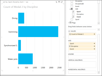
Drill down further by double clicking one of the fields. Double-clicking Synchronized S. drills down to the Events level in my hierarchy and displays duet, solo, and team.
Drill up by clicking the up arrow in the top right corner of the visualization
In a matrix
When you have a matrix with multiple fields in the rows or columns, you can set it to show levels, and that collapses the matrix to show only the top, or outermost, level. Double-clicking one value in that level expands the matrix to show the values under that one in the hierarchy. For example, in a hierarchy consisting of the fields Continent > Country/Region > State/Province > City, if you set Power View to show levels then you see only continent names in the matrix. Double-clicking a continent—say, Asia —shows the countries/regions in Asia, with an arrow to go back to continents. Double-clicking a country—say, India—shows the states/provinces of India, again with an arrow to go back up to countries/regions.
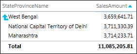
In a bar, column, or pie chart
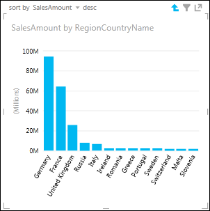
Bar, column, and pie charts work the same way. If a chart has multiple fields in the Axis box, you set it to show levels and you see only one level at a time, starting with the top level. Going back to the Continents example, if you double-click the Europe bar in a Continents bar chart…
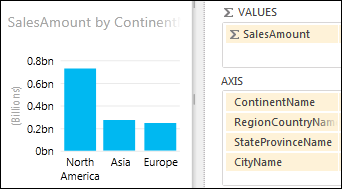
You see the bars for the countries/regions in Europe only, with an arrow to take you back up.
See Also
Working with a matrix in Power View
Power View: Explore, visualize, and present your data
Power View and Power Pivot videos
Tutorial: PivotTable data analysis using a Data Model in Excel 2013
No comments:
Post a Comment