How data is organized in a chart
Data in rows or columns?
When you create a chart in Microsoft Graph, you can determine which part of your data you want to emphasize. In the following example, the years, rather than the country or region, are plotted as the data series. This chart emphasizes the comparison of sales by country/region.
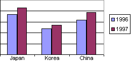
To emphasize a comparison of sales by year, you can change the chart to have the country/region data used as the data series.
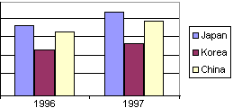
Order of categories and values
By default, Microsoft Graph plots categories and values in the order in which they appear on your datasheet. If you want them in a different order, you can reverse them.
In the following example, categories are plotted in the order in which they appear on the datasheet — April, March, February, and January:
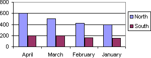
If you want the months to appear in chronological order instead, you can reverse the order:
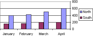
In the example above, you could also reverse the order of values so that the scale shows 0 at the top and 800 at the bottom.
Second value axis
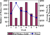
A secondary value axis is useful when the average values for different data series vary widely or when you are plotting different types of data in one chart. For example, to show both the number of homes sold each week and the average sales price per week, plot the number along one axis and the average price along the second axis.
X and Y values in a scatter chart
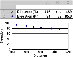
By default, the values in the first series on the datasheet are used for the x-axis in an xy (scatter) chart. An "X" appears in the row or column heading next to the data series you have assigned to be plotted on the x-axis.
In the following example, distance in feet is plotted on the x-axis:
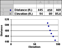
To change the emphasis, you can plot elevation on the x-axis, and the chart would look like this:
Empty cells
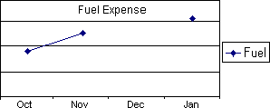
There are three ways that Microsoft Graph can plot an empty cell in the data range. By default, Graph does not plot a point for that cell. This causes a break in a data series, as shown in the following example, where there is no fuel expense data for December:
If you don't want to see a break in the series, you can have Graph interpolate, or estimate, the point. For example, in this chart, Graph averages the data for November and January to estimate the missing December data:
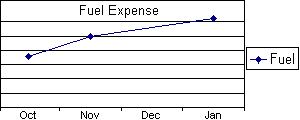
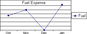
If the empty cell actually reflects a zero value, your chart can also reflect a zero value:
No comments:
Post a Comment