Interactive Dashboards using PowerPoint and Excel
Note: This article has done its job, and will be retiring soon. To prevent "Page not found" woes, we're removing links we know about. If you've created links to this page, please remove them, and together we'll keep the web connected.
Business Intelligence with Style and Functionality
By Glenna Shaw, PowerPoint MVP
What are interactive dashboards, and how can you use dashboards to communicate important information to your audience? This article discusses how to design and use interactive dashboards and provides links to sample files and presentations.
In this article
Introduction to Dashboards
Business Intelligence is a hot commodity in today's world and dashboards are the most frequently used method of providing that information.
So what exactly is a dashboard? My favorite definition comes from Stephen Few, "A dashboard is a visual display of the most important information needed to achieve one or more objectives which fits entirely on a single computer screen so it can be monitored at a glance." This echoes a theme that I once heard in a session lead by David Paradi at the PowerPoint Live Conference about using the GAR (Glance, Absorb, and Return.) principle. Rick Altman, the host of The Presentation Summit has graciously agreed to let me use data from his conference to create the example dashboard used for this article. Note that I've used aliases for topics and presenters to protect sensitive business information and speaker's privacy.
SharePoint and Excel are the most frequently used Microsoft mediums for creating dashboards (see the Microsoft Help Article: Introduction to Business Intelligence Features). Though frequently overlooked, PowerPoint combined with Excel offers an easy solution for creating elegant and functional dashboards. Additionally, PowerPoint offers an interactivity feature not available in other applications.
When creating any dashboard, the first rule of thumb should be that the data is the star. Cluttering the screen with unnecessary components will distract from the information displayed, so a KISS (Keep It Simple Stupid) approach is best. You'll want to strike a balance between making your dashboard attractive enough to hold your audience's interest, but not so stylized that it obscures the information displayed. A best practice is to avoid 3D charts and if information can be displayed more clearly in a table than a chart it should be in a table. Excel has a wonderful conditional formatting feature that allows you to have both: a graphical display within a table.
Dashboard Background
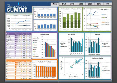
The first thing you'll want to do is create your background for housing your dashboard elements. I've chosen to place a gray custom shape on a dark blue background. Additionally I've applied an Inside Center shadow effect to the shape. This gives the appearance of a recessed box to house my dashboard elements. The advantage of this is that it draws the eye to the interior of the shape, placing the focus of the slide on the dashboard elements.

Dashboard Elements
Once you've created your background, you'll need to decide what elements you're going to include in your dashboard. Keep in mind that your dashboard should display data that will meet one or more business objectives. In my example, I've chosen to display a comparison of costs, attendance, topics and speakers for The Presentation Summit. Once you know your main objectives you can experiment with the elements to best display the information in a format easily understood by your audience. I've chosen to stick with simple tables and charts and take advantage of Excel's conditional formatting for my tables.

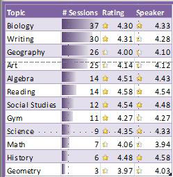
This table displays frequency of sessions graphically and ratings of sessions and speakers with indicators. I chose to use the default settings of conditional formatting indicators which are based loosely on a bell curve. Using the features of Excel you can display your information using complex statistical analysis (see the Microsoft Help and How-to article), but you should always keep your audience in mind. An element on a dashboard serves no purpose if your audience can't understand it.
Once you've decided on your elements, you'll want to group the elements so that it's clear to the audience how they relate to each other. There are multiple methods to achieve this. I've chosen to use color, proximity and enclosure in my example. Elements are grouped by placing them close together, using the same colors on charts and enclosing them using a colored outline. Costs are enclosed in blue, attendance in green, topics in purple, speakers in orange and specialized vs. general topics is turquoise. Note that I do not use both green and red. Significant portions of the population are red/green color blind and would not be able to tell the difference between the two.
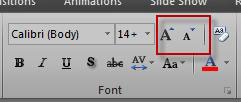
Finally, you'll want to make sure that the text on your dashboard is easy to read. Because dashboards are viewed on an individual computer screen you have more flexibility than with a traditional projected slide, but it can still be challenging. Trial and error using the Increase Font Size/Decrease Font Size buttons on the ribbon helps make this a little easier.

Interactive Dashboards
One of the most powerful features of PowerPoint is the ability to easily add interactivity without complicated programming. Interactivity in a dashboard can be a tricky element. Typically interactivity is added as a "drill down" to allow the audience to see more details about a particular element. On the down side, it's very difficult to easily absorb the information when you change from one window to another. It frequently requires your audience to flip back and forth. PowerPoint provides a unique ability to overcome this limitation that I like to call "dashboards in motion."
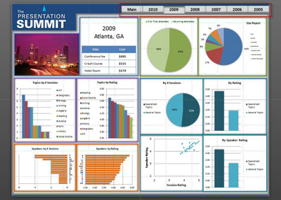
For my example I've created buttons at the top of the screen to allow Rick to drill down to dashboards displaying the same information for individual years. These buttons link to a separate slide for the respective yearly details. I've applied a shadow effect to indicate which button has been pressed. You can also link directly from the dashboard elements (i.e. click on a chart to see more details.) For more about PowerPoint interactivity see my tutorial on Dynamic PowerPoint.

I've very deliberately displayed the exact same data on every yearly detail slide and charts are carefully set to have the exact same axes. The audience can now drill down to see specific details for any single year. However, this isn't really the best part. By focusing on a single element of the yearly details slides, the audience can move back and forth between those slides (using the dashboard buttons, arrow keys, page up/page down keys or the scroll button) and observe the yearly changes for that element. The charts are literally in motion.

This is a trait unique to PowerPoint and handily overcomes the issue with absorbing the information on multiple slides/windows. If you chose to use this method, make sure to place your elements in the exact same location on your slides and that chart axes are consistent across the slides. This ensures that you're comparing like to like, otherwise the results can be misleading.
Sharing Your Dashboard
Once your dashboard is complete, save it as a PowerPoint Show (*.ppsx.) This will automatically open the dashboard when your audience clicks on it. You can save the file to a shared network drive or send it in email. If you're going to put your dashboard online, it doesn't get much better than the new Office Online. This feature is built into the Save & Send options in PowerPoint 2010, but if you're still using PowerPoint 2007 all it takes is a Windows Live account. With your Windows Live account you'll get access to OneDrive where you can post and share documents.
Conclusion
Any dashboard is only worth the value of the information that can be obtained from it, so what did Rick's dashboard tell us? Happily the dashboard shows that The Presentation Summit is a healthy conference that experiences annual growth and a high degree of customer satisfaction while keeping costs low. As an avid attendee and supporter of the conference, this was no surprise to me but it was nice to provide Rick the dashboard that proves what we already intuitively knew.
|

No comments:
Post a Comment