Explore and analyze data in reports and dashboards
Suppose that someone has published reports to SharePoint libraries, such as a Documents library in a Business Intelligence Center site. The reports look interesting, but you might not know at first how to use them. Read this article to learn how to explore and analyze data in reports, scorecards, and dashboards.
Getting started by using a simple dashboard
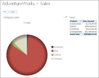
The best way to get started exploring data is to begin by using a simple report or a dashboard. The following image displays an example dashboard that we will use to explore and analyze data.
Figure: Example dashboard

In the example dashboard, we have a scorecard and several reports showing sales information.
-
A Category Sales report shows sales amounts across different product categories in a pie chart.
-
A Sales report shows sales amounts across different product categories in a table.
-
A Year filter that enables people to view information for a particular calendar year.
Together, the scorecard and reports convey a lot of information at a glance. For example, you can glean the following bits of information quickly and easily:
-
The sales amount for the Bikes category totals far more than any other product category.
-
Sales for Accessories and Clothing represent a very small portion of overall sales amounts.
-
The pie chart is showing sales information for the calendar year 2008.
To begin exploring data, we can conduct analysis using a report in the example dashboard.
We'll begin by opening the Category Sales report in a new browser window to make it easier to see.
To open a view in a new browser window
-
Click (or touch) near the title of the report. A small drop-down arrow appears.
-
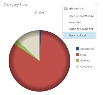
Click (or touch) the down arrow to open the Web Part menu for the report, and then choose Open in New Window. The report is displayed in a new browser window, where it is bigger and easier to see.
Figure: Web Part menu for an analytic report

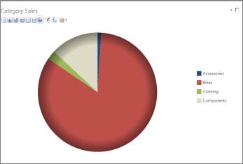
Notice that the chart legend and various toolbar commands are visible for this particular report. These items were not displayed until we opened this report in a new window.
Figure: Report open in a new browser window

You can use the toolbar commands in the upper left corner of the browser window to change the report type. For example, you can change it from a pie chart to a table, a bar chart, a stacked bar chart, and so on.
This particular report is highly interactive, which means that by clicking (or tapping) on values in the report, you can view additional or different information. To see a list of data exploration options, open the context menu.
To open the context menu for a report
-
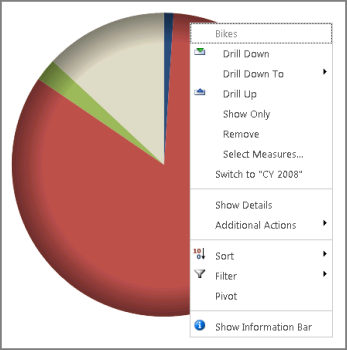
On a value, such as a wedge in a pie chart, right-click (or tap and hold a value for a second). The context menu opens and displays a list of actions you can apply to the report.
-
Click (or tap) an action in the context menu. The report updates to display information according to what was selected in the context menu.
Figure: Context menu open for an analytic report

Note: The list of actions that is displayed in a context menu will vary from one report to another. Some reports offer more options and commands than others, depending on the report type and the data source that is used for the report.
The following table summarizes commonly used actions.
Table: Commonly used actions for reports
| Action | Description |
| Drill Down | Shows the next lower level of detail for the group of items we are viewing. For example, if you are viewing Bikes, and you choose Drill Down, you would see the next level of detail for Bikes. In this case, it would be kinds of bikes, such as Mountain Bikes, Road Bikes, and so on. |
| Drill Down To | Enables you to view information for another dimension. For example, you could choose Drill Down To and then select a dimension such as Sales Territory > Country to see sales amounts for bikes in different countries. |
| Drill Up | Shows the next higher level of detail for the item you are viewing. For example, if you are viewing a report showing sales across four product categories, and you choose Drill Up, you will view sales for all the products together as a single group. |
| Show Only | Keeps the item you are viewing visible and removes the other items from view. This enables you to focus on a particular item, such as Bikes. |
| Remove | Removes an item from the view. This is useful if you are viewing a report that contains one item that has a trivial amount in relation to the other items in view. |
| Select Measures | Enables you to select a different measure to use in the report. For example, if you are viewing a report showing sales information, you can use this action to view information for a different measure, such as gross profit. |
| Show Details | Enables you to view transaction-level details for a particular item in a new browser window. For example, if you are viewing sales amounts for bikes, you can use this action to see all the underlying transactions for the total sales amount. You can also export these details to Excel and save the information to your computer to conduct further analysis on your own. |
Tips and tricks for successful analysis
Use actions such as those described earlier in this article to navigate and explore data in reports. You need not worry about clicking the wrong thing or breaking anything, because most reports are read-only reports. This means that although you can open menus that enable you to change your view of information, your changes are not saved on the server. In addition, you can easily reset a view to its original display by either using the Web Part menu to select Reset View, or by clicking the Refresh button in your browser window.
Here are some additional pointers for exploring and analyzing data:
-
Look for drop-down menus and icons that suggest menus are available for a given report or a value in a report
-
Try right-clicking (or touching and holding for a second) to open context menus that contain available actions you can apply.
-
If you find yourself getting lost in the data, reset the report view by clicking the Refresh button in your browser window, and try again.
-
Contact your SharePoint administrator if you need help understanding where the data comes from or if you cannot find the information that you need.
No comments:
Post a Comment