Update the data in an existing chart
After you create a chart, you might have to change its source data on the worksheet. To incorporate these changes in the chart, Microsoft Excel provides various ways to update a chart. You can instantly update a chart with changed values, or you can dynamically change the underlying source data. You can also update a chart by adding, changing, or removing data.
Change the underlying data that a chart is based on
When you update the underlying data of a chart, the chart's data and appearance also changes. The extent of those changes depends on how you define the chart's data source. In Excel, you can automatically update changed worksheet values in a chart, or you can use ways to dynamically change a chart's underlying data source.
Automatically update changed worksheet values in an existing chart
The values in a chart are linked to the worksheet data from which the chart is created. With calculation options set to automatic (in Excel, click File tab > Options > Formulas tab, Calculation Options button), changes that you make to the worksheet data automatically appear in the chart.
Note: In Excel 2007, click the Microsoft Office Button  > Excel Options> Formulas > Calculation > Calculation Options.
-
Open the worksheet that contains the data that is plotted in the chart.
-
In the cell that contains the value that you want to change, type a new value.
-
Press ENTER.
Dynamically change the underlying data source of an existing chart
If you want the chart's data source to dynamically grow, there are two approaches you can take. You can base a chart on data in an Excel table, or you can base it on a defined name.
Base the chart on an Excel table
If you create a chart based on a cell range, updates to data within the original range are reflected in the chart. But to expand the size of the range, by adding rows and columns, and change the chart's data and appearance, you must manually change the original data source in the chart by changing the cell range that a chart is based on.
If you want to change the chart's data and appearance when the data source expands, you can use an Excel table as the underlying data source.
-
Click the chart for which you want to change the cell range of the source data.
This displays the Chart Tools, adding the Design, Layout, and Format tabs.
-
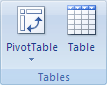
On the Design tab, in the Data group, click Select Data.
-
In the Select Data Source dialog box, note the location of the data range, and then click OK.
-
Go to the location of the data range, and click any cell in the data range.
-
On the Insert tab, in the Tables group, click Table.
Keyboard shortcut : Press CTRL+L or CTRL+T.
Base the chart on a defined name
Another approach to dynamically changing the chart's data and appearance when the data source expands is to use a defined name with the OFFSET function. This approach is useful when you need a solution that also works with previous versions of Excel.
For more information, see How to use defined names to automatically update a chart range in Excel.
Add data to an existing chart
You can use one of several ways to include additional source data in an existing chart. You can quickly add another data series, drag the sizing handles of ranges to include data on a chart that is embedded on the same worksheet, or copy additional worksheet data to an embedded chart or to a separate chart sheet.
Add a data series to a chart
-
Click the chart to which you want to add another data series.
This displays the Chart Tools, adding the Design, Layout, and Format tabs.
-
On the Design tab, in the Data group, click Select Data.
-
In the Select Data Source dialog box, under Legend Entries (Series), click Add.
-
In the Edit Series dialog box, do the following:
-
In the Series name box, type the name that you want to use for the series, or select the name on the worksheet.
-
In the Series values box, type the reference of the data range of the data series that you want to add, or select the range on the worksheet.
You can click the Collapse Dialog button
 , at the right end of the Series name or Series values box, and then select the range that you want to use for the table on the worksheet. When you finish, click the Collapse Dialog button again to display the whole dialog box.
If you use arrow keys to position the pointer to type the reference, you can press F2 to ensure that you are in Edit mode. Pressing F2 again switches back to Point mode. You can verify the current mode on the status bar.
-
Drag the sizing handles of ranges to add data to an embedded chart
If you created an embedded chart from adjacent worksheet cells, you can add data by dragging the sizing handles of source data ranges. The chart must be on the same worksheet as the data that you used to create the chart.
-
On the worksheet, type the data and labels that you want to add to the chart in cells that are adjacent to the existing worksheet data.
-
Click the chart to display the sizing handles around the source data on the worksheet.
-
On the worksheet, do one of the following:
-
To add new categories and data series to the chart, drag a blue sizing handle to include the new data and labels in the rectangle.
-
To add new data series only, drag a green sizing handle to include the new data and labels in the rectangle.
-
To add new categories and data points, drag a purple sizing handle to include the new data and categories in the rectangle.
-
Copy worksheet data to a chart
If you created an embedded chart from nonadjacent selections or if the chart is on a separate chart sheet, you can copy additional worksheet data into the chart.
-
On the worksheet, select the cells that contain the data that you want to add to the chart.
If you want the column or row label for the new data to appear in the chart, include the cell that contains the label in the selection.
-
On the Home tab, in the Clipboard group, click Copy
 .
.
Keyboard shortcut: Press CTRL+C.
-
Click the chart sheet or the embedded chart into which you want to paste the copied data.
-
Do one of the following:
-
To paste the data in the chart, on the Home tab, in the Clipboard group, click Paste
 .
.Keyboard shortcut: Press CTRL+V.
-
To specify how the copied data should be plotted in the chart, on the Home tab, in the Clipboard group, click the arrow on the Paste button, click Paste Special, and then select the options that you want.
-
Change the data in an existing chart
You can change an existing chart by changing the cell range that the chart is based on or by editing the individual data series that are displayed in the chart. You can also change the axis labels on the horizontal (category) axis.
Change the cell range that a chart is based on
-
Click the chart for which you want to change the cell range of the source data.
This displays the Chart Tools, adding the Design, Layout, and Format tabs.
-
On the Design tab, in the Data group, click Select Data.
-
In the Select Data Source dialog box, make sure that the whole reference in the Chart data range box is selected.
You can click the Collapse Dialog button
, at the right end of the Chart data range box, and then select the range that you want to use for the table on the worksheet. When you finish, click the Collapse Dialog button again to display the whole dialog box. -
On the worksheet, select the cells that contain the data that you want to appear in the chart.
If you want the column and row labels to appear in the chart, include the cells that contain them in the selection.
If you use arrow keys to position the pointer to type the reference, you can press F2 to make sure that you are in Edit mode. Pressing F2 again switches back to Point mode. You can verify the current mode on the status bar.
Rename or edit a data series that is displayed in a chart
You can modify the name and values of existing data series without affecting the data on the worksheet.
-
Click the chart that contains the data series that you want to change.
This displays the Chart Tools, adding the Design, Layout, and Format tabs.
-
On the Design tab, in the Data group, click Select Data.
-
In the Select Data Source dialog box, under Legend Entries (Series), select the data series that you want to change, and then click Edit.
-
To rename the data series, in the Series name box, type the name that you want to use for the series, or select the name on the worksheet. The name that you type appears in the chart legend, but is not added to the worksheet.
-
To change the data range for the data series, in the Series values box, type the reference of the data range of the data series that you want to add, select the range on the worksheet, or enter the values in the boxes. The values that you type are not added to the worksheet.
If the chart is an xy (scatter), the Series X values and Series Y values boxes appear so you can change the data range for those values. If the chart is a bubble chart, the Series X values, Series Y values, and Series bubble sizes boxes appear so you can change the data range for those values.
For each of the series boxes, you can click the Collapse Dialog button , at the right end of the Series name or Series values box, and then select the range that you want to use for the table on the worksheet. When you finish, click the Collapse Dialog button again to display the whole dialog box.
If you use arrow keys to position the pointer to type the reference, you can press F2 to ensure that you are in Edit mode. Pressing F2 again switches back to Point mode. You can verify the current mode on the status bar.
Change the order of the data series
-
Click the chart that contains the data series that you want to change.
This displays the Chart Tools, adding the Design, Layout, and Format tabs.
-
On the Design tab, in the Data group, click Select Data.
-
In the Select Data Source dialog box, under Legend Entries (Series), select the data series that you want to move to a different location in the sequence.
-
Click the Move Up or Move Down arrows to move the data series.
-
Repeat step 3 and 4 for all data series that you want to move.
Change the horizontal (category) axis labels
When you change the horizontal (category) axis labels, all horizontal axis labels will be changed. You cannot change individual, horizontal axis labels.
-
Click the chart that contains the horizontal axis labels that you want to change.
This displays the Chart Tools, adding the Design, Layout, and Format tabs.
-
On the Design tab, in the Data group, click Select Data.
-
Under Horizontal (Category) Axis Labels, click Edit.
-
In the Axis label range box, type the reference of the data range of the data series that you want to use for the horizontal axis labels, or select the range on the worksheet.
You can click the Collapse Dialog button
, at the right end of the Series name or Series values box, and then select the range that you want to use for the table on the worksheet. When you finish, click the Collapse Dialog button again to display the whole dialog box.If you use arrow keys to position the pointer to type the reference, you can press F2 to make sure that you are in Edit mode. Pressing F2 again switches back to Point mode. You can verify the current mode on the status bar.
Remove data from a chart
With calculation options set to automatic, the data that is deleted from the worksheet will automatically be removed from the chart. You can also remove data from the chart without affecting the source data on the worksheet.
Delete source data on the worksheet
-
On the worksheet, select the cell or range of cells that contains the data that you want to remove from the chart, and then press DELETE.
-
If you remove data from selected cells, empty cells are plotted in the chart. You can change the way empty cells are plotted by right-clicking the chart, and then selecting Hidden and Empty Cells.
-
If you delete a column, the whole data series is removed from the chart. If you delete a row, you may receive an error message. When you click OK, the chart may display one or more data points of the data series that you deleted. You can click those data points, and then press DELETE.
-
Remove a data series from the chart
-
Click the chart or the data series that you want to remove, or do the following to select the chart or data series from a list of chart elements:
-
Click a chart.
This displays the Chart Tools, adding the Design, Layout, and Format tabs.
-
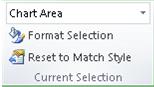
On the Format tab, in the Current Selection group, click the arrow next to the Chart Area box, and then click the chart element that you want to use.
-
-
Do one of the following:
-
If you selected the chart, do the following:
-
On the Design tab, in the Data group, click Select Data.
-
In the Select Data Source dialog box, under Legend Entries (Series), select the data series that you want to remove, and then click Remove.
-
-
If you selected a data series on the chart, press DELETE.
-
- Which version of Office are you using?
- Office 2016 for Mac
- Office for Mac 2011
Word
Edit data included in a chart
After you create a chart, you can edit the data in the Excel sheet. The changes will be reflected in the chart in Word.
-
On the View menu, click Print Layout.
-
Click the chart.
-
On the Chart Design tab, click Edit Data in Excel.
Excel opens and displays the data table for the chart.
-
To change the number of rows and columns that are included in the chart, rest the pointer on the lower-right corner of the selected data, and then drag to select additional data. In the following example, the table is expanded to include additional categories and data series.
-
To add data to or edit data in a cell, click the cell, and then make the change.
-
To see the results of your changes, switch to Word.
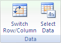
Change which chart axis is emphasized
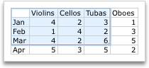
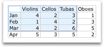
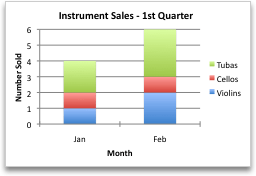
After you create a chart, you might want to change the way that table rows and columns are plotted in the chart. For example, your first version of a chart might plot the rows of data from the table on the chart's vertical (value) axis, and the columns of data on the horizontal (category) axis. In the following example, the chart emphasizes sales by instrument.

However, if you want the chart to emphasize the sales by month, you can reverse the way the chart is plotted.
-
On the View menu, click Print Layout.
-
Click the chart.
-
On the Chart Design tab, click Switch Row/Column.
Switch Row/Column is available only when the chart's Excel data table is open and only for certain chart types. If Switch Row/Column is not available:
-
Click the chart.
-
On the Chart Design tab, click Edit Data in Excel.
-
Change the order of the data series
To change the order of a data series, you need to work with a chart that has more than one data series.
-
On the View menu, click Print Layout.
-
In the chart, select a data series. For example, in a column chart, click a column, and all the columns of that data series become selected.
-
On the Chart Design tab, click Select Data.
-
In the Select Data Source dialog box, next to Legend entries (Series), use the up and down arrows to move the series up or down in the list.
Depending on the chart type, some options may not be available.
Note: For most chart types, changing the order of the data series affects both the legend and the chart itself.
-
Click OK.
Remove or add a data series
-
On the View menu, click Print Layout.
-
In the chart, select a data series. For example, in a column chart, click a column, and all columns of that data series become selected.
-
On the Chart Design tab, click Select Data.
-
In the Select Data Source dialog box, do one of the following.
To
Do this
Remove a series
Under Legend entries (Series), select the data series that you want to remove, and then click Remove (-).
Add a series
Under Legend entries (Series), click Add (+), and then in the Excel sheet, select all the data that you want to include in the chart.
-
Click OK.
Change the fill color of the data series
-
On the View menu, click Print Layout.
-
In the chart, select a data series. For example, in a column chart, click a column, and all the columns of that data series become selected.
-
Click the Format tab.
-
Under Chart Element Styles, click the arrow next to Fill
 , and then click the color that you want.
Add data labels
You can add labels to show the data point values from the Excel sheet in the chart.
-
On the View menu, click Print Layout.
-
Click the chart, and then click the Chart Design tab.
-
Click Add Chart Element, and then click Data Labels.
-
Select the location in which you want the data label to appear (for example, select Outside End).
Depending on the chart type, some options may not be available.
Add a data table
-
On the View menu, click Print Layout.
-
Click the chart, and then click the Chart Design tab.
-
Click Add Chart Element, and then click Data Table.
-
Select the options that you want.
Depending on the chart type, some options may not be available.
Display dates on a horizontal axis
When you create a chart from data that uses dates, and the dates are plotted along the horizontal axis in the chart, Office automatically changes the horizontal axis to a date (time-scale) axis. You can also manually change a horizontal axis to a date axis. A date axis displays dates in chronological order at set intervals or base units, such as the number of days, months, or years, even if the dates on the Excel sheet are not in sequential order or in the same base units.
By default, Office uses the smallest difference between any two dates in the data to determine the base units for the date axis. For example, if you have data for stock prices where the smallest difference between dates is seven days, Office sets the base unit to days. However, you can change the base unit to months or years if you want to see the performance of the stock over a longer time.
-
On the View menu, click Print Layout.
-
Click the chart, and then click the Chart Design tab.
-
Click Add Chart Element, click Axes, and then click More Axis Options. The Format Axis pane appears.
-
For the axis that you want to change, make sure that the axis labels show.
-
Under Axis Type, click Date axis.
-
Under Units, in the Base drop-down list box, select Days, Months, or Years.
Depending on the chart type, some options may not be available.
Note: If you follow this procedure and your chart does not display the dates as a time-scale axis, make sure that the axis labels are written in date format in the Excel table, such as 05/01/08 or May-08. To learn more about how to format cells as dates, see Display dates, times, currency, fractions, or percentages.
PowerPoint
Edit data included in a chart
After you create a chart, you can edit the data in the Excel sheet. The changes will be reflected in the chart in PowerPoint.
-
Click the chart.
-
On the Chart Design tab, click Edit Data in Excel.
Excel opens and displays the data table for the chart.
-
To change the number of rows and columns that are included in the chart, rest the pointer on the lower-right corner of the selected data, and then drag to select additional data. In the following example, the table is expanded to include additional categories and data series.
-
To add data to or edit data in a cell, click the cell, and then make the change.
-
To see your changes, switch to PowerPoint.
Change which chart axis is emphasized
After you create a chart, you might want to change the way that table rows and columns are plotted in the chart. For example, your first version of a chart might plot the rows of data from the table on the chart's vertical (value) axis, and the columns of data on the horizontal (category) axis. In the following example, the chart emphasizes sales by instrument.
However, if you want the chart to emphasize the sales by month, you can reverse the way the chart is plotted.
-
Click the chart.
-
On the Chart Design tab, select Switch Row/Column.
Switch Row/Column is available only when the chart's Excel data table is open and only for certain chart types. If Switch Row/Column is not available:
-
Click the chart.
-
On the Chart Design tab, click Edit Data in Excel.
-
Change the order of the data series
To change the order of a data series, you need to work with a chart that has more than one data series.
-
In the chart, select a data series. For example, in a column chart, click a column, and all the columns of that data series become selected.
-
On the Chart Design tab, click Select Data.
-
In the Select Data Source dialog box, next to Legend entries (Series), use the up and down arrows to move the series up or down in the list.
Depending on the chart type, some options may not be available.
Note: For most chart types, changing the order of the data series affects both the legend and the chart itself.
-
Click OK.
Remove or add a data series
-
In the chart, select a data series. For example, in a column chart, click a column, and all columns of that data series become selected.
-
Click the Chart Design tab, and then click Select Data.
-
In the Select Data Source dialog box, do one of the following.
To
Do this
Remove a series
Under Legend entries (Series), select the data series that you want to remove, and then click Remove (-).
Add a series
Under Legend entries (Series), click Add (+), and then in the Excel sheet, select all the data that you want to include in the chart.
-
Click OK.
Change the fill color of the data series
-
In the chart, select a data series. For example, in a column chart, click a column, and all the columns of that data series become selected.
-
Click the Format tab.
-
Under Chart Element Styles, click the arrow next to Fill
, and then click the color that you want.
Add data labels
You can add labels to show the data point values from the Excel sheet in the chart.
-
Click the chart, and then click the Chart Design tab.
-
Click Add Chart Element, and then click Data Labels.
-
Select the location in which you want the data label to appear (for example, select Outside End).
Depending on the chart type, some options may not be available.
Add a data table
-
Click the chart, and then click the Chart Design tab.
-
Click Add Chart Element, and then click Data Table.
-
Select the options that you want.
Depending on the chart type, some options may not be available.
Display dates on a horizontal axis
When you create a chart from data that uses dates, and the dates are plotted along the horizontal axis in the chart, Office automatically changes the horizontal axis to a date (time-scale) axis. You can also manually change a horizontal axis to a date axis. A date axis displays dates in chronological order at set intervals or base units, such as the number of days, months, or years, even if the dates on the Excel sheet are not in sequential order or in the same base units.
By default, Office uses the smallest difference between any two dates in the data to determine the base units for the date axis. For example, if you have data for stock prices where the smallest difference between dates is seven days, Office sets the base unit to days. However, you can change the base unit to months or years if you want to see the performance of the stock over a longer time.
-
Click the chart, and then click the Chart Design tab.
-
Click Add Chart Element, click Axes, and then click More Axis Options. The Format Axis pane appears.
-
For the axis that you want to change, make sure that the axis labels show.
-
Under Axis Type, select Date axis.
-
Under Units, in the Base drop-down list box, select Days, Months, or Years.
Depending on the chart type, some options may not be available.
Note: If you follow this procedure and your chart does not display the dates as a time-scale axis, make sure that the axis labels are written in date format in the Excel table, such as 05/01/08 or May-08. To learn more about how to format cells as dates, see Display dates, times, currency, fractions, or percentages.
Excel
Edit data included in a chart
After you create a chart, you can edit the data in the Excel sheet. The changes will be reflected in the chart.
-
Click the chart.
Excel highlights the data table that is used for the chart. The gray fill indicates a row or column used for the category axis. The red fill indicates a row or column that contains data series labels. The blue fill indicates data points plotted in the chart.
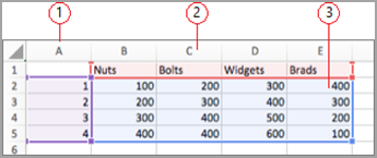
 Data series labels
 Values for the category axis
 Data points plotted in the chart
 -
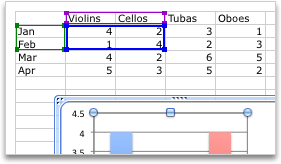
To change the number of rows and columns that are included in the chart, rest the pointer on the lower-right corner of the selected data, and then drag to select additional data. In the following example, the table is expanded to include additional categories and data series.
Tip: To prevent that data from being displayed in the chart, you can hide rows and columns in the table.
-
To add data to or edit data in a cell, click the cell, and then make the change.
Change which chart axis is emphasized
After you create a chart, you might want to change the way that table rows and columns are plotted in the chart. For example, your first version of a chart might plot the rows of data from the table on the chart's vertical (value) axis, and the columns of data on the horizontal (category) axis. In the following example, the chart emphasizes sales by instrument.
However, if you want the chart to emphasize the sales by month, you can reverse the way the chart is plotted.
-
Click the chart.
-
On the Chart Design tab, click Switch Row/Column.
Change the order of the data series
To change the order of a data series, you need to work with a chart that has more than one data series.
-
In the chart, select a data series. For example, in a column chart, click a column, and all the columns of that data series become selected.
-
On the Chart Design tab, click Select Data.
-
In the Select Data Source dialog box, next to Legend entries (Series), use the up and down arrows to move the series up or down in the list.
Depending on the chart type, some options may not be available.
Note: For most chart types, changing the order of the data series affects both the legend and the chart itself.
-
Click OK.
Remove or add a data series
-
In the chart, select a data series. For example, in a column chart, click a column, and all columns of that data series become selected.
-
Click the Chart Design tab, and then click Select Data.
-
In the Select Data Source dialog box, do one of the following.
To
Do this
Remove a series
Under Legend entries (Series), select the data series that you want to remove, and then click Remove (-).
Add a series
Under Legend entries (Series), click Add (+), and then in the Excel sheet, select all the data that you want to include in the chart.
-
Click OK.
Change the fill color of the data series
-
In the chart, select a data series. For example, in a column chart, click a column, and all the columns of that data series become selected..
-
Click the Format tab.
-
Under Chart Element Styles, click the arrow next to Fill
, and then click the color that you want.Tip: To vary the color by data point in a chart that has only one data series, click the series, and then click the Format tab. Click Fill, and then depending on the chart, select the Vary color by point check box or the Vary color by slice check box. Depending on the chart type, some options may not be available.
Add data labels
You can add labels to show the data point values from the Excel sheet in the chart.
-
Click the chart, and then click the Chart Design tab.
-
Click Add Chart Element, and then click Data Labels.
-
Select the location in which you want the data label to appear (for example, select Outside End).
Depending on the chart type, some options may not be available.
Add a data table
-
Click the chart, and then click the Chart Design tab.
-
Click Add Chart Element, and then click Data Table.
-
Select the options that you want.
Depending on the chart type, some options may not be available.
Display dates on a horizontal axis
When you create a chart from data that uses dates, and the dates are plotted along the horizontal axis in the chart, Office automatically changes the horizontal axis to a date (time-scale) axis. You can also manually change a horizontal axis to a date axis. A date axis displays dates in chronological order at set intervals or base units, such as the number of days, months, or years, even if the dates on the Excel sheet are not in sequential order or in the same base units.
By default, Office uses the smallest difference between any two dates in the data to determine the base units for the date axis. For example, if you have data for stock prices where the smallest difference between dates is seven days, Office sets the base unit to days. However, you can change the base unit to months or years if you want to see the performance of the stock over a longer time.
-
Click the chart, and then click the Chart Design tab.
-
Click Add Chart Element, click Axes, and then click More Axis Options. The Format Axis pane appears.
-
For the axis that you want to change, make sure that the axis labels show.
-
Under Axis Type, select Date axis.
-
Under Units, in the Base drop-down list box, select Days, Months, or Years.
Depending on the chart type, some options may not be available.
Note: If you follow this procedure and your chart does not display the dates as a time-scale axis, make sure that the axis labels are written in date format in the Excel table, such as 05/01/08 or May-08. To learn more about how to format cells as dates, see Display dates, times, currency, fractions, or percentages.
Word
Edit data included in a chart
After you create a chart, you can edit the data in the Excel sheet. The changes will be reflected in the chart in Word.
-
On the View menu, click Print Layout.
-
Click the chart.
-
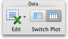
On the Charts tab, under Data, click the arrow next to Edit, and then click Edit Data in Excel.
Excel opens and displays the data table for the chart.
-
To change the number of rows and columns that are included in the chart, rest the pointer on the lower-right corner of the selected data, and then drag to select additional data. In the following example, the table is expanded to include additional categories and data series.
-
To add data to or edit data in a cell, click the cell, and then make the change.
-
To see the results of your changes, switch to Word.
Change which chart axis is emphasized
After you create a chart, you might want to change the way that table rows and columns are plotted in the chart. For example, your first version of a chart might plot the rows of data from the table on the chart's vertical (value) axis, and the columns of data on the horizontal (category) axis. In the following example, the chart emphasizes sales by instrument.
However, if you want the chart to emphasize the sales by month, you can reverse the way the chart is plotted.
-
On the View menu, click Print Layout.
-
Click the chart.
-
On the Charts tab, under Data, click Plot series by row
 or Plot series by column
  .
. If Switch Plot is not available
Switch Plot is available only when the chart's Excel data table is open and only for certain chart types.
-
Click the chart.
-
On the Charts tab, under Data, click the arrow next to Edit, and then click Edit Data in Excel.
-
Change the order of the data series
To change the order of a data series, you need to work with a chart that has more than one data series.
-
On the View menu, click Print Layout.
-
In the chart, select a data series, and then click the Chart Layout tab.
For example, in a column chart, click a column, and all the columns of that data series become selected.
-
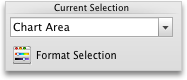
Under Current Selection, click Format Selection.
-
In the navigation pane, click Order, click a series name, and then click Move Up or Move Down.
Depending on the chart type, some options may not be available.
Note: For most chart types, changing the order of the data series affects both the legend and the chart itself.
Remove or add a data series
-
On the View menu, click Print Layout.
-
In the chart, select a data series, and then click the Charts tab.
For example, in a column chart, click a column, and all columns of that data series become selected.
-
Under Data, click the arrow next to Edit, and then click Select Data in Excel.
-
In the Select Data Source dialog box, do one of the following.
To
Do this
Remove a series
Under Series, select the data series that you want to remove, and then click Remove.
Add a series
Under Series, click Add, and then in the Excel sheet, select all the data that you want to include in the chart.
Change the fill color of the data series
-
On the View menu, click Print Layout.
-
In the chart, select a data series, and then click the Format tab.
For example, in a column chart, click a column, and all the columns of that data series become selected.
-
Under Chart Element Styles, click the arrow next to Fill
, and then click the color that you want.Tip: To vary the color by data point in a chart that has only one data series, click the series, and then click the Chart Layout tab. Under Current Selection, click Format Selection. In the navigation pane, click Fill, and then depending on the chart, select the Vary color by point check box or the Vary color by slice check box. Depending on the chart type, some options may not be available.
Add data labels
You can add labels to show the data point values from the Excel sheet in the chart.
-
On the View menu, click Print Layout.
-
Click the chart, and then click the Chart Layout tab.
-
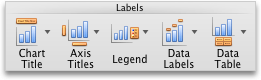
Under Labels, click Data Labels, and then in the upper part of the list, click the data label type that you want.
-
Under Labels, click Data Labels, and then in the lower part of the list, click where you want the data label to appear.
Depending on the chart type, some options may not be available.
Add a data table
-
On the View menu, click Print Layout.
-
Click the chart, and then click the Chart Layout tab.
-
Under Labels, click Data Table, and then click the option that you want.
Depending on the chart type, some options may not be available.
Display dates on a horizontal axis
When you create a chart from data that uses dates, and the dates are plotted along the horizontal axis in the chart, Office automatically changes the horizontal axis to a date (time-scale) axis. You can also manually change a horizontal axis to a date axis. A date axis displays dates in chronological order at set intervals or base units, such as the number of days, months, or years, even if the dates on the Excel sheet are not in sequential order or in the same base units.
By default, Office uses the smallest difference between any two dates in the data to determine the base units for the date axis. For example, if you have data for stock prices where the smallest difference between dates is seven days, Office sets the base unit to days. However, you can change the base unit to months or years if you want to see the performance of the stock over a longer time.
-
On the View menu, click Print Layout.
-
Click the chart, and then click the Chart Layout tab.
-
For the axis that you want to change, make sure that the axis labels show.
-
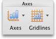
Under Axes, click Axes, point to Horizontal Axis, and then click Axis Options.
-
In the navigation pane, click Scale, and then under Horizontal axis type, click Date.
Depending on the chart type, some options may not be available.
Note: If you follow this procedure and your chart does not display the dates as a time-scale axis, make sure that the axis labels are written in date format in the Excel table, such as 05/01/08 or May-08. To learn more about how to format cells as dates, see Display dates, times, currency, fractions, or percentages.
PowerPoint
Edit data included in a chart
After you create a chart, you can edit the data in the Excel sheet. The changes will be reflected in the chart in PowerPoint.
-
Click the chart.
-
On the Charts tab, under Data, click the arrow next to Edit, and then click Edit Data in Excel.
Excel opens and displays the data table for the chart.
-
To change the number of rows and columns that are included in the chart, rest the pointer on the lower-right corner of the selected data, and then drag to select additional data. In the following example, the table is expanded to include additional categories and data series.
-
To add data to or edit data in a cell, click the cell, and then make the change.
-
To see your changes, switch to PowerPoint.
Change which chart axis is emphasized
After you create a chart, you might want to change the way that table rows and columns are plotted in the chart. For example, your first version of a chart might plot the rows of data from the table on the chart's vertical (value) axis, and the columns of data on the horizontal (category) axis. In the following example, the chart emphasizes sales by instrument.
However, if you want the chart to emphasize the sales by month, you can reverse the way the chart is plotted.
-
Click the chart.
-
On the Charts tab, under Data, click Plot series by row
or Plot series by column . If Switch Plot is not available
Switch Plot is available only when the chart's Excel data table is open and only for certain chart types.
-
Click the chart.
-
On the Charts tab, under Data, click the arrow next to Edit, and then click Edit Data in Excel.
-
Change the order of the data series
To change the order of a data series, you need to work with a chart that has more than one data series.
-
In the chart, select a data series, and then click the Chart Layout tab.
For example, in a column chart, click a column, and all the columns of that data series become selected.
-
Under Current Selection, click Format Selection.
-
In the navigation pane, click Order, click a series name, and then click Move Up or Move Down.
Depending on the chart type, some options may not be available.
Note: For most chart types, changing the order of the data series affects both the legend and the chart itself.
Remove or add a data series
-
In the chart, select a data series, and then click the Charts tab.
For example, in a column chart, click a column, and all columns of that data series become selected.
-
Under Data, click the arrow next to Edit, and then click Select Data in Excel.
-
In the Select Data Source dialog box, do one of the following.
To
Do this
Remove a series
Under Series, select the data series that you want to remove, and then click Remove.
Add a series
Under Series, click Add, and then in the Excel sheet, select all the data that you want to include in the chart.
Change the fill color of the data series
-
In the chart, select a data series, and then click the Format tab.
For example, in a column chart, click a column, and all the columns of that data series become selected.
-
Under Chart Element Styles, click the arrow next to Fill
, and then click the color that you want.Tip: To vary the color by data point in a chart that has only one data series, click the series, and then click the Chart Layout tab. Under Current Selection, click Format Selection. In the navigation pane, click Fill, and then depending on the chart, select the Vary color by point check box or the Vary color by slice check box. Depending on the chart type, some options may not be available.
Add data labels
You can add labels to show the data point values from the Excel sheet in the chart.
-
Click the chart, and then click the Chart Layout tab.
-
Under Labels, click Data Labels, and then in the upper part of the list, click the data label type that you want.
-
Under Labels, click Data Labels, and then in the lower part of the list, click where you want the data label to appear.
Depending on the chart type, some options may not be available.
Add a data table
-
Click the chart, and then click the Chart Layout tab.
-
Under Labels, click Data Table, and then click the option that you want.
Depending on the chart type, some options may not be available.
Display dates on a horizontal axis
When you create a chart from data that uses dates, and the dates are plotted along the horizontal axis in the chart, Office automatically changes the horizontal axis to a date (time-scale) axis. You can also manually change a horizontal axis to a date axis. A date axis displays dates in chronological order at set intervals or base units, such as the number of days, months, or years, even if the dates on the Excel sheet are not in sequential order or in the same base units.
By default, Office uses the smallest difference between any two dates in the data to determine the base units for the date axis. For example, if you have data for stock prices where the smallest difference between dates is seven days, Office sets the base unit to days. However, you can change the base unit to months or years if you want to see the performance of the stock over a longer time.
-
Click the chart, and then click the Chart Layout tab.
-
For the axis that you want to change, make sure that the axis labels show.
-
Under Axes, click Axes, point to Horizontal Axis, and then click Axis Options.
-
In the navigation pane, click Scale, and then under Horizontal axis type, click Date.
Depending on the chart type, some options may not be available.
Note: If you follow this procedure and your chart does not display the dates as a time-scale axis, make sure that the axis labels are written in date format in the Excel table, such as 05/01/08 or May-08. To learn more about how to format cells as dates, see Display dates, times, currency, fractions, or percentages.
Excel
Edit data included in a chart
After you create a chart, you can edit the data in the Excel sheet. The changes will be reflected in the chart.
-
Click the chart.
Excel highlights the data table that is used for the chart. A purple outline indicates a row or column used for the category axis. A green outline indicates a row or column that contains data series labels. A blue outline indicates data points plotted in the chart.
 Data series labels Values for the category axis Data points plotted in the chart
 -
To change the number of rows and columns that are included in the chart, rest the pointer on the lower-right corner of the selected data, and then drag to select additional data. In the following example, the table is expanded to include additional categories and data series.
Tip: To prevent that data from being displayed in the chart, you can hide rows and columns in the table.
-
To add data to or edit data in a cell, click the cell, and then make the change.
Change which chart axis is emphasized
After you create a chart, you might want to change the way that table rows and columns are plotted in the chart. For example, your first version of a chart might plot the rows of data from the table on the chart's vertical (value) axis, and the columns of data on the horizontal (category) axis. In the following example, the chart emphasizes sales by instrument.
However, if you want the chart to emphasize the sales by month, you can reverse the way the chart is plotted.
-
Click the chart.
-
On the Charts tab, under Data, click Plot series by row
or Plot series by column .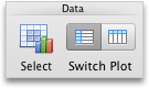
Change the order of the data series
To change the order of a data series, you need to work with a chart that has more than one data series.
-
In the chart, select a data series, and then click the Chart Layout tab.
For example, in a column chart, click a column, and all the columns of that data series become selected.
-
Under Current Selection, click Format Selection.
-
In the navigation pane, click Order, click a series name, and then click Move Up or Move Down.
Depending on the chart type, some options may not be available.
Note: For most chart types, changing the order of the data series affects both the legend and the chart itself.
Remove or add a data series
-
In the chart, select a data series, and then click the Charts tab.
For example, in a column chart, click a column, and all columns of that data series become selected.
-
Under Data, click Select.
-
In the Select Data Source dialog box, do one of the following.
To
Do this
Remove a series
Under Series, select the data series that you want to remove, and then click Remove.
Add a series
Under Series, click Add, and then in the Excel sheet, select all the data that you want to include in the chart.
Change the fill color of the data series
-
In the chart, select a data series, and then click the Format tab.
For example, in a column chart, click a column, and all the columns of that data series become selected.
-
Under Chart Element Styles, click the arrow next to Fill
, and then click the color that you want.Tip: To vary the color by data point in a chart that has only one data series, click the series, and then click the Chart Layout tab. Under Current Selection, click Format Selection. In the navigation pane, click Fill, and then depending on the chart, select the Vary color by point check box or the Vary color by slice check box. Depending on the chart type, some options may not be available.
Add data labels
You can add labels to show the data point values from the Excel sheet in the chart.
-
Click the chart, and then click the Chart Layout tab.
-
Under Labels, click Data Labels, and then in the upper part of the list, click the data label type that you want.
-
Under Labels, click Data Labels, and then in the lower part of the list, click where you want the data label to appear.
Depending on the chart type, some options may not be available.
Add a data table
-
Click the chart, and then click the Chart Layout tab.
-
Under Labels, click Data Table, and then click the option that you want.
Depending on the chart type, some options may not be available.
Display dates on a horizontal axis
When you create a chart from data that uses dates, and the dates are plotted along the horizontal axis in the chart, Office automatically changes the horizontal axis to a date (time-scale) axis. You can also manually change a horizontal axis to a date axis. A date axis displays dates in chronological order at set intervals or base units, such as the number of days, months, or years, even if the dates on the Excel sheet are not in sequential order or in the same base units.
By default, Office uses the smallest difference between any two dates in the data to determine the base units for the date axis. For example, if you have data for stock prices where the smallest difference between dates is seven days, Office sets the base unit to days. However, you can change the base unit to months or years if you want to see the performance of the stock over a longer time.
-
Click the chart, and then click the Chart Layout tab.
-
For the axis that you want to change, make sure that the axis labels show.
-
Under Axes, click Axes, point to Horizontal Axis, and then click Axis Options.
-
In the navigation pane, click Scale, and then under Horizontal axis type, click Date.
Depending on the chart type, some options may not be available.
Note: If you follow this procedure and your chart does not display the dates as a time-scale axis, make sure that the axis labels are written in date format in the Excel table, such as 05/01/08 or May-08. To learn more about how to format cells as dates, see Display dates, times, currency, fractions, or percentages.
No comments:
Post a Comment