Filtering and highlighting in Power View
Power View provides several ways to filter and highlight data in reports. Because of the metadata in the underlying Data Model, Power View uses the relationships between the different tables and fields in the model to make items on a sheet or view highlight and filter each other.
Power View has many different ways to slice and dice the data. Filters remove all but the data I want to focus on. To filter data in Power View, I can use Filter Pane filters, slicers, and cross-filters. Highlighting is not filtering since it does not remove data but highlights a subset of the viewable data; the unhighlighted data remains visible but dimmed.
Filters and highlighting can apply to an entire sheet or view, individual visualizations, and to each other. None of the filters apply across multiple sheets or views.
All of them allow you to limit your data by selecting one or multiple values.
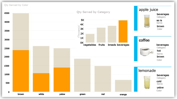
Clicking the beverages bar in the inset bar chart highlights beverage values in the large bar chart and filters the cards.

Cross-filtering and highlighting with charts
Visualizations can act as filters and highlighters, thanks to the relationships in the underlying model. This is cross-visual interactivity, meaning that you can select values directly on one visualization and have that filter and/or highlight other data regions on a view. For example, if you select one column in a column chart, this automatically:
filters the values in all the tables, tiles, and bubble charts in the report; and
highlights values in maps and bar and column charts. It highlights the parts that pertain to that value, showing the contribution of the selected values to the original values.
Use Ctrl + click to select multiple values. To clear the filter, click inside the filter, but not on a value.
Interactive filtering also works with charts with multiple series. Clicking one section of a bar in a stacked bar chart filters to that specific value. Clicking an item in the legend filters all the sections in that series.
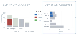
In the following image, the column chart on the left is highlighting just cold beverages in the bar chart on the right. Cold beverages are only yellow and white. This shows what part of the yellow and white foods are cold beverages.
Column chart filtering a value in a series

Interactive filter selections are saved when you move from one sheet or view to another, but they are not saved with the workbook or report. When you save and open the workbook or report later, each chart will be back in its original state.
No comments:
Post a Comment