Examples of chart types
Column
A column chart shows data changes over a period of time or illustrates comparisons among items. Categories are organized horizontally, values vertically, to emphasize variation over time.
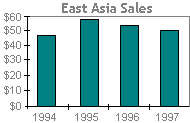
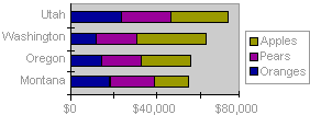
Stacked column charts show the relationship of individual items to the whole.
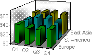
The 3-D perspective column chart compares data points along two axes. In this 3-D chart, you can compare four quarters of sales performance in Europe with the performance of two other divisions.
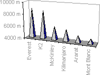
Cone, cylinder, and pyramid
The cone, cylinder, and pyramid data markers can lend a dramatic effect to 3-D column and bar charts.
Bar
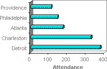
A bar chart illustrates comparisons among individual items. Categories are organized vertically, values horizontally, to focus on comparing values and to place less emphasis on time.
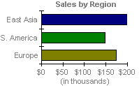
Stacked bar charts show the relationship of individual items to the whole.
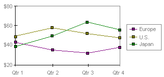
Line
A line chart shows trends in data at equal intervals.
Area
An area chart emphasizes the magnitude of change over time. By displaying the sum of the plotted values, an area chart also shows the relationship of parts to a whole.
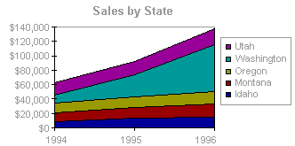
In this example, an area chart emphasizes increased sales in Washington and illustrates the contribution of each state to total sales.
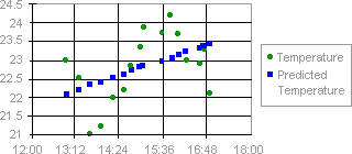
XY (scatter)
An xy (scatter) chart either shows the relationships among the numeric values in several data series or plots two groups of numbers as one series of xy coordinates. It shows uneven intervals — or clusters — of data and is commonly used for scientific data.
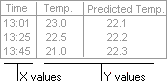
When you arrange your data, place x values in one row or column, and then enter corresponding y values in the adjacent rows or columns.
Bubble
A bubble chart is a type of xy (scatter) chart. The size of the data marker indicates the value of a third variable.
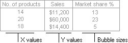
To arrange your data, place the x values in one row or column, and enter corresponding y values and bubble sizes in the adjacent rows or columns.
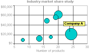
The chart in this example shows that Company A has the most products and the greatest market share but not the highest sales.
Pie
A pie chart shows the proportional size of items that make up a data series to the sum of the items. It always shows only one data series and is useful when you want to emphasize a significant element.
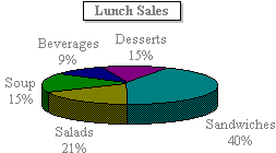
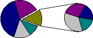
To make small slices easier to see, you can group them together as one item in a pie chart and then break down that item in a smaller pie or bar chart next to the main chart.
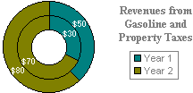
Doughnut
Like a pie chart, a doughnut chart shows the relationship of parts to a whole, but it can contain more than one data series. Each ring of the doughnut chart represents a data series.
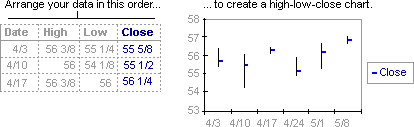
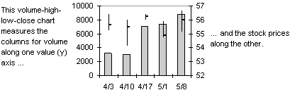
Stock
The high-low-close chart is often used to illustrate stock prices. This chart can also be used for scientific data, for example, to indicate temperature changes. You must organize your data in the correct order to create this and other stock charts.
A stock chart that measures volume has two value axes: one for the columns that measure volume, the other for the stock prices. You can include volume in a high-low-close or open-high-low-close chart.
Surface
A surface chart is useful when you want to find optimum combinations between two sets of data. As in a topographic map, colors and patterns indicate areas that are in the same range of values.
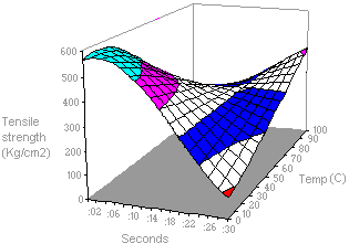
This chart shows the various combinations of temperature and time that result in the same measure of tensile strength.
Radar
In a radar chart, each category has its own value axis radiating from the center point. Lines connect all the values in the same series.
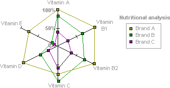
A radar chart compares the aggregate values of a number of data series. In this chart, the data series that covers the most area, Brand A, represents the brand with the highest vitamin content.
No comments:
Post a Comment