Quick start: Apply conditional formatting
By applying conditional formatting to your data, you can quickly identify variances in a range of values with a quick glance.

This graphic shows temperature data with conditional formatting that uses a color scale to differentiate high, medium, and low values. The following procedure uses that data.
How?
| | Select the data that you want to conditionally format |
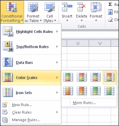
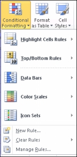
| | Apply the conditional formatting
|
| | Experiment with the conditional formatting On the Home tab, in the Styles group, click the arrow next to Conditional Formatting, and then experiment with the available styles. |
Next steps
-
Watch a video to see conditional formatting in action: Video: Apply conditional formatting
-
After you have applied a style, select your data, click Conditional Formatting on the ribbon, and then click Manage Rules to manually fine-tune your rules and formatting.
-
For more detailed information about getting started with conditional formatting, see Add, change, or clear conditional formats.


No comments:
Post a Comment