Add a trend or moving average line to a chart
To show data trends or moving averages in a chart you created, you can add a trendline. You can also extend a trendline beyond your actual data to help predict future values. For example, the following linear trendline forecasts two quarters ahead and clearly shows an upward trend that looks promising for future sales.
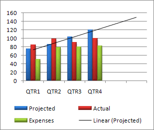
You can add a trendline to a 2-D chart that isn't stacked, including area, bar, column, line, stock, scatter, and bubble.
You cannot add a trendline to a stacked, 3-D, radar, pie, surface, or doughnut chart.
Add a trendline
-
On your chart, click the data series to which you want to add a trendline or moving average.
The trendline will start on the first data point of the data series you choose.
-
Click the Chart Elements button
 next to the upper-right corner of the chart.
 -
Check the Trendline box.
-
To choose a different type of trendline, click the arrow next to Trendline, and then click Exponential, Linear Forecast, or Two Period Moving Average. For additional trendlines, click More Options.
-
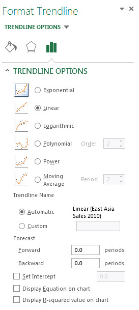
If you choose More Options, click the option you want in the Format Trendline pane under Trendline Options.
-
If you select Polynomial, enter the highest power for the independent variable in the Order box.
-
If you select Moving Average, enter the number of periods to use to calculate the moving average in the Period box.
-
Tip: A trendline is most accurate when its R-squared value (a number from 0 to 1 that reveals how closely the estimated values for the trendline correspond to your actual data) is at or near 1. When you add a trendline to your data, Excel automatically calculates its R-squared value. You can display this value on your chart by checking the Display R-squared value on chart box (Format Trendline pane, Trendline Options).
You can learn more about all the trend line options in the sections below.
Linear trend line
Use this type of trendline to create a best-fit straight line for simple linear data sets. Your data is linear if the pattern in its data points looks like a line. A linear trendline usually shows that something is increasing or decreasing at a steady rate.
A linear trendline uses this equation to calculate the least squares fit for a line:

where m is the slope and b is the intercept.
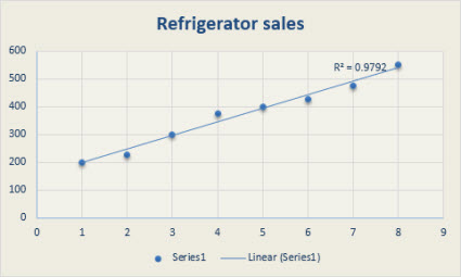
The following linear trendline shows that refrigerator sales have consistently increased over an 8-year period. Notice that the R-squared value (a number from 0 to 1 that reveals how closely the estimated values for the trendline correspond to your actual data) is 0.9792, which is a good fit of the line to the data.
Logarithmic trendline
Showing a best-fit curved line, this trendline is useful when the rate of change in the data increases or decreases quickly and then levels out. A logarithmic trendline can use negative and positive values.
A logarithmic trendline uses this equation to calculate the least squares fit through points:

where c and b are constants and ln is the natural logarithm function.
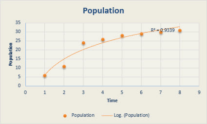
The following logarithmic trendline shows predicted population growth of animals in a fixed-space area, where population leveled out as space for the animals decreased. Note that the R-squared value is 0.933, which is a relatively good fit of the line to the data.
Polynomial trendline
This trendline is useful when your data fluctuates. For example, when you analyze gains and losses over a large data set. The order of the polynomial can be determined by the number of fluctuations in the data or by how many bends (hills and valleys) appear in the curve. Typically, an Order 2 polynomial trendline has only one hill or valley, an Order 3 has one or two hills or valleys, and an Order 4 has up to three hills or valleys.
A polynomial or curvilinear trendline uses this equation to calculate the least squares fit through points:

where b and  are constants.
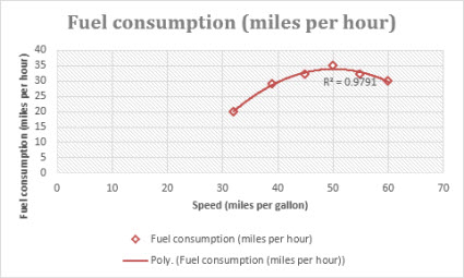
The following Order 2 polynomial trendline (one hill) shows the relationship between driving speed and fuel consumption. Notice that the R-squared value is 0.979, which is close to 1 so the line's a good fit to the data.
Power trendline
Showing a curved line, this trendline is useful for data sets that compare measurements that increase at a specific rate. For example, the acceleration of a race car at 1-second intervals. You cannot create a power trendline if your data contains zero or negative values.
A power trendline uses this equation to calculate the least squares fit through points:

where c and b are constants.
Note: This option is not available when your data includes negative or zero values.
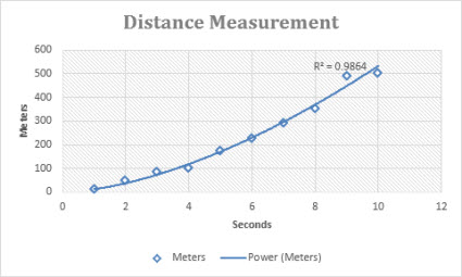
The following distance measurement chart shows distance in meters by seconds. The power trendline clearly demonstrates the increasing acceleration. Note that the R-squared value is 0.986, which is an almost perfect fit of the line to the data.
Exponential trendline
Showing a curved line, this trendline is useful when data values rise or fall at constantly increasing rates. You cannot create an exponential trendline if your data contains zero or negative values.
An exponential trendline uses this equation to calculate the least squares fit through points:

where c and b are constants and e is the base of the natural logarithm.
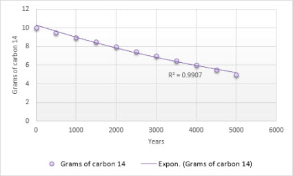
The following exponential trendline is shows the decreasing amount of carbon 14 in an object as it ages. Note that the R-squared value is 0.990, which means the line fits the data almost perfectly.
Moving Average trendline
This trendline evens out fluctuations in data to show a pattern or trend more clearly. A moving average uses a specific number of data points (set by the Period option), averages them, and uses the average value as a point in the line. For example, if Period is set to 2, the average of the first two data points is used as the first point in the moving average trendline. The average of the second and third data points is used as the second point in the trendline, etc.
A moving average trendline uses this equation:

The number of points in a moving average trendline equals the total number of points in the series, minus the number you specify for the period.
In a scatter chart, the trendline is based on the order of the x values in the chart. For a better result, sort the x values before you add a moving average.
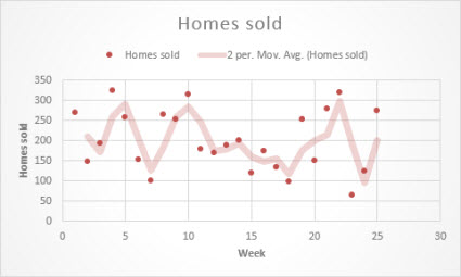
The following moving average trendline shows a pattern in the number of homes sold over a 26-week period.
No comments:
Post a Comment