Charts help you visualize your data in a way that creates maximum impact on your audience. Learn to create a chart and add a trendline.

Create a chart
-
Select data for the chart.
-
Select Insert > Recommended Charts.
-
Select a chart on the Recommended Charts tab, to preview the chart.
Note: You can select the data you want in the chart and press ALT + F1 to create a chart immediately, but it might not be the best chart for the data. If you don't see a chart you like, select the All Charts tab to see all chart types.
-
Select a chart.
-
Select OK.
Add a trendline
-
Select a chart.
-
Select Design > Add Chart Element.
-
Select Trendline and then select the type of trendline you want, such as Linear, Exponential, Linear Forecast, or Moving Average.
Note: Some of the content in this topic may not be applicable to some languages.
Charts display data in a graphical format that can help you and your audience visualize relationships between data. When you create a chart, you can select from many chart types (for example, a stacked column chart or a 3-D exploded pie chart). After you create a chart, you can customize it by applying chart quick layouts or styles.
Learn the elements of a chart
Charts contain several elements, such as a title, axis labels, a legend, and gridlines. You can hide or display these elements, and you can also change their location and formatting.
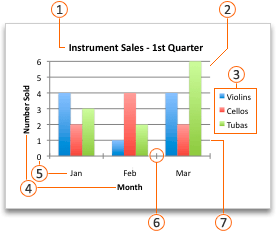
 Chart title
 Plot area
 Legend
 Axis titles
 Axis labels
 Tick marks
 Gridlines
- Which version of Office are you using?
- Office for Mac 2016
- Office 2011 for Mac
Create a chart
You can create a chart in Excel, Word, and PowerPoint. However, the chart data is entered and saved in an Excel worksheet. If you insert a chart in Word or PowerPoint, a new sheet is opened in Excel. When you save a Word document or PowerPoint presentation that contains a chart, the chart's underlying Excel data is automatically saved within the Word document or PowerPoint presentation.
Note: The Excel Workbook Gallery replaces the former Chart Wizard. By default, the Excel Workbook Gallery opens when you open Excel. From the gallery, you can browse templates and create a new workbook based on one of them. If you don't see the Excel Workbook Gallery, on the File menu, click New from Template.
-
On the View menu, click Print Layout.
-
Click the Insert tab, and then click the arrow next to Chart.
-
Click a chart type, and then double-click the chart you want to add.
When you insert a chart into Word or PowerPoint, an Excel worksheet opens that contains a table of sample data.
-
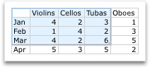
In Excel, replace the sample data with the data that you want to plot in the chart. If you already have your data in another table, you can copy the data from that table and then paste it over the sample data. See the following table for guidelines for how to arrange the data to fit your chart type.
For this chart type
Arrange the data
Area, bar, column, doughnut, line, radar, or surface chart
In columns or rows, as in the following examples:
Series 1
Series 2
Category A
10
12
Category B
11
14
Category C
9
15
or
Category A
Category B
Series 1
10
11
Series 2
12
14
Bubble chart
In columns, putting x values in the first column and corresponding y values and bubble size values in adjacent columns, as in the following examples:
X-Values
Y-Value 1
Size 1
0.7
2.7
4
1.8
3.2
5
2.6
0.08
6
Pie chart
In one column or row of data and one column or row of data labels, as in the following examples:
Sales
1st Qtr
25
2nd Qtr
30
3rd Qtr
45
or
1st Qtr
2nd Qtr
3rd Qtr
Sales
25
30
45
Stock chart
In columns or rows in the following order, using names or dates as labels, as in the following examples:
Open
High
Low
Close
1/5/02
44
55
11
25
1/6/02
25
57
12
38
or
1/5/02
1/6/02
Open
44
25
High
55
57
Low
11
12
Close
25
38
X Y (scatter) chart
In columns, putting x values in the first column and corresponding y values in adjacent columns, as in the following examples:
X-Values
Y-Value 1
0.7
2.7
1.8
3.2
2.6
0.08
or
X-Values
0.7
1.8
2.6
Y-Value 1
2.7
3.2
0.08
-
To change the number of rows and columns included in the chart, rest the pointer on the lower-right corner of the selected data, and then drag to select additional data. In the following example, the table is expanded to include additional categories and data series.
-
To see the results of your changes, switch back to Word or PowerPoint.
Note: When you close the Word document or the PowerPoint presentation that contains the chart, the chart's Excel data table closes automatically.
Change which chart axis is emphasized
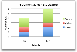
After you create a chart, you might want to change the way that table rows and columns are plotted in the chart. For example, your first version of a chart might plot the rows of data from the table on the chart's vertical (value) axis, and the columns of data on the horizontal (category) axis. In the following example, the chart emphasizes sales by instrument.

However, if you want the chart to emphasize the sales by month, you can reverse the way the chart is plotted.
-
On the View menu, click Print Layout.
-
Click the chart.
-
Click the Chart Design tab, and then click Switch Row/Column.
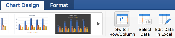
If Switch Row/Column is not available
Switch Row/Column is available only when the chart's Excel data table is open and only for certain chart types. You can also edit the data by clicking the chart, and then editing the worksheet in Excel.
Apply a predefined chart layout
-
On the View menu, click Print Layout.
-
Click the chart.
-
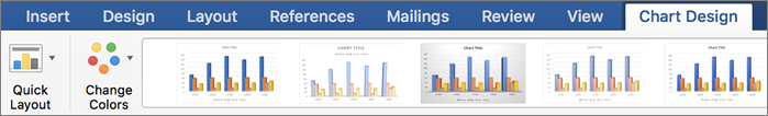
Click the Chart Design tab, and then click Quick Layout.
-
Click the layout you want.
To immediately undo a quick layout that you applied, press
 + Z .
+ Z .
Apply a predefined chart style
Chart styles are a set of complementary colors and effects that you can apply to your chart. When you select a chart style, your changes affect the whole chart.
-
On the View menu, click Print Layout.
-
Click the chart.
-
Click the Chart Design tab, and then click the style you want.
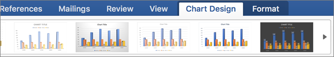
To see more styles, point to a style, and then click
 .
.To immediately undo a style that you applied, press
+ Z .
Add a chart title
-
On the View menu, click Print Layout.
-
Click the chart, and then click the Chart Design tab.
-
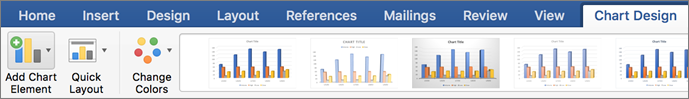
Click Add Chart Element.
-
Click Chart Title to choose title format options, and then return to the chart to type a title in the Chart Title box.
See also
Create a chart
You can create a chart in Excel, Word, and PowerPoint. However, the chart data is entered and saved in an Excel worksheet. If you insert a chart in Word or PowerPoint, a new sheet is opened in Excel. When you save a Word document or PowerPoint presentation that contains a chart, the chart's underlying Excel data is automatically saved within the Word document or PowerPoint presentation.
Note: The Excel Workbook Gallery replaces the former Chart Wizard. By default, the Excel Workbook Gallery opens when you open Excel. From the gallery, you can browse templates and create a new workbook based on one of them. If you don't see the Excel Workbook Gallery, on the File menu, click New from Template.
-
On the View menu, click Print Layout.
-
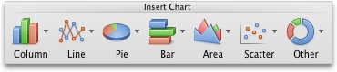
On the Charts tab, under Insert Chart, click a chart type, and then click the one that you want to add.
When you insert a chart into Word or PowerPoint, an Excel sheet opens that contains a table of sample data.
-
In Excel, replace the sample data with the data that you want to plot in the chart. If you already have your data in another table, you can copy the data from that table and then paste it over the sample data. See the following table for guidelines on how to arrange the data to fit your chart type.
For this chart type
Arrange the data
Area, bar, column, doughnut, line, radar, or surface chart
In columns or rows, as in the following examples:
Series 1
Series 2
Category A
10
12
Category B
11
14
Category C
9
15
or
Category A
Category B
Series 1
10
11
Series 2
12
14
Bubble chart
In columns, putting x values in the first column and corresponding y values and bubble size values in adjacent columns, as in the following examples:
X-Values
Y-Value 1
Size 1
0.7
2.7
4
1.8
3.2
5
2.6
0.08
6
Pie chart
In one column or row of data and one column or row of data labels, as in the following examples:
Sales
1st Qtr
25
2nd Qtr
30
3rd Qtr
45
or
1st Qtr
2nd Qtr
3rd Qtr
Sales
25
30
45
Stock chart
In columns or rows in the following order, using names or dates as labels, as in the following examples:
Open
High
Low
Close
1/5/02
44
55
11
25
1/6/02
25
57
12
38
or
1/5/02
1/6/02
Open
44
25
High
55
57
Low
11
12
Close
25
38
X Y (scatter) chart
In columns, putting x values in the first column and corresponding y values in adjacent columns, as in the following examples:
X-Values
Y-Value 1
0.7
2.7
1.8
3.2
2.6
0.08
or
X-Values
0.7
1.8
2.6
Y-Value 1
2.7
3.2
0.08
-
To change the number of rows and columns that are included in the chart, rest the pointer on the lower-right corner of the selected data, and then drag to select additional data. In the following example, the table is expanded to include additional categories and data series.
-
To see the results of your changes, switch back to Word or PowerPoint.
Note: When you close the Word document or the PowerPoint presentation that contains the chart, the chart's Excel data table closes automatically.
Change which chart axis is emphasized
After you create a chart, you might want to change the way that table rows and columns are plotted in the chart. For example, your first version of a chart might plot the rows of data from the table on the chart's vertical (value) axis, and the columns of data on the horizontal (category) axis. In the following example, the chart emphasizes sales by instrument.
However, if you want the chart to emphasize the sales by month, you can reverse the way the chart is plotted.
-
On the View menu, click Print Layout.
-
Click the chart.
-
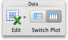
On the Charts tab, under Data, click Plot series by row
 or Plot series by column
  .
.
If Switch Plot is not available
Switch Plot is available only when the chart's Excel data table is open and only for certain chart types.
-
Click the chart.
-
On the Charts tab, under Data, click the arrow next to Edit, and then click Edit Data in Excel.
-
Apply a predefined chart layout
-
On the View menu, click Print Layout.
-
Click the chart.
-
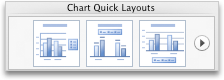
On the Charts tab, under Chart Quick Layouts, click the layout that you want.
To see more layouts, point to a layout, and then click
.To immediately undo a quick layout that you applied, press
+ Z .
Apply a predefined chart style
Chart styles are a set of complementary colors and effects that you can apply to your chart. When you select a chart style, your changes affect the whole chart.
-
On the View menu, click Print Layout.
-
Click the chart.
-
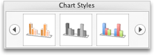
On the Charts tab, under Chart Styles, click the style that you want.
To see more styles, point to a style, and then click
.To immediately undo a style that you applied, press
+ Z .
Add a chart title
-
On the View menu, click Print Layout.
-
Click the chart, and then click the Chart Layout tab.
-
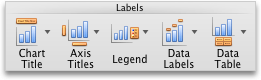
Under Labels, click Chart Title, and then click the one that you want.
-
Select the text in the Chart Title box, and then type a chart title.
See also
Need more help?
You can always ask an expert in the Excel Tech Community, get support in the Answers community, or suggest a new feature or improvement on Excel User Voice.
No comments:
Post a Comment