Enhance your data with data graphics
You can display information about the data contained within a shape by using data graphics. In Microsoft Visio 2010 you can construct your own data graphics that include text, data bars, icons, or unique fill colors.
Notes:
-
Data graphics cannot be applied to images or other objects that aren't drawn in Visio. For more information, see the article Data graphics are not displayed when you try to apply data graphics to images or other objects.
-
For more information about how to link data to shapes, see Import data from Excel, SQL Server, SharePoint sites, and other external sources.
-
For more information about how to format a shape fill, line, shadow, or other visual effect, see Format a shape.

In this article
What is a data graphic?
A data graphic is a visual enhancement that you can apply to shapes to show data that the shapes contain. Data graphics display your data as a combination of textual and visual elements, such as numbers, flags, and progress bars.
For example, assume that you have a shape that represents a process, which contains data about the cost, process number, owner, function, start date, end date, and status for the process:
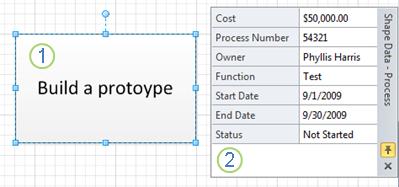
1. A Process shape without any data graphics
2. The Shape Data task pane showing the data contained in the Process shape
Now, imagine that you want to express the data contained in the shape visually:
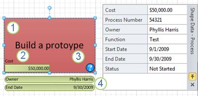
1. The function of the process ("Test") is shown as a unique fill color.
2. The cost of the process ("$50,000.00") is shown as a data bar.
3. The status of the process ("Not Started") is show as a question mark icon.
4. The owner ("Phyllis Harris") and end date ("9/30/2009") of the process are shown as text callouts.
By applying a data graphic to the shape, you can easily show the data contained by the shape without having to select the shape and view the Shape Data task pane. Additionally, you can quickly view specific data contained by several shapes at once by observing the shapes' data graphics.
After you create a data graphic, you can apply it to other shapes with the same data. By default, when you change the data graphic, the change is automatically applied to all of the shapes that the data graphic is applied to.
You can create as many data graphics as you need for your shapes. For example, you can create one to show process data and apply it to all of your employee shapes. You can create a second data graphic to show equipment data and apply it to all of your equipment shapes.
Where does the data come from? The data that you can show by using data graphics is listed in each shape's Shape Data. Either you can type data into the Shape Data task pane for each shape individually, or you can use the Link Data to Shapes Wizard. If you import your data by using the Link Data to Shapes Wizard, you can choose how you want Visio to show the data for you. For more information about the wizard, see Import data from Excel, SQL Server, SharePoint sites, and other external sources.
Note: To show the Shape Data task pane, on the Data tab, in the Show/Hide group, select the Shape Data Window check box.
Create a data graphic
You can add four types of items to your data graphic: text, data bars, icons, and color-coding. The following sections describe how to add each type of element.
Note: These procedures work best if your shape already contains data. For more information on applying data to shapes, see Import data from Excel, SQL Server, SharePoint sites, and other external sources.
Add a text graphic to a shape
You can choose from either text callouts or text headings. Text callouts contain both the name of the column and its value. Headings show only the data value.
-
Select the shape that you want to create a data graphic for.
-
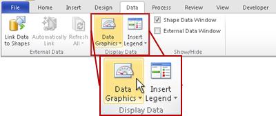
On the Data tab, in the Display Data group, click Data Graphics, and then select Create New Data Graphic.
-
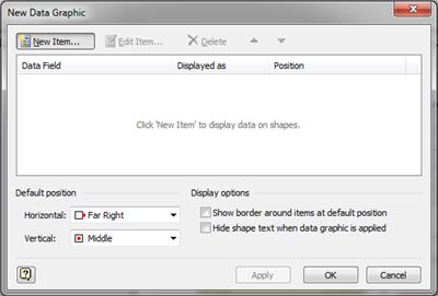
In the New Data Graphic dialog box click New Item.
-
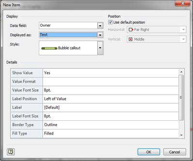
In the New Item dialog box, under Display, in the Data field list, select the data field that you want to represent.
-
In the Displayed as list, select Text.
-
In the Style list, select style of text graphic that you want.
-
Under Position, select the position for the text graphic in one of the following ways:
-
To use the default position listed, select the Use default position check box.
-
To specify another position, clear the Use default position check box, click Horizontal or Vertical, and then select the positions that you want.
-
-
Under Details, select the options to choose how you want the callout or heading to look.
-
When you finish creating your new data graphic item, click OK.
-
To add more items to your data graphic, repeat steps 3 through 9.
-
When you are finished adding items to your data graphic, in the New Data Graphic dialog box, click Apply, and then click OK.
Add a data bar to a shape
Data bars show your data dynamically in miniature charts and graphs, such as progress bars, star ratings, thermometers, and speedometers.
-
Select the shape that you want to create a data graphic for.
-
On the Data tab, in the Display Data group, click Data Graphics, and then select Create New Data Graphic.

-
In the New Data Graphic dialog box click New Item.

-
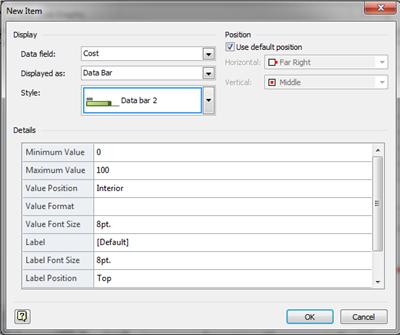
In the New Item dialog box, under Display, in the Data field list, select the data field that you want to represent.
-
In the Displayed as list, select Data Bar.
-
In the Style list, select style of data bar that you want.
-
Under Position, select the position for the data bar in one of the following ways:
-
To use the default position listed, select the Use default position check box.
-
To specify another position, clear the Use default position check box, click Horizontal or Vertical, and then select the positions that you want.
-
-
Under Details, select the options to choose how you want the data bar to look.
-
When you finish creating your new data graphic item, click OK.
-
To add more items to your data graphic, repeat steps 3 through 9.
-
When you are finished adding items to your data graphic, in the New Data Graphic dialog box, click Apply, and then click OK.
Add an icon set to a shape
You can show your data by using sets of icons such as flags, traffic signals, and trend arrows. You can set the icons to be displayed based upon specific values, dates, expressions, or even other data fields in the same shape.
For example, you can use flags to indicate how current sales compare to those of the previous year. As shown in the following example, you can set the flag values so that a blue flag means sales were up significantly, a yellow flag means that sales were up moderately, and a red flag means that sales were down for the year.
-
Select the shape that you want to create a data graphic for.
-
On the Data tab, in the Display Data group, click Data Graphics, and then select Create New Data Graphic.

-
In the New Data Graphic dialog box click New Item.

-
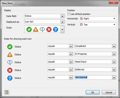
In the New Item dialog box, under Display, in the Data field list, select the data field that you want to represent.
-
In the Displayed as list, select Icon Set.
-
In the Style list, select the icon set that you want.
-
Under Position, select the icon position in one of the following ways:
-
To use the default position listed, under Position, select the Use default position check box.
-
To specify another position, clear the Use default position check box, click Horizontal or Vertical and then select the positions that you want.
-
-
Under Rules for showing each icon, select the values that each icon is to represent.
-
When you finish creating your new data graphic item, click OK.
-
To add more items to your data graphic, repeat steps 3 through 9.
-
When you are finished adding items to your data graphic, in the New Data Graphic dialog box, click Apply, and then click OK.
Apply a fill color by data value
Using the Color by Value option, you can apply fill color to indicate unique values or ranges of values.
Note: If you create more than one Color by Value data graphic items and both are true for a single shape, Visio applies the data graphic fill to that shape that is listed first in the Edit Data Graphic dialog box.
-
Select the shape that you want to create a data graphic for.
-
On the Data tab, in the Display Data group, click Data Graphics, and then select Create New Data Graphic.

-
In the New Data Graphic dialog box click New Item.

-
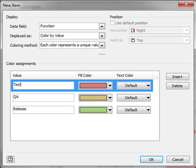
In the New Item dialog box, under Display, in the Data field list, select the data field that you want to represent with a data graphic.
-
In the Displayed as list, select Color by Value.
-
In the Coloring method list, select how Visio applies a fill to the shape based on that data field:
-
Each color represents a unique value You can apply the same color to all of the shapes that have the same value. For example, you can color all the shapes for employees in the sales department yellow and all the shapes for employees in the accounting department red.
-
Each color represents a range of values You can use a range of colors, from bright to muted, to indicate a range of values. For example, you can use a range of colors that pale from red to pink to correspond to regions with high, medium, and low increases in sales.
-
-
Under Color assignments, type the data field values to apply for each of the fill colors and select the fill and text colors to apply.
-
If you need to create more possible fill colors, click Insert.
-
When you finish creating your new data graphic item, click OK.
-
To add more items to your data graphic, repeat steps 3 through 9.
-
When you are finished adding items to your data graphic, in the New Data Graphic dialog box, click Apply, and then click OK.
Apply an existing data graphic to a shape
Note: The shape that you apply the existing data graphic to needs to contain the data fields that the data graphic refers to.
-
Select the shape that you want to apply the data graphic to.
-
On the Data tab, in the Display Data group, click Data Graphics, and then under Available Data Graphics, select the data graphic that you want.
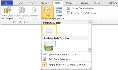
Note: You can rest the pointer over a graphic to see a preview of the shape with the data graphic applied.
Change an existing data graphic
-
Select a shape that has the data graphic that you want to edit.
-
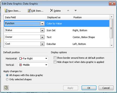
On the Data tab, in the Display Data group, click Data Graphics, and select Edit Data Graphic.
-
In the Edit Data Graphic dialog box, do one of the following:
-
To change the data field that the graphic represents, in the Data Field column, select another data field for that item.
-
To change the color, settings, font, format, or type of graphic that is displayed, in the Displayed as column, select the item that you want to change and then click Edit Item. In the Edit Item dialog box, under Display, in the Displayed as list, select the type of graphic type that you want.
-
To change the position of the data graphic item in relation to the shape, in the Displayed as column, select the item that you want to change and then click Edit Item. In the Edit Item dialog box, under Position, select the position that you want.
-
-
If you want to apply the changes to all the shapes that have the same data graphic, under Apply changes to, select the All shapes with this data graphic option.
-
If you only want to apply the changes to selected shapes, under Apply changes to, select the Only selected shapes option.
Remove a data graphic from a shape
-
Select the shape(s) that you want to remove the data graphic from.
-
On the Data tab, in the Display Data group, click Data Graphics, and then under No Data Graphic select No Data Graphic.

No comments:
Post a Comment