Make your PowerPoint presentations accessible
Key best practices for creating PowerPoint presentations can also help you make your presentations accessible to people with disabilities. This topic describes why you should use these best practices and gives you step-by-step instructions for following them.

PowerPoint presentations tend to be highly visual, and people who are blind or have low vision can understand them more easily if you create your slides with accessibility in mind.
Windows: Best practices for making PowerPoint presentations accessible
The following table includes key best practices for creating PowerPoint presentations that are accessible to people with disabilities.
| What to fix | How to find it | Why fix it | How to fix it |
| Include alternative text with all visuals and tables. Visual content includes pictures, clip art, SmartArt graphics, shapes, groups, charts, embedded objects, ink, and videos. | To find missing alternative text, use the Accessibility Checker. | Alt text helps people who can't see the screen to understand what's important in images and other visuals. Avoid using text in images as the sole method of conveying important information. If you must use an image with text in it, repeat that text in the document. In alt text, briefly describe the image and mention the existence of the text and its intent. | |
| Make sure slide contents can be read in the order that you intend | You can use the Accessibility Checker to find slides that have possible problems with reading order. | When someone who can see reads a slide, they usually read things, such as text or a picture, in the order the elements appear on the slide. In contrast, a screen reader reads the elements of a slide in the order they were added to the slide, which might be very different from the order in which things appear. To make sure everyone reads the contents in the order you intend, it's important to check the reading order. | |
| If designing a new slide, use the built-in slide layout | This tip applies to a new slide that you're creating | PowerPoint contains built-in slide layouts that you can apply to any slide. When you use them with a new slide, these layouts automatically make sure that the reading order works for everyone. | |
| Add meaningful hyperlink text and ScreenTips. | To determine whether hyperlink text makes sense as standalone information and whether it gives readers accurate information about the destination target, visually scan the slides in your presentation. | People who use screen readers sometimes scan a list of links. Links should convey clear and accurate information about the destination. For example, instead of linking to the text Click here, include the full title of the destination page. Tip: You can also add ScreenTips that appear when your cursor hovers over text or images that include a hyperlink. | |
| Ensure that color is not the only means of conveying information. | To find instances of color-coding, visually scan the slides in your presentation. | People who are blind, have low vision, or are colorblind might miss out on the meaning conveyed by particular colors. For example, add an underline to color-coded hyperlink text so that people who are colorblind know that the text is linked even if they can't see the color. For headings, consider adding bold or using a larger font. | |
| Use sufficient contrast for text and background colors. | To find insufficient color contrast, look for slide text that's hard to read or to distinguish from the background. | Make sure there is strong contrast between text and background, so people with low vision can see it well. Use dark text on a white or off-white background, or reverse it and use white text on a dark background. White and black schemes also make it easier for people who are colorblind to distinguish text and shapes. | |
| Give every slide a unique title | To find slides that do not have titles, use the Accessibility Checker. | People who are blind, have low vision, or a reading disability rely on slide titles to navigate. For example, by skimming or using a screen reader, they can quickly scan through a list of slide titles and go right to the slide they want. | |
| Use a simple table structure, and specify column header information. | To ensure that tables don't contain split cells, merged cells, nested tables, or completely blank rows or columns, use the Accessibility Checker. | Screen readers keep track of their location in a table by counting table cells. If a table is nested within another table or if a cell is merged or split, the screen reader loses count and can't provide helpful information about the table after that point. Blank cells in a table could also mislead someone using a screen reader into thinking that there is nothing more in the table. Screen readers also use header information to identify rows and columns. | |
| Use a larger font size (18pt or larger), sans serif fonts, and sufficient white space. | To find potential issues related to fonts or white space, review your slides for areas that look crowded or illegible. | People who have dyslexia describe seeing text "swim together" on a page (the compressing of one line of text into the line below). They often see text merge or distort. For people who have dyslexia or have low vision, reduce the reading load. For example, they may benefit from familiar sans serif fonts, such as Arial or Calibri. Avoid using all capital letters and excessive italics or underlines. Include ample white space between sentences and paragraphs. | |
| Make videos accessible to visually impaired and hearing-impaired users | Subtitles typically contain a transcription (or translation) of the dialogue. Closed captions typically also describe audio cues such as music or sound effects that occur off-screen. Video description means audio-narrated descriptions of a video's key visual elements. These descriptions are inserted into natural pauses in the program's dialogue. Video description makes video more accessible to individuals who are blind or visually impaired. | Use captions, subtitles, and alternative audio tracks in videos |
Add alt text to visuals and tables
The following procedures describe how to add alt text to visuals and tables in your PowerPoint presentations.
Note: We recommend only putting text in the description field and leaving the title blank. This will provide the best experience with most major screen readers including Narrator. For audio and video content, in addition to alt text, include closed captioning for people who are deaf or have limited hearing.
Add alt text to images
Beginning in March of 2017, PowerPoint for PC in Office 365 automatically generates alt text for photographs by using intelligent services in the cloud.
Note: This feature is only available to Office 365 subscribers who have joined the Office Insider program. If you are an Office 365 subscriber, make sure you have the latest version of Office.
PowerPoint does not generate alt text for drawn images, such as clip art, diagrams, or icons.
To review generated alt text, or add alt text to images without alt text, such as drawn images, take these steps:
-
Right-click an image.
-
If your image is a photograph, take these steps.
-
Select Edit Alt Text to open the Alt Text pane.
-
In the Alt Text pane, review the description in the text box.
-
To accept the suggested text, close the Alt Text pane and return to the PowerPoint slide.
To change the suggested alt text, type your preferred text in the box.
-
Close the Alt Text pane and return to the PowerPoint slide.
-
-
If your image is an icon, clipart, or other image that is not a photograph, take these steps.
-
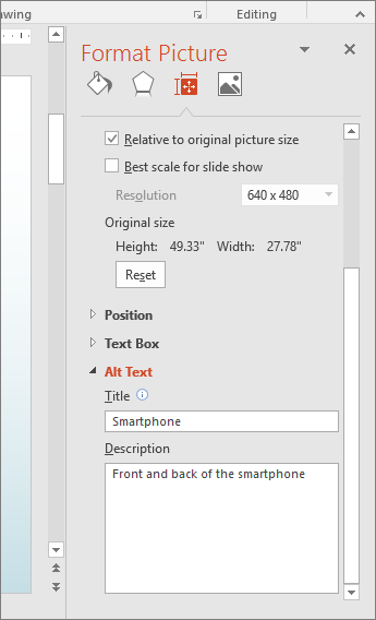
Right-click the image and select Format picture.
-
In the Format Picture pane, select the Size and Properties icon and then choose Alt Text.
-
In the Description text box, type the alt text for the image.
-
Close the Format Picture pane and return to the PowerPoint slide.
-
Add alt text to SmartArt graphics
-
Right-click a SmartArt graphic.
-
Select Size and Position
-
In the right pane, select Alt Text.
-
Type a description and a title.
Tip: Include the most important information in the first line, and be as concise as possible.
Add alt text to shapes
Add alt text to shapes, including shapes within a SmartArt graphic.
-
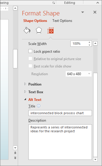
Right-click a shape.
-
Select Size and Position.
-
In the right pane, select Alt Text.
-
Type a description and a title.
Tip: Include the most important information in the first line, and be as concise as possible.
Add alt text to charts
-
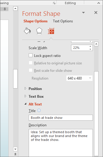
Right-click a chart.
-
Select Format Chart Area.
-
In the right pane, select Alt Text.
-
Type a description and a title.
Tip: Include the most important information in the first line, and be as concise as possible.
Add alt text to tables
-
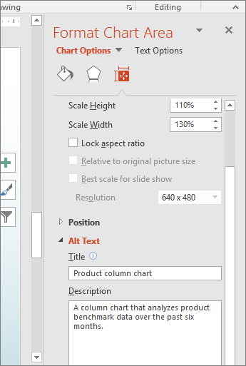
Right-click a table.
-
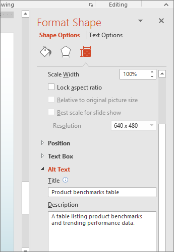
Select Format Shape.
-
In the right pane, select Size & Properties.
-
Select the Alt Text tab.
-
Type a description and a title.
Tip: Include the most important information in the first line, and be as concise as possible.
Make hyperlinks, text, and tables accessible
The following procedures describe how to make the hyperlinks, text, and tables in your PowerPoint presentations accessible.
Add hyperlink text and ScreenTips
-
Select the text to which you want to add the hyperlink, and then right-click.
-
Select Hyperlink.
The text you selected displays in the Text to display box. This is the hyperlink text. -
If necessary, change the hyperlink text.
-
In the Address box, enter the description address for the hyperlink.
-
Select the ScreenTip button and, in the ScreenTip text box, type a ScreenTip.
Tip: If the title on the hyperlink's destination page gives an accurate summary of what's on the page, use it for the hyperlink text. For example, this hyperlink text matches the title on the destination page: Templates and Themes for Office Online.

Use an accessible slide design
-
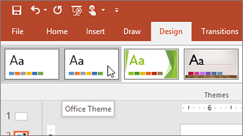
On the Design tab, in the Themes group, select Office Theme.
The Office Theme is designed for accessible colors, contrast, and fonts. It's also designed so that screen readers can more easily read slide content.
Use table headers
-
Position the cursor anywhere in a table.
-
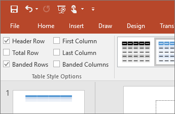
On the Table Tools Design tab, in the Table Style Options group, select the Header Row check box.
-
Type column headings.
Format text for accessibility
-
Select your text.
-
Select the Home tab.
-
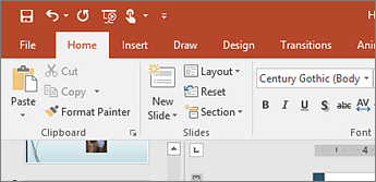
In the Font group, which provides options for font type, size, style, and color, select your formatting choices.

Make slides accessible
The following procedures describe how to make the slides in your PowerPoint presentations accessible.
Use unique slide titles
-
To restore all placeholders for the selected slide, on the Home tab, in the Slides group, select Reset.
-
On the slide, in the Title box, type a unique name.
Hide a slide title
Make a title invisible on the slide, but still voiced by screen readers.
-
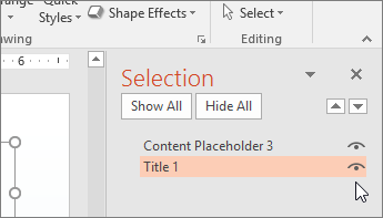
On the Home tab, in the Drawing group, select Arrange, and then choose Selection Pane.
-
Select the Home tab.
-
In the Selection pane, next to the Title text box, click the eye icon.
Set the reading order of slide contents
-
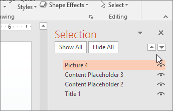
On the Home tab, in the Drawing group, select Arrange, and then choose Selection Pane.
The Selection pane lists the objects on the slide in reverse order. When the screen reader reads this slide, it reads the objects in the reverse order listed in the Selection pane. -
To change the reading order, drag items to the location that you want or select the item and then select the Bring Forward or Send Backward button.
Use captions, subtitles, and alternative audio tracks in videos
PowerPoint 2016 supports the playback of video with multiple audio tracks. It also supports closed captions and subtitles that are embedded in video files.
Currently, only PowerPoint for Windows supports insertion and playback of closed captions or subtitles that are stored in files separate from the video. For all other editions of PowerPoint (such as PowerPoint for Mac or for mobile editions), closed captions or subtitles must be encoded into the video before it is inserted into PowerPoint.
Supported video formats for captions and subtitles vary depending on the operating system that you're using. Each operating system has settings you can use to adjust how the closed captions or subtitles are displayed.
Closed captions, subtitles, and alternate audio tracks are not preserved when you use the Compress Media or Optimize Media Compatibility features. Also, when saving your presentation as a video, closed captions, subtitles, or alternate audio tracks in the embedded videos are not included in the video that is saved.
When you use the Save Media as command on a selected video, closed captions, subtitles, and multiple audio tracks embedded in the video are preserved in the video file that is saved.
To make your PowerPoint presentations accessible, ensure the following:
-
Videos include an audio track with video descriptions, if needed, for users that are blind or visually impaired.
-
Videos that include dialogue also include closed captions or subtitles in a supported format for users that are deaf or hard of hearing.
Use built-in slide layouts for inclusive reading order
PowerPoint has built-in slide layouts that contain placeholders for text, videos, pictures, clip art, and more. They also contain all the formatting, such as theme colors, fonts, and effects. And to make sure that your slides are accessible, built-in layouts are designed so that the reading order is the same for people who see and people who use technology such as screen readers.
To apply a slide layout, follow these steps.
-
On the Home tab, click Normal.
-
In the Thumbnail pane, locate the place where you want to add the new slide. Right-click, and select New Slide. Click the new slide to select it.
-
On the Home tab, click Layout to open the gallery, and select the slide layout that you want. PowerPoint automatically applies this layout to the new slide.
-
Go to the new slide, and add the title and content that you want.
Learn more
Mac: Best practices for making PowerPoint presentations accessible
The following table includes key best practices for creating PowerPoint presentations that are accessible to people with disabilities.
| What to fix | How to find it | Why fix it | How to fix it |
| Include alternative text with all visuals and tables. Visual content includes pictures, clip art, SmartArt graphics, shapes, groups, charts, embedded objects, ink, and videos. | To find missing alternative text, use Accessibility Checker. | Alt text helps people who can't see the screen to understand what's important in images and other visuals. Avoid using text in images as the sole method of conveying important information. If you must use an image with text in it, repeat that text in the document. In alt text, briefly describe the image and mention the existence of the text and its intent. | |
| Make sure slide contents can be read in the order that you intend | You can use the Accessibility Checker to find slides that have possible problems with reading order. | When someone who can see reads a slide, they usually read things, such as text or a picture, in the order the elements appear on the slide. In contrast, a screen reader reads the elements of a slide in the order they were added to the slide, which might be very different from the order in which things appear. To make sure everyone reads the contents in the order you intend, it's important to check the reading order. | |
| If designing a new slide, use the built-in slide layout | This tip applies to a new slide that you're creating | PowerPoint contains built-in slide layouts that you can apply to any slide. When you use them with a new slide, these layouts automatically make sure that the reading order works for everyone. | |
| Add meaningful hyperlink text and ScreenTips. | To determine whether hyperlink text makes sense as standalone information and whether it gives readers accurate information about the destination target, visually scan the slides in your presentation. | People who use screen readers sometimes scan a list of links. Links should convey clear and accurate information about the destination. For example, instead of linking to the text Click here, include the full title of the destination page. Tip: You can also add ScreenTips that appear when your cursor hovers over text or images that include a hyperlink. | |
| Ensure that color is not the only means of conveying information. | To find instances of color-coding, visually scan the slides in your presentation. | People who are blind, have low vision, or are colorblind might miss out on the meaning conveyed by particular colors. For example, add an underline to color-coded hyperlink text so that people who are colorblind know that the text is linked even if they can't see the color. For headings, consider adding bold or using a larger font. | |
| Use sufficient contrast for text and background colors. | To find insufficient color contrast, look for slide text that's hard to read or to distinguish from the background. | The text in your presentations should be readable in High Contrast mode so that everyone, including people with visual disabilities, can see it well. For example, use bright colors or high-contrast color schemes on opposite ends of the color spectrum. White and black schemes can help people who are colorblind distinguish between colors. | |
| Give every slide a unique title, and check the reading order of slide contents. | To find slides that do not have titles, use Accessibility Checker. | People who are blind, have low vision, or a reading disability rely on slide titles to navigate. For example, by skimming or using a screen reader, they can quickly scan through a list of slide titles and go right to the slide they want. A screen reader reads slide contents in a certain order, including the title, text, and alt text for shapes, and table contents. It's important to make sure that the slide contents are read in the order that you intend. | |
| Use a simple table structure, and specify column header information. | To ensure that tables don't contain split cells, merged cells, nested tables, or completely blank rows or columns, use the Accessibility Checker. | Screen readers keep track of their location in a table by counting table cells. If a table is nested within another table or if a cell is merged or split, the screen reader loses count and can't provide helpful information about the table after that point. Blank cells in a table could also mislead someone using a screen reader into thinking that there is nothing more in the table. Screen readers also use header information to identify rows and columns. | |
| Use a larger font size (18pt or larger), sans serif fonts, and sufficient white space. | To find potential issues related to fonts or white space, review your slides for areas that look crowded or illegible. | People who have dyslexia describe seeing text "swim together" on a page (the compressing of one line of text into the line below). They often see text merge or distort. For people who have dyslexia or have low vision, reduce the reading load. For example, they may benefit from familiar sans serif fonts, such as Arial or Calibri. Avoid using all capital letters and excessive italics or underlines. Include ample white space between sentences and paragraphs. | |
| Make videos accessible to visually impaired and hearing-impaired users | Subtitles typically contain a transcription (or translation) of the dialogue. Closed captions typically also describe audio cues such as music or sound effects that occur off-screen. Video description means audio-narrated descriptions of a video's key visual elements. These descriptions are inserted into natural pauses in the program's dialogue. Video description makes video more accessible to individuals who are blind or visually impaired. | Use captions, subtitles, and alternative audio tracks in videos |
Add alt text to visuals and tables
The following procedures describe how to add alt text to visuals and tables in your PowerPoint presentations.
Note: For audio and video content, in addition to alt text, include closed captioning for people who are deaf or have limited hearing.
Add alt text to images
Add alt text to images, such as pictures, clip art, and screenshots, so that screen readers can read the text to describe the image to users who can't see the image.
-
Right-click an image.
-
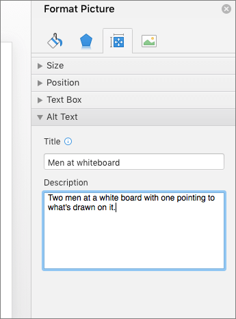
Select Format Picture.
-
In the right pane, select Size & Properties, and then select Alt Text.
-
Type a description and a title.
Tip: Include the most important information in the first line, and be as concise as possible.
Add alt text to SmartArt graphics
-
Right-click a SmartArt graphic.
-
Select Format SmartArt, and then select Shape Options.
-
In the right pane, select Size & Properties, and then select Alt Text.
-
Type a description and a title.
Tip: Include the most important information in the first line, and be as concise as possible.
Add alt text to shapes
Use the following procedure to add alt text to shapes, including shapes within a SmartArt graphic.
-
Right-click a shape.
-
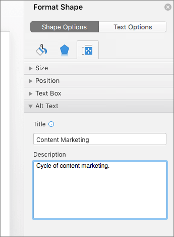
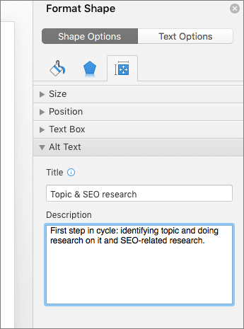
Select Format Shape.
-
In the right pane, select Size & Properties, and then select Alt Text.
-
Type a description and a title.
Tip: Include the most important information in the first line, and be as concise as possible.
Add alt text to charts
-
Right-click a chart.
-
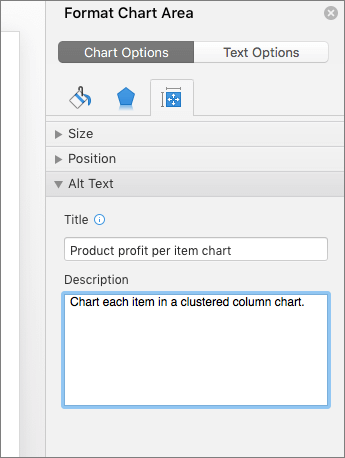
Select Format Chart Area.
-
In the right pane, select the Chart Options tab, and then select Size & Properties.
-
Select Alt Text.
-
Type a description and a title.
Tip: Include the most important information in the first line, and be as concise as possible.
Add alt text to tables
-
Right-click a table.
-
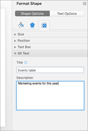
Select Format Shape.
-
In the right pane, select the Shape Options tab, and then select Size & Properties.
-
Select Alt Text.
-
Type a description and a title.
Tip: Include the most important information in the first line, and be as concise as possible.
Make hyperlinks, text, and tables accessible
The following procedures describe how to make the hyperlinks, text, and tables in your PowerPoint presentations accessible.
Add hyperlink text and ScreenTips
-
Select the text to which you want to add the hyperlink, and then right-click.
-
Select Hyperlink.
The text you selected displays in the Text to Display box. This is the hyperlink text. -
If necessary, change the hyperlink text.
-
In the Address box, enter the destination address for the hyperlink.
-
Select the ScreenTip button and, in the ScreenTip text box, type a ScreenTip.
Tip: If the title on the hyperlink's destination page gives an accurate summary of what's on the page, use it for the hyperlink text. For example, this hyperlink text matches the title on the destination page: Templates and Themes for Office Online.

Use an accessible slide design
-
On the Design tab, select Office Theme.
The Office Theme is designed for accessible colors, contrast, and fonts. It's also designed so that screen readers can more easily read slide content.

Use table headers
-
Position the cursor anywhere in a table.
-
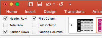
On the Table Design tab, select the Header Row check box.
-
Type column headers.
Format text for accessibility
-
Select your text.
-
Select the Home tab.
-
In the Font group, which provides options for font type, size, style, and color, select your formatting choices.

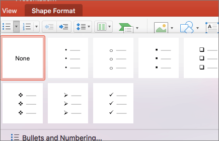
Create bulleted lists
-
Position the cursor anywhere in your slide.
-
Select the Home tab.
-
In the Paragraph group, select the Bullets button.
-
Type each bullet item in the bulleted list.
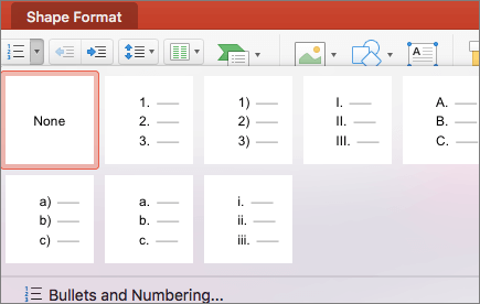
Create ordered lists
-
Position the cursor anywhere in your slide.
-
Select the Home tab.
-
In the Paragraph group, select the Numbering button.
-
Type the sequential steps.
Make slides accessible
The following procedures describe how to make the slides in your PowerPoint presentations accessible.
Use unique slide titles
-
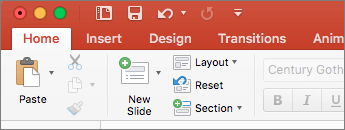
To restore all placeholders for the selected slide, on the Home tab, in the Slides group, select Reset.
-
On the slide, in the Title box, type a unique name.
Hide a slide title
If you want the title to be invisible on the slide, but still voiced by screen readers, do the following:
-
On the Home tab, in the Drawing group, select Arrange and then choose Selection Pane
-
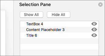
In the Selection Pane, next to the Title text box, click the eye icon.
Set the reading order of slide contents
-
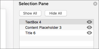
On the Home tab, in the Drawing group, select Arrange, and then choose Selection Pane.
-
The Selection Pane lists the objects on the slide in reverse order. Objects are read back, beginning with the last list item and ending with the first list item.
-
To rearrange the reading order, in the Selection Pane, drag items to the location that you want. Or, in the Selection Pane, select an item and, on the Home tab, select Arrange. Then select Bring to Front or Send to Back.
Use built-in slide layouts for inclusive reading order
PowerPoint has built-in slide layouts that contain placeholders for text, videos, pictures, clip art, and more. They also contain all the formatting, such as theme colors, fonts, and effects. And to make sure that your slides are accessible, built-in layouts are designed so that the reading order is the same for people who see and people who use technology such as screen readers.
To apply a slide layout, follow these steps.
-
On the Home tab, click Normal.
-
In the Thumbnail pane, locate the place where you want to add the new slide. Right-click, and select New Slide. Click the new slide to select it.
-
On the Home tab, click Layout to open the gallery, and select the slide layout that you want. PowerPoint automatically applies this layout to the new slide.
-
Go to the new slide, and add the title and content that you want.
Use captions, subtitles, and alternative audio tracks in videos
PowerPoint 2016 supports the playback of video with multiple audio tracks. It also supports closed captions and subtitles that are embedded in video files.
Closed captions or subtitles must be encoded into the video before it is inserted into PowerPoint. PowerPoint does not support closed captions or subtitles that are stored in a separate file from the video file.
Supported video formats for captions and subtitles vary depending on the operating system that you're using. Each operating system has settings you can use to adjust how the closed captions or subtitles are displayed.
Closed captions, subtitles, and alternate audio tracks are not preserved when you use the Compress Media or Optimize Media Compatibility features. Also, when saving your presentation as a video, closed captions, subtitles, or alternate audio tracks in the embedded videos are not included in the video that is saved.
When you use the Save Media as command on a selected video, closed captions, subtitles, and multiple audio tracks embedded in the video are preserved in the video file that is saved.
To make your PowerPoint presentations accessible, ensure the following:
-
Videos include an audio track with video descriptions, if needed, for users that are blind or visually impaired.
-
Videos that include dialogue also include closed captions or subtitles in a supported format for users that are deaf or hard of hearing.
Learn more
iOS: Best practices for making PowerPoint presentations accessible
The following table includes key best practices for creating PowerPoint presentations that are accessible to people with disabilities.
| What to fix | Why fix it | How to fix it |
|---|---|---|
| Ensure that color is not the only means of conveying information. | People who are blind, have low vision, or are colorblind might miss out on the meaning conveyed by particular colors. For example, add an underline to color-coded hyperlink text so that people who are colorblind know that the text is linked even if they can't see the color. For headings, consider adding bold or using a larger font. | |
| Use sufficient contrast for text and background colors. | The text in your presentations should be readable in High Contrast mode so that everyone, including people with visual disabilities, can see it well. For example, use bright colors or high-contrast color schemes on opposite ends of the color spectrum. White and black schemes make it easier for people who are colorblind to distinguish text and shapes. | |
| Use a simple table structure, and specify column header information. | Screen readers keep track of their location in a table by counting table cells. If a table is nested within another table or if a cell is merged or split, the screen reader loses count and can't provide helpful information about the table after that point. Blank cells in a table could also mislead someone using a screen reader into thinking that there is nothing more in the table. Screen readers also use header information to identify rows and columns. | |
| Use a larger font size (18pt or larger), sans serif fonts, and sufficient white space. | People who have dyslexia describe seeing text "swim together" on a page (the compressing of one line of text into the line below). They often see text merge or distort. For people who have dyslexia or have low vision, reduce the reading load. For example, they may benefit from familiar sans serif fonts, such as Arial or Calibri. Avoid using all capital letters, and excessive italics or underlines. Include ample white space between sentences and paragraphs. | |
| Make videos accessible to visually impaired and hearing-impaired users | Subtitles typically contain a transcription (or translation) of the dialogue. Closed captions typically also describe audio cues such as music or sound effects that occur off-screen. Video description means audio-narrated descriptions of a video's key visual elements. These descriptions are inserted into natural pauses in the program's dialogue. Video description makes video more accessible to individuals who are blind or visually impaired. | Use captions, subtitles, and alternative audio tracks in videos |
Use an accessible slide design
-
Select a slide.
-
To open the Home tab, at the bottom of the screen, at the end of the toolbar, tap the More icon.
-
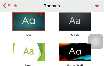
Tap Home > Design.
-
Tap the Themes command.
Note: These themes are designed for accessible colors, contrast, and fonts. They're also designed so that screen readers can more easily read slide content.
Use table headers
-
Position the cursor anywhere in a table.
-
To open the Table tab, at the bottom of the screen, at the end of the toolbar, tap the More icon.
-
On the Style Options command, tap the right arrow.
-
To select the Header Row option, tap it.
-
In your table, type column headings.

Format text for accessibility
-
Select your text.
-
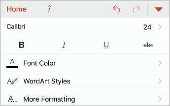
To open the Home tab, at the bottom of the screen, at the end of the toolbar, tap the More icon.
-
The Home tab provides a variety of formatting choices, including font type, size, style, and color. Select your formatting choices.
Use captions, subtitles, and alternative audio tracks in videos
PowerPoint 2016 supports the playback of video with multiple audio tracks. It also supports closed captions and subtitles that are embedded in video files.
Closed captions or subtitles must be encoded into the video before it is inserted into PowerPoint. PowerPoint does not support closed captions or subtitles that are stored in a separate file from the video file.
Supported video formats for captions and subtitles vary depending on the operating system that you're using. Each operating system has settings you can use to adjust how the closed captions or subtitles are displayed.
Closed captions, subtitles, and alternate audio tracks are not preserved when you use the Compress Media or Optimize Media Compatibility features. Also, when saving your presentation as a video, closed captions, subtitles, or alternate audio tracks in the embedded videos are not included in the video that is saved.
When you use the Save Media as command on a selected video, closed captions, subtitles, and multiple audio tracks embedded in the video are preserved in the video file that is saved.
To make your PowerPoint presentations accessible, ensure the following:
-
Videos include an audio track with video descriptions, if needed, for users that are blind or visually impaired.
-
Videos that include dialogue also include closed captions or subtitles in a supported format for users that are deaf or hard of hearing.
Learn more
Android: Best practices for making PowerPoint presentations accessible
The following table includes key best practices for creating PowerPoint presentations that are accessible to people with disabilities.
| What to fix | Why fix it | How to fix it |
|---|---|---|
| Include alternative text with all visuals and tables. Visual content includes pictures, clip art, SmartArt graphics, shapes, groups, charts, embedded objects, ink, and videos. | Alt text helps people who can't see the screen to understand what's important in images and other visuals. Avoid using text in images as the sole method of conveying important information. If you must use an image with text in it, repeat that text in the document. In alt text, briefly describe the image and mention the existence of the text and its intent. | |
| Ensure that color is not the only means of conveying information. | People who are blind, have low vision, or are colorblind might miss out on the meaning conveyed by particular colors. For example, add an underline to color-coded hyperlink text so that people who are colorblind know that the text is linked even if they can't see the color. For headings, consider adding bold or using a larger font. | |
| Use sufficient contrast for text and background colors. | The text in your presentations should be readable in High Contrast mode so that everyone, including people with visual disabilities, can see it well. For example, use bright colors or high-contrast color schemes on opposite ends of the color spectrum. White and black schemes make it easier for people who are colorblind to distinguish text and shapes. | |
| Use a simple table structure, and specify column header information. | Screen readers keep track of their location in a table by counting table cells. If a table is nested within another table or if a cell is merged or split, the screen reader loses count and can't provide helpful information about the table after that point. Blank cells in a table could also mislead someone using a screen reader into thinking that there is nothing more in the table. Screen readers also use header information to identify rows and columns. | |
| Use a larger font size (18pt or larger), sans serif fonts, and sufficient white space. | People who have dyslexia describe seeing text "swim together" on a page (the compressing of one line of text into the line below). They often see text merge or distort. For people who have dyslexia or have low vision, reduce the reading load. For example, they may benefit from familiar sans serif fonts, such as Arial or Calibri. Avoid using all capital letters, and excessive italics or underlines. Include ample white space between sentences and paragraphs. | |
| Make videos accessible to visually impaired and hearing-impaired users | Subtitles typically contain a transcription (or translation) of the dialogue. Closed captions typically also describe audio cues such as music or sound effects that occur off-screen. Video description means audio-narrated descriptions of a video's key visual elements. These descriptions are inserted into natural pauses in the program's dialogue. Video description makes video more accessible to individuals who are blind or visually impaired. | Use captions, subtitles, and alternative audio tracks in videos |
Add alt text to visuals and tables
The following procedures describe how to add alt text to visuals and tables in your PowerPoint presentations.
Note: For audio and video content, in addition to alt text, include closed captioning for people who are deaf or have limited hearing.
Add alt text to images
Add alt text to images such as pictures, clip art, and screenshots so that screen readers can read the text to describe the image to users who can't see the image.
-
Select an image.
-
To open the Picture tab, at the bottom of the screen, at the end of the toolbar, tap the up arrow.
-
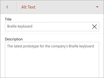
Scroll down to the Alt Text command, and then tap it.
-
Type a description and a title. Your changes are automatically saved.
Tip: Include the most important information in the first line, and be as concise as possible.
Add alt text to SmartArt graphics
-
Select a SmartArt graphic.
-
To open the SmartArt tab, at the bottom of the screen, at the end of the toolbar, tap the up arrow.
-
Scroll down to the Alt Text command, and then tap it.
-
Type a description and a title. Your changes are automatically saved.
Tip: Include the most important information in the first line, and be as concise as possible.
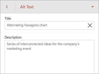
Add alt text to shapes
Add alt text to shapes including shapes within a SmartArt graphic.
-
Select a shape.
-
To open the Shape tab, at the bottom of the screen, at the end of the toolbar, tap the up arrow.
-
Scroll down to the Alt Text command, and then tap it.
-
Type a description and a title. Your changes are automatically saved.
Tip: Include the most important information in the first line, and be as concise as possible.
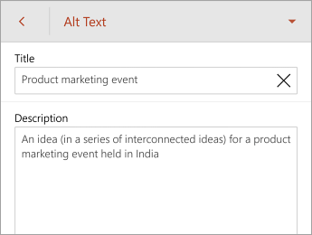
Add alt text to charts
-
Select a chart.
-
To open the Chart tab, at the bottom of the screen, at the end of the toolbar, tap the up arrow.
-
Scroll down to the Alt Text command, and then tap it.
-
Type a description and a title. Your changes are automatically saved.
Tip: Include the most important information in the first line, and be as concise as possible.
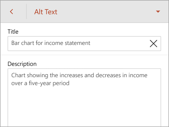
Add alt text to tables
-
Tap anywhere within a table.
-
To open the Table tab, at the bottom of the screen, at the end of the toolbar, tap the up arrow.
-
In the right pane, select the Shape Options tab, and then select Size & Properties.
-
Scroll down to the Alt Text command, and then tap it.
-
Type a description and a title. Your changes are automatically saved.
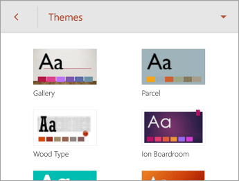
Tip: Include the most important information in the first line, and be as concise as possible.
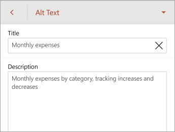
Use an accessible slide design
-
Select a slide.
-
To open the Home tab, at the bottom of the screen, at the end of the toolbar, tap the up arrow.
-
Tap Home > Design.
-
On the Themes command, tap the right arrow.
Note: These themes are designed for accessible colors, contrast, and fonts. They're also designed so that screen readers can more easily read slide content.
Use table headers
-
Position the cursor anywhere in a table.
-
To open the Table tab, at the bottom of the screen, at the end of the toolbar, tap the down arrow.
-
On the Style Options command, tap the right arrow.
-
To select the Header Row option, tap it.
Tip: When the option is selected, it's gray.
-
In your table, type column headings.

Format text for accessibility
-
Select your text.
-
To open the Home tab, at the bottom of the screen, at the end of the toolbar, tap the up arrow.
-
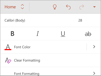
The Home tab provides a variety of formatting choices, including font type, size, style, and color. Select your formatting choices.
Use captions, subtitles, and alternative audio tracks in videos
PowerPoint 2016 supports the playback of video with multiple audio tracks. It also supports closed captions and subtitles that are embedded in video files.
Closed captions or subtitles must be encoded into the video before it is inserted into PowerPoint. PowerPoint does not support closed captions or subtitles that are stored in a separate file from the video file.
Supported video formats for captions and subtitles vary depending on the operating system that you're using. Each operating system has settings you can use to adjust how the closed captions or subtitles are displayed.
Closed captions, subtitles, and alternate audio tracks are not preserved when you use the Compress Media or Optimize Media Compatibility features. Also, when saving your presentation as a video, closed captions, subtitles, or alternate audio tracks in the embedded videos are not included in the video that is saved.
When you use the Save Media as command on a selected video, closed captions, subtitles, and multiple audio tracks embedded in the video are preserved in the video file that is saved.
To make your PowerPoint presentations accessible, ensure the following:
-
Videos include an audio track with video descriptions, if needed, for users that are blind or visually impaired.
-
Videos that include dialogue also include closed captions or subtitles in a supported format for users that are deaf or hard of hearing.
Learn more
Office Online: Best practices for making PowerPoint Online presentations accessible
The following table includes key best practices for creating PowerPoint Online presentations that are accessible to people with disabilities.
| What to fix | How to find it | Why fix it | How to fix it |
| Include alternative text with all visuals and tables. Visual content includes pictures, clip art, SmartArt graphics, shapes, groups, embedded objects, and videos. | Use the Accessibility Checker in PowerPoint Online to find missing alternative text. | Alt text helps people who can't see the screen to understand what's important in images and other visuals. Avoid using text in images as the sole method of conveying important information. If you must use an image with text in it, repeat that text in the document. In alt text, briefly describe the image and mention the existence of the text and its intent. | Add alt text to SmartArt graphics |
| Add meaningful hyperlink text. | To determine whether hyperlink text makes sense as standalone information and whether it gives readers accurate information about the destination target, visually scan the slides in your presentation. | People who use screen readers sometimes scan a list of links. Links should convey clear and accurate information about the destination. For example, instead of linking to the text Click here, include the full title of the destination page. | |
| Ensure that color is not the only means of conveying information. | To find instances of color-coding, visually scan the slides in your presentation. | People who are blind, have low vision, or are colorblind might miss out on the meaning conveyed by particular colors. For example, add an underline to color-coded hyperlink text so that people who are colorblind know that the text is linked even if they can't see the color. For headings, consider adding bold or using a larger font. | |
| Use sufficient contrast for text and background colors. | To find insufficient color contrast, look for slide text that's hard to read or to distinguish from the background. | The text in your presentations should be readable so that everyone, including people with visual disabilities, can see it well. For example, use bright colors or high-contrast color schemes on opposite ends of the color spectrum. White and black schemes make it easier for people who are colorblind to distinguish text and shapes. | |
| Give every slide a unique title. | Use the Accessibility Checker in PowerPoint Online to find slides that don't have titles. | People who use screen readers and other assistive technology hear slide text, shapes, and content read back in a specific order. That's why it's a good practice to use the slide layouts in PowerPoint Online, which ensure that content is read in a logical order by screen readers. People who are blind, have low vision, or a reading disability rely on slide titles to navigate. For example, by skimming or using a screen reader, they can quickly scan through a list of slide titles and go right to the slide they want. | |
| Use a simple table structure, and specify column header information. | To ensure that tables don't contain split cells, merged cells, nested tables, or completely blank rows or columns, Use the Accessibility Checker in PowerPoint Online. | Screen readers keep track of their location in a table by counting table cells. If a table is nested within another table or if a cell is merged or split, the screen reader loses count and can't provide helpful information about the table after that point. Blank rows and columns in a table could also mislead someone using a screen reader into thinking that there is nothing more in the table. Screen readers also use header information to identify rows and columns. | |
| Use a larger font size (18pt or larger), sans serif fonts, and sufficient white space. | To find potential issues related to fonts or white space, review your slides for areas that look crowded or illegible. | People who have dyslexia describe seeing text "swim together" on a page (the compressing of one line of text into the line below). They often see text merge or distort. For people who have dyslexia or have low vision, reduce the reading load. For example, they may benefit from familiar sans serif fonts, such as Arial or Calibri. Avoid using all capital letters and excessive italics or underlines. Include ample white space between sentences and paragraphs. |
Add alt text to images and tables
The following procedures describe how to add alt text to images and tables in your PowerPoint Online presentations.
Note: We recommend only putting text in the description field and leaving the title blank. This will provide the best experience with most major screen readers including Narrator. For audio and video content, in addition to alt text, include closed captioning for people who are deaf or have limited hearing.
Add alt text to images
-
Select the image, such as a picture, clip art, or screenshot.
-
In Picture Tools, select the Format tab.
-
In the Properties group, select Alt Text.
-
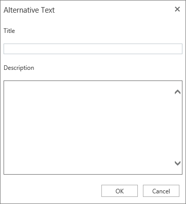
In Alternative Text, type a description.
Add alt text to SmartArt graphics
-
Select the SmartArt graphic.
-
In Smartart Tools, select the Design tab.
-
In the Properties group, select Alt Text.
-
In Alternative Text, type a description.

Add alt text to shapes or embedded videos
-
Select the shape or video.
-
In Drawing Tools, select the Format tab.
-
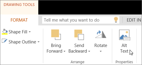
In the Properties group, select Alt Text.
-
In Alternative Text, type a description.
Add alt text to tables
-
Place the cursor in a cell of the table.
-
In Table Tools, select the Layout tab.
-
In the Properties group, select Alt Text.
-
In Alternative Text, type a description.

Make hyperlinks and tables accessible
The following procedures describe how to make the hyperlinks and tables in your PowerPoint Online presentations accessible.
Add hyperlink text
-
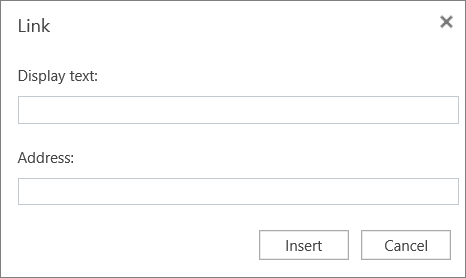
Select the text to which you want to add the hyperlink, right-click, and select Link.
The text you selected displays in the Display text box. This is the hyperlink text.
Tip: If the title on the hyperlink's destination page gives an accurate summary of what's on the page, use it for the hyperlink text. For example, this hyperlink text matches the title on the destination page: Templates and Themes for Office Online.
-
In the Address box, type or paste the destination URL.
-
Select Insert.
Change the text of a hyperlink
-
Select the text of the hyperlink, right-click, and select Edit Link.
-
In the Display text box, edit the text you want to appear for the hyperlink..
-
Select OK.
Use table headers
-
Position the cursor anywhere in a table to display Table Tools.
-
On the Design tab in Table Tools, select Header Row.
-
Type column headings in the header.

Make slides accessible
The following procedures describe how to make the slides in your PowerPoint Online presentations accessible.
Use an accessible slide design
The Office Theme is designed for accessible colors, contrast, and fonts. It's also designed so that screen readers can more easily read slide content.
-
On the Design tab, in the Themes group, select Office Theme.

Here are some tips to help increase visibility:
-
Avoid using orange, red, and green in your template and text.
-
Use patterns in graphs, instead of color, to highlight points of interest.
-
Circle or use animation to highlight information, rather than relying on laser pointers or color.
-
Keep the overall contrast in your presentation high.
Use a logical reading order
If your slides contain objects that aren't part of a slide template, you need to arrange them in a logical order. Objects are read in the order you created them, which might not make sense in a screen reader.
It's easier to test reading order in PowerPoint desktop because you can rearrange the order of objects in the Selection pane. But, in PowerPoint Online, you can copy and paste objects to change their order on a slide.
-
To test the order of objects on a slide, select the object and then press the Tab key to switch the focus from object to object.
Format text for accessibility
-
Select your text.
-
Select the Home tab.
-
In the Font group, which provides options for font type, size, style, and color, select your formatting choices.
Consider these ideas to help improve your text's accessibility:
-
Add an underline to color-coded hyperlink text. That can help colorblind people know the text is linked even if they can't see the color.
-
Add shapes if color is used to indicate status. For example, add a checkmark symbol if green is used to indicate "pass" and an uppercase X if red indicates "fail".
Use unique titles for slides
-
Select a slide without a title.
-
On the Home tab, in the Slides group, select Layout.
-
In the Slide Layout dialog box, select a slide layout that includes title placeholders and select Change Layout. The new slide is added.
-
In the title placeholder, type a unique name.
Note: A title doesn't necessarily have to be visible to be accessible. For example, people who use screen readers hear a slide's title even if it isn't visible. In PowerPoint 2016 desktop, you can use the Selection pane to turn visibility on or off for titles and other objects on a slide.

Use the Accessibility Checker in PowerPoint Online
-
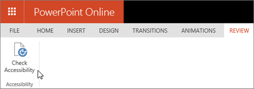
Select the Review tab.
-
Select Check Accessibility.
-
Review the results in the Accessibility Checker. Results are categorized based on the severity of the issue found, as follows:
-
Errors. Includes content that is very difficult or impossible for people with disabilities to understand.
-
Warnings. The content is challenging for people with disabilities to understand.
-
Tips. Tips let you know that, even though people with disabilities can understand the content, it could be better organized or presented to improve their experience.
-
-
Fix the issues.
Learn more
Technical support for customers with disabilities
Microsoft wants to provide the best possible experience for all our customers. If you have a disability or questions related to accessibility, please contact the Microsoft Disability Answer Desk for technical assistance. The Disability Answer Desk support team is trained in using many popular assistive technologies and can offer assistance in English, Spanish, French, and American Sign Language. Please go to the Microsoft Disability Answer Desk site to find out the contact details for your region.
If you are a government, commercial, or enterprise user, please contact the enterprise Disability Answer Desk.
No comments:
Post a Comment