A sparkline is a tiny chart in a worksheet cell that provides a visual representation of data. Use sparklines to show trends in a series of values, such as seasonal increases or decreases, economic cycles, or to highlight maximum and minimum values. Position a sparkline near its data for greatest impact.

Add a Sparkline
-
Select a blank cell at the end of a row of data.
-
Select Insert and pick Sparkline type, like Line, or Column.
-
Select cells in the row and OK in menu.
-
More rows of data? Drag handle to add a Sparkline for each row.
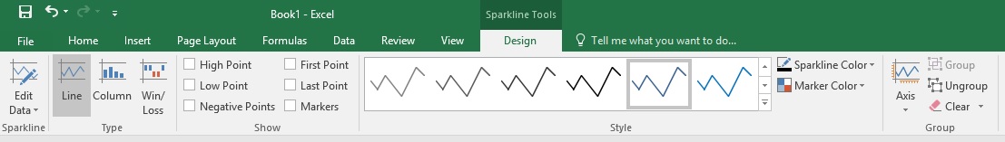
Format a Sparkline chart
-
Select the Sparkline chart.
-
Select Design and then select an option.
-
Select Line, Column, or Win/Loss to change the chart type.
-
Check Markers to highlight individual values in the Sparkline chart.
-
Select a Style for the Sparkline.
-
Select Sparkline Color and the color.
-
Select Sparkline Color > Weight to select the width of the Sparkline.
-
Select Marker Color to change the color of the markers.
-
If the data has positive and negative values, select Axis to show the axis.
-
Need more help?
You can always ask an expert in the Excel Tech Community, get support in the Answers community, or suggest a new feature or improvement on Excel User Voice.
No comments:
Post a Comment