Highlighting in Power View
Highlighting is a way to examine a subset of my data while still being able to see the entire data set. The selected data is highlighted, while the unselected data is dimmed. Simply selecting a data point reveals its connection (or lack of connection) with the rest of the data.
Because of the metadata in the underlying Data Model, Power View uses the relationships between the different tables and fields in the data model to make items on a sheet highlight each other.
Highlighting is not saved with the report – when you save your workbook and reopen it, any highlighting you applied is removed.

Highlighting versus Filtering
Highlighting is not filtering; it highlights what is in view already. Filtering, on the other hand, removes data. But highlighting is tightly integrated with filtering – highlighting is often the result of cross-filtering. Depending on which visualization is the source (doing the highlighting or filtering) and which visualization is the target (being highlighted or filtered), the target visualization will be either filtered or highlighted. If it is highlighted, this is sometimes referred to as 1. cross-highlighting.
Add highlighting
In a Power View sheet with a chart and at least one other chart or map, select one or more bars or slices in a chart.
Use Ctrl + click to select multiple values. To clear the highlighting, click inside the source visualization, but not on a value.
For example, when you select a bar in a chart (cross-filter), other related charts and maps on that sheet are highlighted.
-
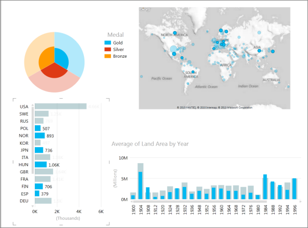
In this sheet, selecting multiple values in the bar chart highlights the column chart, pie chart, and the map.
-
In cases where the highlighting doesn't apply to all the columns or slices in a chart, the previous values are still displayed, dimmed, so that you can get the whole picture – not just see the values affected by highlighting.
-
Even columns with zero highlighting are still displayed. This makes it possible to see cases where the selected item from the source visualization has no representation in the target.

Highlighting charts with average aggregations
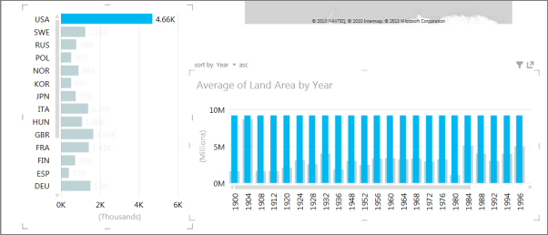
When you have a visualization with averages, sometimes the highlighted selection is taller than the average. This column chart looks at average land area of participating country/regions by year. The land area of the United States is larger than the average, so when you click USA, the highlighted bar is drawn narrower, so you can still see the dimmed total bar.

See Also
Filtering and highlighting in Power View
No comments:
Post a Comment