What's new in Excel 2013

Note: SkyDrive is now OneDrive, and SkyDrive Pro is now OneDrive for Business. Read more about this change at From SkyDrive to OneDrive.
The first thing you'll see when you open Excel is a brand new look. It's cleaner, but it's also designed to help you get professional-looking results quickly. You'll find many new features that let you get away from walls of numbers and draw more persuasive pictures of your data, guiding you to better, more informed decisions.
Tip: To learn how you can get started creating a basic Excel workbook quickly, see Basic tasks in Excel 2013.
Top features to explore
Get started quickly
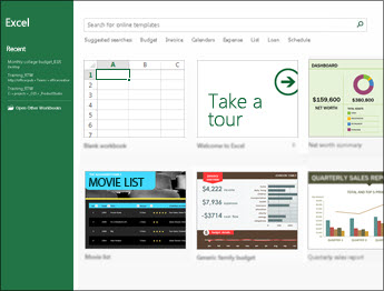
Templates do most of the set-up and design work for you, so you can focus on your data. When you open Excel 2013, you'll see templates for budgets, calendars, forms, and reports, and more.
Instant data analysis
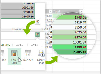
The new Quick Analysis tool lets you convert your data into a chart or table in two steps or less. Preview your data with conditional formatting, sparklines, or charts, and make your choice stick in just one click. To use this new feature, see Analyze your data instantly.
Fill out an entire column of data in a flash
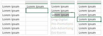
Flash Fill is like a data assistant that finishes your work for you. As soon as it detects what you want to do, Flash Fill enters the rest of your data in one fell swoop, following the pattern it recognizes in your data. To see when this feature comes in handy, see Split a column of data based on what you type.
Create the right chart for your data
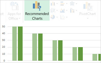
With Chart recommendations, Excel recommends the most suitable charts for your data. Get a quick peek to see how your data looks in the different charts, and then simply pick the one that shows the insights you want to present. Give this feature a try when you create your first chart.
Filter table data by using slicers
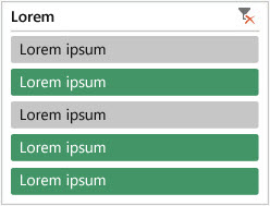
First introduced in Excel 2010 as an interactive way to filter PivotTable data, slicers can now also filter data in Excel tables, query tables, and other data tables. Simpler to set up and use, slicers show the current filter so you'll know exactly what data you're looking at.
One workbook, one window
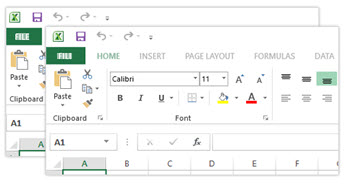
In Excel 2013 each workbook has in its own window, making it easier to work on two workbooks at once. It also makes life easier when you're working on two monitors.
New Excel functions

You'll find several new functions in the math and trigonometry, statistical, engineering, date and time, lookup and reference, logical, and text function categories. Also new are a few Web service functions for referencing existing Representational State Transfer (REST)-compliant Web services. Look for details in New functions in Excel 2013.
Save and share files online
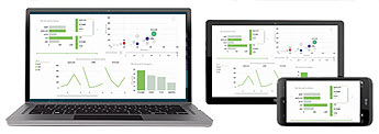
Excel makes it easier to save your workbooks to your own online location, like your free OneDrive or your organization's Office 365 service. It's also simpler to share your worksheets with other people. No matter what device they're using or where they are, everyone works with the latest version of a worksheet— and you can even work together in real time. To learn more about it, see Save a workbook to the Web.
Embed worksheet data in a web page
To share part of your worksheet on the web, you can simply embed it on your web page. Other people can then work with the data in Excel Online or open the embedded data in Excel.
Share an Excel worksheet in an online meeting
No matter where you are or what device you're on—be it your smartphone, tablet, or PC—as long as you have Lync installed, you can connect to and share a workbook in an online meeting. To learn more about it, see Present a workbook online.
Save to a new file format
Now you can save to and open files in the new Strict Open XML Spreadsheet (*.xlsx) file format. This file format lets you read and write ISO8601 dates to resolve a leap year issue for the year 1900. To learn more about it, see Save a workbook in another file format.
New charting features
Changes to the ribbon for charts

The new Recommended Charts button on the Insert tab lets you pick from a variety of charts that are right for your data. Related types of charts like scatter and bubble charts are under one umbrella. And there's a brand new button for combo charts—a favorite chart you've asked for. When you click a chart, you'll also see a simpler Chart Tools ribbon. With just a Design and Format tab, it should be easier to find what you need.
Fine tune charts quickly

Three new chart buttons let you quickly pick and preview changes to chart elements (like titles or labels), the look and style of your chart, or to the data that is shown. To learn more about it, see Format your chart.
Richer data labels

Now you can include rich and refreshable text from data points or any other text in your data labels, enhance them with formatting and additional freeform text, and display them in just about any shape. Data labels stay in place, even when you switch to a different type of chart. You can also connect them to their data points with leader lines on all charts, not just pie charts. To work with rich data labels, see Change the format of data labels in a chart.
View animation in charts
See a chart come alive when you make changes to its source data. This isn't just fun to watch—the movement in the chart also makes the changes in your data much clearer.
Powerful data analysis
Create a PivotTable that suits your data
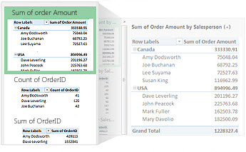
Picking the right fields to summarize your data in a PivotTable report can be a daunting task. Now you can get some help with that. When you create a PivotTable, Excel recommends several ways to summarize your data, and shows you a quick preview of the field layouts so you can pick the one that gives you the insights you're looking for. To learn more about it, see Create a PivotTable to analyze worksheet data.
Use one Field List to create different types of PivotTables
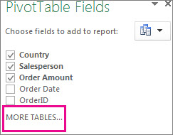
Create the layout of a PivotTable that uses one table or multiple tables by using one and the same Field List. Revamped to accommodate both single and multi-table PivotTables, the Field List makes it easier to find the fields you want in your PivotTable layout, switch to the new Excel Data Model by adding more tables, and explore and navigate to all of the tables. To learn more about it, see Use the Field List to arrange fields in a PivotTable.
Use multiple tables in your data analysis
The new Excel Data Model lets you to tap into powerful analysis features that were previously only available by installing the Power Pivot add-in. In addition to creating traditional PivotTables, you can now create PivotTables based on multiple tables in Excel. By importing different tables, and creating relationships between them, you'll be able to analyze your data with results you aren't able to get from traditional PivotTable data. To learn more about it, see Create a Data Model in Excel.
Power Query
If you're using Office Professional Plus 2013 or Office 365 Pro Plus, you can take advantage of Power Query for Excel. Use Power Query to easily discover and connect to data from public and corporate data sources. This includes new data search capabilities, as well as capabilities to easily transform and merge data from multiple data sources so that you can continue to analyze it in Excel. To learn more about it, see Discover and combine with Power Query for Excel.
Power Map

If you're using Office 365 Pro Plus, Office 2013, or Excel 2013, you can take advantage of Power Map for Excel. Power Map is a three-dimensional (3-D) data visualization tool that lets you look at information in new ways by using geographic and time-based data. You can discover insights that you might not see in traditional two-dimensional (2-D) tables and charts. Power Map is built into Office 365 Pro Plus, but you'll need to download a preview version to use it with Office 2013 or Excel 2013. See Power Map for Excel for details about the preview. To learn more about using Power Map to create a visual 3-D tour of your data, see Get started with Power Map.
Connect to new data sources
To use multiple tables in the Excel Data Model, you can now connect to and import data from additional data sources into Excel as tables or PivotTables. For example, connect to data feeds like OData, Windows Azure DataMarket, and SharePoint data feeds. You can also connect to data sources from additional OLE DB providers.
Create relationships between tables
When you've got data from different data sources in multiple tables in the Excel Data Model, creating relationships between those tables makes it easy to analyze your data without having to consolidate it into one table. By using MDX queries, you can further leverage table relationships to create meaningful PivotTable reports. To learn more about it, see Create a relationship between two tables.
Use a timeline to show data for different time periods
A timeline makes it simpler to compare your PivotTable or PivotChart data over different time periods. Instead of grouping by dates, you can now simply filter dates interactively or move through data in sequential time periods, like rolling month-to-month performance, in just one click. To learn more about it, see Create a PivotTable timeline to filter dates.
Use Drill Down, Drill Up, and Cross Drill to get to different levels of detail
Drilling down to different levels of detail in a complex set of data is not an easy task. Custom sets are helpful, but finding them among a large number of fields in the Field List takes time. In the new Excel Data Model, you'll be able to navigate to different levels more easily. Use Drill Down into a PivotTable or PivotChart hierarchy to see granular levels of detail, and Drill Up to go to a higher level for "big picture" insights. To learn more about it, see Drill into PivotTable data.
Use OLAP calculated members and measures
Tap into the power of self-service Business Intelligence (BI) and add your own Multidimensional Expression (MDX)-based calculations in PivotTable data that is connected to an Online Analytical Processing (OLAP) cube. No need to reach for the Excel Object Model—now you can create and manage calculated members and measures right in Excel.
Create a standalone PivotChart
A PivotChart no longer has to be associated with a PivotTable. A standalone or de-coupled PivotChart lets you experience new ways to navigate to data details by using the new Drill Down, and Drill Up features. It's also much easier to copy or move a de-coupled PivotChart. To learn more about it, see Create a PivotChart.
Power View
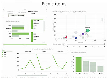
If you're using Office Professional Plus, you can take advantage of Power View. Simply click the Power View button on the ribbon to discover insights about your data with highly interactive, powerful data exploration, visualization, and presentation features that are easy to apply. Power View lets you create and interact with charts, slicers, and other data visualizations in a single sheet. Learn more about Power View in Excel 2013.
New and improved add-ins and converters
Power Pivot for Excel add-in
If you're using Office Professional Plus 2013 or Office 365 Pro Plus, the Power Pivot add-in comes installed with Excel. The Power Pivot data analysis engine is now built into Excel so that you can build simple data models directly in Excel. The Power Pivot add-in provides an environment for creating more sophisticated models. Use it to filter out data when importing it, define your own hierarchies, calculation fields, and key performance indicators (KPIs), and use the Data Analysis Expressions (DAX) language to create advanced formulas. Learn more about the Power Pivot in Excel 2013 add-in.
Inquire add-in
If you're using Office Professional Plus 2013 or Office 365 Pro Plus, the Inquire add-in comes installed with Excel. It helps you analyze and review your workbooks to understand their design, function, and data dependencies, and to uncover a variety of problems including formula errors or inconsistencies, hidden information, broken links and others. From Inquire, you can start a new Microsoft Office tool, called Spreadsheet Compare, to compare two versions of a workbook, clearly indicating where changes have occurred. During an audit, you have full visibility of the changes in your workbooks.
No comments:
Post a Comment