Apply conditional formatting by using Quick Analysis
It can be hard to get a lot of meaning out of numbers in a worksheet. But Excel provides a bunch of ways to quickly analyze your data using conditional formatting. For example, you can use a color scale to differentiate high, medium, and low temperature values.

Here's how you can quickly apply this type of formatting:
-
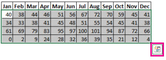
Start by selecting your data. The Quick Analysis button appears on the lower-right corner of the selection.

-
Click the Quick Analysis button
 , or press Ctrl+Q.
 -
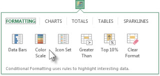
On the Formatting tab, move your mouse over the different options to see a Live Preview on your data, and then pick the formatting you like best.

Notes:
-
To remove any conditional formatting, click Clear Format in the Quick Analysis gallery.
-
For additional formatting options and colors, select your data, and then click Home > Conditional Formatting.
This discussion will focus on the role Excel plays in data analysis and how the Quick Analysis tool for Excel helps you understand complex spreadsheets. You will also learn about ChartExpo, a charting tool for Excel that enables you to produce better visual representations of your data.
ReplyDeletehttps://ppcexpo.com/blog/quick-analysis-tool-for-excel