What is new in PerformancePoint Dashboard Designer
The latest version of PerformancePoint Dashboard Designer makes it easier than ever to create, publish, and maintain your PerformancePoint dashboards. New features include tighter integration with Microsoft SharePoint Server 2010, more robust key performance indicators (KPIs) and scorecards, and new and improved report types.
Additional features include enhancements in Time Intelligence, filters, and other advanced functionality that enable you to create better dashboards. And, the Dashboard Designer workspace has been streamlined, making it easier to navigate the workspace while you work on your dashboard content.
Microsoft SharePoint Server 2010 Service Pack 1 includes new functionality in filters, such as the ability to connect filters to other filters to create cascading filters for your dashboards.
In this article
Better integration with SharePoint Server
Dashboard Designer is now tightly integrated with SharePoint Server, making it easier to save, organize, and manage all your dashboard content.
-
Save dashboard items to SharePoint lists and document libraries
-
Organize your dashboard content in SharePoint folders
-
Control who can view or edit your dashboard items
-
View version history on dashboard items where they are stored in SharePoint lists and libraries
-
Save a collection of items in a workspace file
-
Open Dashboard Designer by using a variety of methods
Save dashboard items to SharePoint lists and document libraries
You now save and manage all your PerformancePoint dashboard content in SharePoint lists and document libraries. You can also view history information about dashboard items by using Version History in the SharePoint lists and document libraries that contain your dashboard content. To learn more, see View the version history of an item or file in a list or library
To help manage dashboard content, Dashboard Designer provides several special-purpose libraries and lists. You can locate the SharePoint lists and libraries that you will use for your PerformancePoint content and other documents in the Quick Launch, which is located in the upper left corner of your SharePoint site.
The Quick Launch might resemble the following image:
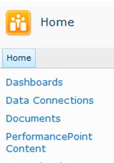
The following table describes these SharePoint lists and libraries:
| SharePoint list or document library | Description |
| Data Connections | The Data Connections content library contains data sources that you can use for your dashboard items, with server connection information and security details for each data source. |
| Dashboards | The Dashboards document library contains only live dashboards that have been deployed. |
| Documents | The Documents content library contains a variety of documents that you and other users can use to view and store documents. You might not have PerformancePoint dashboard content in this library, but you could have Excel Services reports, Visio Services reports, Word documents, and other relevant files in this library. |
| PerformancePoint Content | The PerformancePoint Content list is a SharePoint list that contains scorecards, reports, filters, unpublished dashboards, and other dashboard items. You can organize the items in the list into folders. SharePoint administrators can change this list name when they configure PerformancePoint Services. |
PerformancePoint Services defines content types for the SharePoint lists and document libraries that contain your dashboard items. The content type definitions determine how items can be viewed or edited. For example, a Data Connections document library contains only the data sources that you would use for your dashboard content. You cannot save other types of dashboard items in the Data Connections document library.
Note: The actual names of these lists and libraries might vary in your organization. Contact your SharePoint administrator for more information.
To learn more, see Saving and organizing PerformancePoint content.
Organize your dashboard content in SharePoint folders
You can create display folders in Dashboard Designer that serve as tags for your dashboard items in SharePoint lists and document libraries. In Dashboard Designer, you use the Properties tab to select or create those folders, which are called display folders, for your items. This is useful when your organization has a large number of dashboard items saved to SharePoint Server 2010.
To learn more, see Saving and organizing PerformancePoint content
Control who can view or edit your dashboard items
If you have the necessary permissions, you control who can view and use your dashboard content. You can assign or edit SharePoint Server permissions for your individual dashboard items.
Important: You must have Design permissions to create and edit dashboard items. However, you must have Full Control permissions to view, edit, or assign permissions for dashboard items, including the items that you create.
To learn more, see About user permissions for PerformancePoint Services
View version history on dashboard items
If version control is enabled on the SharePoint lists and document libraries that contain your dashboard items, you can easily view the version history for each item. And, in the event that an unwanted change is made to a dashboard item, you can restore a previous version of that item. To learn more, see View the version history of an item or file in a list or library
Save a collection of items in a workspace file
You can create and save a workspace file on your computer to view and manage a set of dashboard items. In Dashboard Designer, a workspace file contains a list of the dashboard items that you create or reuse for a particular dashboard. The individual dashboard items are saved to SharePoint Server, but you can save a list of the items in a workspace file on your computer. You can use workspace files to view and manage your dashboard content without having to browse through all the items that other dashboard authors have created and saved to SharePoint lists and document libraries.
Open Dashboard Designer from the Business Intelligence Center
You can easily open Dashboard Designer from the Business Intelligence Center, which resembles the following image:
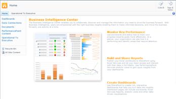
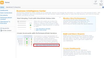
There, you click a section, such as Monitor Key Performance, and then click Start using PerformancePoint Services.
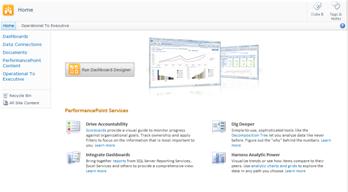
The PerformancePoint site template loads, where you can click Run Dashboard Designer.
New and improved KPIs, scorecards, reports, and filters
You can create more sophisticated KPIs, scorecards, reports, and filters by using Dashboard Designer. PerformancePoint scorecards include many enhancements, such as more sophisticated KPIs and dynamic hierarchies. PerformancePoint reports offer important improvements, including streamlined wizards that make it easier to create your reports. In addition, more font and number formatting options are available, so that you have more control over how your reports look in dashboards.
Some report types that were available in Microsoft Office PerformancePoint Server 2007, such as trend analysis charts, PivotTable and PivotChart reports, and static spreadsheets, are no longer available as reports that you can create by using Dashboard Designer. However, you can easily replace those reports by using new report types. You can use PivotChart and PivotTable reports from Excel Services workbooks, and you can replace trend analysis charts with analytic line charts.
Using the latest release of Dashboard Designer, you can do all of the following:
-
Create more sophisticated KPIs for your scorecards
-
Use dynamic hierarchies in scorecards
-
Create analytic pie charts
-
Create KPI Details reports
-
Enable dashboard users to launch a Decomposition Tree from values in some scorecards and analytic reports
-
Create reusable filters that can be shared across dashboard pages and multiple dashboards
-
Link PerformancePoint filters to more kinds of Web Parts
-
Enable dashboard users to focus on more specific information by using value-based filters in a dashboard
The following sections include more information about these capabilities.
Create more sophisticated KPIs
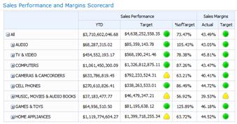
You can now create scorecards that have multiple actuals in the KPIs. This means that you can have more than one metric for each KPI, all on the same row. And, you can create scorecards that include advanced KPIs that are based on calculated metrics for your dashboard.
A scorecard with KPIs that use multiple actuals might resemble the following image:
Use dynamic hierarchies in scorecards
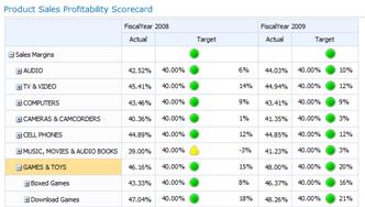
You can now put a hierarchy, such as Products, in your scorecard and have expand/collapse capabilities automatically available. You no longer have to select individual dimension members for your scorecard and then manually indent those members. The hierarchical structure of a dimension is preserved when you put that dimension in your scorecard.
A scorecard with a Products hierarchy on rows might resemble the following image:
Create analytic pie charts
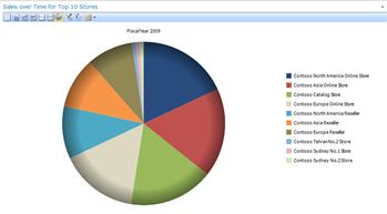
You can now select a pie chart as the view type for an analytic chart or grid. Similar to an analytic line or bar chart, an analytic pie chart enables users to click a wedge to see the next level of detail. Or, users can drill into the data to view a different dimension in the Analysis Services cube.
An analytic pie chart might resemble the following image:
Create KPI Details reports
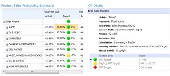
You can now create a KPI Details report on your dashboard to provide additional information about scorecard KPIs without cluttering up your scorecard. Typically, you would use a KPI Details report to show details that do not fit in the scorecard layout. For example, you can show the types of metrics that are used for KPIs, how scores are calculated, thresholds are for individual scores, comments that were posted by other scorecard users, and other information. When you create a KPI Details report, you can select the specific information that you want to display for each scorecard KPI.
A KPI Details report might resemble the following image:
Use Decomposition Tree reports
You can now enable your dashboard users to open a Decomposition Tree report from a report or a scorecard. A Decomposition Tree report shows how a value in a report or a scorecard can be broken down into its contributing members. The Decomposition Tree is available as an action that users can apply to analytic reports and scorecards that use Analysis Services data.
To open the Decomposition Tree, dashboard users can click an individual value, such as a point in a line chart, a bar in a chart, or a cell in a grid or scorecard. Then, they can select Decomposition Tree. The Decomposition Tree opens in a new window, where users can drill down to the next level of detail or drill into the data to view a different dimension in the cube.
A Decomposition Tree might resemble the following image:
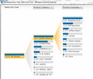
Note: The Decomposition Tree is not available in Dashboard Designer. It is only available in a PerformancePoint dashboard that has been deployed to SharePoint Server 2010. In addition, users must have Microsoft Silverlight 2 or Silverlight 3 installed on their computer. Otherwise, Decomposition Tree is not available on a right-click menu.
To learn more, see Learn about the Decomposition Tree.
Create reusable dashboard filters
You can now reuse a dashboard filter in more than one dashboard. When you create a dashboard filter, you can save it to SharePoint Server. Then, you and other dashboard authors can use that filter in more than one dashboard and in multiple pages of the same dashboard.
Link PerformancePoint filters to more kinds of Web Parts
You can link a PerformancePoint filter to a wider variety of Web Parts. This includes SharePoint Web Parts that were not created by using Dashboard Designer.
Important: Not all filters work with all dashboard items. Make sure that the filter that you want to connect to your dashboard item contains similar dimensions. For example, if you want to connect a Geography filter that contains a list of countries/regions to another report, that report must use data that includes a Geography dimension that has the same countries/regions.
Use value-based filters in a dashboard
Dashboard users can now apply value-based filters, such as Top 10 or "is more than," to analytic reports. You do not create value-based filters by using Dashboard Designer. Those filters are automatically available to users when you deploy a dashboard.
For example, suppose that you deploy a dashboard that contains an analytic chart. The chart shows sales information across different geographical regions. Suppose further that a dashboard user wants to see just the Top 10 geographical regions in the report. The dashboard user can right-click the report, and then select Top 10. The report automatically updates to display the top 10 geographical regions.
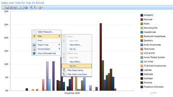
Now suppose that the dashboard user wants to view only the geographical regions with sales amounts larger than a particular value. The dashboard user can right-click the report, select Filter, and then click Value Filter. A Value Filter dialog box opens. The dashboard user can use the Value Filter dialog box to create a filter to show only the geographical regions with sales amounts that are larger than a particular amount.
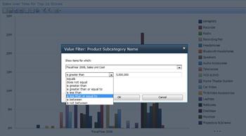
To learn more, see Use multiple filters to focus on specific information and How to navigate PerformancePoint dashboards and explore data.
Enhanced functionality, such as Time Intelligence
Several improvements have been made to advanced functionality, such as Time Intelligence. You can create not only Time Intelligence filters that connect to your reports and scorecards, but you can also use Time Intelligence directly in your individual reports and scorecards. And, you can use Time Intelligence to show dynamic time periods, such as year-to-date, quarter-to-date, and month-to-date, in your scorecards and reports.
A scorecard that uses Time Intelligence might resemble the following image:
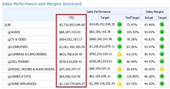
To learn more, see Extend PerformancePoint dashboards by using Time Intelligence.
Streamlined ribbon and workspace
Dashboard Designer features a simple, streamlined user interface. Improvements in the ribbon, Workspace Browser, Details pane, and center pane make it easier than ever for you to create and view your dashboard items.
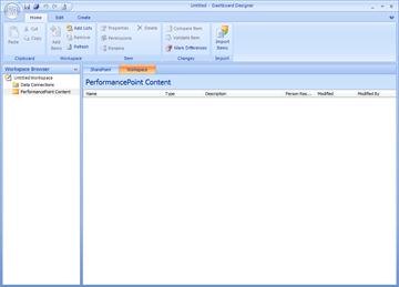
For example, the Workspace Browser now includes two main categories: Data Connections and PerformancePoint Content. Depending on the dashboard item that you want to create or edit, you select a category and then a view the list of dashboard items that pertain to that category in the center pane. For example, when you click Data Connections in the Workspace Browser, a list of data sources is displayed in the center pane. And, when you click PerformancePoint Content, a list of dashboard items other than data sources is displayed in the center pane.
Cascading filters (available only with SharePoint Server 2010 Service Pack 1)
You can now use Dashboard Designer to create and configure cascading filters for your PerformancePoint dashboards. You can configure dashboard filters in such a way that one is connected to another. This creates cascading filters.
Cascading filters work so that as a dashboard user selects an item in one filter, the list of items in the next is scoped according to what was selected in the first. By including cascading filters in your dashboards, dashboard users can pinpoint the information that they need more efficiently.
To learn more, see Configure cascading filters by using Dashboard Designer on TechNet.
Additional Resources
To learn more about Dashboard Designer, see the following resources:
No comments:
Post a Comment