Using Microsoft Excel, you can quickly turn your data into a doughnut chart, and then use the new formatting features to make that doughnut chart easier to read. For example, by adding a legend, data labels, and text boxes that point out what each ring of a doughnut chart represents, you can quickly understand the data that is plotted in the chart.
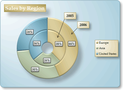
After you create a doughnut chart, you can rotate the slices for different perspectives, focus on specific slices by pulling out slices of the doughnut chart, or change the hole size of the doughnut chart to enlarge or reduce the size of the slices.
Note: Beginning with Office 2016, doughnut charts are discontinued in favor of starburst charts.
What do you want to do?
Learn more about plotting data in a doughnut chart
Data that is arranged in columns or rows only on a worksheet can be plotted in a doughnut chart. Just like a pie chart, a doughnut chart shows the relationship of parts to a whole, but a doughnut chart can contain more than one data series. Each data series that you plot in a doughnut chart adds a ring to the chart. The first data series is displayed in the center of the chart.
Because of their circular nature, doughnut charts are not easy to read, especially when they display multiple data series. The proportions of outer rings and inner rings do not represent the size of the data accurately — data points on outer rings may appear larger than data points on inner rings while their actual values may be smaller. Displaying values or percentages in data labels is very useful in a doughnut chart, but if you want to compare the data points side by side, you should use a stacked column or stacked bar chart instead.
Consider using a doughnut chart when:
-
You have one or more data series that you want to plot.
-
None of the values that you want to plot is negative.
-
None of the values that you want to plot is a zero (0) value.
-
You don't have more than seven categories per data series.
-
The categories represent parts of whole in each ring of the doughnut chart.
When you create a doughnut chart, you can choose one of the following doughnut chart subtypes:
-
Doughnut Doughnut charts display data in rings, where each ring represents a data series. If percentages are displayed in data labels, each ring will total 100%.

-
Exploded Doughnut Much like exploded pie charts, exploded doughnut charts display the contribution of each value to a total while emphasizing individual values, but they can contain more than one data series.

Doughnut charts and exploded doughnut charts are not available in 3-D, but you can use 3-D formatting to give these charts a 3-D-like appearance.
Create an elaborate doughnut chart

So, how did we create this doughnut chart? The following procedure will help you create a doughnut chart with similar results. For this chart, we used the example worksheet data. You can copy this data to your worksheet, or you can use your own data.
-
Open the worksheet that contains the data that you want to plot into a doughnut chart, or copy the example worksheet data into a blank worksheet.
How to copy the example worksheet data
-
Create a blank workbook or worksheet.
-
Select the example in the Help topic.
Note: Do not select the row or column headers.

-
Press CTRL+C.
-
In the worksheet, select cell A1, and press CTRL+V.
1
2
3
4
A
B
C
2005
2006
Europe
$12,704,714.00
$17,987,034.00
Asia
$8,774,099.00
$12,214,447.00
United States
$12,094,215.00
$10,873,099.00
-
-
Select the data that you want to plot in the doughnut chart.
-
On the Insert tab, in the Charts group, click Other Charts.

-
Under Doughnut, click Doughnut.
-
Click the plot area of the doughnut chart.
This displays the Chart Tools, adding the Design, Layout, and Format tabs.
-
On the Design tab, in the Chart Layouts group, select the layout that you want to use.

For our doughnut chart, we used Layout 6.
Layout 6 displays a legend. If your chart has too many legend entries or if the legend entries are not easy to distinguish, you may want to add data labels to the data points of the doughnut chart instead of displaying a legend (Layout tab, Labels group, Data Labels button).
-
On the Design tab, in the Chart Styles group, click the chart style that you want to use.

For our doughnut chart, we used Style 26.
-
To change the size of the chart, do the following:
-
Click the chart.
-
On the Format tab, in the Size group, enter the size that you want in the Shape Height and Shape Width box.
For our doughnut chart, we set the shape height to 4" and the shape width to 5.5".
-
-
To change the size of the doughnut hole, do the following:
-
Click a data series, or select it from a list of chart elements (Format tab, Current Selection group, Chart Elements box).

-
On the Format tab, in the Current Selection group, click Format Selection.
-
Click Series Options, and then under Doughnut Hole Size, drag the slider to the size that you want, or type a percentage value between 10 and 90 in the Percentage box.
For our doughnut chart, we used 20%.
-
-
To make the data labels stand out better, do the following:
-
Click a data label once to select the data labels for an entire data series, or select them from a list of chart elements (Format tab, Current Selection group, Chart Elements box).
-
On the Format tab, in the Shape Styles group, click More
 , and then click a shape style.
For our doughnut chart, we used Subtle Effect - Dark 1.
-
Repeat these steps to format the data labels of all data series in your doughnut chart.
-
-
To change and format the chart title, do the following:
-
Click the chart title, or select it from a list of chart elements (Format tab, Current Selection group, Chart Elements box).
-
Type the title that you want to use, and then press ENTER.
-
On the Format tab, in the Shape Styles group, click More
 , and then click a shape style.
For our doughnut chart, we used Moderate Effect - Accent 1.
-
If you want to change the placement of the title, drag it to the location that you want.
-
-
To change the format of the legend, click the legend, and then select the style that you want in the Shape Styles box (Format tab, in the Shape Styles group, More
 button).
 -
To add text labels with arrows that point to the doughnut rings, do the following:
-
On the Layout tab, in the Insert group, click Text Box.
-
Click on the chart where you want to place the text box, type the text that you want, and then press ENTER.
-
Select the text box, and then on the Format tab, in the Shape Styles group, click the Dialog Box Launcher
 .
. -
Click Text Box, and then under Autofit, select the Resize shape to fit text check box, and click OK.
-
In the Shape Styles group, select the style that you want to use.
-
On the Layout tab, in the Insert group, click Shapes.
-
Under Lines, click Arrow.
-
On the chart, draw the arrow from the corner of the text box to the doughnut ring that you want it to point to.
-
To change the format of text boxes, click a text box, and then select the style that you want in the Shape Styles group (Format tab, Shape Styles group).
Repeat these steps for all doughnut rings in your chart.
-
-
To change the background of the chart, do the following:
-
Click the chart area, or select it from a list of chart elements (Format tab, Current Selection group, Chart Elements box).
-
On the Format tab, in the Shape Styles group, click More
 , and then click a shape style.
For our doughnut chart, we used Subtle Effect - Accent 3.
-
-
To round the corners of the chart background, do the following:
-
On the Format tab, in the Shape Styles group, click the Dialog Box Launcher
 .
. -
Click Border Styles, and then select the Rounded corners check box.
-
-
If you want to use theme colors that are different from the default theme that is applied to your workbook, do the following:
-
On the Page Layout tab, in the Themes group, click Themes.

-
Under Built-in, click the theme that you want to use.
For our doughnut chart, we used the Apex theme.
-
Rotate the slices in a doughnut chart
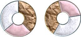
The order in which data series in doughnut charts are plotted in Office Excel 2007 is determined by the order of the data on the worksheet. For a different perspective, you can rotate the doughnut chart slices within the 360 degrees of the circle of the doughnut chart.
-
In a doughnut chart, click the data series or a data point, or do the following to select it from a list of chart elements.
-
Click the chart.
This displays the Chart Tools, adding the Design, Layout, and Format tabs.
-
On the Format tab, in the Current Selection group, click the arrow next to the Chart Elements box, and then click the data series or data point that you want.

-
-
On the Format tab, in the Current Selection group, click Format Selection.
-
Under Angle of first slice box, drag the slider to the degree of rotation that you want, or type a value between 0 (zero) and 360 to specify the angle at which you want the first slice to appear.
Pull out slices of a doughnut chart
To emphasize the individual slices of a doughnut chart, you can use the exploded doughnut chart type when you create the chart. Exploded doughnut charts display the contribution of each value to a total while emphasizing individual values. You can change the doughnut explosion setting for all slices or individual slices.
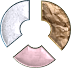
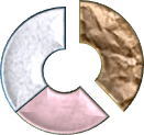
You can also pull out the slices manually.
Change the settings of slices in an exploded doughnut chart
-
In the exploded doughnut chart, click a data series or a data point, or do the following to select a data series from a list of chart elements:
-
Click the chart.
This displays the Chart Tools, adding the Design, Layout, and Format tabs.
-
On the Format tab, in the Current Selection group, click the arrow next to the Chart Elements box, and then click a data series.

-
-
On the Format tab, in the Current Selection group, click Format Selection.
-
Under Doughnut Explosion, drag the slider to increase or decrease the percentage of separation, or type the percentage of separation that you want in the Percentage box.
Pull out slices of a doughnut chart manually
Click the doughnut chart, and then do one of the following:
-
To pull out all of the slices of the doughnut chart, drag away from the center of the chart.
-
To pull out individual slices of the doughnut chart, click the slice that you want to pull out, and then drag that slice away from the center of the chart.
Change the hole size in a doughnut chart
By enlarging or reducing the hole size in a doughnut chart, you reduce or enlarge the width of the slices. For example, you may want to display wider slices to better accommodate data labels that contain long series or category names, or a combination of names, values and percentages.
-
In a doughnut chart, click a data series, or do the following to select it from a list of chart elements.
-
Click the chart.
This displays the Chart Tools, adding the Design, Layout, and Format tabs.
-
On the Format tab, in the Current Selection group, click the arrow next to the Chart Elements box, and then click a data series.

-
-
On the Format tab, in the Current Selection group, click Format Selection.
-
Under Doughnut Hole Size, drag the slider to the size that you want, or type a percentage value between 10 and 90 in the Percentage box.
Save a chart as a template
If you want to create another chart like the one that you just created, you can save the chart as a template that you can use as the basis for other similar charts.
-
Click the chart that you want to save as a template.
-
On the Design tab, in the Type group, click Save as Template.

-
In the File name box, type a name for the template.
Tip: Unless you specify a different folder, the template file (.crtx) will be saved in the Charts folder, and the template becomes available under Templates in both the Insert Chart dialog box (Insert tab, Charts group, Dialog Box Launcher
 ) and the Change Chart Type dialog box (Design tab, Type group, Change Chart Type).
For more information about how to apply a chart template, see Save a custom chart as a template.
Note: A chart template contains chart formatting and stores the colors that are in use when you save the chart as a template. When you use a chart template to create a chart in another workbook, the new chart uses the colors of the chart template — not the colors of the document theme that is currently applied to the workbook. To use the document theme colors instead of the chart template colors, right-click the chart area, and then click Reset to Match Style on the shortcut menu.
No comments:
Post a Comment