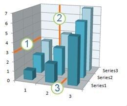
To make the data in a chart that displays axes easier to read, you can display horizontal and vertical chart gridlines. Gridlines extend from any horizontal and vertical axes across the plot area of the chart. You can also display depth gridlines in 3-D charts. Displayed for major and minor units, gridlines align with major and minor tick marks on the axes when tick marks are displayed. You cannot display gridlines for chart types that do not display axes, such as pie charts and doughnut charts.

1 Horizontal gridline
2 Vertical gridline
3 Depth gridline
Note: The following procedure applies to Office 2013 and newer versions. Looking for Office 2010 steps?
Display chart gridlines
-
Click anywhere on the chart to which you want to add chart gridlines.
-
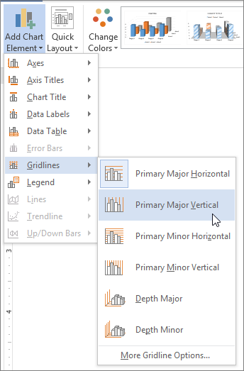
On the Design tab, in the Chart Layouts group, click Add Chart Element, point to Gridlines, and then click the gridline option you want to display. You can rest your mouse pointer over each option to preview the gridline display.

Note: Options will vary depending on your chart type. For example, if your chart is a 3-D chart, you will see Depth gridline options, and if your chart has a secondary horizontal axis, you will see Secondary horizontal and vertical gridline options.
Hide chart gridlines
-
Click anywhere on the chart in which you want to hide chart gridlines.
-
On the Design tab, in the Chart Layouts group, click Add Chart Element, point to Gridlines, and then click the gridline option you want to hide. You can rest your mouse pointer over each option to preview the gridline display.

Alternatively, select the horizontal or vertical chart gridlines that you want to remove, and then press DELETE.
Display or hide chart gridlines (Office 2010)
Follow these steps to display chart gridlines:
-
Click anywhere on the chart to which you want to add chart gridlines.
-
On the Layout tab, in the Axes group, click Gridlines.

-
Do one or more of the following:
-
For horizontal gridlines, click Primary Horizontal Gridlines, and then click the option that you want.
-
For secondary horizontal gridlines, click Secondary Horizontal Gridlines.
Note: This option is only available for charts that display a secondary horizontal axis. For more information, see Add or remove a secondary axis in a chart.
-
For vertical gridlines, click Primary Vertical Gridlines, and then click the option that you want.
-
For secondary vertical gridlines, click Secondary Vertical Gridlines.
Note: This option is only available for charts that display a secondary vertical axis. For more information, see Add or remove a secondary axis in a chart.
-
For depth gridlines on a 3-D chart, click Depth Gridlines, and then click the option that you want.
Note: This option is only available when the selected chart is a true 3-D chart, such as a 3-D column chart.
-
Follow these steps to hide chart gridlines:
-
Click anywhere on the chart in which you want to hide chart gridlines.
-
On the Layout tab, in the Axes group, click Gridlines.

-
Do one or more of the following:
-
Click Primary Horizontal Gridlines, Primary Vertical Gridlines, or Depth Gridlines (on a 3-D chart), and then click None.
-
Click Secondary Horizontal Gridlines or Secondary Vertical Gridlines, and then click None.
Note: These options are only available when a chart has secondary horizontal or vertical axes.
-
Select the horizontal or vertical chart gridlines that you want to remove, and then press DELETE.
-
Add or format gridlines
To make the data in a chart easier to read, you can display horizontal and vertical chart gridlines that extend across the plot area of the chart. You can also display depth gridlines in 3-D charts. Gridlines can be displayed for major and minor units, and they align with major and minor tick marks on the axes when those are displayed.
-
This step applies to Word for Mac only: On the View menu, click Print Layout.
-
Click the chart, and then click the Chart Design tab.
-
Click Add Chart Element > Gridlines.
-
Choose the axis that you want to apply the gridlines to or click More Gridline Options to open the Format Major Gridlines pane. You can change the line transparency, add arrows, and apply shadow, glow, and soft edge effects.
Depending on the type of data table or chart, some options for gridlines may not be available.
No comments:
Post a Comment