Maps in Power View
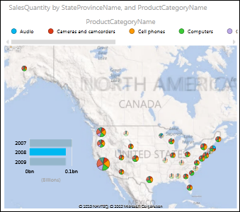
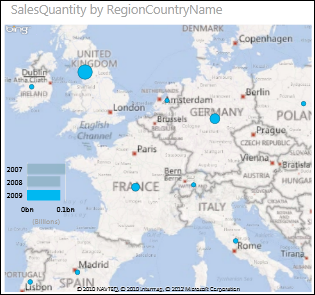
Maps in Power View display your data in the context of geography. Maps in Power View use Bing map tiles, so you can zoom and pan as you would with any other Bing map. To make maps work, Power View has to send the data to Bing through a secured web connection for geocoding, so it asks you to enable content. Adding locations and fields places dots on the map. The larger the value, the bigger the dot. When you add a multi-value series, you get pie charts on the map, with the size of the pie chart showing the size of the total.

Create a map
-
Drag a geographic field such as Country/Region, State/Province, or City to the Power View sheet or view to create a table.
Tip: A geographic field might be marked with a small globe icon. This identifies it as a geographic field.
-
Drag a numeric field such as Sales to the table.
-
On the Design tab, click Map.
-
Click Enable Content to send the data to Bing for geocoding through a secured web connection.
Power View creates a map with a dot for each value, such as each city. The size of the dot represents the value.
-
To convert the dots to pie charts, add a category field to the Color box for the map.

Maps cross-filter charts and other Power View visualizations, and vice versa. For example, when you click a data point on a map, the other charts are filtered by that data point. Likewise when you a click bar in a bar chart, the map is filtered to the data that relates to that bar.
Notes:
-
You can't zoom in as close in maps in Power View as you can in the same maps in Bing.
-
The Bing mapping service integrated with Power View isn't currently available in some locales. In unsupported locales, Power View plots map data points on a generic map.
Make map data unambiguousPower View

Map data can be ambiguous. For example, there's a Paris, France, but there's also a Paris, Texas. Your geographic data is probably stored in separate columns – a column for city names, a column for state or province names, etc. – so Bing may not be able to tell which Paris is which. You fix this by making the geographic values unique.
The place to fix this is in the data model, and not in Power View. If the data model is in an Excel file (XLSX), then in Power Pivot, you create a calculated column that concatenates the values in the two columns to create one unique value.

-
In Excel, click the Power Pivot tab and then click Manage Data Model.
Don't see a Power Pivot tab? Start Power Pivot in Microsoft Excel 2013.
-
Click the tab for the table containing geographic data.
-
Click Add Column in the column to the right of the table and type a formula similar to this in the formula bar above the worksheet:
=[StateProvinceName] & ", " & [RegionCountryName]
-
Press Enter.
Power Pivot fills in the column with the values in each row formatted with a separating comma:
StateProvinceName, RegionCountryName
-
Right-click the column to rename it.
-
Go back to your Power View sheet in Excel. Refresh the data and use your new column in your maps.
This doesn't change the underlying data. The new calculated column is in the data model, not in the source data.
Tip: This formula uses Data Analysis Expression (DAX) language. Learn more about DAX in this QuickStart: Learn DAX Basics in 30 Minutes.
Notes: Video copyrights:
-
Olympics Dataset © Guardian News & Media Ltd.
-
Flag images courtesy of CIA Factbook (cia.gov)
-
Population data courtesy of UNData (data.un.org ) on Microsoft Azure Marketplace
-
Olympic Sport Pictograms by Thadius856 and Parutakupiu, distributed according to the license on Wikimedia Commons (creativecommons.org/licenses/by-sa/3.0/)
See Also
Charts and other visualizations in Power View
Power View: Explore, visualize, and present your data
Power View and Power Pivot videos
Tutorial: PivotTable data analysis using a Data Model in Excel 2013
No comments:
Post a Comment